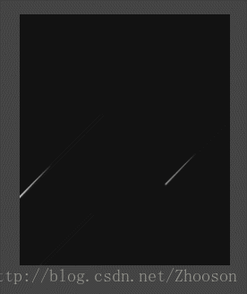
純css實現的流星雨的效果
檢視效果
<!DOCTYPE html>
<html>
<head>
<meta charset="UTF-8">
<title></title>
<style>
html,body {
width: 100%;
height: 100%;
margin: 0;
background:#444444;
}
.space {
width: 235px;
height: 280px;
margin:150px;
background: #121212;
float:left;
overflow: hidden;
}
.space .star {
display: block;
width : 0px;
height: 0px;
border-radius: 50%;
background: #fff;
top: -50px;
left:200px;
position: relative;
transform-origin: 100% 0;
animation: star-ani 6s infinite ease-out;
box-shadow : 0 0 0px 0px rgba(255, 255, 255, .3);
opacity: 0;
z-index: 2;
}
.space .star:after {
content: '';
display: block;
top: -10px;
left: 200px;
border: 0px solid #fff;
border-width: 0px 90px 3px 90px;
border-color: transparent transparent transparent #fff;
transform: rotate(-45deg) translate3d(1px, 3px, 0);
box-shadow: 0 0 1px 0 rgba(255, 255, 255, .1);
transform-origin: 0% 100%;
animation: shooting-ani 1s infinite ease-out;
}
.space .star1 {
top: -10px;
left: 300px;
background: #fff;
animation-delay: 0.5s;
-webkit-animation-delay:0.5s;
-moz-animation-delay: 0.5s;
}
.space .star1:after {
border-color: transparent transparent transparent #fff;
animation-delay: 0.5s;
-webkit-animation-delay:0.5s;
-moz-animation-delay: 0.5s;
}
.space .star2 {
top: 100px;
left: 200px;
background: #fff;
animation-delay: 0s;
-webkit-animation-delay:0s;
-moz-animation-delay: 0s;
}
.space .star2:after {
border-color: transparent transparent transparent #fff;
animation-delay: 0;
-webkit-animation-delay:0s;
-moz-animation-delay: 0s;
}
.space .star3 {
top: -10px;
left: 100px;
background: #fff;
animation-delay: 1.5s;
-webkit-animation-delay: 1.5s;
-moz-animation-delay: 1.5s;
}
.space .star3:after {
border-color: transparent transparent transparent #fff;
animation-delay: 1.5s;
-webkit-animation-delay: 1.5s;
-moz-animation-delay:1.5s;
}
.space .star4 {
top: 100px;
left: 250px;
background: #fff;
animation-delay: 1.5s;
-webkit-animation-delay: 1.5s;
-moz-animation-delay: 1.5s;
}
.space .star4:after {
border-color: transparent transparent transparent #fff;
animation-delay: 1.5s;
-webkit-animation-delay: 1.5s;
-moz-animation-delay:1.5s;
}
.space .star5 {
top: 200px;
left: 250px;
background: #fff;
animation-delay: 1.5s;
-webkit-animation-delay: 1.5s;
-moz-animation-delay: 1.5s;
}
.space .star5:after {
border-color: transparent transparent transparent #fff;
animation-delay: 1.5s;
-webkit-animation-delay: 1.5s;
-moz-animation-delay: 1.5s;
}
.space .star6 {
top: -10px;
left: 100px;
background: #fff;
animation-delay: 1.5s;
-webkit-animation-delay: 1.5s;
-moz-animation-delay: 1.5s;
}
.space .star6:after {
border-color: transparent transparent transparent #fff;
animation-delay: 1.5s;
-webkit-animation-delay: 1.5s;
-moz-animation-delay: 1.5s;
}
.space .star7 {
top: 100px;
left: 200px;
background: #fff;
animation-delay: 3s;
-webkit-animation-delay:3s;
-moz-animation-delay: 3s;
}
.space .star7:after {
border-color: transparent transparent transparent #fff;
animation-delay: 3s;
-webkit-animation-delay:3s;
-moz-animation-delay: 3s;
}
.space .star13 {
top: -10px;
left: 210px;
background: #fff;
animation-delay: 3s;
-webkit-animation-delay:3s;
-moz-animation-delay: 3s;
}
.space .star13:after {
border-color: transparent transparent transparent #fff;
animation-delay: 3s;
-webkit-animation-delay:3s;
-moz-animation-delay: 3s;
}
.space .star14 {
top: -100px;
left: 150px;
background: #fff;
animation-delay: 2s;
-webkit-animation-delay:2s;
-moz-animation-delay: 2s;
}
.space .star14:after {
border-color: transparent transparent transparent #fff;
animation-delay: 2s;
-webkit-animation-delay:2s;
-moz-animation-delay: 2s;
}
.space .star15 {
top: 200px;
left: 250px;
background: #fff;
animation-delay: 2.5s;
-webkit-animation-delay:2.5s;
-moz-animation-delay: 2.5s;
}
.space .star15:after {
border-color: transparent transparent transparent #fff;
animation-delay: 2.5s;
-webkit-animation-delay:2.5s;
-moz-animation-delay: 2.5s;
}
.space .star8 {
top: -10px;
left: 100px;
background: #fff;
animation-delay: 3s;
-webkit-animation-delay: 3s;
-moz-animation-delay: 3s;
}
.space .star8:after {
border-color: transparent transparent transparent #fff;
animation-delay: 3s;
-webkit-animation-delay: 3s;
-moz-animation-delay:3s;
}
.space .star9 {
top: 100px;
left: 250px;
background: #fff;
animation-delay: 4s;
-webkit-animation-delay: 4s;
-moz-animation-delay: 4s;
}
.space .star9:after {
border-color: transparent transparent transparent #fff;
animation-delay: 4s;
-webkit-animation-delay: 4s;
-moz-animation-delay:4s;
}
.space .star10 {
top: 200px;
left: 250px;
background: #fff;
animation-delay: 5s;
-webkit-animation-delay: 5s;
-moz-animation-delay: 5s;
}
.space .star10:after {
border-color: transparent transparent transparent #fff;
animation-delay: 5s;
-webkit-animation-delay: 5s;
-moz-animation-delay: 5s;
}
.space .star11 {
top: -10px;
left: 100px;
background: #fff;
animation-delay: 5s;
-webkit-animation-delay: 5s;
-moz-animation-delay: 5s;
}
.space .star11:after {
border-color: transparent transparent transparent #fff;
animation-delay: 5s;
-webkit-animation-delay: 5s;
-moz-animation-delay: 5s;
}
.space .star12 {
top: -10px;
left: 100px;
background: #fff;
animation-delay: 6s;
-webkit-animation-delay: 6s;
-moz-animation-delay: 6s;
}
.space .star12:after {
border-color: transparent transparent transparent #fff;
animation-delay: 6s;
-webkit-animation-delay: 6s;
-moz-animation-delay: 6s;
}
@keyframes star-ani {
0% {
opacity: 0;
transform: scale(0) rotate(0) translate3d(0, 0, 0);
-webkit-transform: scale(0) rotate(0) translate3d(0, 0, 0);
-moz-transform: scale(0) rotate(0) translate3d(0, 0, 0);
}
50% {
opacity: 1;
transform: scale(1) rotate(0) translate3d(-300px, 300px, 0);
-webkit-transform: scale(1) rotate(0) translate3d(-300px, 300px, 0);
-moz-transform: scale(1) rotate(0) translate3d(-300px, 300px, 0);
}
100% {
opacity: 0;
transform: scale(1) rotate(0) translate3d(-400px, 300px, 0);
-webkit-transform: scale(1) rotate(0) translate3d(-400px, 400px, 0);
-moz-transform: scale(1) rotate(0) translate3d(-400px, 400px, 0);
}
}
</style>
</head>
<body>
<div class="space">
<div class="star"></div>
<div class="star star1"></div>
<div class="star star2"></div>
<div class="star star3"></div>
<div class="star star4"></div>
<div class="star star5"></div>
<div class="star star6"></div>
<div class="star star7"></div>
<div class="star star8"></div>
<div class="star star9"></div>
<div class="star star10"></div>
<div class="star star11"></div>
<div class="star star12"></div>
<div class="star star13"></div>
<div class="star star14"></div>
<div class="star star15"></div>
</div>
</body>
</html>
純css寫的流星效果,有這幾個缺點,節點應該迴圈出來,每個流星出來的時間,位置,大小等元素應該隨機分配的,這幾點後期慢慢優化
備註: 如您有更好的建議和效果展示,請留言,謝謝!!
相關推薦
使用純css實現波浪效果
波浪 gree transform orm infinite ram 定位 position mes 有時候我們需要實現水晃動的效果,其實我們可以通過css旋轉動畫和圓角來實現。 首先來2個div,外層div相對定位,內層div絕對定位,內層div大致位於外層div上半部分
純css實現打字效果
idt strong htm rap 混合 實現 有時 append com 概述 很早以前就在別人的博客上面看到打字動畫了,覺得非常炫酷,以為是用js做的,找了半天也沒找到js在哪裏。今天看《css揭秘》,碰巧看到書上打字動畫的實現了,而且是純css實現的!我參考這本書把
純css實現氣泡效果
先上程式碼: div.bubble{ position: absolute; margin: 0; padding: 0; color: #86181d; background-color: #ffdce0; border-color: #cea0a5; displa
純 CSS 實現波浪效果!
而使用純 CSS 的方式,實現貝塞爾曲線,額,暫時是沒有很好的方法。 當然,藉助其他力量(SVG、CANVAS),是可以很輕鬆的完成所謂的波浪效果的,先看看,非 CSS 方式實現的波浪效果。 使用 SVG 實現波浪效果 藉助 SVG ,是很容
純css實現的流星雨的效果
檢視效果 <!DOCTYPE html> <html> <head> <meta charset="UTF-8">
純CSS實現專案展示遮罩詳情效果
本例項主要用於專案展示時滑鼠hover後顯示一個遮罩顯示專案詳情的效果,遮罩採用CSS的絕對定位以及CSS3盒子模型。 本例項應用廣泛,很多品牌官方網站均有采用。 hover: 1 <!DOCTYPE html> 2 <html> 3 4 <head
【CSS】純css實現立體擺放圖片效果
1. 元素的 width/height/padding/margin 的百分比基準 設定 一個元素 width/height/padding/margin 的百分比的時候,大家可知道基準是什麼? 舉個栗子: .parent { width: 200px; height: 100px; } .ch
用純CSS實現載入中動畫效果
HTML <div class="pswp__preloader__icn"> <div class="pswp__preloader__cut"> <div class="pswp__preloader__donut"&
用純CSS實現加載中動畫效果
cit one form overflow relative tor -o ica tom HTML <div class="pswp__preloader__icn"> <div class="
純css實現圖片翻轉效果
所要掌握知識點 CSS樣式 1.backface-visibility; visible/hidden: 設定當所指定的元素被進行翻轉等操作而使背面顯示時,是否進行顯示還是隱藏 2.transf
純CSS實現選項卡效果
利用 :focus-within 可以在父節點獲取元素獲得焦點的特性,實現的TAB導航切換 .xxk { width: 300px;margin: 50px auto;padding: 10px;border: 1px solid #ddd;} .nav-box {f
純CSS實現隱藏滾動條但仍具有滾動的效果
移動端移動端頁面只要相容 Chrome 和 Safari 就夠了,所以可以使用自定義滾動條的偽類選擇器 ::-webkit-scrollbar 來隱藏滾動條。 .container::-webkit-scrollbar { display: none; }PC
純css實現瀑布流效果
<!doctype html> <html lang="en"> <head> <meta charset="UTF-8"> <title>純CSS3實現的瀑布流</title> <link
純CSS實現聊天框小尖角、氣泡效果
經常看到這樣的尖角,以前不懂,以為都是用圖片做出來的,後來驚奇的發現,原來很多都是用CSS做出來的,既美觀又節省資源,真是兩全其美啊! 那麼,用CSS怎麼實現這種效果呢?首先,來寫一個簡單的程式碼: <div class="arrow"></div&g
純CSS實現導航欄效果
利用偽類、display和盒子模型完成一個CSS導航欄。 CSS樣式: #nav{margin:50px} .box{width:0;height:0} .btn{text-align:center
45個純 CSS 實現的精美邊框效果【附原始碼】
確實覺得很好,但是貼上不過來,所以把連線分享給大家了。 地址:http://www.cnblogs.com/lhb25/archive/2012/08/29/css-border-and-box-effect-a.html 地址:http://www.cnblogs
純css實現輪播效果
#frame {/*----------圖片輪播相框容器----------*/ position:absolute;width:300px; height:200px;overflow:hidden;border-radius:5px;} #phot
微信小程式 --- CSS實現仿網易雲音樂播放介面效果(黑膠唱片與唱針純CSS實現)
下面程式碼的效果是網易雲音樂唱針和黑膠唱片的CSS效果實現方式,播放等並沒貼出來 實現效果的範圍 動態圖效果預覽: stylusW,panW是獲取系統寬度計算後的引數 w
純CSS實現影象滑鼠懸停效果
前端開發whqet,csdn,王海慶,whqet,前端開發專家今天來看一組純CSS實現的滑鼠懸停效果,線上研究程式碼點效果一、效果二、效果三,下載收藏點這裡,效果預覽點這裡。效果1效果1的html檔案<div class="pic"> <img src="
CSS3 - vue中純css實現柱狀圖表效果
背景 以前我們製作柱狀圖都用echarts或者其他同類型的圖表外掛 這次是個移動端的需求,而且這個圖表需要動畫 使用echarts就會顯得過重,而且動畫達不到我想要的效果(主要是我自己愚蠢想不到好的動畫辦法)。 先來看下效果圖: 幾個柱狀圖分數不滿時: 幾個滿分柱圖: 還