
echarts環形餅圖
阿新 • • 發佈:2019-01-25
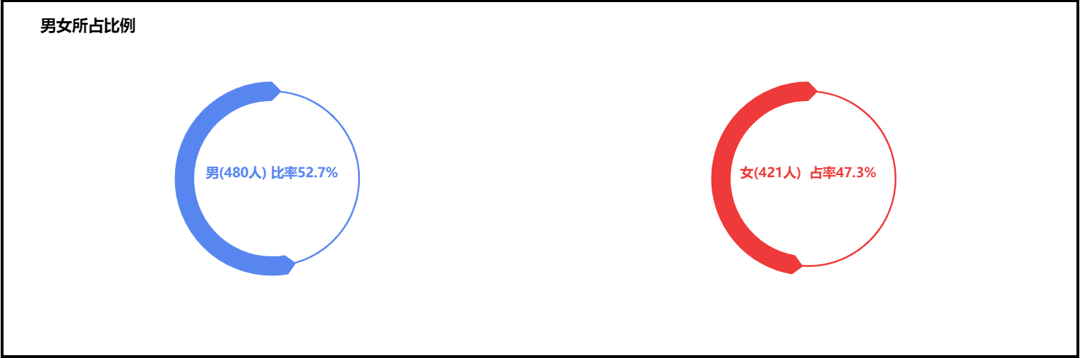
圖表效果如下:
具體程式碼如下:
- <html>
- <head>
- <meta charset="UTF-8">
- <title>關係圖案例</title>
- <!-- 引入 ECharts 檔案 -->
- <script src="js/echarts4.0.js" type="text/javascript" charset="utf-8"></script>
- </head>
- <body>
- <!-- 為 ECharts 準備一個具備大小(寬高)的 容器 -->
- <div id="chart1" style="width: 80%;height: 400px;top: 50px;left: 10%;border: 3px solid #000;"></div>
- </body>
- </html>
- <script type="text/javascript">
- // 基於準備好的容器(這裡的容器是id為chart1的div),初始化echarts例項
- var chart1 = echarts.init(document.getElementById("chart1"));
- // 指定圖表的配置項和資料
- var option = {
- title: {
- text: '男女所佔比例',
- left : '3%', // 標題距離左側邊距
- top : '3%', // 標題距頂部邊距
- textStyle: {
- color: '#000'
- }
- },
- series: [{
- type: "pie", // 系列1型別: 餅圖
- center: ["25%","50%"], // 餅圖的中心(圓心)座標,陣列的第一項是橫座標,第二項是縱座標。[ default: ['50%', '50%'] ]
- radius: ["49%","50%"], // 餅圖的半徑,陣列的第一項是內半徑,第二項是外半徑。[ default: [0, '75%'] ]
- // 可以將內半徑設大顯示成圓環圖(Donut chart)。
- clockWise: false, // 餅圖的扇區是否是順時針排布。[ default: true ]
- startAngle: 90, // 起始角度,支援範圍[0, 360]。 [ default: 90 ]
- hoverAnimation: true, // 是否開啟 hover 在扇區上的放大動畫效果。[ default: true ]
- itemStyle: { // 圖形樣式
- normal: {
- color: "#5886f0", // 圖形的顏色
- borderColor: "#5886f0", // 圖形的描邊顏色
- borderWidth: 20, // 描邊線寬。為 0 時無描邊。[ default: 0 ]
- borderType: 'solid', // 柱條的描邊型別,預設為實線,支援 'solid', 'dashed', 'dotted'。
- label: { // 圖形內部標籤
- show: true, // 是否顯示標籤
- textStyle: { // 標籤文字樣式
- fontSize: 15,
- fontWeight: "bold" // 標籤字型加粗,'normal','bold','bolder','lighter',100 | 200 | 300 | 400...
- },
- position: "center" // 標籤的位置,'outside'(餅圖扇區外側,通過視覺引導線連到相應的扇區)
- // 'inside'(餅圖扇區內部); 'inner' 同 'inside'。
- // 'center'(在餅圖中心位置。)
- },
- labelLine: { // 標籤的視覺引導線樣式,在 label 位置 設定為'outside'的時候會顯示視覺引導線。
- show: false
- }
- },
- emphasis: { // 高亮的扇區和標籤樣式(起強調作用)
- color: "#5886f0",
- borderColor: "#5886f0",
- borderWidth: 20,
- borderType: 'solid',
- label: {
- textStyle: {
- fontSize: 15,
- fontWeight: "bold"
- }
- }
- }
- },
- data: [{value: 52.7,name: "男(480人) 比率52.7%"},
- {name: " ",value: 47.3,
- itemStyle: {
- normal: {
- color: "#5886f0",
- borderColor: "#5886f0",
- borderWidth: 0,
- label: {
- show: false
- },
- labelLine: {
- show: false
- }
- },
- emphasis: {
- color: "#5886f0",
- borderColor: "#5886f0",
- borderWidth: 0
- }
- }
- }
- ]
- }, {
- type: "pie", // 系列2型別: 餅圖
- center: [
- "75.0%",
- "50%"
- ],
- radius: [
- "49%",
- "50%"
- ],
- clockWise: false,
- hoverAnimation: true,
- itemStyle: {
- normal: {
- label: {
- show: true,
- textStyle: {
- fontSize: 15,
- fontWeight: "bold"
- },
- position: "center"
- },
- labelLine: {
- show: false
- },
- color: "#ee3a3a",
- borderColor: "#ee3a3a",
- borderWidth: 20
- },
- emphasis: {
- label: {
- textStyle: {
- fontSize: 15,
- fontWeight: "bold"
- }
- },
- color: "#ee3a3a",
- borderColor: "#ee3a3a",
- borderWidth: 20
- }
- },
- data: [{
- value: 47.3,
- name: "女(421人) 佔率47.3%"
- },
- {
- name: " ",
- value: 52.7,
- itemStyle: {
- normal: {
- label: {
- show: false
- },
- labelLine: {
- show: false
- },
- color: "#ee3a3a",
- borderColor: "#ee3a3a",
- borderWidth: 0
- },
- emphasis: {
- color: "#ee3a3a",
- borderColor: "#ee3a3a",
- borderWidth: 0
- }
- }
- }
- ]
- }
- ]
- };
- // 使用剛指定的配置項和資料顯示圖表
- chart1.setOption(option);
- </script>
想要使用該圖表,只需要 複製以上程式碼 ,再下載 echarts.js 在頁面檔案中引入即可.
注:本文的一個關鍵點就是環形圖內部標籤位置的設定,相關的配置項是 position,其取值分別為:
'outside'(餅圖扇區外側,通過視覺引導線連到相應的扇區);
'inside'(餅圖扇區內部);
'inner' 同 'inside';
'center'(在餅圖中心位置);