matplotlib中繪圖常用函式
matplotlib中常用函式
- 散點圖
- 柱狀圖
- 等高線
- matplotlib繪製3D圖
- 子影象
- 動態圖
常見設定
一、設定座標軸
# x軸和y軸的值域
plt.xlim((-1,2))
plt.ylim((-2,3))

# color為線的顏色,linewidth為線寬度,linestyle為樣式(-為實線,--為虛線)
plt.plot(x,y,color='red',linewidth=1.0,linestyle='—')

plt.figure #繪製一個新畫布
plt.figsize #花布尺寸

# x和y軸
plt.xtick()
plt.ytick()
例如:
plt.xticks(new_ticks) #new_ticks 為-2,2分成十一等份
plt.yticks([-1,0,1,2,3],
          ['level2','level2','level3','level4','level5'])
二、
-
plt.gca #獲取當前的座標軸
spines['right'].set_color('red’) #右邊框為紅色
# 分別把x軸與y軸的刻度設定為bottom與left
xaxis.set_ticks_position('bottom')
yaxis.set_ticks_position('left’)
# 分別v把bottom和left型別設定為data,交點為(0,0)
spines['bottom'].set_position(('data',0))
spines['left'].set_position(('data',0))


例如:
ax = plt.gca()
ax.spines['right'].set_color(‘red')
ax.spines['top'].set_color(‘red’)
三、
l1, = plt.plot(x,y1,color='red',linewidth=1.0,linestyle='—') #設定兩條線為l1,l2    注:應該在後面加上,
l2, = plt.plot(x,y2,color="blue",linewidth=5.0,linestyle="-")
plt.legend(handles=[l1,l2],labels=['test1','test2'],loc='best’) #將l1,l2繪製於一張圖中,其中名字分別是l1,l2,位置自動取在最佳位置
設定備註
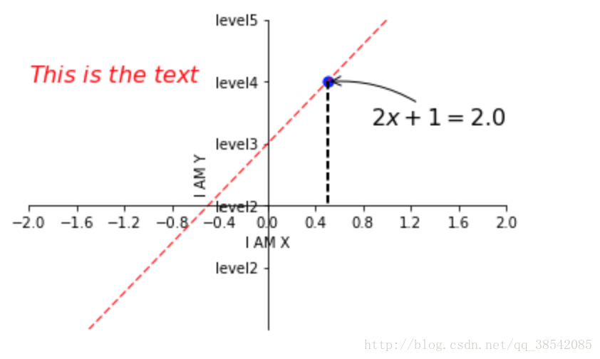
x0 = 0.5
y0 = 2*x0 + 1
# 畫點
plt.scatter(x0,y0,s=50,color='blue')
# 畫虛線
plt.plot([x0,x0],[y0,0],'k--',lw=2)#[x0,x0],[y0,0]代表x0,y0點作虛線交於x0,0  k--代表顏色的虛線,lw代表寬度
plt.annotate(r'$2x+1=%s$' % y0,xy=(x0,y0),xytext=(+30,-30),textcoords='offset points',fontsize=16,arrowprops=dict(arrowstyle='->',connectionstyle='arc3,rad=.2'))
#xy=(x0,y0)指在x0,y0點,xytext=(+30,-30)指在點向右移動30,向下移動30,textcoords='offset points'指以點為起點
#arrowprops=dict(arrowstyle='->',connectionstyle='arc3,rad=.2')指弧度曲線,  .2指弧度
plt.text(-2,2,r'$This\ is\ the\ text$',fontsize=16,color='red’) #-2,2指從-2,2開始寫
散點圖
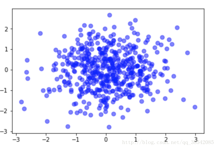
x = np.random.normal(0,1,500)
y = np.random.normal(0,1,500)
plt.scatter(x,y,s=50,color='blue',alpha=0.5) #s指點大小,alpha指透明度
plt.show()
柱狀圖
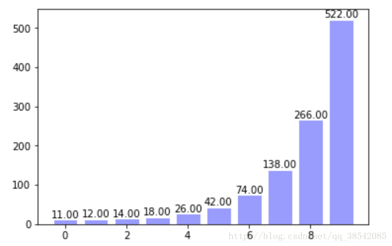
x = np.arange(10)
y = 2**x + 10
plt.bar(x,y,facecolor='#9999ff',edgecolor='white')#柱顏色,柱邊框顏色
for x,y in zip(x,y):#zip指把x,y結合為一個整體,一次可以讀取一個x和一個y
    plt.text(x,y,'%.2f' % y,ha='center',va='bottom')#指字型在中間和柱最頂的頂部
plt.show()
等高圖
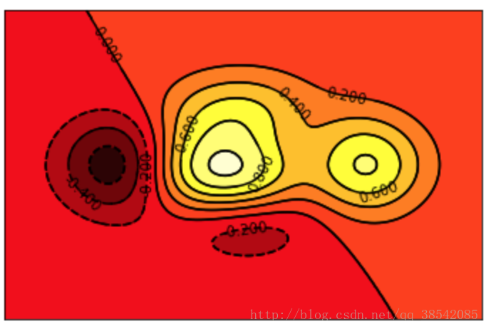
def f(x,y):
    #用來生成高度
    return (1-x/2+x**5+y**3)*np.exp(-x**2-y**2)

x = np.linspace(-3,3,100)
y = np.linspace(-3,3,100)

X,Y = np.meshgrid(x,y)#將x,y指傳入網格中
plt.contourf(X,Y,f(X,Y),8,alpha=0.75,cmap=plt.cm.hot)#8指圖中的8+1根線,繪製等溫線,其中cmap指顏色

C = plt.contour(X,Y,f(X,Y),8,colors='black',linewidth=.5)#colors指等高線顏色
plt.clabel(C,inline=True,fontsize=10)#inline=True指字型在等高線中

plt.xticks(())
plt.yticks(())
plt.show()
matplotlib繪製3D圖
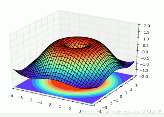
from mpl_toolkits.mplot3d import Axes3D#動態圖所需要的包
fig = plt.figure()
ax = Axes3D(fig)

x = np.arange(-4,4,0.25)#0.25指-4至4間隔為0.25
y = np.arange(-4,4,0.25)
X,Y = np.meshgrid(x,y)#x,y放入網格
R = np.sqrt(X**2 + Y**2)
Z = np.sin(R)

ax.plot_surface(X,Y,Z,rstride=1,cstride=1,cmap=plt.get_cmap('rainbow'))#rstride=1指x方向和y方向的色塊大小
ax.contourf(X,Y,Z,zdir='z',offset=-2,cmap='rainbow')#zdir指對映到z方向,-2代表對映到了z=-2
ax.set_zlim(-2,-2)

plt.show()
子影象
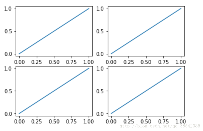
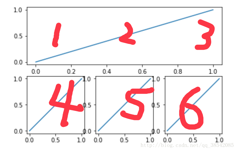
plt.figure()
plt.subplot(2,2,1)#建立一個兩行兩列的畫布,第一個
plt.plot([0,1],[0,1])
plt.subplot(2,2,2)#第二個
plt.plot([0,1],[0,1])
plt.subplot(2,2,3)#第三個
plt.plot([0,1],[0,1])
plt.subplot(2,2,4)#第四個
plt.plot([0,1],[0,1])
plt.show()
plt.figure() plt.subplot(2,1,1)#建立一個兩行兩列的畫布,第一個 plt.plot([0,1],[0,1]) plt.subplot(2,3,4)#第二個 plt.plot([0,1],[0,1]) plt.subplot(2,3,5)#第三個 plt.plot([0,1],[0,1]) plt.subplot(2,3,6)#第四個 plt.plot([0,1],[0,1]) plt.show()動態圖
from matplotlib import animation#動態圖所需要的包
fig,ax = plt.subplots()#子影象
x = np.arange(0,2*np.pi,0.01)
line, = ax.plot(x,np.sin(x))

def animate(i):
    line.set_ydata(np.sin(x+i/10))#用來改變的y對應的值
    return line,
def init():
    line.set_ydata(np.sin(x))#動態圖初始影象
    return line,

ani = animation.FuncAnimation(fig=fig,func=animate,init_func=init,interval=20)#動態作圖的方法,func動態圖函式,init_func初始化函式,interval指影象改變的時間間隔
plt.show()
注:若想看動態效果請在ipython中使用

使用顏色對映
顏色對映(colormap)是一系列顏色,它們從起始顏色漸變到結束顏色。在視覺化中,顏色對映用於突出資料的規律,例如,你可能用較淺的顏色來顯示較小的值,並使用較深的顏色來顯示較大的值。
import matplotlib.pyplot as plt

x_values = list(range(1001))
y_values = [x**2 for x in x_values]

plt.scatter(x_values, y_values, c=y_values, cmap=plt.cm.Blues, edgecolor='none', s=40)
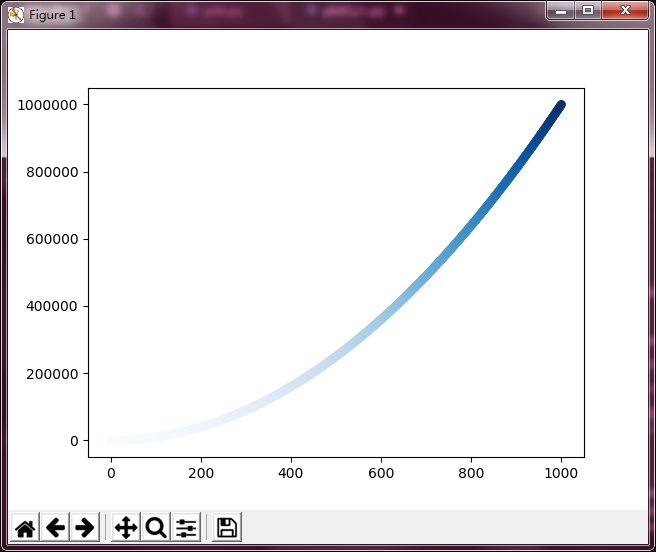
這些程式碼將y值較小的點顯示為淺藍色,並將y值較大的點顯示為深藍色。
Matplotlib進階-Seaborn
Seaborn其實是在matplotlib的基礎上進行了更高階的API封裝,從而使得作圖更加容易,在大多數情況下使用seaborn就能做出很具有吸引力的圖。
安裝方式
安裝方式類似於matplotlib , 在Windows下和Linux下面都可以採用pip安裝方式。
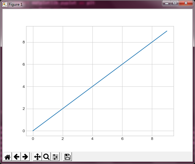
set_style( )
set_style( )是用來設定主題的,Seaborn有五個預設好的主題: darkgrid , whitegrid , dark , white ,和 ticks 預設: darkgrid
import matplotlib.pyplot as plt
import seaborn as sns

sns.set_style("whitegrid")
plt.plot(range(10))

plt.show()
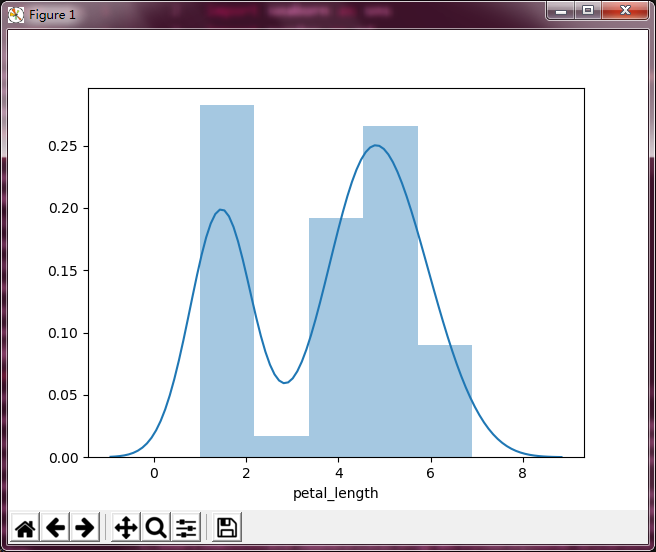
直方圖
直方圖的繪製:
import matplotlib.pyplot as plt
import seaborn as sns
import pandas as pd

df_iris = pd.read_csv(r'D:\Windows 7 Documents\Desktop\iris.csv')

sns.distplot(df_iris['petal_length'], kde = True)   # kde 密度曲線  rug 邊際毛毯

plt.show()
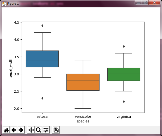
箱型圖
箱形圖(Box-plot)又稱為盒須圖、盒式圖或箱線圖,是一種用作顯示一組資料分散情況資料的統計圖。因形狀如箱子而得名。
import matplotlib.pyplot as plt
import seaborn as sns
import pandas as pd

df_iris = pd.read_csv(r'D:\Windows 7 Documents\Desktop\iris.csv')

sns.boxplot(x = df_iris['species'], y = df_iris['sepal_width'])

plt.show()
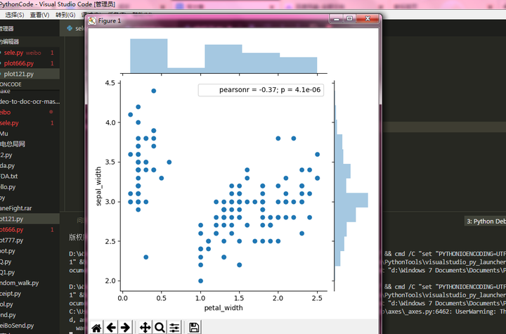
聯合分佈
兩個變數的畫圖
import matplotlib.pyplot as plt
import seaborn as sns
import pandas as pd

df_iris = pd.read_csv(r'D:\Windows 7 Documents\Desktop\iris.csv')

sns.jointplot(df_iris['petal_width'], df_iris['sepal_width'])

plt.show()
不用圓點表示的話也是可以的,可以用其他方式來表示,比如六角形來表示:
import matplotlib.pyplot as plt
import seaborn as sns
import pandas as pd

df_iris = pd.read_csv(r'D:\Windows 7 Documents\Desktop\iris.csv')

sns.jointplot(df_iris['petal_width'], df_iris['sepal_width'], kind='hex')

plt.show()

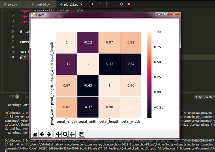
熱力圖
相關係數是最早由統計學家卡爾·皮爾遜設計的統計指標,是研究變數之間線性相關程度的量,一般用字母 r 表示。由於研究物件的不同,相關係數有多種定義方式,較為常用的是皮爾遜相關係數。
相關係數是用以反映變數之間相關關係密切程度的統計指標。相關係數是按積差方法計算,同樣以兩變數與各自平均值的離差為基礎,通過兩個離差相乘來反映兩變數之間相關程度;著重研究線性的單相關係數。公式:以上公式中:
import matplotlib.pyplot as plt
import seaborn as sns
import pandas as pd

df_iris = pd.read_csv(r'D:\Windows 7 Documents\Desktop\iris.csv')

corrmat = df_iris[df_iris.columns[:4]].corr()

sns.heatmap(corrmat, square=True, linewidths=.5, annot=True)
plt.show()
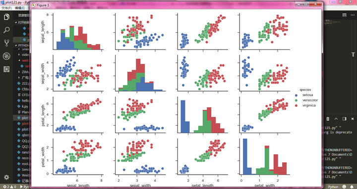
多變數圖
關注資料框中各個特徵之間的相關關係,呈現圖形的展示,給人以直觀的感受。而不是"冰冷"的數字。可以非常方便的找到各個特徵之間呈現什麼樣的關係。比如線性,離散等關係。
import pandas as pd
import matplotlib.pyplot as plt
import seaborn as sns

data = pd.read_csv(r"D:\Windows 7 Documents\Desktop\iris.csv")

sns.set(style="ticks")    # 使用預設配色
sns.pairplot(data,hue="species")   # hue 選擇分類列

plt.show()