
【2017-11-9】CSS 中的媒體查詢
阿新 • • 發佈:2019-02-02
通過媒體查詢,我們可以實現在不同的裝置,不同的螢幕大小,載入不同的樣式表,以實現響應式的佈局效果。
但是這種設計也存在著一定程度上的缺陷,在適配移動端的時候,大量使用 display:none 隱藏富媒體元素,這樣會造成不必要的流量浪費;
1.媒體型別
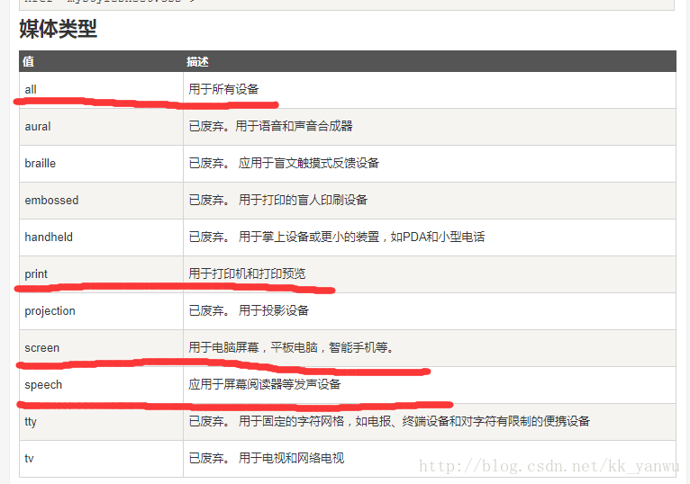
在實際開發中,最常用的媒體型別也就只有all,print,screen這三種類型。
//根據不同的裝置型別,載入不同CSS檔案
<link rel="stylesheet" type="text/css" href="css/1.css" media="all"/>
<link rel="stylesheet" //除了可以寫入外部檔案,也可以直接使用樣式表
<style type="text/css">
@media screen{
}
@media print{
}
</style>
2.媒體特性
媒體查詢除了可以根據不同的裝置型別去載入不同樣式檔案,也可以根據不同裝置特性去載入不同的CSS樣式表;
一般用來根據不同的螢幕尺寸來適配不同的樣式。
1.最大寬度Max Width
<link rel="stylesheet" type="text/css" href="css/1.css"  media="(max-width:600px)"/>

//如圖:1.CSS 的最大適配螢幕寬度為600px,即當螢幕小於600px時才會載入 1.CSS
2.最小寬度Min Width
<link rel="stylesheet" type="text/css" href="css/1.css"  media="(min-width:600px)"/>

//如圖:1.CSS 的最小適配螢幕寬度為600px,即當螢幕大於600px時才載入 1.CSS
3.多特性同時使用
<link rel="stylesheet" type="text/css" href="css/1.css"  media="(min-width:600px) and (max-width:900px)"/>

//如圖:多特性同時使用,當螢幕大小大於600px小於900px的時候,載入 1.CSS
4.min-device-width 與 max-device-width
代表的螢幕可見區域的最大值與最小值,與Max Width Min Width型別相似
5.not關鍵字,用來排除某種特性,相當於“非”
<link rel="stylesheet" type="text/css" href="css/1.css"  media="not screen and (min-width:600px)"/>

//如圖:適配1.CSS的最小螢幕寬度為600px,加上not之後就會變成,適配1.CSS的最大螢幕寬度為600px;
6.only關鍵字
only用來定某種特定的媒體型別;
@media only screen and (min-width: ) {

}
//如圖:only screen 用來規定媒體型別為 screen