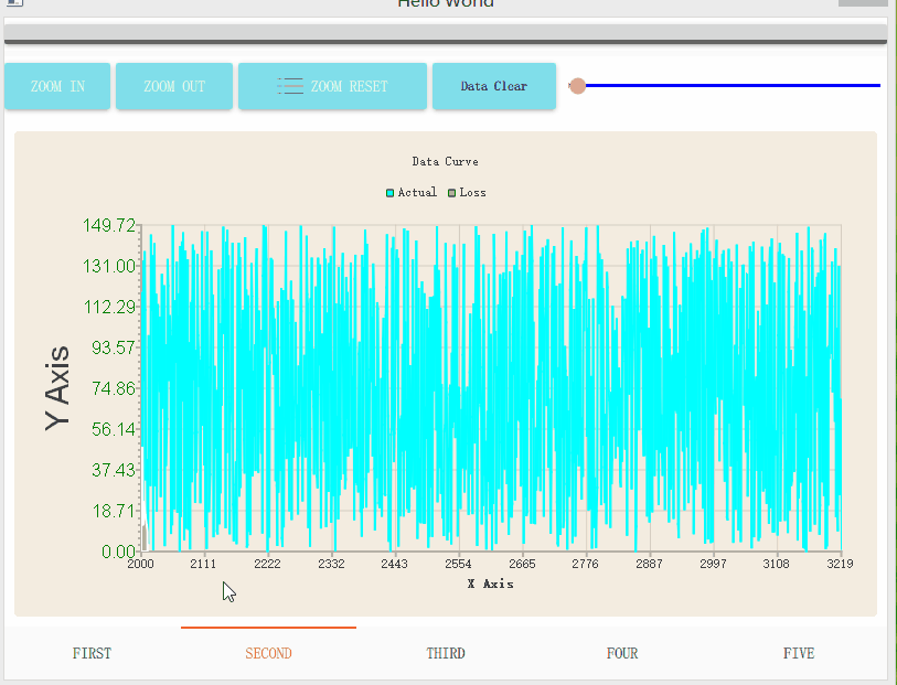
QML程式設計:頁面導航效果的實現
阿新 • • 發佈:2019-02-04
QML作為一種指令碼化語言,可以很方便的實現各種圖形特效,同時又能友好的和Qt中的C++程式碼進行互動。隨之QML的日趨成熟,使用QML進行專案開發,成為一種選擇
本文介紹兩種方式實現支援Button直接跳轉切換和頁面滑動切換效果
使用SwipeView控制元件實現,重寫contentItem屬性:
import QtQuick 2.7 import QtQuick.Controls 2.0 import QtQuick.Layouts 1.3 import QtQml.Models 2.3 import QtQuick.Controls.Material 2.0 ApplicationWindow { visible: true width: 800 height: 600 title: qsTr("Hello World") Material.theme: Material.Light Material.accent: Material.DeepOrange Material.primary: Material.Blue ColumnLayout{ anchors.fill: parent Rectangle{ Layout.fillWidth:true height: 30 Button{ id:indicator anchors.fill: parent checkable: true onClicked: { if(checked==true){ area.visible=true } else{ area.visible=false } } } } Rectangle{ id:area visible:indicator.checked?true:false Layout.fillWidth:true height: 160 Label{ text:"Area .........." } } SwipeView { id: swipeView Layout.fillWidth:true Layout.fillHeight: true currentIndex: tabBar.currentIndex contentItem: ListView { model: swipeView.contentModel interactive: swipeView.interactive currentIndex: swipeView.currentIndex spacing: swipeView.spacing orientation: swipeView.orientation snapMode: ListView.SnapOneItem boundsBehavior: Flickable.StopAtBounds highlightRangeMode: ListView.StrictlyEnforceRange preferredHighlightBegin: 0 preferredHighlightEnd: 0 highlightMoveDuration: 1maximumFlickVelocity: 4 * (control.orientation === Qt.Horizontal ? width : height) } Page1{ } Light{ } PageTimer{ } } } footer: TabBar { id: tabBar currentIndex: swipeView.currentIndex TabButton { text: qsTr("First") } TabButton { text: qsTr("Second") } TabButton { text: qsTr("Third") } } }
currentIndex表示訪問索引,contentItem表示可視區域物件模型,通過改寫ListView的highlightMoveDuration屬性值,實現跳轉的效果
使用ListView控制元件實現方式:
import QtQuick 2.7
import QtQuick.Controls 2.0
import QtQuick.Layouts 1.3
import QtQml.Models 2.3
import QtQuick.Controls.Material 2.0


ApplicationWindow {
    visible: true
    width: 800
    height: 600
    title: qsTr("Hello World")
    Material.theme: Material.Light
    Material.accent: Material.DeepOrange
    Material.primary: Material.Blue
    ColumnLayout{
        anchors.fill: parent
        Rectangle{
            Layout.fillWidth:true
            height: 30
            Button{
                id:indicator
                anchors.fill: parent
               checkable: true
               onClicked: {
                    if(checked==true){
                        area.visible=true
                    }
                    else{
                        area.visible=false
                    }
               }
            }
        }
        Rectangle{
            id:area
            visible:indicator.checked?true:false
            Layout.fillWidth:true
            height: 160
            Label{
                text:"Area .........."
            }
        }
        ListView {
            id: swipeView
            //anchors.fill: parent
            Layout.fillWidth:true
            Layout.fillHeight: true
            currentIndex: tabBar.currentIndex

            contentItem: ListView {
                model: swipeView.contentModel
                interactive: swipeView.interactive
                currentIndex: swipeView.currentIndex

                spacing: swipeView.spacing
                orientation: swipeView.orientation
                snapMode: ListView.SnapOneItem
                boundsBehavior: Flickable.StopAtBounds

                highlightRangeMode: ListView.StrictlyEnforceRange
                preferredHighlightBegin: 0
                preferredHighlightEnd: 0
                highlightMoveDuration: 1
                maximumFlickVelocity: 4 * (control.orientation === Qt.Horizontal ? width : height)
            }

            model:pages
            delegate: delegatePages
            highlightMoveDuration: 1
            //flickDeceleration: 5
            highlightMoveVelocity:1000
            orientation: ListView.Horizontal
            highlightRangeMode:ListView.StrictlyEnforceRange
            snapMode: ListView.SnapOneItem
            boundsBehavior: Flickable.StopAtBounds
        }

        ListModel{
            id:pages
            ListElement{
                // @disable-check M16
                pageSource:"Page1.qml"
            }
            ListElement{
                // @disable-check M16
                pageSource:"Light.qml"
            }
            ListElement{
                // @disable-check M16
                pageSource:"PageTimer.qml"
            }

        }
        Component{
            id:delegatePages
            Loader{
                    width:ListView.view.width
                    height:ListView.view.height
                    source: pageSource
           }
        }

    }

    footer: TabBar {
        id: tabBar
        currentIndex: swipeView.currentIndex
        TabButton {
            text: qsTr("First")
        }
        TabButton {
            text: qsTr("Second")
        }
        TabButton {
            text: qsTr("Third")
        }
    }
}
效果如下