
Winform:自定義滾動條——可自定義面板
阿新 • • 發佈:2019-02-05
最近做了一個可自定義面板的滾動條,
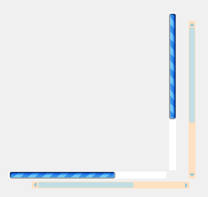
直接上效果圖:
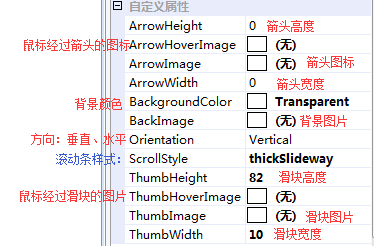
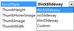
其中ScrollStyle屬性中內建了3中樣式和可自定義面板的樣式(Custom):
下面為三種內建樣式的效果圖:

下面是選擇Custom樣式後自定義面板:
只要有漂亮的素材,就可以通過屬性加進來,迅速自定義出一套好看的面板。
實現思路:
繼承Control,寫好基本的功能後,把所有涉及到樣式的屬性全部外放出來。
以下是部分程式碼:
public class MyScrollBar : Control
OnPaint繪圖:DrawThumb繪製滑塊,DrawArrowButton繪製箭頭
protected override void OnPaint(PaintEventArgs e)
{
e.Graphics DrawThumb繪製滑塊,_arrowbtns中儲存了上下左右以及hover的圖片,共8張,通過對給定的一張箭頭圖片和一張箭頭hover進行旋轉得到的。
        /// <summary>
        /// 初始化箭頭圖示
        /// </summary>
        /// <returns></returns>
        private Bitmap[] InitArrawBtns()
        {
            if (ArrowImage == null || ArrowHoverImage == null || ArrowHeight == 0 || ArrowWidth == 0) return null;

            Bitmap[] result = new Bitmap[8];
            for (int i = 0; i < result.Length; i++)
            {
                result[i] = new Bitmap(ArrowWidth, ArrowHeight);
            }

            result[0] = new Bitmap(ArrowImage);
            result[1] = new Bitmap(ArrowHoverImage);

            Graphics g1 = Graphics.FromImage(result[2]);
            g1.DrawImage(ArrowImage, Point.Empty);
            result[2].RotateFlip(RotateFlipType.Rotate180FlipNone);

            Graphics g2 = Graphics.FromImage(result[3]);
            g2.DrawImage(ArrowHoverImage, Point.Empty);
            result[3].RotateFlip(RotateFlipType.Rotate180FlipNone);

            Graphics g3 = Graphics.FromImage(result[4]);
            g3.DrawImage(ArrowImage, Point.Empty);
            result[4].RotateFlip(RotateFlipType.Rotate90FlipNone);

            Graphics g4 = Graphics.FromImage(result[5]);
            g4.DrawImage(ArrowHoverImage, Point.Empty);
            result[5].RotateFlip(RotateFlipType.Rotate90FlipNone);

            Graphics g5 = Graphics.FromImage(result[6]);
            g5.DrawImage(ArrowImage, Point.Empty);
            result[6].RotateFlip(RotateFlipType.Rotate270FlipNone);

            Graphics g6 = Graphics.FromImage(result[7]);
            g6.DrawImage(ArrowHoverImage, Point.Empty);
            result[7].RotateFlip(RotateFlipType.Rotate270FlipNone);

            g1.Dispose();
            g2.Dispose();
            g3.Dispose();
            g4.Dispose();
            g5.Dispose();
            g6.Dispose();

            return result;
        }


private void DrawArrowButton(Graphics g, ScrollBarState state, ScrollBarOrientation orientation)
        {
            if (_arrowbtns == null) return;
            int index = 0;
            if (state == ScrollBarState.Pressed | state == ScrollBarState.Hot | state == ScrollBarState.Active)
            {
                index = 1;
            }

            if (orientation == ScrollBarOrientation.Vertical)
            {
                g.DrawImage(_arrowbtns[0 + index], this.topArrowRectangle);
                g.DrawImage(_arrowbtns[2 + index], this.bottomArrowRectangle);
            }
            else
            {
                g.DrawImage(_arrowbtns[4 + index], this.bottomArrowRectangle);
                g.DrawImage(_arrowbtns[6 + index], this.topArrowRectangle);
            }
        }
DrawThumb繪製滑塊,裡面內建了3種樣式的繪製,繪製時分上中下3部分繪製,因為滑塊需要拉昇,那麼就只對中間部分拉昇,繪製中間部分時就對其進行動態控制。
 private void DrawThumb(Graphics g, ScrollBarState state, ScrollBarOrientation orientation)
        {
            Image thumbImg;

            if (state == ScrollBarState.Pressed | state == ScrollBarState.Hot | state == ScrollBarState.Active)
            {
                if (this.ScrollStyle == ScrollExStyle.thickSlideway)
                {
                    thumbImg = thumbMid2;
                }
                else if (ScrollStyle == ScrollExStyle.noSlideway || ScrollStyle == ScrollExStyle.thinSlideway)
                {
                    thumbImg = thumbMid_hover;
                }
                else
                {
                    thumbImg = thumbHoverImage;
                }

            }
            else
            {
                if (this.ScrollStyle == ScrollExStyle.thickSlideway)
                {
                    thumbImg = thumbMid2;
                }
                else if (ScrollStyle == ScrollExStyle.noSlideway || ScrollStyle == ScrollExStyle.thinSlideway)
                {
                    thumbImg = thumbMid1;
                }
                else
                {
                    thumbImg = ThumbImage;
                }
            }
            int x = this.thumbRectangle.X;
            int y = this.thumbRectangle.Y;
            using (ImageAttributes ImgAtt = new ImageAttributes())
            {
                ImgAtt.SetWrapMode(System.Drawing.Drawing2D.WrapMode.Tile);
                if (orientation == ScrollBarOrientation.Vertical)
                {
                    if (thumbImg == null) return;
                    if (thumbImg.Width > thumbImg.Height) thumbImg.RotateFlip(RotateFlipType.Rotate270FlipNone);
                    //畫中間部分
                    g.DrawImage(thumbImg, new Rectangle(x, y + 3, thumbRectangle.Width, this.thumbRectangle.Height - 6),
                      0, 3, thumbImg.Width, thumbImg.Height - 6, GraphicsUnit.Pixel, ImgAtt);
                    //畫上部分
                    g.DrawImage(thumbImg, new Rectangle(x, y, thumbRectangle.Width, 3),
                     0, 0, thumbImg.Width, 3, GraphicsUnit.Pixel, ImgAtt);
                    //畫下部分
                    g.DrawImage(thumbImg, new Rectangle(x, thumbRectangle.Bottom - 3, ThumbWidth, 3),
                     0, thumbImg.Height - 3, thumbImg.Width, 3, GraphicsUnit.Pixel, ImgAtt);
                }
                else
                {
                    if (thumbImg == null) return;
                    ///畫中間部分
                    if (thumbImg.Width < thumbImg.Height) thumbImg.RotateFlip(RotateFlipType.Rotate270FlipNone);

                    g.DrawImage(thumbImg, new Rectangle(x + 3, y, this.thumbRectangle.Width - 6, this.thumbRectangle.Height),
                     3, 0, thumbImg.Width - 6, thumbImg.Height, GraphicsUnit.Pixel, ImgAtt);
                    ///畫上部分
                    g.DrawImage(thumbImg, new Rectangle(x, y, 3, thumbRectangle.Height),
                   0, 0, 3, thumbImg.Height, GraphicsUnit.Pixel, ImgAtt);
                    ///畫下部分
                    g.DrawImage(thumbImg, new Rectangle(thumbRectangle.Right - 3, y, 3, thumbRectangle.Height),
                      thumbImg.Width - 3, 0, 3, thumbImg.Height, GraphicsUnit.Pixel, ImgAtt);

                }
            }
        }
然後將所有屬性加到屬性控制面板上去:
        [Category("自定義屬性")]
        [Description("滾動條方向")]
        [DefaultValue(ScrollBarOrientation.Vertical)]
        public ScrollBarOrientation Orientation
        {
            get
            {
                return this.orientation;
            }

            set
            {
                if (value == this.orientation)
                {
                    return;
                }

                this.orientation = value;


                this.scrollOrientation = value == ScrollBarOrientation.Vertical ?
                   ScrollOrientation.VerticalScroll : ScrollOrientation.HorizontalScroll;


                this.Size = new Size(this.Height, this.Width);

                this.SetUpScrollBar();
            }
        }

        [Category("自定義屬性")]
        [Description("滾動條樣式")]
        public ScrollExStyle ScrollStyle
        {
            get { return scrollStyle; }
            set
            {
                if (scrollStyle != value)
                {
                    scrollStyle = value;
                    SetBackImage();
                }
            }
        }

        [Category("自定義屬性")]
        [Description("滾動條背景圖片")]
        public Image BackImage
        {
            get { return backImage; }
            set
            {
                if (backImage != value)
                {
                    backImage = value;
                    Invalidate();
                }
            }
        }

        [Category("自定義屬性")]
        [Description("滑塊背景圖片")]
        public Image ThumbImage
        {
            get
            {
                return thumbImage;
            }
            set
            {
                if (thumbImage != value)
                {
                    thumbImage = value;
                    _arrowbtns = InitArrawBtns();
                    Invalidate();
                }
            }
        }

        [Category("自定義屬性")]
        [Description("滑塊經過圖片")]
        public Image ThumbHoverImage
        {
            get { return thumbHoverImage; }
            set
            {
                if (thumbHoverImage != value)
                {
                    thumbHoverImage = value;
                    _arrowbtns = InitArrawBtns();
                    Invalidate();
                }
            }
        }

        [Category("自定義屬性")]
        [Description("箭頭圖示")]
        public Image ArrowImage
        {
            get { return arrowImage; }
            set
            {
                if (arrowImage != value)
                {
                    arrowImage = value;
                    _arrowbtns = InitArrawBtns();
                    Invalidate();
                }
            }
        }

        [Category("自定義屬性")]
        [Description("箭頭滑鼠懸停圖示")]
        public Image ArrowHoverImage
        {
            get { return arrowHoverImage; }
            set
            {
                if (arrowHoverImage != value)
                {
                    arrowHoverImage = value;
                    _arrowbtns = InitArrawBtns();
                    Invalidate();
                }
            }
        }

        [Category("自定義屬性")]
        [Description("滑塊寬度")]
        [DefaultValue(11)]
        public int ThumbWidth
        {
            get { return thumbWidth; }
            set
            {
                if (thumbWidth != value)
                {
                    thumbWidth = value;
                    this.SetUpScrollBar();
                }
            }
        }

        [Category("自定義屬性")]
        [Description("滑塊高度")]
        [DefaultValue(11)]
        public int ThumbHeight
        {
            get { return thumbHeight; }
            set
            {
                if (thumbHeight != value)
                {
                    thumbHeight = value;
                    this.SetUpScrollBar();
                    this.Invalidate();
                }
            }
        }

        [Category("自定義屬性")]
        [Description("箭頭寬度")]
        [DefaultValue(0)]
        public int ArrowWidth
        {
            get { return arrowWidth; }
            set
            {
                if (arrowWidth != value)
                {
                    arrowWidth = value;
                    //SetUpScrollBar();
                    //Invalidate();
                }
            }
        }

        [Category("自定義屬性")]
        [Description("箭頭高度")]
        [DefaultValue(0)]
        public int ArrowHeight
        {
            get { return arrowHeight; }
            set
            {
                if (arrowHeight != value)
                {
                    arrowHeight = value;
                    //SetUpScrollBar();
                    // Invalidate();
                }
            }
        }