
001-自定義檢視-圓角TextView、ImageView、Button
今天總結了一下如何自定義圓角檢視的方法,使用了一種比較簡單的方式,直接在控制元件屬性裡面新增.9格式圓角的png圖片背景,然後即可達到預期的效果,同時還挺方便,在專案中使用到這裡方式來設定效果,還是很常見的。那我就不見解了,現在講如何自定義ImageView、LinearLayout,實現在ImageView中可以顯示文字,同時在LinearLayout中顯示圖文並茂的效果,如下圖:
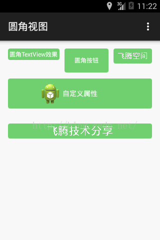
一、前面二個直接新增.9格式圖片作為TextView、Button控制元件的背景,展示出圓角效果
二、後面三個自定義ImageView、LinearLayout,即繼承ImageView、LinearLayout
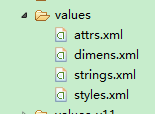
三、自定義檢視三部曲:第一宣告屬性、第二繼承需要的自定義檢視的父類,例如ImageView、LinearLayout或者View、第三在佈局檔案中引用
第一步:建立attrs.xml,並定義需要使用到的屬性,我習慣的自定義方式,如下圖:
<resources>
<declare-styleable name="MyImageView">
<attr name="android:text" />
<attr name="android:textColor" />
<attr name
<attr name="android:background"/>
</declare-styleable>
</resources>
說明:這裡,我直接定義屬性名字系統的一樣,在佈局檔案中引用的時候,比較方便,你也可以定義成<attrs name=”myText” format=”string”/>表示屬性名為:myText,格式是字串型別,或者定義成顏色型別:<attrs name=”myColor” format=”color”/>,其中format的取值主要有:
1. reference:參考某一資源
2. color:顏色值。
3. boolean:布林值。
4. dimension:尺寸值。
5. float:浮點值。
6. integer:整型值。
7. string:字串。
8. fraction:百分數。
9. enum:列舉值。
10. flag:位或運算。
這裡我只列出取值的型別,具體怎麼使用請前往飛騰空間檢視我另一篇帖子。
第二步:繼承ImageView,重寫onDraw方法
package cn.teachcourse.utils.view;
import android.content.Context;
import android.content.res.TypedArray;
import android.graphics.Canvas;
import android.graphics.Paint;
import android.graphics.Paint.FontMetricsInt;
import android.util.AttributeSet;
import android.widget.ImageView;
import cn.teachcourse.round.R;
/**
* 重寫onDraw方法,繪製獨特的ImageView
*
* @author 飛騰:http://teachcourse.cn
* @version 建立:2015-9-30上午9:35:05
*/
public class MyRoundImageView extends ImageView {
private int textColor;
private float textSize;
private String textContent;
private Paint mPaint;
private FontMetricsInt mFontMetricsInt;
private int mWidth;
private int mHeight;
private float mStringWidth;
public MyRoundImageView(Context context) {
super(context);
// TODO Auto-generated constructor stub
}
public MyRoundImageView(Context context, AttributeSet attrs) {
super(context, attrs);
// TODO Auto-generated constructor stub
TypedArray ta = context.obtainStyledAttributes(attrs,
R.styleable.MyImageView);
textColor = ta.getColor(R.styleable.MyImageView_android_textColor, 0);
textSize = ta.getDimension(R.styleable.MyImageView_android_textSize,
12f);
textContent = ta.getString(R.styleable.MyImageView_android_text);
initPaint();
ta.recycle();
}
public MyRoundImageView(Context context, AttributeSet attrs,
int defStyleAttr) {
super(context, attrs, defStyleAttr);
}
@Override
protected void onMeasure(int widthMeasureSpec, int heightMeasureSpec) {
// TODO Auto-generated method stub
super.onMeasure(widthMeasureSpec, heightMeasureSpec);
}
@Override
protected void onDraw(Canvas canvas) {
// TODO Auto-generated method stub
super.onDraw(canvas);
int x, y;
if (mPaint.getTextAlign() == Paint.Align.LEFT) { // 左
x = mWidth / 2 - (int) (mStringWidth / 2);
} else if (mPaint.getTextAlign() == Paint.Align.CENTER) { // 中
x = mWidth / 2;
} else { // 右
x = mWidth / 2 + (int) (mStringWidth / 2);
}
y = (mHeight - mFontMetricsInt.ascent - mFontMetricsInt.descent) / 2;
canvas.drawText(textContent, x, y, mPaint);
}
@Override
protected void onSizeChanged(int w, int h, int oldw, int oldh) {
super.onSizeChanged(w, h, oldw, oldh);
mWidth = w;
mHeight = h;
}
private float measureText() {
mStringWidth = mPaint.measureText(textContent);
return mStringWidth;
}
private void initPaint() {
mPaint = new Paint();
mPaint.setStrokeWidth(1);
mPaint.setTextSize(textSize);
mPaint.setTextAlign(Paint.Align.CENTER);
mPaint.setStyle(Paint.Style.FILL);
mPaint.setColor(textColor);
mFontMetricsInt = mPaint.getFontMetricsInt();
measureText();
}
}
第三步:佈局檔案中引用
檢視效果:
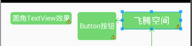
現在算是完成了自定義ImageView顯示文字、圓角效果,關鍵是重寫onDraw方法,在裡面繪製顯示的文字,因為ImageView本身沒提供顯示文字的屬性,如果對Paint、Canvas熟悉的,自然很容易理解,不是問題。接下來我們看看,這種重寫的LinearLayout如何實現:
第一步:宣告需要使用到的屬性
<declare-styleable name="MyImageButtton">
<attr name="android:src" />
<attr name="android:background" />
<attr name="android:text" />
<attr name="android:textColor"/>
</declare-styleable>
第二步:繼承LinearLayout父類
package cn.teachcourse.utils.view;
import cn.teachcourse.round.R;
import android.annotation.SuppressLint;
import android.content.Context;
import android.content.res.TypedArray;
import android.graphics.drawable.Drawable;
import android.util.AttributeSet;
import android.view.LayoutInflater;
import android.view.View;
import android.widget.ImageView;
import android.widget.LinearLayout;
import android.widget.RelativeLayout;
import android.widget.TextView;
/**
*
* @author 飛騰:http://teachcourse.cn
* @version 建立:2015-9-29下午2:50:25
*/
@SuppressLint("NewApi")
public class MyRoundButtonView extends LinearLayout {
private RelativeLayout round_bg_ll;
private ImageView round_iv;
private TextView round_tv;
public MyRoundButtonView(Context context, AttributeSet attrs) {
super(context, attrs);
// TODO Auto-generated constructor stub
View view = LayoutInflater.from(context).inflate(
R.layout.my_round_btn_view, this, true);
round_bg_ll = (RelativeLayout) view.findViewById(R.id.my_round_rl);
round_iv = (ImageView) view.findViewById(R.id.my_icon_iv);
round_tv = (TextView) view.findViewById(R.id.my_info_tv);
TypedArray ta = context.obtainStyledAttributes(attrs,
R.styleable.MyImageButtton);
CharSequence text = ta.getText(R.styleable.MyImageButtton_android_text);
Drawable background = ta
.getDrawable(R.styleable.MyImageButtton_android_background);
Drawable src = ta.getDrawable(R.styleable.MyImageButtton_android_src);
int color=ta.getColor(R.styleable.MyImageButtton_android_textColor, 0);
if (text != null)
round_tv.setText(text);
if (background != null)
// round_bg_ll.setBackground(background);
round_bg_ll.setBackgroundResource(ta.getResourceId(
R.styleable.MyImageButtton_android_background, 0));
if (src != null)
round_iv.setImageDrawable(src);
if(color!=0)
round_tv.setTextColor(color);
}
public MyRoundButtonView(Context context, AttributeSet attrs,
int defStyleAttr, int defStyleRes) {
super(context, attrs, defStyleAttr, defStyleRes);
// TODO Auto-generated constructor stub
}
public MyRoundButtonView(Context context) {
super(context);
// TODO Auto-generated constructor stub
}
}
第三步:佈局檔案中引用
<cn.teachcourse.utils.view.MyRoundButtonView
android:id="@+id/round_btn_view_001"
android:layout_width="match_parent"
android:layout_height="wrap_content"
android:layout_alignParentLeft="true"
android:layout_below="@+id/round_view_iv"
android:layout_marginTop="30dp"
android:background="@drawable/green_bg"
android:src="@drawable/ic_launcher"
android:text="自定義屬性"
android:textColor="#FFFFFF" />
效果顯示:
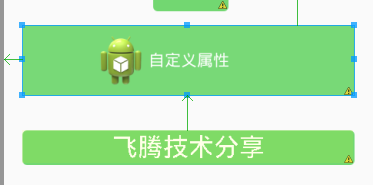
說明:這裡解釋一下這裡,直接載入一個自定義的my_round_btn_view.xml檔案,然後取得其View物件對應的控制元件
LayoutInflater.from(context).inflate(
R.layout.my_round_btn_view, this, true);
my_round_btn_view.xml檔案內容
<?xml version="1.0" encoding="utf-8"?>
<RelativeLayout xmlns:android="http://schemas.android.com/apk/res/android"
android:layout_width="fill_parent"
android:layout_height="wrap_content"
android:id="@+id/my_round_rl"
android:layout_gravity="center_vertical" >
<ImageView
android:id="@+id/my_icon_iv"
android:layout_width="wrap_content"
android:layout_height="wrap_content"
android:src="@drawable/ic_launcher"
android:layout_toLeftOf="@+id/my_info_tv"
android:layout_centerInParent="true"/>
<TextView
android:id="@+id/my_info_tv"
android:layout_width="wrap_content"
android:layout_height="wrap_content"
android:text="顯示文字"
android:layout_centerInParent="true"/>
</RelativeLayout>