
Material Design之TextInputLayout使用示例
使用TextInputLayout建立一個登陸介面
介紹
Google在2015的IO大會上,給我們帶來了更加詳細的Material Design設計規範,同時,也給我們帶來了全新的Android Design Support Library,在這個support庫裡面,Google給我們提供了更加規範的MD設計風格的控制元件。最重要的是,Android Design Support Library的相容性更廣,直接可以向下相容到Android 2.2。這不得不說是一個良心之作。
- 使用TextInputLayout
- 建立一個新的工程
在Android Studio中,從File選單中,選擇New > New project ,填入必要的資訊配置並建立工程。在我的例項中使用了API 7,這個是Design Support Library支援的最低等級。這樣設定,可以讓你的裝置儘可能執行在更多裝置上,我已經把MainActivity改成LoginActivity,佈局檔案activity_login.xml。
工程設定號以後,去掉自動生成的onCreateOptionsMenu()和onOptionsItemSelected (),同時刪除res/menu下面對應的xml(因為用不到menu這塊)。 匯入支援庫
使用TextInputLayout 控制元件需要匯入兩個庫,一個是appcompat-v7,保證material styles可以向下相容。另一個是Design Support Library。
在專案的build.gradle檔案中,新增下面的依賴(dependencies):dependencies { compile fileTree(dir: 'libs', include: ['*.jar']) compile 'com.android.support:design:22.2.0' compile 'com.android.support:appcompat-v7:22.2.0' }如果gralde沒有自動要求同步(synchronize)工程,從build選單選擇
Make module 'app'或者按F9,這樣AS會自動獲取必要的資源。設計UI
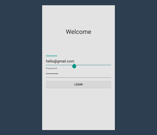
UI很簡單,一個welcome的標籤(後期可以很方便的替換成圖片)和兩個EditText (使用者名稱,密碼框),不居中再加上一個登陸按鈕。再選個漂亮的背景色。
另一個需要注意的細節是設定好兩個輸入框的inputType ,第一個框設定為textEmail ,第二個框設定為textPassword,佈局如下所示。<linearlayout xmlns:android="http://schemas.android.com/apk/res/android" xmlns:tools="http://schemas.android.com/tools" android:background="#e3e3e3" android:layout_width="match_parent" android:layout_height="match_parent" android:padding="@dimen/activity_horizontal_margin" tools:context=".LoginActivity" android:orientation="vertical"> <relativelayout android:layout_width="match_parent" android:layout_height="wrap_content" android:layout_weight="0.5" android:orientation="vertical"> <textview android:layout_width="match_parent" android:layout_height="wrap_content" android:layout_centerInParent="true" android:gravity="center" android:text="Welcome" android:textSize="30sp" android:textColor="#333333"></textview> </relativelayout> </linearlayout><linearlayout android:layout_width="match_parent" android:layout_height="wrap_content" android:layout_weight="0.5" android:orientation="vertical"> <edittext android:id="@+id/username" android:layout_width="match_parent" android:layout_height="wrap_content" android:inputType="textEmailAddress"></edittext> <edittext android:id="@+id/password" android:layout_width="match_parent" android:layout_height="wrap_content" android:inputType="textPassword"></edittext> <button android:id="@+id/btn" android:layout_marginTop="4dp" android:layout_width="match_parent" android:layout_height="wrap_content" android:text="Login"></button> </linearlayout>
你可能還想去掉應用欄(app bar),也就是之前說的action bar,修改下style.xml就可以了
<style name="AppTheme" parent="Theme.AppCompat.Light.NoActionBar">
</style>
使用TextInputLayout
終於到了教程中最有趣的部分了,TextInputLayout 控制元件表現得就像LinearLayout 一樣,它是一個容器。TextInputLayout 中只能放一個子元素,和ScrollView有點類似,並且子元素必須是EditText 。<android .support.design.widget.TextInputLayout android:id="@+id/usernameWrapper" android:layout_width="match_parent" android:layout_height="wrap_content"> <edittext android:id="@+id/username" android:layout_width="match_parent" android:layout_height="wrap_content" android:inputType="textEmailAddress" android:hint="Username"></edittext> </android>
注意到了麼,我在EditText設定一個屬性-hint。這個屬性大家都很熟悉了,EditText沒有輸入的時候,hint會顯示,當輸入第一個字母上去的時候,hint就消失了。這個體驗不是太好。
感謝TextInputLayout,這個馬上就不是問題了。當EditText中輸入第一個字母要隱藏hint的時候,TextInputLayout中會出現一個懸浮的標籤來顯示這個hint,還負責一個炫酷的的material 動畫。
下面,我們給password也來一個。
<android .support.design.widget.TextInputLayout
    android:id="@+id/passwordWrapper"
    android:layout_width="match_parent"
    android:layout_height="wrap_content"
    android:layout_below="@id/usernameWrapper"
    android:layout_marginTop="4dp">

    <edittext android:id="@+id/password"
        android:layout_width="match_parent"
        android:layout_height="wrap_content"
        android:inputType="textPassword"
        android:hint="Password"></edittext>

</android>
如果現在執行程式,啥效果都木有。當然,EditText 的hint效果除外。辣麼,為啥會木有動畫捏?我們還缺了點程式碼。
- 設定提示資訊(hints)
在setContentView()下面,初始化TextInputLayout 的引用。
final TextInputLayout usernameWrapper = (TextInputLayout) findViewById(R.id.usernameWrapper);
final TextInputLayout passwordWrapper = (TextInputLayout) findViewById(R.id.passwordWrapper);
想要看到hint浮動的動畫,還需要呼叫setHint
usernameWrapper.setHint("Username");
passwordWrapper.setHint("Password");
做完這個以後,這個應用已經完全符合material design了,執行程式,然後你會看到登入介面。
處理錯誤
TextInputLayout另一個很讚的功能是,可以處理錯誤情況。通過驗證使用者輸入,你可以防止使用者輸入錯誤的郵箱,或者輸入不符合規則的密碼。
有些輸入驗證,驗證是在後臺做得,產生錯誤後會反饋給前臺,最後展示給使用者。非常耗時而且使用者體驗差。最好的辦法是在請求後臺前做校驗。
實現onClick 方法
首先處理點選事件,處理點選事件的方法也有很多種,在XML中設定方法名,然後Activity完善這個方法。或者setOnClickListener。寫文章的哥們兒比較喜歡後面這種。btn.setOnClickListener(new View.OnClickListener() { @Override public void onClick(View v) { // STUB } });其實,當這個方法被呼叫以後,就不需要鍵盤了。但是不幸的是,Android不會自動隱藏。怎麼辦呢?呼叫下面的方法吧。
private void hideKeyboard() {
    View view = getCurrentFocus();
    if (view != null) {
        ((InputMethodManager) getSystemService(Context.INPUT_METHOD_SERVICE)).
            hideSoftInputFromWindow(view.getWindowToken(), InputMethodManager.HIDE_NOT_ALWAYS);
    }
}
驗證使用者輸入
在設定錯誤標籤前,我們先明確下什麼是錯誤,什麼不是錯誤。我們假設使用者名稱驗證郵箱是否正確。
驗證郵箱稍微有些複雜,我們可以用Apache Commons library 來做這個事。我這裡用一個維基百科裡的正則表示式。/^[a-zA-Z0-9#_~!$&'()*+,;=:."(),:;<>@\[\]\\][email protected][a-zA-Z0-9-]+(\.[a-zA-Z0-9-]+)*$/為啥這麼寫,就不做解釋了。。。。。
既然我們想驗證一個string,我們必須依賴Pattern and Matcher,它們在java.util.regex下面。在Activity中匯入它們。private static final String EMAIL_PATTERN = "^[a-zA-Z0-9#_~!$&'()*+,;=:.\"(),:;<>@\\[\\]\\\\][email protected][a-zA-Z0-9-]+(\\.[a-zA-Z0-9-]+)*$"; private Pattern pattern = Pattern.compile(EMAIL_PATTERN); private Matcher matcher; public boolean validateEmail(String email) { matcher = pattern.matcher(email); return matcher.matches(); }密碼驗證相對簡單,不同的組織有不同的驗證方式。但是大都有最小長度限制。最合理的規則就是至少輸入六位字元。
public boolean validatePassword(String password) {
    return password.length() > 5;
}
接收資料
之前已說過,TextInputLayout只是一個容器。不像LinearLayout and ScrollView,你可以直接獲取它的子元素通過特定的方法(getEditText)。根本木有必要使用findViewById。
如果TextInputLayout 中沒有EditText,getEditText 會返回null,你得注意下NPE了。public void onClick(View v) { hideKeyboard(); String username = usernameWrapper.getEditText().getText().toString(); String password = usernameWrapper.getEditText().getText().toString(); // TODO: Checks // TODO: Login }顯示錯誤
TextInputLayout 錯誤處理簡單而迅速。相關的方法有setErrorEnabled和setError。
setError會彈出紅色的提示訊息同時顯示在EditText下面,如果傳入的錯誤訊息是null,之前的訊息會被清除掉。這個方法還會使EditText 也變紅色。
setErrorEnabled 是控制這個功能的。這會直接影響layout的大小。請自行腦補。。。。
還有一個需要注意的是,如果沒有呼叫setErrorEnabled(true)但是呼叫了setError 方法並且傳入了非空的訊息,setErrorEnabled(true) 會被自動呼叫。
正確和錯誤情況我們已經說明了,下面就實現onClick 方法。
public void onClick(View v) {
    hideKeyboard();
    String username = usernameWrapper.getEditText().getText().toString();
    String password = usernameWrapper.getEditText().getText().toString();
    if (!validateEmail(username)) {
        usernameWrapper.setError("Not a valid email address!");
    } else if (!validatePassword(password)) {
        passwordWrapper.setError("Not a valid password!");
    } else {
        usernameWrapper.setErrorEnabled(false);
        passwordWrapper.setErrorEnabled(false);
        doLogin();
    }
}
下面是空的登入方法:
public void doLogin() {
    Toast.makeText(getApplicationContext(), "OK! I'm performing login.", Toast.LENGTH_SHORT).show();
    // TODO: login procedure; not within the scope of this tutorial.
}
修改TextInputLayout背景
<style name="AppTheme" parent="Theme.AppCompat.Light.NoActionBar">
    <item name="colorAccent">#3498db</item>
</style>

總結
感謝Design Support Library給我們帶來了TextInputLayout。
下面的不想翻譯了,好好學習,天天向上吧。
The design paradigm that this widget implements allows users to never never lose context of the information they are entering and it was actually introduced by Google last year, along with Material Design.
At that time, there was no support library giving developers the possibility to put this widget into action in their projects, until Google I/O 2015. Now, if your application expects some sort of data input, you will finally be truly material design compliant.
相關推薦
Material Design之TextInputLayout使用示例
使用TextInputLayout建立一個登陸介面 介紹 Google在2015的IO大會上,給我們帶來了更加詳細的Material Design設計規範,同時,也給我們帶來了全新的Android Design Support Library,在這個su
Material Design之CardView的使用
public show 預覽 eve pad -m 優雅 pub name 本文介紹CardView這個控件的使用,CardView繼承至FrameLayout類,是support-v7包下的一個類,使用時必須引入cardview依賴包。可在下載的sdk目錄中找到。。。
Material Design之 AppbarLayout 開發實踐總結
原文連結:https://www.jianshu.com/p/ac56f11e7ce1 前一篇文章是Material Design 系列的第一篇文章,講了Toolbar 的使用,《Material Design 之 Toolbar 開發實踐總結》,還沒看過的同學可以去看一下,這篇是Materia
【Android】Material Design 之二 BottomNavigationView使用
上午記錄了TabLayout的使用,簡單實現了一個頂部可滑動的導航效果,突然想到Material Design的另一個控制元件BottomNavigationView,可以實現類似淘寶、微信、QQ、京東的底部導航欄的效果,下面就來介紹一下使用BottomNavigationV
【Android】Material Design 之四 五 六 AppBarLayout、CoordinatorLayout、CollapsingToolbarLayout使用
一、AppBarLayout AppBarLayout是繼承自LinearLayout,預設是垂直方向,可以看成是一個垂直方向的線性佈局,其作用是將APPBarLayout包裹的內容都作為AppBar,支援手勢滑動。 AppBarLayout必須作為Toolbar的父佈局
Material Design之ToolBar
ToolBar可以定製修改的地方有: 設定導航欄圖示 設定App的logo 支援設定標題和子標題 支援新增一個或者多個的自定義控制元件 &nb
Material design之MaterialDialog例項
1.Material design簡介 卡片式風格,簡約時尚的設計,Material design的核心思想,就是把物理世界的體驗帶進螢幕。去掉現實中的雜質和隨機性,保留其最原始純淨的形態、空間關係、
Android原始碼解析--Material Design之水波紋點選效果RippleEffect使用
好了,這樣差不多就完成了我們的水波漣漪效果了。。。。 看一下怎麼用吧? 如果你的開發IDE是Android Studio那麼我們可以把github上的庫整合到我們的專案中, <span style="font-size:14px;">dependencies { comp
Material Design 之 Touch Feedback
目錄 概要 在 Materil Design(一下簡稱 MD ) 中,當用戶與 UI 互動的時候,觸控反饋(Touch Feedback)可以在互動點提供一種及時的視覺確認效果。 設定觸控反饋 Button 在 MD 中預設就有一個反饋動畫
Material Design之CoordinatorLayout CollapsingToolbarLayout
如想實現專案中相關效果,需要新增以下jar包至工程中 在專案對應的build.gradle中新增以下配置 dependencies { compile 'com.android.support
Android之Material Design之可重新整理的滑動列表(RecyclerView)
Material Design控制元件的簡單介紹:Toolbar — 加強版ActionBar,用setSupportActionBar()方法將Toolbar例項傳入 (app:showAsAction-用來指定按鈕的顯示位置)。DrawerLayout — 用於滑動選單。
Android Material Design之Toolbar與Palette實踐
前言我們都知道Marterial Design是Google推出的全新UI設計規範,如果對其不太瞭解的可以看下:Material design非官方中文指導手冊 ,或者我的前面幾篇Material Design的譯文,相比之前Google在Android Holo風格上平平淡
Material Design學習之 ProgreesBar
public ani bit -c cell 空間 fin pen port 轉載奇怪註明出處:王亟亟的大牛之路 繼續我們Material Design的內容,這一篇講的是進度條,上一篇是Switch地址例如以下:http://blog.csdn.ne
Material Design 實戰 之 第六彈 —— 可摺疊式標題欄(CollapsingToolbarLayout) & 系統差異型的功能實現(充分利用系統狀態列空間)...
本模組共有六篇文章,參考郭神的《第一行程式碼》,對Material Design的學習做一個詳細的筆記,大家可以一起交流一下: Material Design 實戰 之第一彈——Toolbar(即本文) Material Design 實戰 之第二彈——滑動選
Material Design 實戰 之第五彈 —— 下拉重新整理(SwipeRefreshLayout)
本模組共有六篇文章,參考郭神的《第一行程式碼》,對Material Design的學習做一個詳細的筆記,大家可以一起交流一下: Material Design 實戰 之第一彈——Toolbar(即本文) Material Design 實戰 之第二彈——滑動選
Material Design 實戰 之第四彈 —— 卡片佈局以及靈動的標題欄(CardView & AppBarLayout)...
本模組共有六篇文章,參考郭神的《第一行程式碼》,對Material Design的學習做一個詳細的筆記,大家可以一起交流一下: Material Design 實戰 之第一彈——Toolbar(即本文) Material Design 實戰 之第二彈——滑動選
Material Design 元件之NavigationView
今天來看一下 NavigationView 的使用,NavigationView 是一個標準的導航選單,其選單內容由選單資原始檔來填充,NavigationView 一般和 DrawerLayout 一起搭配使用構成抽屜選單,分別由內容頁和選單頁組成。 基本佈局 可以直接使用 D
Material Design 元件之 CollapsingToolbarLayout
CollapsingToolbarLayout 主要用於實現一個可摺疊的標題欄,一般作為 AppBarLayout 的子 View 來使用,下面總結一下 CollapsingToolbarLayout 的使用。 Material Design 系列文章: Material
Material Design 元件之 AppBarLayout
AppBarLayout 是一個垂直方向的 LinearLayout,它實現了許多符合 Material Design 設計規範的狀態列應該具有的功能,比如滾動手勢。 AppBarLayout 一般直接用作 CoordinatorLayout 的直接子物件,如果 AppBarLayo
Material Design 元件之 FloatingActionButton
Material Design 設計規範在 Google I/O 2014 推出,這種設計理念一經推出就受到廣大開發者的喜愛,主要側重於紙墨化創作和突出設計的實體感,使得設計更接近於真實世界,力求平滑、連續的互動方式與使用者體驗,這種設計規範更能促進 Android 生態系統的發展,為此