
CSS3繪製不規則圖形(一)
阿新 • • 發佈:2019-02-13
由於近期的專案中出現了不規則的邊框和圖形, 所以只好提前先溫習一下,以前收集的一些CSS3繪製的圖形。。。樣式繪製的圖形比圖片的效能要好,體驗更佳。
廢話不多說,我們直接看效果:
1、三角形系列(三角形、倒三角、左三角、右三角、左上三角、右上三角、左下三角、右下三角)
主要用到的是:寬度高度設定為0, border的各個邊的設定(各個邊的透明或不透明);
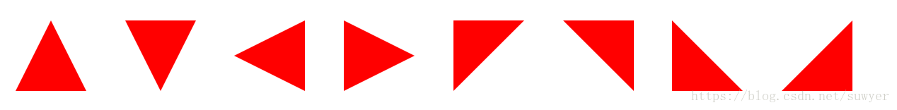
                 .triangle-up {
			/* 三角形 */
			width: 0;
			height: 0;
			border-left: 50px solid transparent;
    		        border-right: 50px solid transparent;
        	        border-bottom: 100px solid #f00;
		}
		.triangle-down {
			/* 倒三角 */
			width: 0;
			height: 0;
			border-left: 50px solid transparent;
    		        border-right: 50px solid transparent;
        	        border-top: 100px solid #f00;
		}
		.triangle-left {
			/* 左三角 */
			width: 0;
			height: 0;
			border-top: 50px solid transparent;
    		        border-bottom: 50px solid transparent;
        	        border-right: 100px solid #f00;
		}
		.triangle-right {
			/* 右三角 */
			width: 0;
			height: 0;
			border-top: 50px solid transparent;
    		        border-bottom: 50px solid transparent;
        	        border-left: 100px solid #f00;
		}
		.triangle-topleft {
			/* 左上三角 */
			width: 0;
			height: 0;
    		        border-right: 100px solid transparent;
        	        border-top: 100px solid #f00;
		}
		.triangle-topright {
			/* 右上三角 */
			width: 0;
			height: 0;
			border-left: 100px solid transparent;
        	        border-top: 100px solid #f00;
		}
		.triangle-downleft {
			/* 左下三角 */
			width: 0;
			height: 0;
    		        border-right: 100px solid transparent;
        	        border-bottom: 100px solid #f00;
		}
		.triangle-downright {
			/* 右下三角 */
			width: 0;
			height: 0;
			border-left: 100px solid transparent;
        	        border-bottom: 100px solid #f00;
		}
2、圓形、橢圓、扇形、圓環、月牙

               .circular{
			/* 圓形 */
			width: 100px;
			height: 100px;
			background: #f00;
			border-radius: 50%;
		}
		.oval {
			/* 橢圓 */
			width: 200px;
			height: 100px;
			background: #f00;
			border-radius: 100px / 50px;
		}
		.sector {
			/* 扇形 */
			width: 0;
			height: 0;
			border-left: 50px solid transparent;
    		        border-right: 50px solid transparent;
        	        border-top: 100px solid #f00;
        	        border-radius: 50%;
		}
		.ring {
			/* 圓環 */
			width: 100px;
			height: 100px;
			border: 5px solid #f00;
			border-radius: 50%;
		}
		.crescent {
			/* 月牙 */
			width: 100px;
			height: 100px;
			border-radius: 50%;
			box-shadow: 20px 20px 0 0 #f00;
		}
3、正方形、長方形、菱形、平行四邊形、梯形
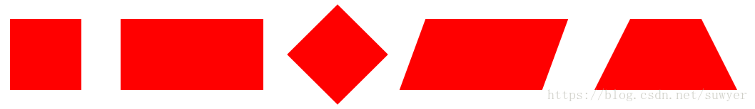
                .square {
			/* 正方形 */
			width: 100px;
			height: 100px;
			background: #f00;
		}
		.rectangle {
			/* 長方形 */
			width: 200px;
			height: 100px;
			background: #f00;
		}
		.rhomb {
			/* 菱形 */
			width: 100px;
			height: 100px;
			background: #f00;
			transform: rotate(45deg);
		}
		.parallelogram {
			/* 平行四邊形 */
			width: 200px;
			height: 100px;
			background: #f00;
			transform: skew(-20deg);
		}
		.trapezoid {
			/* 梯形 */
			width: 100px;
			height: 0;
			border-bottom: 100px solid #f00;
			border-left: 50px solid transparent;
			border-right: 50px solid transparent;
		}
4、五邊形、六邊形、八邊形

               .pentagon {
			/* 五邊形:三角形和梯形的結合 */
		        width: 60px;
		        height: 0;
		        position: relative;
		        border-top: 55px solid #f00;
		        border-left: 25px solid transparent;
		        border-right: 25px solid transparent;
		}
		.pentagon:before {
			content: "";
		        position: absolute;
		        width: 0px;
		        height: 0;
		        border-left: 55px solid transparent;
		        border-right: 55px solid transparent;
		        border-bottom: 35px solid #f00;
		        left: -25px;
		        top: -90px;
		}

		.hexagon {
			/*六邊形:在長方形上面和下面各放置一個三角形*/
			width: 100px;
			height: 55px;
			background: #f00;
			position: relative;
		}
		.hexagon:before {
			content: "";
			width: 0;
			height: 0;
			position: absolute;
			top: -25px;
			left: 0;
			border-left: 50px solid transparent;
			border-right: 50px solid transparent;
			border-bottom: 25px solid #f00;
		}
		.hexagon:after {
			content: "";
			width: 0;
			height: 0;
			position: absolute;
			bottom: -25px;
			left: 0;
			border-left: 50px solid transparent;
			border-right: 50px solid transparent;
			border-top: 25px solid #f00;
		}

		.octagon {
			/* 八邊形:長方形、上下各放置一個梯形 */
			width: 100px;
			height: 100px;
			background: #f00;
			position: relative;
		}
		.octagon:before {
			content: "";
			position: absolute;
			width: 42px;
			height: 0;
			border-left: 29px solid #fff;
			border-right: 29px solid #fff;
			border-bottom: 30px solid #f00;
			top: 0;
			left: 0;
		}
		.octagon:after {
			content: "";
			position: absolute;
			width: 42px;
			height: 0;
			border-left: 29px solid #fff;
			border-right: 29px solid #fff;
			border-top: 30px solid #f00;
			bottom: 0;
			left: 0;
		}
5、愛心
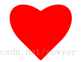
                .love {
			/* 愛心 */
			position: relative;
		}
		.love:before {
			content: "";
			width: 70px;
			height: 110px;
			background: #f00;
			position: absolute;
			border-top-left-radius: 50%;
			border-top-right-radius: 50%;
			transform: rotate(45deg);
		}
		.love:after {
			content: "";
			width: 70px;
			height: 110px;
			background: #f00;
			position: absolute;
			border-top-left-radius: 50%;
			border-top-right-radius: 50%;
			transform: rotate(-45deg);
			left: -30px;
		}
6、無窮大符號
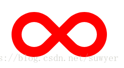
                .infinity {
			/* 無窮大 */
			width: 190px;
			height: 100px;
			position: relative;
		}
		.infinity:before {
			content: "";
			width: 50px;
			height: 50px;
			position: absolute;
			top: 0;
			left: 0;
			border: 20px solid #f00;
			border-radius: 50px 50px 0 50px;
			transform: rotate(-45deg);
		}
		.infinity:after {
			content: "";
			width: 50px;
			height: 50px;
			position: absolute;
			top: 0;
			right: 0;
			border: 20px solid #f00;
			border-radius: 50px 50px 50px 0;
			transform: rotate(45deg);
		}
7、雞蛋

		.egg {
			/* 雞蛋 */
			width: 120px;
		        height: 180px;
		        background: #f00;
		        border-radius: 60% 60% 60% 60% / 70% 70% 50% 50%;
		}
8、食人豆
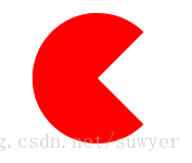
                .pacman {
			/* 食人豆 */
			width: 0;
		        height: 0;
		        border: 60px solid #f00;
		        border-right: 60px solid transparent;
		        border-radius: 100%;
		}
9、對話方塊

               .alertDialog {
			/* 對話方塊:一個圓角矩形和一個小三角形 */
			width: 150px;
			height: 100px;
			background: #f00;
			border-radius: 10px;
			position: relative;
		}
		.alertDialog:before {
			content: "";
			width: 0;
			height: 0;
			position: absolute;
		        left: -20px;
		        top: 40px;
			border-top: 10px solid transparent;
		        border-bottom: 10px solid transparent;
		        border-right: 20px solid #f00;
		}
10、鑽石
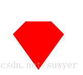
               .diamond {
			/* 鑽石:梯形和三角形組成 */
			width: 50px;
			height: 0;
			position: relative;
			border-bottom: 25px solid #f00;
			border-left: 25px solid transparent;
			border-right: 25px solid transparent;
		}
		.diamond:before {
			content: "";
			width: 0;
			height: 0;
			position: absolute;
		        border-left: 50px solid transparent;
		        border-right: 50px solid transparent;
		        border-top: 70px solid #f00;
		        left: -25px;
		        top: 25px;
		}
11、八卦圖
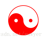
                .eightDiagrams {
			/* 八卦:多個圓形組成 */
			width: 100px;
			height: 50px;
			border-color: #f00;
			border-width: 2px 2px 50px 2px;
			border-style: solid;
			border-radius: 50%;
			position: relative;
		}
		.eightDiagrams:before {
			content: "";
			position: absolute;
			width: 12px;
			height: 12px;
			background: #fff;
			border-radius: 50%;
			top: 50%;
			left: 0;
			border: 19px solid #f00;
		}
		.eightDiagrams:after {
			content: "";
			position: absolute;
			width: 12px;
			height: 12px;
			background: #f00;
			border-radius: 50%;
			top: 50%;
			left: 50%;
			border: 19px solid #fff;
		}
12、五角星
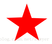
                .starFive {
			/* 五角星: */
			width: 0;
			height: 0;
			position: relative;
			border-left: 80px solid transparent;
			border-right: 80px solid transparent;
			border-bottom: 60px solid #f00;
			transform: rotate(35deg);
		}
		.starFive:before {
			content: "";
			position: absolute;
			width: 0;
			height: 0;
			border-left: 80px solid transparent;
			border-right: 80px solid transparent;
			border-bottom: 60px solid #f00;
			transform: rotate(-70deg);
			top: 3px;
			left: -80px;
		}
		.starFive:after {
			content: "";
			position: absolute;
			width: 0;
			height: 0;
			border-bottom: 60px solid #f00;
			border-right: 20px solid transparent;
			border-left: 20px solid transparent;
			transform: rotate(-35deg);
		        top: -40px;
		        left: -49px;
		}
13、六角形、八角星、十二角星
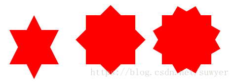
                .starSix {
			/* 六角形:兩個三角形組成 */
			width: 0;
			height: 0;
			position: relative;
			border-left: 50px solid transparent;
			border-right: 50px solid transparent;
			border-bottom: 100px solid #f00;
		}
		.starSix:before {
			content: "";
			width: 0;
			height: 0;
			position: absolute;
			top: 30px;
			left: -50px;
			border-left: 50px solid transparent;
			border-right: 50px solid transparent;
			border-top: 100px solid #f00;
		}

		.starEight {
			/* 八角星:兩個正方形,旋轉角度 */
			width: 100px;
			height: 100px;
			background: #f00;
			position: relative;
		}
		.starEight:before {
			content: "";
			width: 100px;
			height: 100px;
			background: #f00;
			position: absolute;
			top: 0;
			left: 0;
			transform: rotate(45deg);
		}

		.starTwelve {
			/* 十二角星:三個正方形,旋轉角度 */
			width: 100px;
			height: 100px;
			background: #f00;
			position: relative;
		}
		.starTwelve:before {
			content: "";
			width: 100px;
			height: 100px;
			background: #f00;
			position: absolute;
			top: 0;
			left: 0;
			transform: rotate(-30deg)
		}
		.starTwelve:after {
			content: "";
			width: 100px;
			height: 100px;
			background: #f00;
			position: absolute;
			top: 0;
			left: 0;
			transform: rotate(30deg)
}原始碼地址: 稍後會將原始碼地址貼出。。。