matlab畫圖(直方圖,曲線,散點圖)
1. 比較直方圖
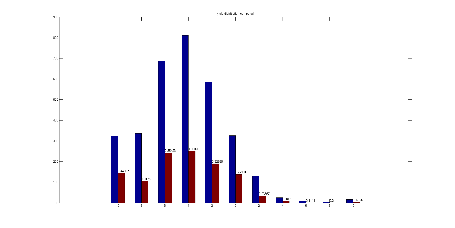
function compare_bar(all, sub)
close all;
step = 2;
x = [-10:step:10];
bar_num = size(x,2);
hist_all = hist(all,x);
hist_sub = hist(sub,x);
rate = hist_sub./hist_all;
y = [hist_all;hist_sub];
y = y';
figure, bar(x,y,1,'grouped');
for k=1:bar_num
text(x(k), hist_sub(k)+10, num2str(rate(k))); % text(x, y, str)
end
title('20180206 yield distribution compared');
return;
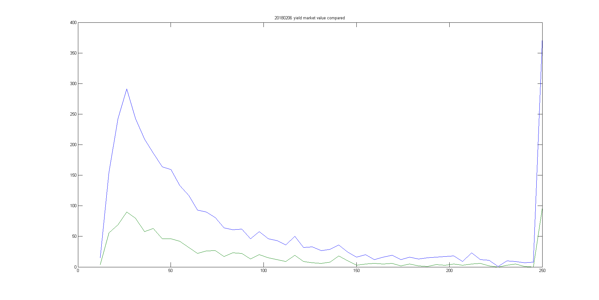
2. 曲線比較圖
figure,plot(x,hist_all,x,hist_sub);
title('20180206 yield market value compared');
3. 散點圖
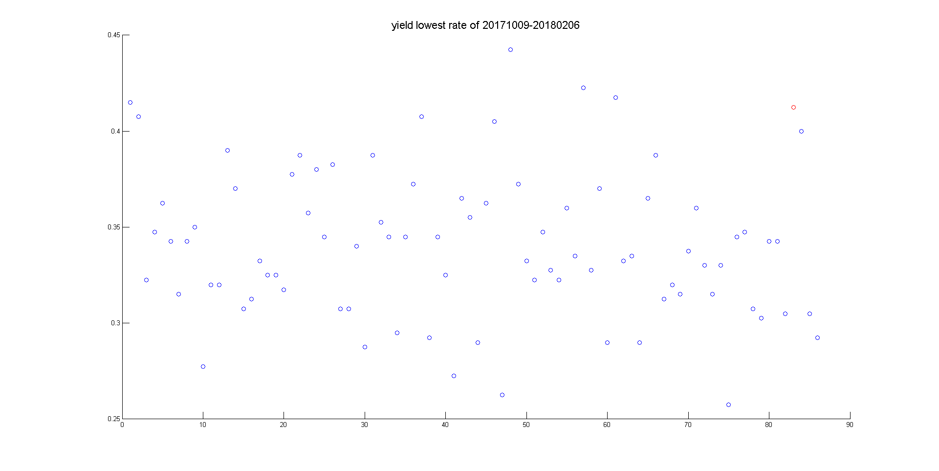
function plot_lowest_rate(rate)
close all;
% x = [20180102:20180105, 20180108:20180112, 20180115:20180119, 20180122:20180126, 20180129:20180131, 20180201, 20180202, 20180205, 20180206];
bar_num = size(rate,1);
x = [1:1:bar_num];
figure,scatter(x,rate),hold on
scatter(83,rate(83),'r');
title('\fontsize{16}yield lowest rate of 20171009-20180206');
return;