
[WPF自定義控制元件庫]簡單的表單佈局控制元件
1. WPF佈局一個表單
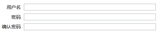
<Grid Width="400" HorizontalAlignment="Center" VerticalAlignment="Center">
    <Grid.RowDefinitions>
        <RowDefinition Height="Auto" />
        <RowDefinition Height="Auto" />
        <RowDefinition Height="Auto" />
    </Grid.RowDefinitions>
    <Grid.ColumnDefinitions>
        <ColumnDefinition Width="Auto" />
        <ColumnDefinition Width="*" />
    </Grid.ColumnDefinitions>
    <TextBlock Text="使用者名稱" HorizontalAlignment="Right" VerticalAlignment="Center" Margin="4" />
    <TextBox Grid.Column="1" Margin="4" />

    <TextBlock Text="密碼" HorizontalAlignment="Right" VerticalAlignment="Center" Margin="4" Grid.Row="1" />
    <PasswordBox Grid.Row="1" Grid.Column="1" Margin="4" />

    <TextBlock Grid.Row="2" Text="確認密碼" HorizontalAlignment="Right" VerticalAlignment="Center" Margin="4" />
    <PasswordBox Grid.Column="1" Grid.Row="2" Margin="4" />
</Grid>
在WPF中佈局表單一直都很傳統,例如使用上面的XAML,它通過Grid佈局一個表單。這樣出來的結果整整齊齊,看上去沒什麼問題,但當系統裡有幾十個表單頁以後需要統一將標籤改為上對齊,或者標籤和控制元件中加一個:號等需求都會難倒開發人員。一個好的做法是使用某些控制元件庫提供的表單控制元件;如果不想引入一個這麼“重”的東西,可以自己定義一個簡單的表單控制元件。
這篇文章介紹一個簡單的用於佈局表單的Form控制元件,雖然是一個很老的方案,但我很喜歡這個控制元件,不僅因為它簡單實用,而且是一個很好的結合了ItemsControl、ContentControl、附加屬性的教學例子。
Form是一個自定義的ItemsControl,部分程式碼可以參考自定義ItemsControl這篇文章。
2. 一個古老的方法
即使拋開驗證資訊、確認取消這些更高階的需求(表單的其它功能真的很多很多,但這篇文章只談論佈局),表單佈局仍是個十分複雜的工作。幸好十年前ScottGu分享過一個簡單的方案,很有參考價值:
WPF & Silverlight LOB Form Layout - Searching for a Better Solution: Karl Shifflett has another great WPF blog post that covers a cool way to perform flexible form layout for LOB scenarios.
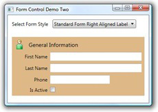

<pt:Form x:Name="formMain" Style="{DynamicResource standardForm}" Grid.Row="1">
  <pt:FormHeader>
    <pt:FormHeader.Content>
      <StackPanel Orientation="Horizontal">
        <Image Source="User.png" Width="24" Height="24" Margin="0,0,11,0" />
        <TextBlock VerticalAlignment="Center" Text="General Information" FontSize="14" />
      </StackPanel>
    </pt:FormHeader.Content>
  </pt:FormHeader>
  <TextBox pt:FormItem.LabelContent="_First Name" />
  <TextBox pt:FormItem.LabelContent="_Last Name"  />
  <TextBox pt:FormItem.LabelContent="_Phone" Width="150" HorizontalAlignment="Left" />
  <CheckBox pt:FormItem.LabelContent="Is _Active" />
</pt:Form>
使用程式碼和截圖如上所示。這個方案最大的好處是隻需在Form中宣告表單的邏輯結構,隱藏了佈局的細節和具體實現,而且可以通過Style設定不同表單的外觀。
3. 我的實現
從十年前開始我就一直用這個方案佈局表單,不過我對原本的方案進行了改進:
- 由於原本的程式碼是VB.NET,我把它改為了C#。
- 原本的方案提供了十分多的屬性,我只保留了最基本的幾個,其它都靠Style處理。因為我希望Form是一個80/20原則下的產物,很少的程式碼,很短的程式設計時間,可以處理大部分的需求。
3.1 用FormItem封裝表單元素
在文章開頭的表單中,TextBox、Password等是它的邏輯結構,其它都只是它外觀和裝飾,可以使用自定義的ItemsCntrol控制元件分離表單的邏輯結構和外觀。之前自定義ItemsControl這篇文章介紹過,自定義ItemsControl可以首先定義ItemContainer,所以在實現Form的功能前首先實現FormItem的功能。
3.1.1 如何使用
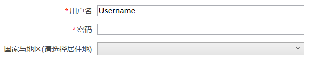
<StackPanel Grid.IsSharedSizeScope="True">
    <kino:FormItem Label="使用者名稱" IsRequired="True">
        <TextBox />
    </kino:FormItem>
    <kino:FormItem Label="密碼" IsRequired="True">
        <PasswordBox />
    </kino:FormItem>
    <kino:FormItem Label="國家與地區(請選擇居住地)">
        <ComboBox />
    </kino:FormItem>
</StackPanel>
Form的方案是將每一個表單元素放進單獨的FormItem,再由Form負責佈局。FormItem也可以單獨使用,例如把FormItem放進StackPanel佈局。
FormItem並不會為UI提供豐富的屬性選項,那是需要賺錢的控制元件庫才會提供的需求,而且除了Demo外應該沒什麼機會要為每個Form設定不同的外觀。在一個程式內,通常只有以下兩種情況:
通用表單的佈局,一般最多隻有幾種,只需要給出對應數量的全域性樣式就足夠應付。
複雜而獨特的佈局,應該不會很多,所以不在Form面對的80%應用場景,這種情況就特殊處理吧。
如果有一個程式有幾十個表單而且每個表單佈局全都不同,那麼應該和產品經理好好溝通讓TA不要這麼任性。
3.1.2 FormItem的具體實現
<Style TargetType="local:FormItem">
    <Setter Property="IsTabStop"
            Value="False" />
    <Setter Property="Margin"
            Value="12,0,12,12" />
    <Setter Property="Padding"
            Value="8,0,0,0" />
    <Setter Property="LabelTemplate">
        <Setter.Value>
            <DataTemplate>
                <TextBlock Text="{Binding}"
                           VerticalAlignment="Center" />
            </DataTemplate>
        </Setter.Value>
    </Setter>
    <Setter Property="Template">
        <Setter.Value>
            <ControlTemplate TargetType="local:FormItem">
                <Grid x:Name="Root">
                    <Grid.ColumnDefinitions>
                        <ColumnDefinition Width="Auto"
                                          SharedSizeGroup="Header" />
                        <ColumnDefinition />
                    </Grid.ColumnDefinitions>
                    <Grid.RowDefinitions>
                        <RowDefinition Height="Auto" />
                        <RowDefinition Height="Auto" />
                    </Grid.RowDefinitions>
                    <StackPanel Orientation="Horizontal"
                                HorizontalAlignment="Right">
                        <TextBlock x:Name="IsRequiredMark"
                                   Margin="0,0,2,0"
                                   VerticalAlignment="Center"
                                   Grid.Column="2"
                                   Visibility="{Binding IsRequired,RelativeSource={RelativeSource Mode=TemplatedParent},Converter={StaticResource BooleanToVisibilityConverter}}"
                                   Text="*"
                                   Foreground="Red" />
                        <ContentPresenter Content="{TemplateBinding Label}"
                                          TextBlock.Foreground="#FF444444"
                                          ContentTemplate="{TemplateBinding LabelTemplate}"
                                          Visibility="{Binding Label,RelativeSource={RelativeSource Mode=TemplatedParent},Converter={StaticResource EmptyObjectToVisibilityConverter}}" />
                    </StackPanel>
                    <ContentPresenter Grid.Column="1"
                                      Margin="{TemplateBinding Padding}"
                                      x:Name="ContentPresenter" />
                    <ContentPresenter Grid.Row="1"
                                      Grid.Column="1"
                                      Visibility="{Binding Description,RelativeSource={RelativeSource Mode=TemplatedParent},Converter={StaticResource EmptyObjectToVisibilityConverter}}"
                                      Margin="{TemplateBinding Padding}"
                                      Content="{TemplateBinding Description}"
                                      TextBlock.Foreground="Gray" />
                </Grid>
            </ControlTemplate>
        </Setter.Value>
    </Setter>
</Style>
上面是FormItem的DefaultStyle。FormItem繼承ContentControl並提供Label、LabelTemplate、Description和IsRequired四個屬性,它的程式碼本身並不提供其它功能:
Label
本來打算讓FormItem繼承HeaderedContentControl,但考慮到語義上Label比Header更合適結果還是使用了Label。
LabelTemplate
根據多年來的使用經驗,比起提供各種各樣的屬性,一個LabelTemplate能提供的更多更靈活。LabelTemplate可以玩的花樣還挺多的,例如FormItem 使用如下Setter讓標籤右對齊:
<Setter Property="LabelTemplate">
    <Setter.Value>
        <DataTemplate>
            <TextBlock Text="{Binding}"
                       VerticalAlignment="Center"
                       HorizontalAlignment="Right" />
        </DataTemplate>
    </Setter.Value>
</Setter>
IsRequired
是否為必填項,如果為True則顯示紅色的*。
Description
說明,ControlTemplate使用了SystemColors.GrayTextBrush將文字設定為灰色。
一般來說有這些屬性就夠應對80%的需求。有些專案要求得更多,通常我會選擇為這個專案單獨定製一個派生自FormItem的控制元件,而不是讓原本的FormItem更加臃腫。
SharedSizeGroup
FormItem中Label列是自適應的,同一個Form中不同FormItem的這個列通過SharedSizeGroup屬性保持同步。應用了SharedSizeGroup屬性的元素會找到IsSharedSizeScope設定true的父元素(也就是Form),然後同步這個父元素中所有SharedSizeGroup值相同的對應列。具體內容可見在網格之間共享大小調整屬性這篇文章。
很多人喜歡將Label列設定為一個固定的值,但國際化後由於英文比中文長長長長很多,或者字型大小會改變,或者因為Label是動態生成的一開始就不清楚Label列需要的寬度,最終導致Label顯示不完整。如果將Label列設定一個很大的寬度又會在大部分情況下顯得左邊很空曠,所以最好做成自適應。
3.2 用Form和附加屬性簡化表單構建
3.2.1 如何使用
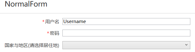
<kino:Form Header="NormalForm">
    <TextBox kino:Form.Label="使用者名稱" kino:Form.IsRequired="True" />
    <PasswordBox kino:Form.Label="密碼" kino:Form.IsRequired="True" />
    <ComboBox kino:Form.Label="國家與地區(請選擇居住地)" />
</kino:Form>
將FormItem封裝到Form中可以靈活地新增更多功能(不過我也只是多加了個Header屬性,一般來說已經夠用)。可以看到使用附加屬性的方式大大簡化了佈局Form的XAML,而更重要的是語義上更加“正常”一些(不過也有人反饋不喜歡這種方式,也可能只是我自己用習慣了)。
3.2.2 Form的基本實現
public partial class Form : HeaderedItemsControl
{
    public Form()
    {
        DefaultStyleKey = typeof(Form);
    }

    protected override bool IsItemItsOwnContainerOverride(object item)
    {
        bool isItemItsOwnContainer = false;
        if (item is FrameworkElement element)
            isItemItsOwnContainer = GetIsItemItsOwnContainer(element);

        return item is FormItem || isItemItsOwnContainer;
    }

    protected override DependencyObject GetContainerForItemOverride()
    {
        var item = new FormItem();
        return item;
    }
}
HeaderedItemsControl
Form是一個簡單的自定義ItemsContro,繼承HeaderedItemsControl是為了多一個Header屬性及它的HeaderTemplate可用。
GetContainerForItemOverride
protected virtual DependencyObject GetContainerForItemOverride () 用於返回Item的Container。所謂的Container即Item的容器,一些ItemsControl不會把Items中的項直接呈現到UI,而是封裝到一個Container,這個Container通常是個ContentControl,如ListBox的ListBoxItem。Form返回的是FormItem。
IsItemItsOwnContainer
protected virtual bool IsItemItsOwnContainerOverride (object item),確定Item是否是(或者是否可以作為)其自己的Container。在Form中,只有FormItem和IsItemItsOwnContainer附加屬性的值為True的元素返回True。
3.2.3 使用附加屬性簡化XAML
比起用FormItem包裝每個表單元素,如果每個TextBox、ComboBox等都有FormItem的Label、IsRequired屬性那就簡單太多了。這種情況可以使用附加屬性解決,如前面示例程式碼所示,使用附加屬性後上面的示例程式碼可以答覆簡化,而且完全隱藏了FormItem這一層,語義上更合理。
如果對附加屬性不熟悉可以看我的這篇文章。
為此Form提供了幾個附加屬性,包括Label、LabelTemplate、Description、IsRequired和ContainerStyle,分別和FormItem中各屬性對應,在Form中使用protected virtual void PrepareContainerForItemOverride (DependencyObject element, object item) 為FormItem設定Header、Description、IsRequired:
protected override void PrepareContainerForItemOverride(DependencyObject element, object item)
{
    base.PrepareContainerForItemOverride(element, item);

    if (element is FormItem formItem && item is FormItem == false)
    {
        if (item is FrameworkElement content)
            PrepareFormFrameworkElement(formItem, content);
    }
}

private void PrepareFormFrameworkElement(FormItem formItem, FrameworkElement content)
{
    formItem.Label = GetLabel(content);
    formItem.Description = GetDescription(content);
    formItem.IsRequired = GetIsRequired(content);
    formItem.ClearValue(DataContextProperty);
    Style style = GetContainerStyle(content);
    if (style != null)
        formItem.Style = style;
    else if (ItemContainerStyle != null)
        formItem.Style = ItemContainerStyle;
    else
        formItem.ClearValue(FrameworkElement.StyleProperty);

    DataTemplate labelTemplate = GetLabelTemplate(content);
    if (labelTemplate != null)
        formItem.LabelTemplate = labelTemplate;
}
ClearValue(FrameworkElement.StyleProperty)
注意formItem.ClearValue(FrameworkElement.StyleProperty)這句。Style是個可以使用繼承值的屬性(屬性值繼承使元素樹中的子元素可以從父元素獲取特定屬性的值,並繼承該值),也就是說如果寫成formItem.Style=null它的Style就會成為Null,而不能繼承父元素中設定的全域性樣式。(關於依賴屬性的優先順序,可以看我的另一篇文章:依賴屬性:概述)
ClearValue(DataContextProperty)
另外還需注意formItem.ClearValue(DataContextProperty)這句,因為FormItem的DataContext會影響FormItem的Header等的繫結,所以需要清除它的DataContext的值,讓它使用繼承值。
Visibility
var binding = new Binding(nameof(Visibility));
binding.Source = content;
binding.Mode = BindingMode.OneWay;
formItem.SetBinding(VisibilityProperty, binding);除了附加屬性,FormItem還可以繫結表單元素的依賴屬性。上面這段程式碼新增在PrepareFormFrameworkElement最後,用於將FormItem的Visibility繫結到表單元素的Visibility。一般來說表單元素的IsEnabled和Visibility都是常常被修改的值,因為它們本身就是UIElement的依賴屬性,不需要為它們另外建立附加屬性。
3.3 為表單佈局新增層次
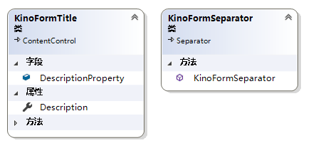
<Style TargetType="local:FormSeparator">
    <Setter Property="Margin"
            Value="0,8,0,8" />
    <Setter Property="Template">
        <Setter.Value>
            <ControlTemplate TargetType="local:FormSeparator">
                <Rectangle VerticalAlignment="Bottom"
                           Height="1" />
            </ControlTemplate>
        </Setter.Value>
    </Setter>
</Style>

<Style TargetType="local:FormTitle">
    <Setter Property="FontSize"
            Value="16" />
    <Setter Property="Margin"
            Value="0,0,0,12" />
    <Setter Property="Padding"
            Value="12,0" />
    <Setter Property="Foreground"
            Value="#FF333333" />
    <Setter Property="IsTabStop"
            Value="False" />
    <Setter Property="Template">
        <Setter.Value>
            <ControlTemplate TargetType="local:FormTitle">
                <StackPanel Margin="{TemplateBinding Padding}">
                    <ContentPresenter x:Name="ContentPresenter"
                                      ContentTemplate="{TemplateBinding ContentTemplate}"
                                      Content="{TemplateBinding Content}" />
                    <ContentPresenter Content="{TemplateBinding Description}"
                                      Visibility="{Binding Description,RelativeSource={RelativeSource Mode=TemplatedParent},Converter={StaticResource NullToValueConverter},ConverterParameter=Collapsed,FallbackValue=Visible}"
                                      Margin="0,2,0,0"
                                      TextBlock.FontSize="12"
                                      TextBlock.Foreground="Gray" />
                </StackPanel>
            </ControlTemplate>
        </Setter.Value>
    </Setter>
</Style>
這兩個控制元件為Form的佈局提供層次感,兩者都將IsItemItsOwnContainer附加屬性設定為True,所以在Form中不會被包裝為FormItem。這兩個控制元件的使用如下:
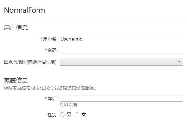
<kino:Form Header="NormalForm">
    <kino:FormTitle Content="使用者資訊" />
    <TextBox kino:Form.Label="使用者名稱" kino:Form.IsRequired="True" />
    <PasswordBox kino:Form.Label="密碼" kino:Form.IsRequired="True" />
    <ComboBox kino:Form.Label="國家與地區(請選擇居住地)" />

    <kino:FormSeparator />

    <kino:FormTitle Content="家庭資訊" Description="填寫家庭資訊可以讓我們給您提供更好的服務。" />
    <TextBox kino:Form.Label="伴侶" kino:Form.Description="可以沒有"
     kino:Form.IsRequired="True" />
    <StackPanel kino:Form.Label="性別" Orientation="Horizontal">
        <RadioButton Content="男" GroupName="Sex" />
        <RadioButton Content="女" GroupName="Sex" Margin="8,0,0,0" />
    </StackPanel>
</kino:Form>
3.4 ShouldApplyItemContainerStyle
ShouldApplyItemContainerStyle的作用是返回一個值,該值表示是否將屬性 ItemContainerStyle 或 ItemContainerStyleSelector 的樣式應用到指定的項的容器元素。由於在Form中設定了:
[StyleTypedProperty(Property = "ItemContainerStyle", StyleTargetType = typeof(FormItem))]但同時Form中很可能有FormTitle、FormSeparator,為避免ItemContainerStyle錯誤地應用到FormTitle和FormSeparator導致出錯,需要新增如下程式碼:
protected override bool ShouldApplyItemContainerStyle(DependencyObject container, object item)
{
    return container is FormItem;
}
4. 其它方案
Form是一個簡單的只滿足了基本佈局功能的表單方案,業務稍微複雜的程式可以考慮使用下面這些方案,由於這些方案通常包含在成熟的控制元件庫裡面(而且稍微超出了“入門"的範圍),所以我只簡單地介紹一下。
ASP.NET MVC的方案是通過在實體類的屬性上新增各種標籤:
[Required]
[EmailAddress]
[Display(Name = "Email Address")]
public string Email { get; set; }
UI上就可以這麼使用:
<form asp-controller="Demo" asp-action="RegisterLabel" method="post">
    <label asp-for="Email"></label>
    <input asp-for="Email" /> <br />
</form>
使用同樣結構的實體類,WPF還可以這麼使用:
<dc:DataForm Data="{Binding SelectedItem}">
     <dc:DataFormFieldDescriptor PropertyName="Id" />
     <dc:DataFormFieldDescriptor PropertyName="FirstName"/>
     <dc:DataFormFieldDescriptor PropertyName="LastName"/>
     <dc:DataFormFieldDescriptor PropertyName="Gender"/>
     <dc:DataFormFieldDescriptor PropertyName="MainAddress">
         <dc:DataFormFieldDescriptor.SubFields>
             <dc:DataFormFieldDescriptor PropertyName="Address1"/>
             <dc:DataFormFieldDescriptor PropertyName="City"/>
             <dc:DataFormFieldDescriptor PropertyName="State"/>
         </dc:DataFormFieldDescriptor.SubFields>
     </dc:DataFormFieldDescriptor>
</dc:DataForm>
由DataForm選擇表單元素並生成的做法也很多人喜歡,但對實體類的要求也較高。DataForm通常還可以更進一步--反射實體類的所有屬性自動建立表單。如果需要的話可以直接買一個包含DataForm的控制元件庫,或者將SilverlightTookit的DataForm移植過來用。這之後話題越來越不“入門”就割愛了。
5. 還有什麼
作為一個表單怎麼可以沒有錯誤驗證和提交按鈕,提交按鈕部分在接下來的文章裡介紹,但錯誤驗證是一個很大的功能(而且沒有錯誤驗證部分這個Form也能用),我打算之後再改進。
其它例如點選取消按鈕要提示“內容已修改是否放棄儲存”之類的功能太傾向業務了,不想包含在控制元件的功能中。
接下來的文章會繼續介紹Form的其它小功能。
6. 參考
ScottGu's Blog - Nov 6th Links_ ASP.NET, ASP.NET AJAX, jQuery, ASP.NET MVC, Silverlight and WPF
ItemsControl Class (System.Windows.Controls) Microsoft Docs
附加屬性1:概述
附加屬性概述
自定義附加屬性
7. 原始碼
Kino.Toolkit.Wpf_F