
[WPF 自定義控制元件]建立包含CheckBox的ListBoxItem
1. 前言
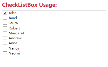
Xceed wpftoolkit提供了一個CheckListBox,效果如下:
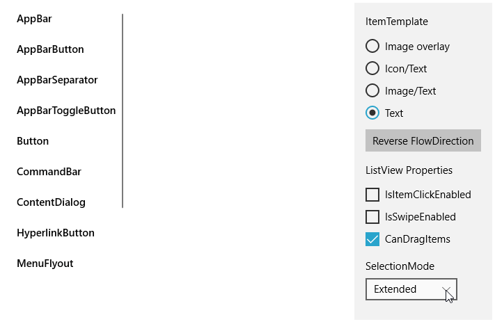
不過它用起來不怎麼樣,與其這樣還不如參考UWP的ListView實現,而且動畫效果也很好看:
它的樣式如下:
<ListViewItemPresenter ContentTransitions="{TemplateBinding ContentTransitions}"
    x:Name="Root"
    Control.IsTemplateFocusTarget="True"
    FocusVisualMargin="{TemplateBinding FocusVisualMargin}"
    SelectionCheckMarkVisualEnabled="{ThemeResource ListViewItemSelectionCheckMarkVisualEnabled}"
    CheckBrush="{ThemeResource ListViewItemCheckBrush}"
    CheckBoxBrush="{ThemeResource ListViewItemCheckBoxBrush}"
    DragBackground="{ThemeResource ListViewItemDragBackground}"
    DragForeground="{ThemeResource ListViewItemDragForeground}"
    FocusBorderBrush="{ThemeResource ListViewItemFocusBorderBrush}"
    FocusSecondaryBorderBrush="{ThemeResource ListViewItemFocusSecondaryBorderBrush}"
    PlaceholderBackground="{ThemeResource ListViewItemPlaceholderBackground}"
    PointerOverBackground="{ThemeResource ListViewItemBackgroundPointerOver}"
    PointerOverForeground="{ThemeResource ListViewItemForegroundPointerOver}"
    SelectedBackground="{ThemeResource ListViewItemBackgroundSelected}"
    SelectedForeground="{ThemeResource ListViewItemForegroundSelected}"
    SelectedPointerOverBackground="{ThemeResource ListViewItemBackgroundSelectedPointerOver}"
    PressedBackground="{ThemeResource ListViewItemBackgroundPressed}"
    SelectedPressedBackground="{ThemeResource ListViewItemBackgroundSelectedPressed}"
    DisabledOpacity="{ThemeResource ListViewItemDisabledThemeOpacity}"
    DragOpacity="{ThemeResource ListViewItemDragThemeOpacity}"
    ReorderHintOffset="{ThemeResource ListViewItemReorderHintThemeOffset}"
    HorizontalContentAlignment="{TemplateBinding HorizontalContentAlignment}"
    VerticalContentAlignment="{TemplateBinding VerticalContentAlignment}"
    ContentMargin="{TemplateBinding Padding}"
    CheckMode="{ThemeResource ListViewItemCheckMode}"
    RevealBackground="{ThemeResource ListViewItemRevealBackground}"
    RevealBorderThickness="{ThemeResource ListViewItemRevealBorderThemeThickness}"
    RevealBorderBrush="{ThemeResource ListViewItemRevealBorderBrush}">
屬性是很多了,但這裡沒有自定義CheckBox樣式的方法,而且也沒法參考它的動畫如何實現。幸好UWP還提供了一個ListViewItemExpanded樣式,裡面有完整的佈局、VisualState等,不過總共有差不多500行,只拿其中MultiSelectStates的部分也將近100行,這太過複雜了,這還是有些麻煩,在WPF中實現起來反而簡單很多。
2. 實現
微軟的文件中有介紹如何Create ListViewItems with a CheckBox,原理十分簡單:
<DataTemplate x:Key="FirstCell">
  <StackPanel Orientation="Horizontal">
    <CheckBox IsChecked="{Binding Path=IsSelected,
      RelativeSource={RelativeSource FindAncestor, AncestorType={x:Type ListViewItem}}}"/>
  </StackPanel>
</DataTemplate>
就是在控制元件模板中新增一個CheckBox並且這個CheckBox通過FindAncestor的Binding方式繫結到ListViewItem的IsSelected屬性。雖然是ListView的方法,但它同樣適用於ListBox。所以我使用這個方式封裝了一個ListBox控制元件,目前基本上沒什麼功能,就只是在每個ListBoxItem前面加上一個CheckBox。以前介紹過如何自定義ItemsControl,要自定義一個ListBox控制元件,同樣需要三部:
- 定義ListBox
- 關聯ListBoxItem和ListBox
- 實現ListBox的邏輯
public class ExtendedListBox : ListBox
{
    public static readonly DependencyProperty IsMultiSelectCheckBoxEnabledProperty =
        DependencyProperty.Register(nameof(IsMultiSelectCheckBoxEnabled), typeof(bool), typeof(ExtendedListBox), new PropertyMetadata(true));

    public bool IsMultiSelectCheckBoxEnabled
    {
        get { return (bool)GetValue(IsMultiSelectCheckBoxEnabledProperty); }
        set { SetValue(IsMultiSelectCheckBoxEnabledProperty, value); }
    }

    protected override DependencyObject GetContainerForItemOverride()
    {
        return new ExtendedListBoxItem();
    }
}


public class ExtendedListBoxItem : ListBoxItem
{
    public ExtendedListBoxItem()
    {
        DefaultStyleKey = typeof(ExtendedListBoxItem);
    }
}
上面就是全部程式碼。定義了ExtendedListBox和ExtendedListBoxItem兩個類,然後重寫GetContainerForItemOverride關聯這兩個類,最後在ExtendedListBox的程式碼裡模仿UWP的ListView提供了IsMultiSelectCheckBoxEnabled屬性,其他功能主要由XAML提供:
<Grid.ColumnDefinitions>
    <ColumnDefinition Width="Auto"/>
    <ColumnDefinition/>
</Grid.ColumnDefinitions>
<Primitives:KinoResizer>
    <CheckBox Margin="{TemplateBinding Padding}"
              IsChecked="{Binding IsSelected, Mode=TwoWay, RelativeSource={RelativeSource TemplatedParent}}"
              VerticalAlignment="{TemplateBinding VerticalContentAlignment}"
              IsTabStop="False"
              x:Name="SelectionCheckMark"/>
</Primitives:KinoResizer>
<ContentPresenter HorizontalAlignment="{TemplateBinding HorizontalContentAlignment}" SnapsToDevicePixels="{TemplateBinding SnapsToDevicePixels}" VerticalAlignment="{TemplateBinding VerticalContentAlignment}" Grid.Column="1"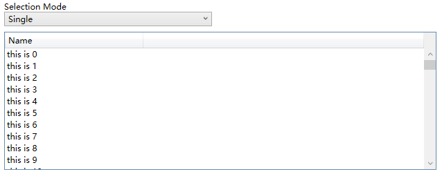
Margin="{TemplateBinding Padding}"/>ControlTemplate使用Resizer包裝CheckBox,這是為了CheckBox隱藏或顯示時有過渡動畫。然後在ControlTemplate.Triggers裡新增兩個DataTrigger,根據所屬的ListBox的IsMultiSelectCheckBoxEnabled和SelectionMode顯示或隱藏SelectionCheckMark:
<DataTrigger Binding="{Binding RelativeSource={RelativeSource Mode=FindAncestor,AncestorType=ListBox},Path=SelectionMode}"
             Value="Single">
    <Setter Property="Visibility"
            TargetName="SelectionCheckMark"
            Value="Collapsed" />
</DataTrigger>
<DataTrigger Binding="{Binding RelativeSource={RelativeSource Mode=FindAncestor,AncestorType=ListBox},Path=IsMultiSelectCheckBoxEnabled}"
             Value="False">
    <Setter Property="Visibility"
            TargetName="SelectionCheckMark"
            Value="Collapsed" />
</DataTrigger>
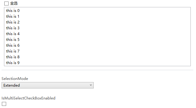
最終效果如下:
3. 新增VisualState
WPF的Button的ControlTemplate沒有使用VisualState,但Button支援VisualState,使用者可以自定義使用VisualState的ControlTemplate。ExtendedListBoxItem也模仿UWP提供了MultiSelectEnabled和MultiSelectDisabled兩個VisualState,因為ListBoxItem需要知道承載它的ListBox的IsMultiSelectCheckBoxEnabled和SelectionMode,所以需要給ListBoxItem新增一個Owner屬性,並重載ListBox的PrepareContainerForItemOverride函式,在這個函式中為ListBoxItem的Owner賦值:
protected override void PrepareContainerForItemOverride(DependencyObject element, object item)
{
    base.PrepareContainerForItemOverride(element, item);
    if (element is ExtendedListBoxItem listBoxItem)
        listBoxItem.Owner = this;
}
ListBoxItem中使用監視Owner的IsMultiSelectCheckBoxEnabled和SelectionMode的改變,並在這兩個值改變時更新VisualState:
protected virtual void OnOwnerChanged(ExtendedListBox oldValue, ExtendedListBox newValue)
{
    if (oldValue != null)
    {
        var descriptor = DependencyPropertyDescriptor.FromProperty(ListBox.SelectionModeProperty, typeof(ExtendedListBox));
        descriptor.RemoveValueChanged(newValue, OnSelectionModeChanged);

        descriptor = DependencyPropertyDescriptor.FromProperty(ExtendedListBox.IsMultiSelectCheckBoxEnabledProperty, typeof(ExtendedListBox));
        descriptor.RemoveValueChanged(newValue, OnIsMultiSelectCheckBoxEnabledChanged);
    }
    if (newValue != null)
    {
        var descriptor = DependencyPropertyDescriptor.FromProperty(ListBox.SelectionModeProperty, typeof(ExtendedListBox));
        descriptor.AddValueChanged(newValue, OnSelectionModeChanged);

        descriptor = DependencyPropertyDescriptor.FromProperty(ExtendedListBox.IsMultiSelectCheckBoxEnabledProperty, typeof(ExtendedListBox));
        descriptor.AddValueChanged(newValue, OnIsMultiSelectCheckBoxEnabledChanged);
    }
}

private void OnSelectionModeChanged(object sender, EventArgs args)
{
    UpdateVisualStates(true);
}

private void OnIsMultiSelectCheckBoxEnabledChanged(object sender, EventArgs args)
{
    UpdateVisualStates(true);
}
為了使用VisualState我在ControlTemplate多寫了80行程式碼,因為沒有用上VisualTransition所以這個ControlTemplate有一些Bug,反正只是用來驗證新增的兩個VisualState是否有效。在ListBoxItem裡用Trigger比使用VisualState更簡潔有效。
4. 使用同樣的原理為DataGrid的行新增ChechBox
DataGrid也可以用同樣的原理為每一行新增CheckBox,只不過DataGrid的Template會負責很多。
首先自定義一個DataGrid類:
public class ExtendedDataGrid : DataGrid, IMultiSelector
{
    // Using a DependencyProperty as the backing store for IsMultiSelectCheckBoxEnabled.  This enables animation, styling, binding, etc...
    public static readonly DependencyProperty IsMultiSelectCheckBoxEnabledProperty =
        DependencyProperty.Register(nameof(IsMultiSelectCheckBoxEnabled), typeof(bool), typeof(ExtendedDataGrid), new PropertyMetadata(true));

    public ExtendedDataGrid()
    {
        DefaultStyleKey = typeof(ExtendedDataGrid);
    }

    public bool IsMultiSelectCheckBoxEnabled
    {
        get { return (bool)GetValue(IsMultiSelectCheckBoxEnabledProperty); }
        set { SetValue(IsMultiSelectCheckBoxEnabledProperty, value); }
    }
}
然後定義一個RowHeaderTemplate
<DataTemplate x:Key="DataGridRowHeaderTemplate">
    <Grid>
        <CheckBox IsChecked="{Binding IsSelected, Mode=TwoWay, RelativeSource={RelativeSource AncestorType={x:Type DataGridRow}, Mode=FindAncestor}}"
                      x:Name="SelectionCheckBox"/>
    </Grid>
</DataTemplate>
在DataGrid的Style上應用這個RowHeaderTemplate。最後再DataGrid的Style的Triggers中新增兩個DataTrigger:
<Trigger Property="SelectionMode" Value="Single">
    <Setter Property="HeadersVisibility"  Value="Column" />
</Trigger>
<Trigger Property="IsMultiSelectCheckBoxEnabled" Value="False">
    <Setter Property="HeadersVisibility"  Value="Column"/>
</Trigger>HeadersVisibility是個DataGridHeadersVisibility的屬性,它用於控制DataGrid行和列的Header是否顯示,因為我在每一行的開頭放了CheckBox(就是使用上面定義的RowHeaderTempalte),所以定一隻只顯示Column的Header的話相當於隱藏了這個CheckBox,執行效果如下:
5. 結語
ListBox和DataGrid的自定義是個很大的話題,這裡只實現最簡單的功能,通常會根據業務需求逐漸增加更多需求。如果有更復雜的需求,我建議買商業的控制元件,畢竟DataGrid的自定義可以很複雜,花時間不如花錢。
6. 參考
How to_ Create ListViewItems with a CheckBox - WPF _ Microsoft Docs
ListBox Class (System.Windows.Controls) _ Microsoft Docs
DataGrid Class (System.Windows.Controls) _ Microsoft Docs
7. 原始碼
Kino.Toolkit.Wpf_ExtendedListBox.cs at master
Kino.Toolkit.Wpf_ExtendedDataGrid.cs at mas