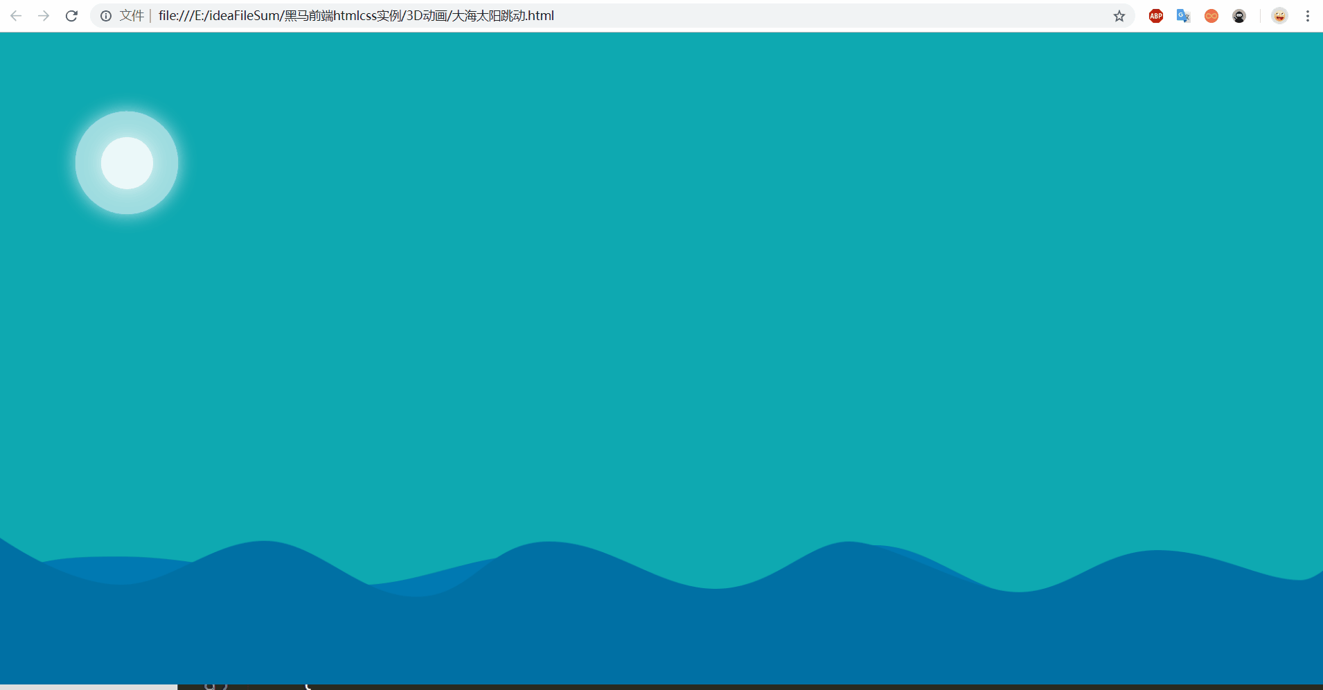
css3動畫案例—太陽大海跳動
阿新 • • 發佈:2018-11-01
要點:
1.一個動畫定義完成之後,任何元素只要呼叫這個動畫的名字,都可以執行這個動畫
2.同一個動畫,裡面的多個效果也是有前後順序的,注意效果的差別
html程式碼:
<!DOCTYPE html>
<html lang="en">
<head>
	<meta charset="UTF-8">
	<title>Document</title>
	<style>
		*{
			margin:0;
			padding: 0;
		}
		/*去除所有邊框,不然背景會留白邊*/
		html,body{
			width: 100%;
			height: 100%;
			background-color: #0ea9b1;
			overflow: hidden;
			/*圖片會撐開頁面,會有滾動條*/
		}
		/*瀏覽器全屏*/
		img{
			width: 100%;
			height: auto;
			position: absolute;
			bottom: 0;
			left: 0;
		}
		img:first-child{
            animation: qifu 2s ease infinite;
		}
		img:last-child{
            animation: qifu 3s ease-in infinite;
		}

		@keyframes qifu{
            0%{
            	bottom: 0;
            }
            50%{
            	bottom: -30px;
            }
            100%{
            	bottom: 0;
            }
		}

		.sun{
			width: 100px;
			height: 100px;
			margin: 100px;
			position: relative;
		}
		.sun::before, .sun::after{
			content: "";
			position: absolute;
			top: 50%;
			left: 50%;

			/*兩個小太陽的盒子垂直居中*/
			width: 50px;
			height: 50px;
			background: rgba(255,255,255,0.8);
			border-radius: 50%;
			animation: sun 2.8s infinite;
			/*動畫覆蓋上面的過渡效果,寫到下面*/
		}
		.sun::after{
			width: 100px;
			height: 100px;
			background: rgba(255,255,255,0.6);
			animation: sun 3.4s infinite;
		}
		@keyframes sun{
            0%{
            	transform: translate(-50%,-50%) scale(1);
            	box-shadow: 0px 0px 5px rgba(255,255,255,0.7);
            }
            50%{
            	transform: translate(-50%,-50%) scale(1.2);
            	box-shadow: 0px 0px 30px rgba(255,255,255,0.7);

            }
            100%{
            	transform: translate(-50%,-50%) scale(1);
            	box-shadow: 0px 0px 5px rgba(255,255,255,0.7);
            }
            /*這裡如果先執行縮放,後執行平移效果不一樣,有先後順序試試*/
		}
	</style>
</head>
<body>
	<div class="sun"></div>
	<img src="img/1.png">
	<img src="img/2.png">
</body>
</html>
效果: