
CSS 之弧形陰影
阿新 • • 發佈:2018-11-04
首先實現一個簡單的陰影效果
<!DOCTYPE html >
<html>
	<head>
		<meta charset="utf-8">
		<title>自學教程(如約智惠.com)</title>
		<style type='text/css'>
			div {
				background:green;
				box-shadow:0 4px 10px rgba(0,0,0,0.5);
				border-raduis:150px/10px;
				height:200px;
				width:400px;
				z-index:-1;
			}
		</style>
	</head>

	<body >
		<div>
		</div>
	</body>
</html>

註釋:
box-shadow: 0 4px 10px rgba(0, 0, 0, 0.5)
表示一個帶外陰影的元素,陰影位置x軸偏移0,y軸偏移4px,模糊範圍10px,陰影顏色rgba(0, 0, 0, 0.5)
border-radius: 150px/10px
表示水平方向的半徑和垂直方向的半徑分別為150px、10px
z-index: -1
z-index屬性設定元素的堆疊順序。擁有更高堆疊順序的元素總是會處於堆疊順序較低的元素的前面。
擁有更低的優先順序,可用於將在一個元素放置於另一元素之後。
註釋:z-index 僅能在定位元素上奏效(例如 position:absolute;)!
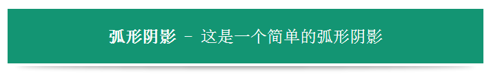
標題效果

設定背景色、字型、位置、行高等。下邊框為藍色部分可以暫時忽略,後面我們需要進行陰影顯示用的。
<!DOCTYPE html >
<html>
	<head>
		<meta charset="utf-8">
		<title>自學教程(如約智惠.com)</title>
		<style type='text/css'>
			body {
				margin:24px;
			}

			h1 {
				background:#139573;
				border-bottom:4px solid blue;
				color:#fff;
				font-family:sans-serif;
				font-size:24px;
				font-weight:normal;
				line-height:80px;
				margin:0px;
				position:relative;
				text-align:center;
			}

			h1 strong {
				font-weight:bold;
			}
		</style>
	</head>

	<body >
		<h1><strong>弧形陰影</strong> - 這是一個簡單的弧形陰影</h1>
	</body>
</html>
合併效果
這裡我們將陰影的背景變為透明色,然後設定位置和大小來實現我們的效果
<!DOCTYPE html >
<html>
	<head>
		<meta charset="utf-8">
		<title>自學教程(如約智惠.com)</title>
		<style type='text/css'>
			body {
				margin:24px;
			}

			h1 {
				background:#139573;
				border-bottom:4px solid #FFF;
				color:#fff;
				font-family:sans-serif;
				font-size:24px;
				font-weight:normal;
				line-height:80px;
				margin:0px;
				position:relative;
				text-align:center;
			}

			h1 strong {
				font-weight:bold;
			}

			h1::before {
			  background: transparent;
			  box-shadow: 0 4px 10px rgba(0, 0, 0, 0.5);
			  border-radius: 800px/10px;
			  bottom: -2px;
			  content: "";
			  height: 8px;
			  left: 2%;
			  position: absolute;
			  width: 96%;
			  z-index: -1;
			}


		</style>
	</head>

	<body >
		<h1><strong>弧形陰影</strong> - 這是一個簡單的弧形陰影</h1>
	</body>
</html>
CSS中存在兩個偽類:before 和 :after,它們特有的屬性content ,用於在 CSS 渲染中向元素邏輯上的頭部或尾部新增內容。注意這些新增不會改變文件內容,不會出現在 DOM 中,不可複製,僅僅是在 CSS 渲染層加入。
所以,我們只需要配合position: absolute ,就可以將其當成容器,拼合成弧形陰影效果。
