python常用畫圖方法
阿新 • • 發佈:2018-11-14
plt.figure() 產生圖
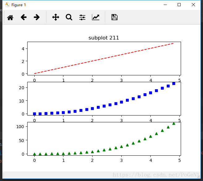
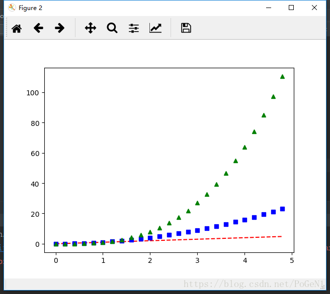
你可以多次使用figure命令來產生多個圖,其中,圖片號按順序增加。這裡,要注意一個概念當前圖和當前座標。所有繪圖操作僅對當前圖和當前座標有效。通常,你並不需要考慮這些事,下面的這個例子為大家演示這一細節。
import numpy as np
import matplotlib.pyplot as plt
t = np.arange(0., 5., 0.2)
plt.figure(1) # 第一張圖
plt.subplot(3, 1, 1) # 第一張圖的第1個子圖
plt.plot(t, t, 'r--')
plt.subplot( 【注:figure()裡面的數字就是相當於影象ID,可以索引定位到它】
plt.text() 新增文字說明
text()可以在圖中的任意位置新增文字,並支援LaTex語法
xlable(), ylable()用於新增x軸和y軸標籤
title()用於新增圖的題目
例如:
import numpy as np
import matplotlib.pyplot as plt
mu, sigma = 100, 15 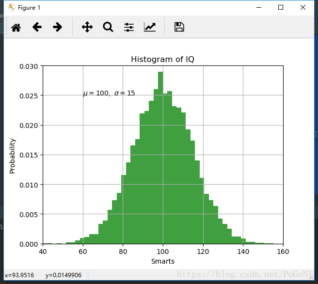
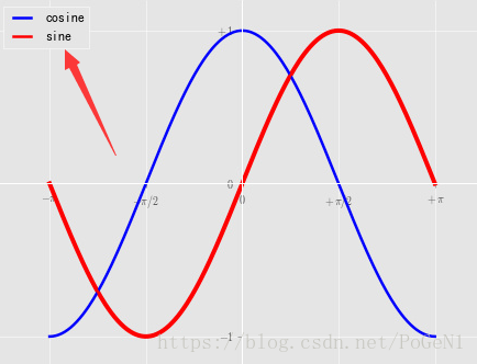
plt.lenged() 新增圖例
plot(X, C, color="blue", linewidth=2.5, linestyle="-", label="cosine")
plot(X, S, color="red",  linewidth=2.5, linestyle="-", label="sine")

legend(loc='upper left')
今天先寫這麼多吧,以後逐漸補充。