Predicting School Performance with Census Income Data
Data Visualization
First, we can make a scatterplot with the location of every school using the library gmplot (pip install gmplot ).

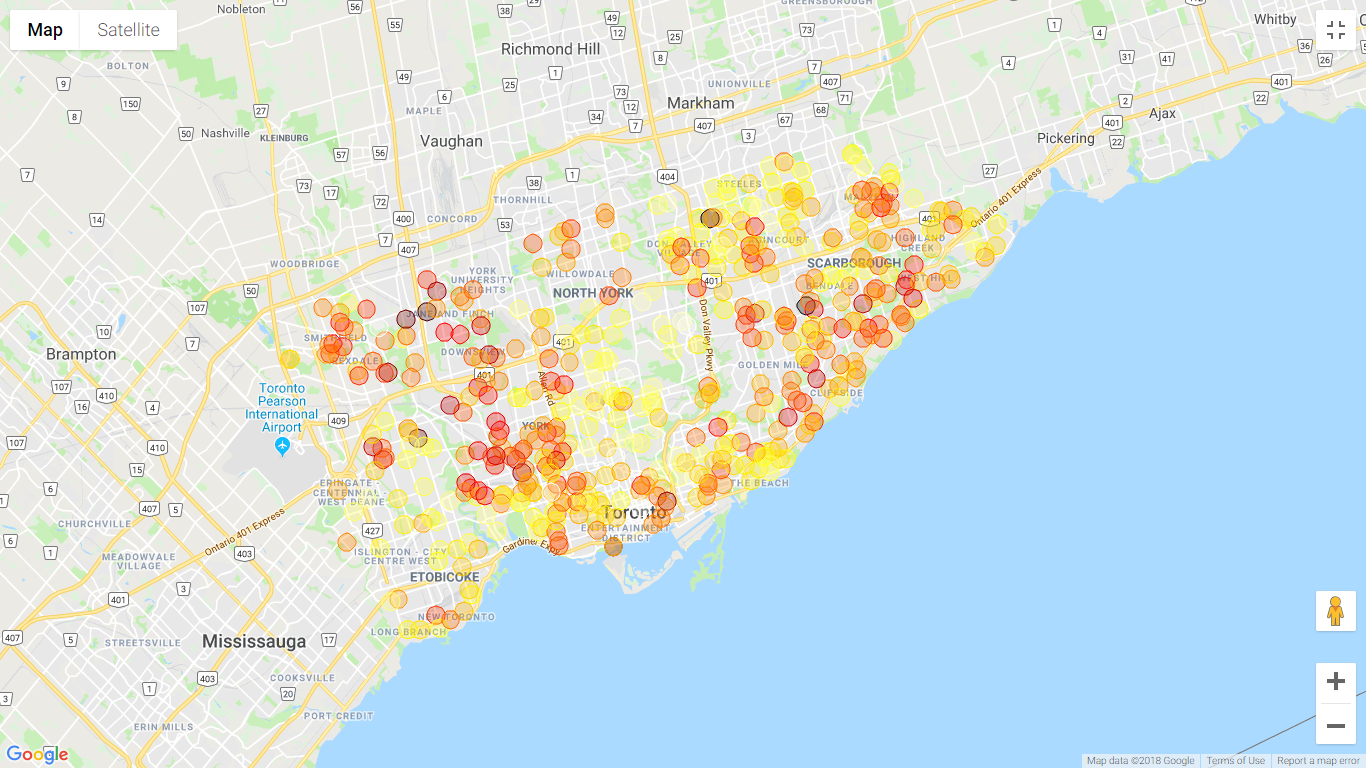
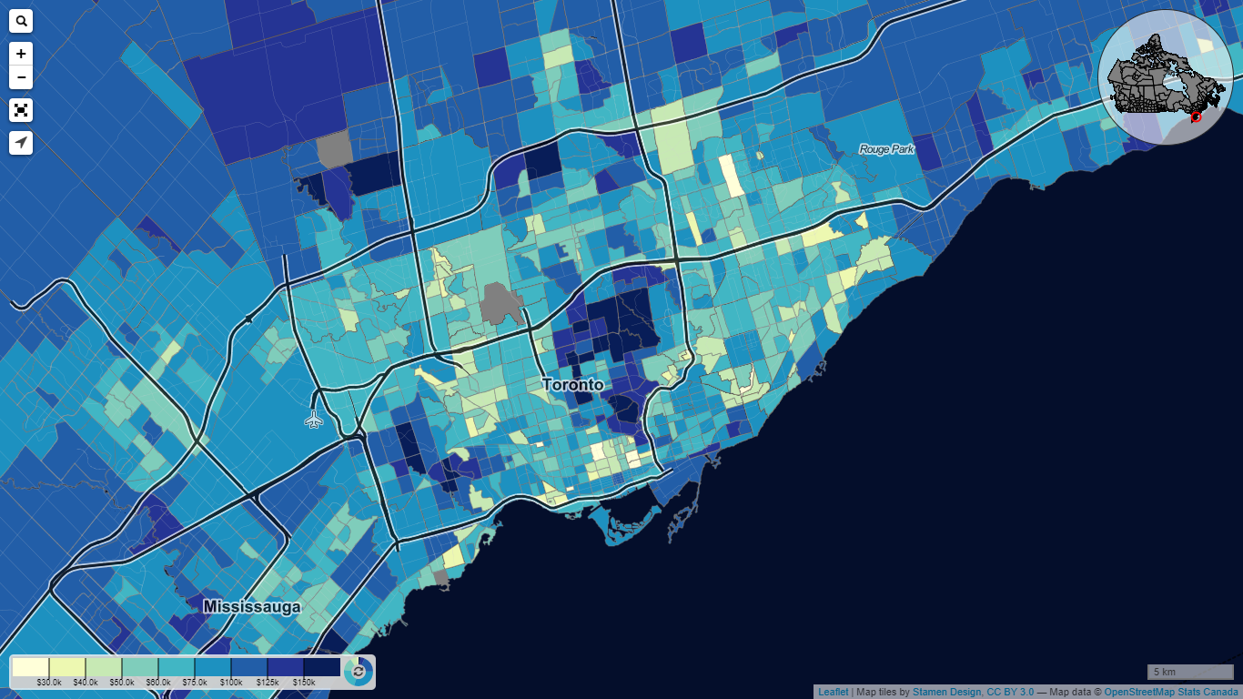
The plot shows that ratings of schools are higher around the middle of Toronto and the northeast (lighter dots are higher ratings). By consulting the income heat map offered by

Let’s see the distribution of ratings given in Toronto.
from statistics import stdev, meanimport matplotlib.pyplot as pltimport seaborn as snssns.set(color_codes=True)
ratings = df['2017 RATING']
sns.distplot(ratings)plt.title('Distribution of 2017 Ratings in Toronto')plt.xlabel('School Rating Out of 10')plt.ylabel('Proportion of Schools')plt.show()print(mean(ratings), stdev(ratings))

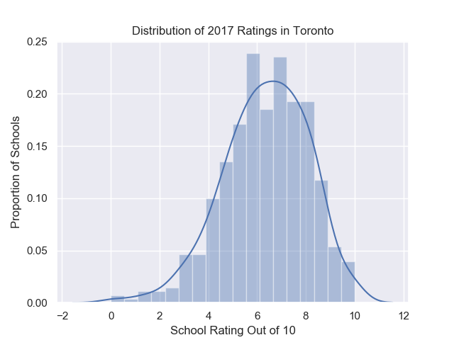
The data is roughly normally distributed with a mean of 6.35 and a standard deviation of 1.73.
Since we have both elementary school and secondary school data, let’s see the difference between the two types.
fig = sns.boxplot(x=df['SCHOOL_TYPE'], y=ratings)plt.title('Distribution of 2017 Ratings by School Type')plt.xlabel('School Type')plt.ylabel('School Rating Out of 10')labels = ['Secondary', 'Elementary']fig.set_xticklabels(labels)plt.show()
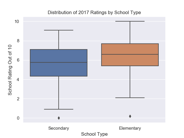
Here we see that elementary schools are usually rated higher than secondary schools.
Similarly, a boxplot of ratings for each school board can also be plotted.

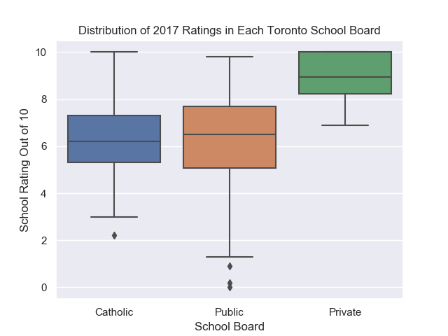
As expected, Private schools have the highest ratings while public and Catholic schools have similar ratings.
We can make a boxplot of ratings in each municipality in Toronto as well.

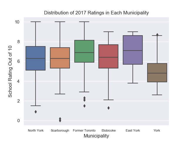
The rating in each municipality seems to be similar, except for York which has a lower interquartile range than the other municipalities. We can test if this difference is statistically significant later on.
To properly visualize the rating of schools as a function of median neighbourhood annual salary per year, we should put the incomes into bins in intervals of $20000.
highest_bin = 200000num_bins = 10intervals = highest_bin / num_binsvalues = []column = 'INCOME'for _, row in df.iterrows(): bin = row[column]/intervals bin = min(bin, num_bins) bin = (math.floor(bin)) values.append(bin)
df[column+'_BINS'] = values
Making a box plot of the data yields:

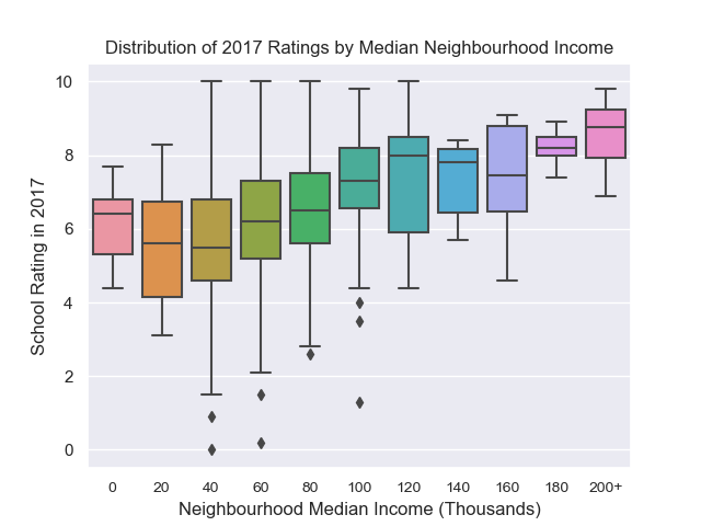
This plot hints that there is some correlation between the median income in a neighbourhood and the rating of the school closest to that neighbourhood.
Statistical Significance
Even though we visually see differences in the box plots above, this is not enough to prove that this difference is not just by chance. We must show that this difference is of statistical significance. To find the statistical significance we may perform a one way ANOVA. With an ANOVA we state the null hypothesis that samples from the categories are drawn from populations which have the same mean. For example, for the school board column, we hypothesize that µ_catholic = µ_public = µ_private. The alternative hypothesis is that the samples are drawn from populations that have different means, and thus are affected by which group they belong to.
from scipy import stats
columns_to_analyze = ['MUN', 'SCHOOL_BOARD', 'SCHOOL_TYPE']for column in columns_to_analyze: grouped_dfs = [] for group in df.groupby(column).groups: grouped_df = df.groupby(column).get_group(group) grouped_df = grouped_df.reset_index()['2017 RATING'] grouped_dfs.append(list(grouped_df.dropna())) F, p = stats.f_oneway(*grouped_dfs) print(f'{column}: {p: 0.2e}')MUN: 3.70e-05SCHOOL_BOARD: 9.25e-07SCHOOL_TYPE: 1.33e-05
ANOVA on each column gives us p values much lower than 0.05 and therefore we can say that the differences are statistically significant. We reject the null hypothesis for each column that the groups’ populations have the same mean.
Feature Engineering
We can use regression techniques to see if the school’s rating can be predicted using the features we created.
However, before we can put the features into a model, missing values must be filled and all features must be one hot encoded. To deal with the missing values, we replace any missing values with the mean of ratings that have been collected. We should make sure to not include 2017 ratings in the mean as that is the value we are trying to predict. We can fill the missing values while we loop through the text file from earlier.
def fill_missing_values(ratings_with_na):
ratings_with_na = [np.nan if rating == 'n/a' else float(rating) for rating in ratings_with_na]
if all([rating == 'n/a' for rating in ratings_with_na[0:-1]]): return ratings_with_na
mean_rating = round(np.nanmean(ratings_with_na[0:-1]), 1)
filled_missing_values = [] for rating in ratings_with_na: if rating in [np.nan]: filled_missing_values.append(mean_rating) else: filled_missing_values.append(rating)
return filled_missing_values
This function takes a list of 5 ratings and converts all ratings that are ‘n/a’ into np.nan so we can apply np.nanmean() to find the mean. We then check if the first 4 ratings are missing, and if they are then we return the list with missing values(we’ll drop these rows later as there are very few of them). Lastly, we find the mean rating between 2013–2016 and return a new list of ratings without missing values.
To one hot encode each categorical value, we can use pd.get_dummies() which converts every categorical value into multiple columns. Each column may have a value of 0 or 1 depending on if the data point is a part of that category or not.
ordinal_columns = df[['INCOME_BINS', '2013 RATING', '2014 RATING', '2015 RATING', '2016 RATING', '2017 RATING']]categorical_columns = ['MUN', 'SCHOOL_TYPE', 'SCHOOL_BOARD']categorical_columns = pd.get_dummies(df[categorical_columns])ohe_df = pd.concat([categorical_columns, ordinal_columns], axis=1)
The new dataframe with renamed columns is shown below.
