Quantile regression, from linear models to trees to deep learning
Quantile regression, from linear models to trees to deep learning
Suppose a real estate analyst wants to predict home prices from factors like home age and distance from job centers. The typical goal will be generating the best home price point estimate given those factors, where “best” typically refers to the smallest squared deviations between predictions and reality.
But what if they want to predict not just a single estimate, but also the likely range? This is called the prediction interval, and the general method for producing them is known as quantile regression. In this post I’ll describe how this problem is formalized; how to implement it in six linear, tree-based, and deep learning methods (in Python —
Quantile regression minimizes quantile loss
Just as regressions minimize the squared-error loss function to predict a single point estimate, quantile regressions minimize the quantile loss in predicting a certain quantile. The most popular quantile is the median, or the 50th percentile, and in this case the quantile loss is simply the sum of absolute
Before digging into the formula, suppose we’ve made a prediction for a single point with a true value of zero, and our predictions range from -1 to +1; that is, our errors also range from -1 to +1. This graph shows how the quantile loss varies with the error, depending on the quantile.

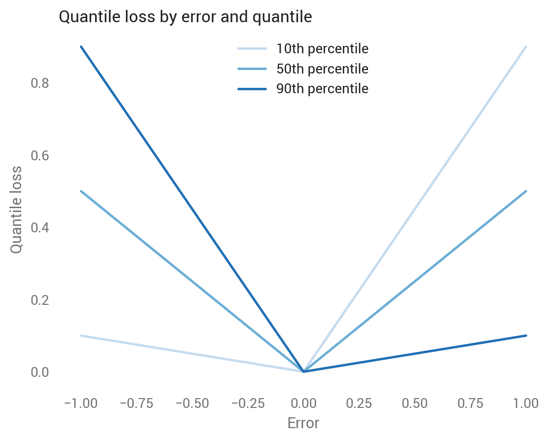
Let’s look at each line separately:
- The medium blue line shows the median, which is symmetric around zero, where all losses equal zero because the prediction was perfect. Looks good so far: the median aims to bisect the set of predictions, so we want to weigh underestimates equally to overestimates. As we’ll see soon, the quantile loss around the median is half the absolute deviation, so 0.5 at both -1 and +1, and 0 at 0.
- The light blue line shows the 10th percentile, which assigns a lower loss to negative errors and a higher loss to positive errors. The 10th percentile means we think there’s a 10 percent chance that the true value is below that predicted value, so it makes sense to assign less of a loss to underestimates than to overestimates.
- The dark blue line shows the 90th percentile, which is the reverse pattern from the 10th percentile.
We can also look at this by quantile for under- and over-estimated predictions. The higher the quantile, the more the quantile loss function penalizes underestimates and the less it penalizes overestimates.


Given this intuition, here’s the quantile loss formula (source):

And in Python code, where we can replace the branched logic with a maximum statement:
def quantile_loss(q, y, f):# q: Quantile to be evaluated, e.g., 0.5 for median.# y: True value.# f: Fitted (predicted) value.e = y - freturn np.maximum(q * e, (q - 1) * e)
Next we’ll look at the six methods — OLS, linear quantile regression, random forests, gradient boosting, Keras, and TensorFlow — and see how they work with some real data.
The data
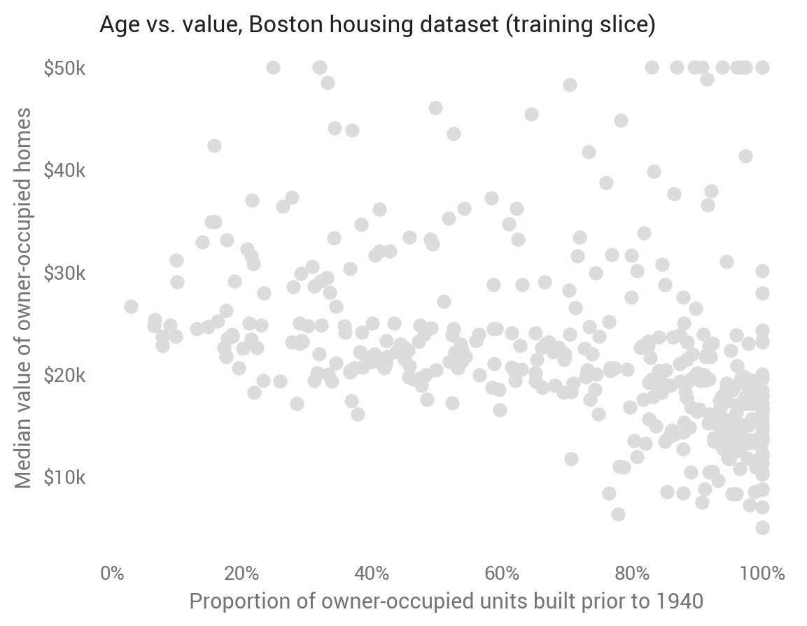
This analysis will use the Boston housing dataset, which contains 506 observations representing towns in the Boston area. It includes 13 features alongside the target, the median value of owner-occupied homes. Quantile regression therefore is predicting the share of towns (not homes) with median home values below a value.
I train the models on 80 percent and test on the remaining 20 percent. For easier visualization, the first set of models uses a single feature: AGE, the proportion of owner-occupied units built prior to 1940. As we might expect, towns with older homes have lower home values, though the relationship is noisy.

For each method, we’ll predict the 10th, 30th, 50th, 70th, and 90th percentiles on the test set.
Ordinary least squares
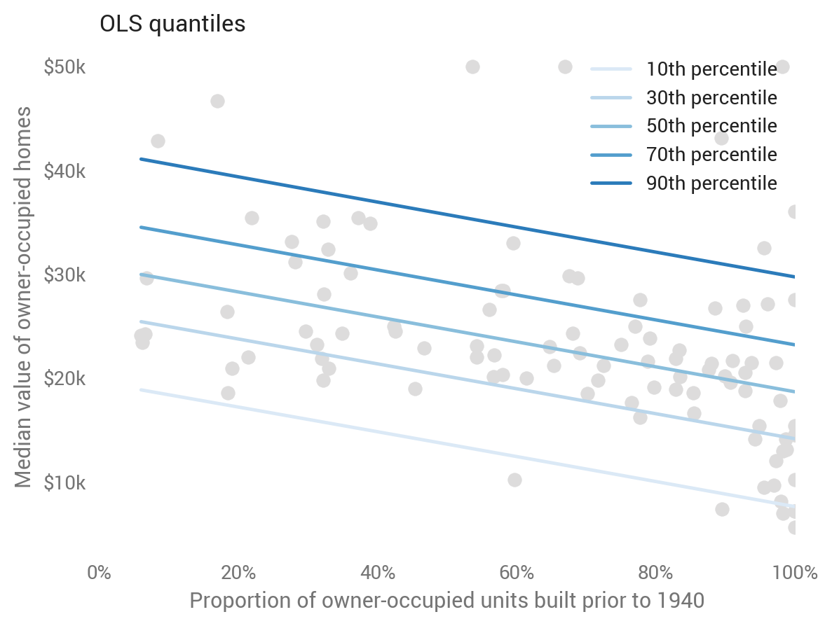
Although OLS predicts the mean rather than the median, we can still calculate prediction intervals from it based on standard errors and the inverse normal CDF:
def ols_quantile(m, X, q): # m: OLS statsmodels model. # X: X matrix. # q: Quantile. mean_pred = m.predict(X) se = np.sqrt(m.scale) return mean_pred + norm.ppf(q) * se
This baseline approach produces linear and parallel quantiles centered around the mean (which is predicted as the median). A well-tuned model will show about 80 percent of dots in between the top and bottom lines. Note the dots differ from the first scatter plot, as here we’re showing the test set to evaluate out-of-sample predictions.

Linear quantile regression
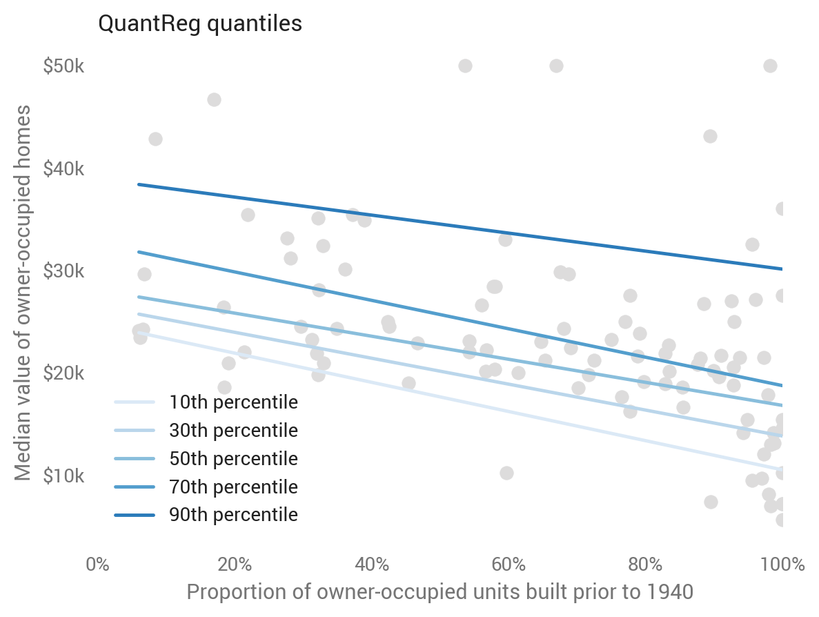
Linear models extend beyond the mean to the median and other quantiles. Linear quantile regression predicts a given quantile, relaxing OLS’s parallel trend assumption while still imposing linearity (under the hood, it’s minimizing quantile loss). This is straightforward with statsmodels :
sm.QuantReg(train_labels, X_train).fit(q=q).predict(X_test)# Provide q.

Random forests
Our first departure from linear models is random forests, a collection of trees. While this model doesn’t explicitly predict quantiles, we can treat each tree as a possible value, and calculate quantiles using its empirical CDF (Ando Saabas has written more on this):
def rf_quantile(m, X, q): # m: sklearn random forests model. # X: X matrix. # q: Quantile. rf_preds = [] for estimator in m.estimators_: rf_preds.append(estimator.predict(X)) # One row per record. rf_preds = np.array(rf_preds).transpose() return np.percentile(rf_preds, q * 100, axis=1)
It goes a bit crazy in this case, suggesting overfitting. Since random forests are more commonly used for high-dimensional datasets, we’ll return to them after adding more features to the model.


Gradient boosting
Another tree-based method is gradient boosting, scikit-learn’s implementation of which supports explicit quantile prediction:
ensemble.GradientBoostingRegressor(loss='quantile', alpha=q)
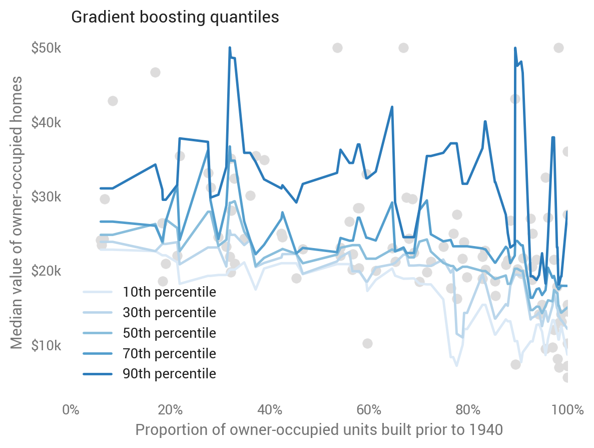
While not as jumpy as the random forests, it doesn’t look to do great on the one-feature model either.

Keras (deep learning)
Keras is a user-friendly wrapper for neural network toolkits including TensorFlow. We can use deep neural networks to predict quantiles by passing the quantile loss function. The code is somewhat involved, so check out the Jupyter notebook or read more from Sachin Abeywardana to see how it works.
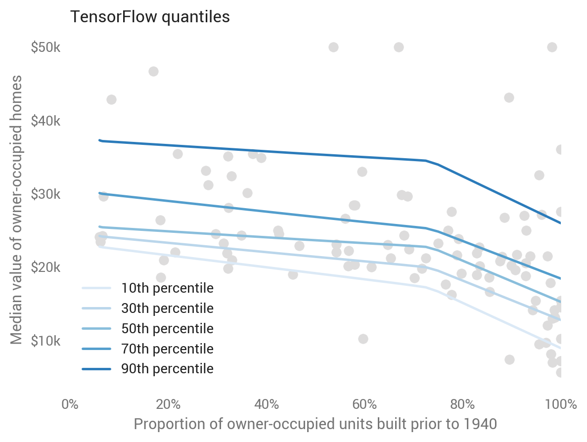
Underlying most deep nets are linear models with kinks (called rectified linear units, or ReLUs), which we can see here visually: Keras predicts more bunching up of home values for towns with about 70 percent built before 1940, while fanning out more at the very low and very high ends of age. This seems to be a good prediction based on fit of the test data.


TensorFlow
One disadvantage of Keras is that each quantile must be trained separately. To leverage patterns common to the quantiles, we have to go to TensorFlow itself. See the Jupyter notebook and Jacob Zweig’s article to learn more about this.
We can see this co-learning across the quantiles in its predictions, where the model learns a common kink rather than separate ones for each quantile. This looks to be a good Occam-inspired choice.

Which did best?
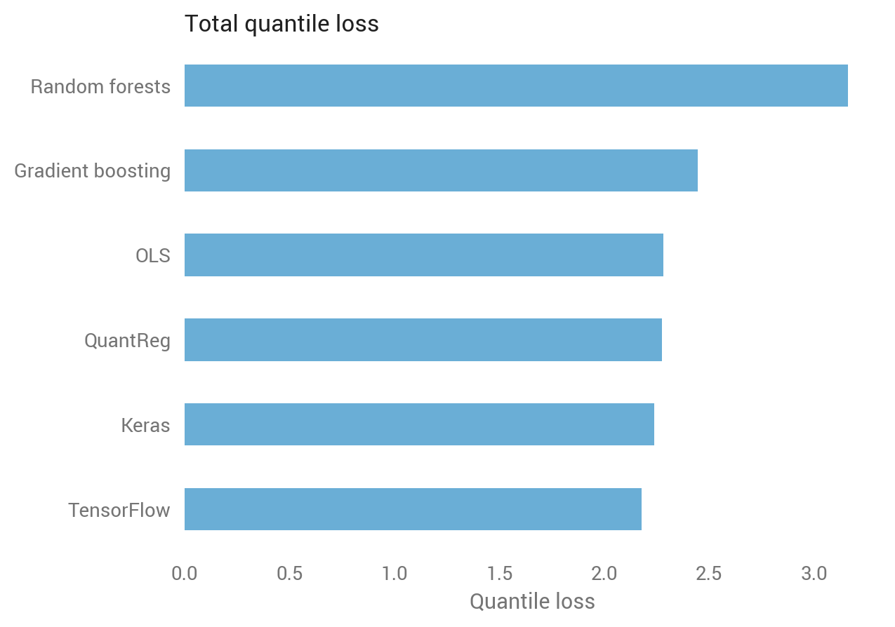
Eyeballing suggests that deep learning did well, linear models did OK, and tree-based methods did poorly, but can we quantify which is best? Yes we can, using quantile loss over the test set.
Recall that the quantile loss differs depending on the quantile. Since we calculated five quantiles, we have five quantile losses for each observation in the test set. Averaging over all quantile-observations confirms the visual intuition: random forests did worst, while TensorFlow did best.

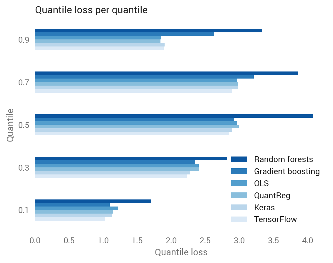
We can also break this out by quantile, revealing that tree-based methods did especially poorly at the 90th percentile, while deep learning did best at the lower quantiles.

Larger datasets give more opportunity to improve over OLS
So random forests was awful for this one-feature dataset, but that’s not what they’re made for. What happens if we add the other 12 features to the Boston housing model?


The tree-based methods made a comeback, and while the OLS improved, the gap between OLS and other non-tree methods grew.
