
A Tale of Three Buttons: Exploring React Native Styling
A Tale of Three Buttons: Exploring React Native Styling
Taking a broad view of styling in React Native.


The final solution of this article is available for download.
The Premise
Contrary to popular belief, one of the benefits of React Native is the ability to create a common user interface (not just common code) between platforms (IOS and Android
At the same time, you can see how one can come to believe that React Native applications strive to make them indistinguishable from other native applications on the same platform, .e.g., buttons look different across the platforms (but are consistent with buttons on the same platform).
With React Native, you don’t build a “mobile web app”, an “HTML5 app”, or a “hybrid app”. You build a real mobile app that’s indistinguishable from an app built using Objective-C or Java. React Native uses the same fundamental UI building blocks as regular iOS and Android apps. You just put those building blocks together using JavaScript and React.
A relevant use of a common user interface between platforms is enterprise (controlled group of users) applications. In this case, the value is that the enterprise can create documentation and training that is consistent between platforms. At the same time, the user has little expectation of consistency with their other applications.
With this in mind, the premise of this article is that we are striving to create a common user interface between platforms.
Fundamentals of React Native Styling
Next it is important to realize that despite the apparently similar patterns and syntax, styling in React Native is fundamentally different than web development. This is described well in series of two articles (a must read).
The biggest head-shifts were:
Styles being scoped to components rather than globally across the appStyles not cascading down to their childrenUsing JavaScript rather than CSS.
Development Platform
Before we can delve into the specifics of styling, we need to select our React Native development platform; based on the conclusion of the article, Untangling React Native Development, we will be using Expo.
Expo’s Quick Start documentation is fairly straightforward. Once Expo is installed, we create a new project.
expo init my-new-project
Observations:
- It is interesting / odd that Expo uses a custom version of the react-native packageinstead of the official npm distribution of react-native
- It is also interesting / odd that Expo relies on a global install in both initializing new projects as well as starting them
note: Working through a number of issues with Expo in writing this article, I started to second guess using it; seems like a safer choice is either React Native or CRNA (with Expo under the hood).
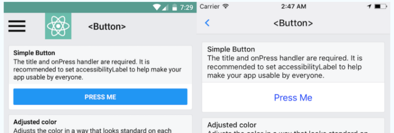
React Native Button
Our first attempt at creating a button that looks consistent across platforms is to use the React Native Button component and updating:
App.js
Observations:
- As Expo’s Babel (transpiler) configuration support class field declarations, we will use them for the handlePress handler
- As I was only using an IOS device during development, the screenshots comparing IOS and Android output in this article are from the web
As we can see, the Button component purposely looks different across the platforms; not what we are looking for.

Hand-Rolled Button
Our second attempt at the button is to use React Native’s TouchableOpacityandTextcomponents.
If this button doesn’t look right for your app, you can build your own button using TouchableOpacity or TouchableNativeFeedback.
— React Native — Button
note: TouchableNativeFeedback is an Android-only component; clearly not going to work for our cross-platform solution.
We update:
App.js
Observations:
- We have to extensively apply styles to create the button
- It was surprising to have to use the overflow style to prevent the background color from showing outside of the border corner (radius)
- We would also need to build in support for a disabled button state
While this approach takes a lot of work, we have a button that is consistent across the platforms.

NativeBase Button
After some research, one can conclude that NativeBase is a solid choice for a React Native component library; sort of like Bootstrap is for web development.
At 10k stars and over 1k forks NativeBase is a widely popular UI component library providing dozens of cross-platform components for React native. When using NativeBase, you can use any native third-party libraries out of the box and the project itself comes with a rich ecosystem around it, from useful starter-kits to customizable theme templates.
The first step is to install NativeBase.
Observations:
- There are no specific instructions for setting up NativeBase with Expo; but as CRNA under-the-hood uses Expo, the instructions for it will work
- The installation will generate warnings about not having the correct version of React and React Native; a little disconcerting but it does work
- After the install, starting the application will generate an error about React Native not being installed; the fix is to just run npm install in the project folder. A bit more disconcerting but it does work
- Finally, after re-installing React Native, starting the application will generate yet another error about Can’t Find Variable Self. The fix is to install an older version (2.0.4) of the npm library whatwg-fetch. A lot of disconcerting things here, but it does work
We then update:
App.js
Observations:
- Many of the NativeBase components, e.g., Text, require the Roboto and Roboto_medium fonts; will generate an error if the fonts are not already loaded
- As the fonts are loaded asynchronously, one needs to take special steps, e.g., using a loading state, to not render those components until the after the font is loaded
- Was surprised that one of the components, Container or Content, automatically handles waiting for the fonts to load before rendering its content, i.e., no need to use a loading state
With this approach are buttons are consistent across the platforms; only slightly adjusted to match the aesthetic of the platform.


Theming
Unlike web development, being moored by CSS, React Native is more of a wild-west of organizing styles into a manageable application-wide theme; as such there are number of patterns and libraries. One such pattern is to not share styles but rather share components.
One method we tried out for sharing styles was to compose React Native components into our own custom set of components.…In many cases though, creating custom components just for styling overrides seems like overkill, adding unnecessary complexity to your app.
Contrary to the concern of creating components simply for styling overrides, NativeBase takes this very approach. For example, we see that they expose a H1 component to represent a top-level heading (pretty much a simple styling thing; no functionality).
node_modules / native-base / src / basic / H1.js
Observations:
- While there is bit of extra complexity; this H1 component fundamentally just wraps the React Native Text component
- One bit of the complexity is that while NativeBase does not share styling between components, it does centralize the styling of components into a separate theme module; still maintaining an one-to-one correspondence between components and styles
- Another bit of complexity is that NativeBase does have a process to share variables, e.g., colors, between styles
The approach of sharing components (not styles) with an application-wide set of variables is both consistent with NativeBase’s approach and is a non-controversial solution to styling in React Native. Feels like a winner to me.
Wrap Up
Bottom-line, the approach to styling React Native application that I gravitated to is:
- Strive to create a common user interface between platforms; this is React Native’s core competency
- Use a React Native component library, like NativeBase, that supports creating such a common user interface
- Use the pattern of sharing components (not styles) with an application-wide set of variables; ideally well integrated with the component library in the project
Enjoy