
The stunning beauty of Chaos theory
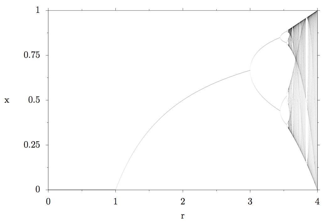
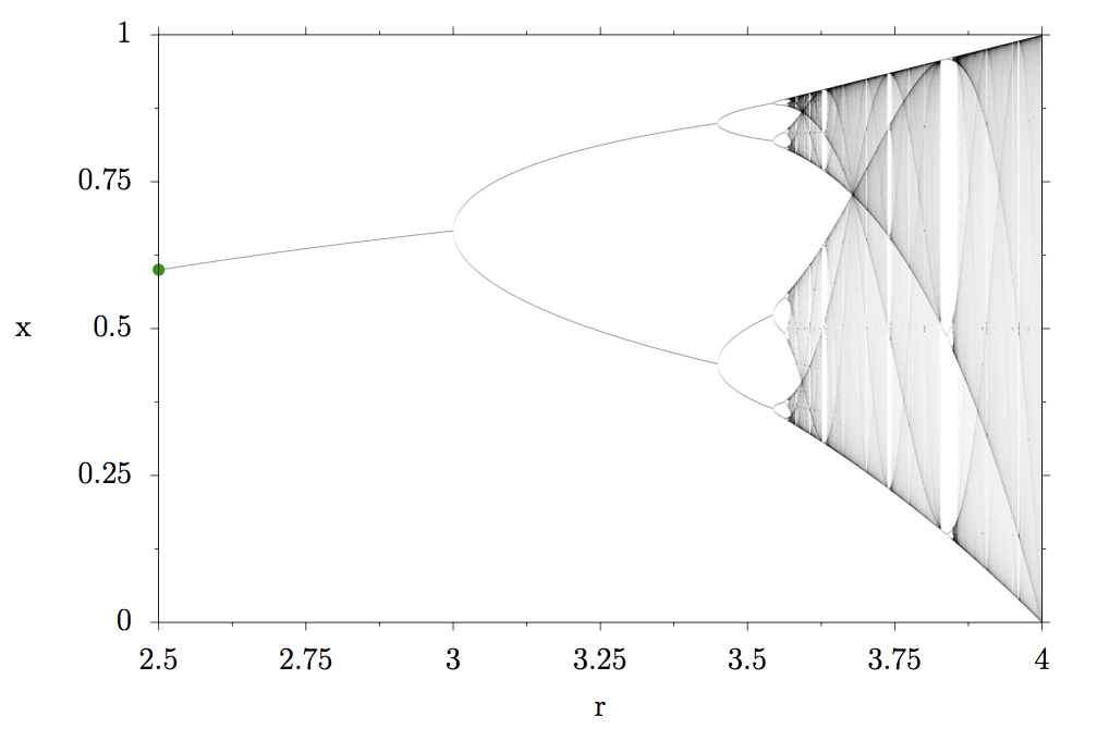
The title picture I chose for this article is a zoomed in region of the so-called bifurcation diagram of the logistic map (plot below). After reading the rest of this article, you will understand how to interpret this plot, one of my favorite ones from the entire field of physics :)


This is the equation of the logistic map. Don’t worry, we will look at it together.
The logistic equation describes a demographic model with two counteracting processes that govern the size of the population: reproduction vs starvation due to a limited food supply.
If there are no animals in the population x has a value of 0, and x=1 means that the population has reached its maximum size (due to limited food supply). r
The index i means population at time i, index i+1 means population at the next time step. This means that if in this model we know the rate of reproduction r and the current size of the population x_i, we can calculate the population at the next time step x_i+1.
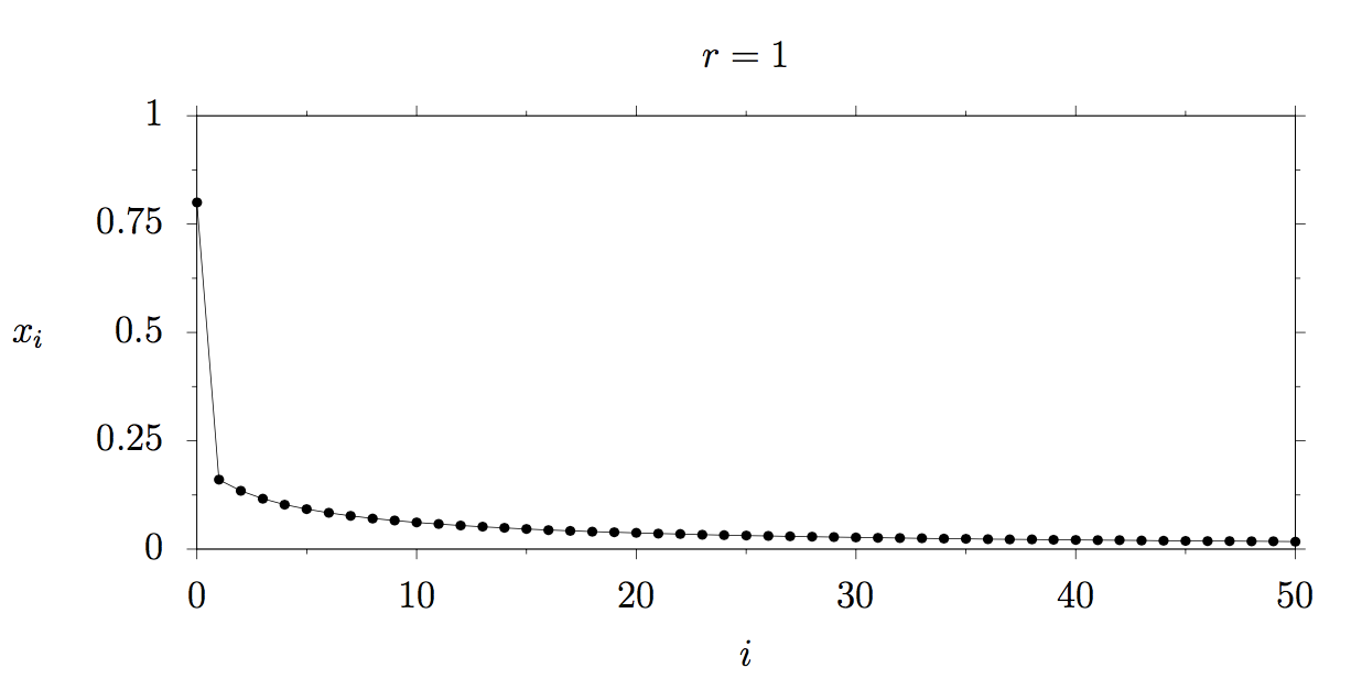
Let’s look at an example to make it more clear. We assume r=1

This means that our animal herd shrank from 80% of the maximum possible population to 16% because the animals did not reproduce enough and there was not enough food to sustain a population of x = 0.8.
- The 1 * 0.8 part describes the reproduction. The higher the reproduction rate (in this case 1), the higher the population in the next step. Here, the reproduction rate is 1, so in the next step, the result is still 0.8.
- The (1–0.8) part describes the starvation since the term r * x_0 = 1 * 0.8 is multiplied by a factor of 0.2 which means that 4 out of 5 animals starved. The closer the population x is to 1, the more animals starve. Thank god, it is just a model ;)
Let’s take a look at how this development continues. The following plot shows the development of our herd over time. What happens? The population x tends to 0 which means that the animals did not reproduce enough and eventually died.

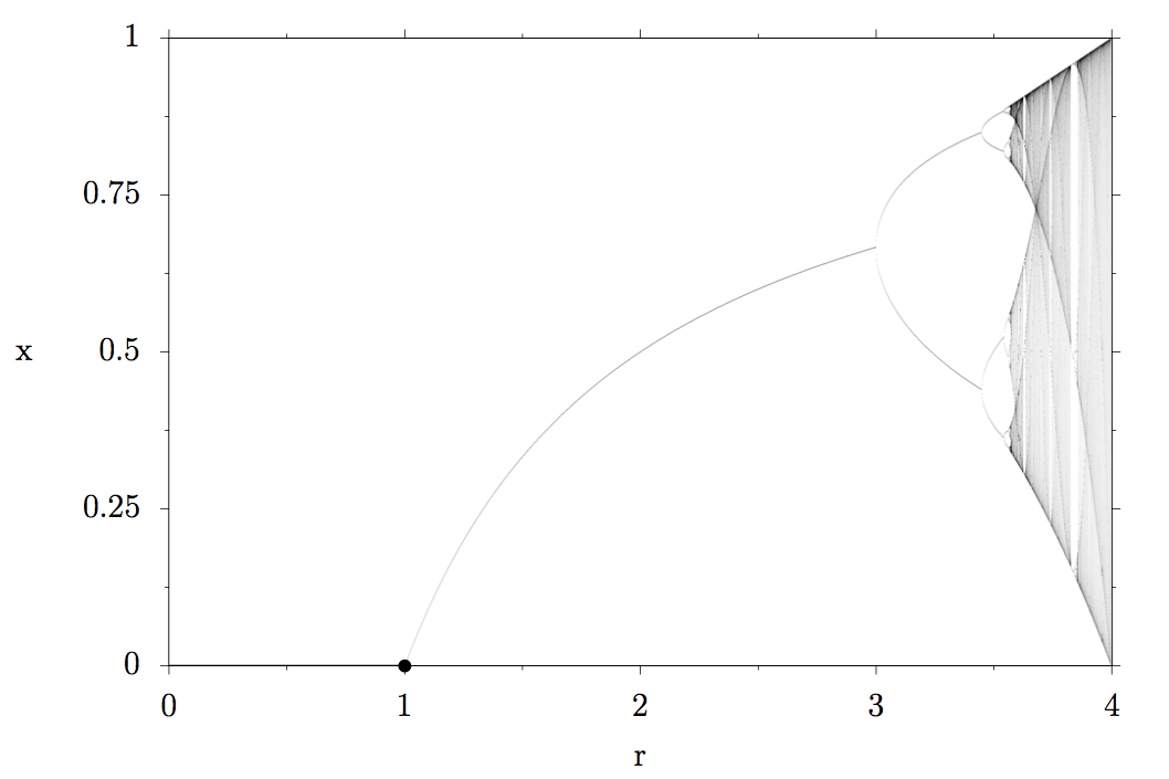
Let’s mark the result x=0 for a reproduction rate r=1 in the bifurcation diagram with a black point:

Let’s see what happens at larger reproduction rates for instance r=2.5:

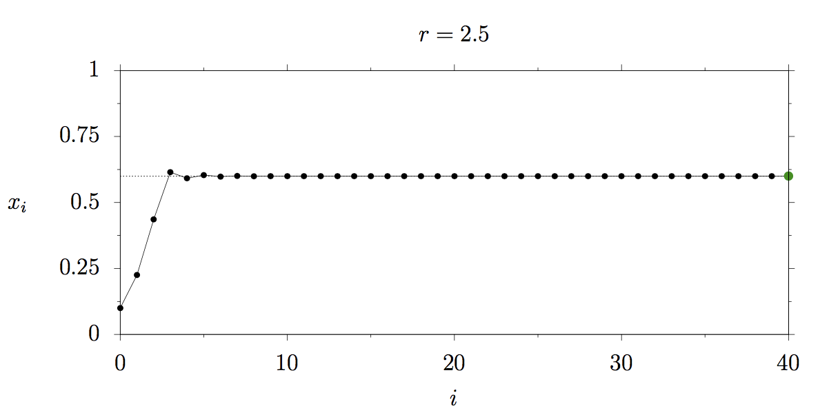
The size of our herd quickly rises to around 60 percent of its maximum possible size and then stays constant. This is called a fixed point of the system. The fixed point does not depend on the initial value of x but only on the reproduction rate r. Let’s mark r=2.5 and x=0.6 in the bifurcation diagram with a green point:

We increase the reproduction rate to r=3.25. The following plot shows the development of the herd: You can see that the population starts oscillating between two population sizes! Why is this happening? At the larger population size there is not enough food for all the animals in our model, some of them die. Then there is enough food for the remaining animals. But once they reproduce again, there is not enough food for all of them and some die and so on and on…

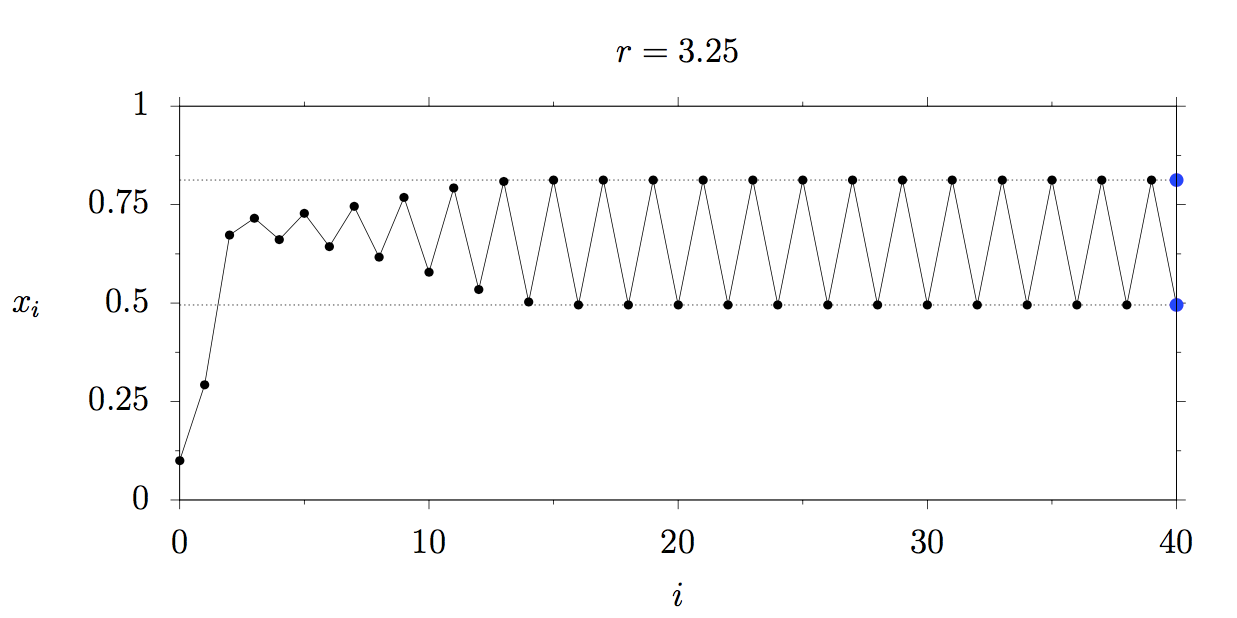
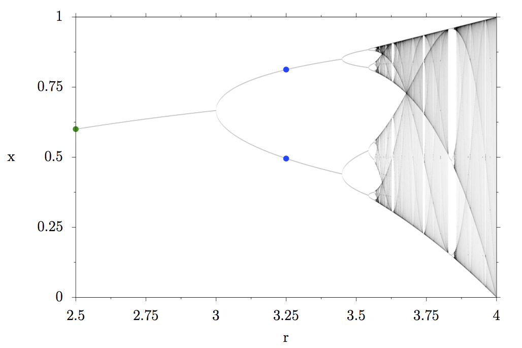
The green fixed point splits into two, physicists say the period doubles. Let’s mark the two new fixed points of the system with blue points at r=3.25:

Can you guess what happens next, if we increase the reproduction rate any further? The two blue fixed points split into four. The size of the herd is now oscillating between four fixed sizes.

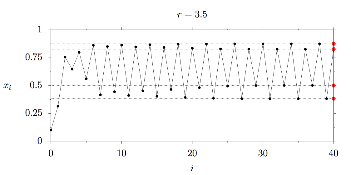
Let’s mark them in the bifurcation diagram:

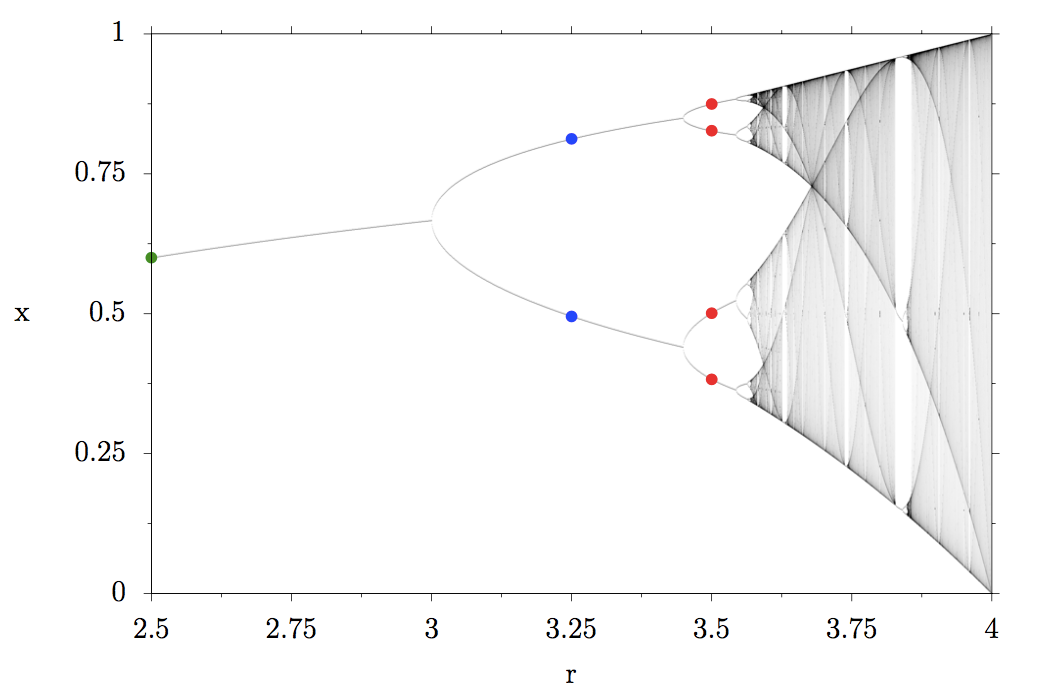
What we are observing is called a period doubling cascade: the four fixed points become 8, 8 then 16, 32, 64 until infinity. At the end of the period doubling cascade, chaos starts. Instead of discrete fixed points that the population size can take or oscillate between, entire regions are marked in gray in the bifurcation diagram because the population takes all those values, the darker, the more often those values occur.
If you look at r=3.75 for example, the grey region starts at x around 0.25 and goes up to around 0.9, meaning that the population constantly varies between those values.
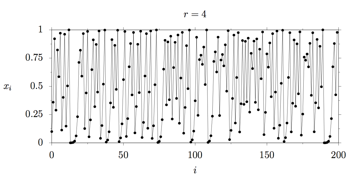
The plot below shows how our herd behaves for r=4: the population varies absolutely chaotically. If you would numerically calculate this development several times, you would find, that slightest variation in the initial population (for example due to limited numerical accuracy) yields dramatically different results over time, which is the main characteristic of chaos.

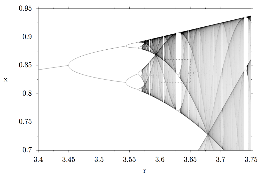
So far so good, but if you look closely at the chaotic region, you can see that within the gray, there are white stripes. What do they mean? Well, let’s take a closer look and zoom into the dashed rectangle!


That looks very similar to the previous plot, right? Let’s zoom in even further into the second rectangle.

What do you see? Left to r≈3.625 there is only chaos. The system can take all values marked in gray. Then, all of a sudden the chaos stops and a single fixed point emerges! These white regions are sometimes called islands of stability. Then the same thing happens again, the period doubles once, twice, …, period doubling cascade, onset of chaos.

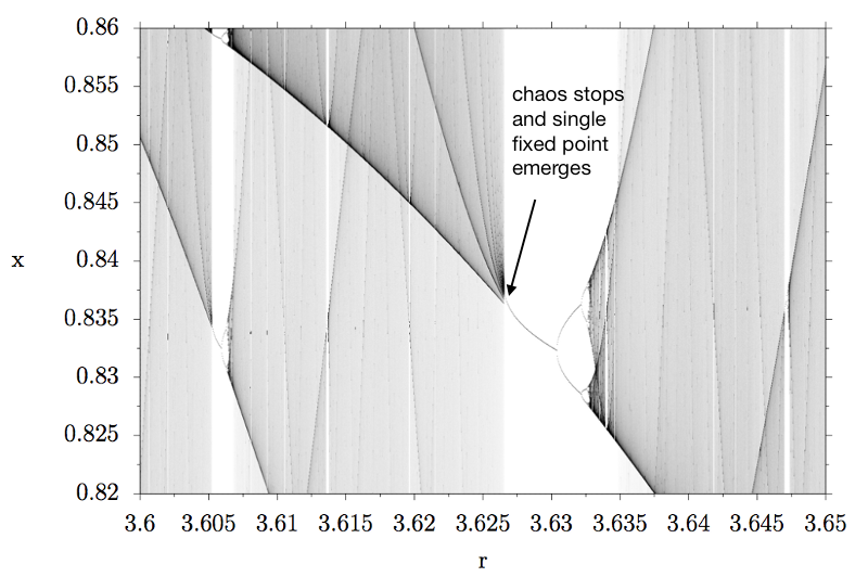
If we would zoom in even further, we would find the same thing again: islands of stability within chaotic regions. Period doubling cascade, onset of chaos. Zooming in, more islands of stability and more period doubling cascades and more chaotic regions…
This absolutely blows my mind. It did the first time I learned about this and it still does years later. And all this complex chaotic behavior from such a simple model!
I tried to create an animation that shows this so-called self-similarity. While watching it, look at the flickering white islands of stability and the period doubling cascades found everywhere.