Using Color Psychology to Accelerate Your Web Designs
Using Color Psychology to Accelerate Your Web Designs


A website is a good marketing strategy for any brand as it helps in commanding authority in the market and boosting reliability among customers.
But a website that is poorly formatted and is not visually appealing is not likely to perform as anticipated.
Visitors would simply pass the website as their eyes wander over the content of other websites that catch their attention. You will fail to engage them and they will miss out on the purpose of the website.
Consequently, it would result in fewer sales for your business.
A web credibility research study from
Potrivaev, who has over eight years of web design experience and currently teaches people his skills, also affirms that “the visual appeal of a website plays a huge role in the first impression a visitor determines from a brand.”
And what better way to boost the visual appeal of a brand than the use of color?
Web designers, mobile app designers, and other people who are out to build strong brands need to understand the color psychology behind impressive designs.
Understanding Color Psychology
Color plays a big role in brand marketing. Customers tend to connect with different brands and take certain actions based on the colors portrayed by a brand.
Good color aesthetics will stir up positive emotions in potential customers and reinforce the brand message.
On the other hand, a website with the wrong colors is visually unappealing and does not connect with visitors. It fails to boost the customer’s confidence in the brand image and the clientele may end up taking business elsewhere; to a more appealing brand.
A brand’s color combination will either make it or break it. It influences how customers relate to your brand and the message they draw from it.
It is therefore vital that you choose the best color combinations through which your business will convey its message.
So, how does the use of color impact your ability to come up with an impressive design?
What are the key drivers?
1. Know Your Audience
This will help you to come up with visually pleasing content that appeals to that particular group of people.
Who are your potential clients? Children? Women?
What are their preferences? What are their age groups?
Different clients respond differently to web color designs.
For example, if you are running a data science website, then more authoritative colors could do your brand a lot of good.
Your website’s color scheme should relate to the potential clientele.
2. Inspire User Experience
The psychology of color’s main purpose is to influence customer behavior. Therefore, it is imperative that you determine which direction you would wish your users’ experience to sway.
Once you understand how to impact your audience and the emotions to stir up in them, you can then settle for the best background color for website.
However, it is key to look at this from the branding perspective, as well.
Will the colors blend in well with the brand you wish to build?
Do not let user experience override your branding activities.
3. Understand the Need for Color
Or lack of it.
Understanding why a certain color is preferable over another is vital. The prevailing conditions should guide you on the best choice of colors to use for a given web design.
For instance, to convey a feeling of maturity, calmness, and dependability, the color blue is the best bet.
But not all designs are impactful with the same color. Build your web designs depending on the prevailing need and the feelings you wish to create.
The absence of color can also sway a customer’s behavior; with the use of the color white creating a feeling of space and allowing particular items to stand out.
With the knowledge that color meaning in web design plays a big role in attracting customers, it is necessary that you understand how to come up with the best color combination.
Color Mixing Methods
Knowledge about the various color associations assists in combining the best colors to help your design convey the intended message.
Here are some of them:
- Red — Excites and stirs passion. It is loud.
- Yellow — It is cheerful and friendly. A favorite with children.
- Blue — portrays a sense of maturity, dependability, and trust.
- Purple — offers a feeling of elegance, luxury, and femininity. It is a hit, especially with women.
- Orange — It is friendly and reflects rejuvenation. It is youthful and fun.
- Pink — It is feminine. Gives a girly feeling and is associated with babies.
How to choose color combinations for website will largely depend on the the current trending colors among enthusiasts.
Your choice of best design and brand colors can be achieved in the following ways:
a. Color Vibrancy and Complementation
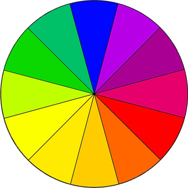
Also referred to as triadic, this method mixes colors based on complementation and vibrancy. It is the most basic way of mixing colors as they are on the color wheel.
Simply, choose colors that are at least 120 degrees apart and combine the colors for content and background. You can use a third color for navigation.


b. Experimentation or Split Complementation
This method focuses on experimenting with compound colors.
For example, four compound colors can be achieved by combining two colors that are lying next to each other on the color wheel with two other complementary colors that are lying opposite each other on the color wheel.
This method requires a lot more effort as colors are mixed on trial and error basis.
c. Using Complementary Colors Only
This method is analogous and can give an exaggerated color combination.
Caution is key when deciding on the color scheme since the chosen colors can appear with extreme vibrancy.
This method is mainly focused on complementary colors only.
Final Thoughts
Although you should be keen on using the right color to come up with the best design for your website and other online properties, the brand personality must not be lost.
The choice of colors should match the brand and boost its meaning and story.
As a designer, do not restrict yourself to choosing colors simply because an existing logo or artwork has different colors.
Instead, learn how to use color psychology appropriately to accelerate your designs. It will help you create a lasting and productive impression.

This story is published in The Startup, Medium’s largest entrepreneurship publication followed by +369,518 people.

