A Critique of the User Interface and Experience of VSCO
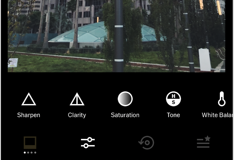
However, even though a major problem of VSCO’s platform is having too simple of a platform, the editing page does a good job of incorporating learnability, memorability, and affordances. One editing the picture, though the symbols still are the main focus, there is small text underneath that indicates what each button edits. This maintains focus on minimalist qualities, yet allows new users to play around with the editing features.


The other main feature is photo capturing (ie. flash, grid display, white balance, etc.). However, this feature has poor learnability, since the symbols are non-universal, minuscule, and have no text explaining what each adjustment is. Even when the user clicks a button, the window that pops up doesn’t explain any more about the purpose. It becomes very inefficient to edit images, since the user has to click through several and randomly adjust settings to get a sense of what the image does.


Overall, VSCO has poor learnability and few affordances, not only due to its simple design, but also because elements of the page are not where most users expect. The photo editing requires several steps to get to making it very inefficient, a user’s list of followers/following is under the ‘discover’ page, and notifications are hidden in the corner.
