
A curiosity in 2018 Kerala floods
A curiosity in 2018 Kerala floods
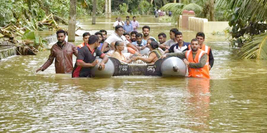
Kerala floods of 2018 was the second worst flooding after the flooding in 1924. Million people were evacuated, more than 480 people died and 14 went missing. Government declared it as Level 3 Calamity or “calamity of a severe nature”. It was the first time in the history of Kerala that 35 out of 54 dams of Kerala were opened. Causes of this flooding were heavy monsoon rainfall, and deforestation. 17 years ago, ecologist Madhav Gagil had submitted a report on the biodiverse Western Ghats, which is also a part in Kerala. In that report, he had warned about ecological destruction and extreme weather events would happen soon and cause a great disaster. He stated this flood as “man-made calamity”.

But I was curious about: were there any other factors that also made an impact on the flood. The factors I thought were land elevation, flood and rainfall trends. To find out, I used data visualization, which tells more insights through graphic visuals, like chart, picture etc. than reading bunch of data of values, which creates confusion and difficult to grasp. The reason I chose data visualization was:
I need data on rainfall and flood that occurred in Kerala from a range of years. From the amount of rainfall and time, I could get the rainfall trend. Rainfall received is the actual rainfall and rainfall departure is the excess rainfall received.
For land elevation, I need data on Kerala’s district, city or taluk elevation above sea level, their latitude and longitude & a map of Kerala to visualize this, otherwise it is just a form of graph and doesn’t shows the variation of elevation by cardinal direction.
With these data itself I can even create another relation between the place and rainfall, elevation and rainfall, which in form graphic visuals gives more information (a possibility that can be new one that is not known to me before). So it’s going to be a large amount of data.
I gathered the data on districts where flood happened, start & end time of the flood from EM-DAT — The international disasters database; latitude, longitude & elevation of the districts from Wikipedia and rainfall data from Customized Rainfall Information System (CRIS). I could only get places as districts of Kerala, the map was obtained from deldersveld and geohacker, which had resolution upto taluk.
I used Tableau as a tool for visualization the data. There are other powerful data visualization tools like Vega-Lite, d3.js, Flourish, p5.js etc. Tableau and Flourish doesn’t need any code to process where as Vega-Lite, p5.js, d3.js requires coding. Each data visualizing tool has its own limitations and advantages. Tableau is simple, flexible and requires less time to learn and get output.
The reason why I downloaded the map in a special format ( json / geojson ) than downloading it as an image was — any data visualzing software doesn’t recognize a place directly, they have to be specially named and formatted and they will come with location parameters & polygons or shapes that gives a definite shape of the district or map. Nowadays data visualizing software allow us to tag places by pincode, which is more accurate than latitude and longitude.
I downloaded Tableau Public, which is free, but you will require internet while using it because the files are saved in server and not in local PC or laptop. At the same time, I was deleting unrelated data, e.g. when I got the flood data from EM — DAT, there is no filter for district or state, so I have to download as floods of India from a range of years. After downloading the file, I opened the file and started deleting floods that are not related to Kerala. After rearranging the data, I uploaded to Tableau Public. The file format can be excel ( xlsx or xls ), csv, json and popular data file formats.

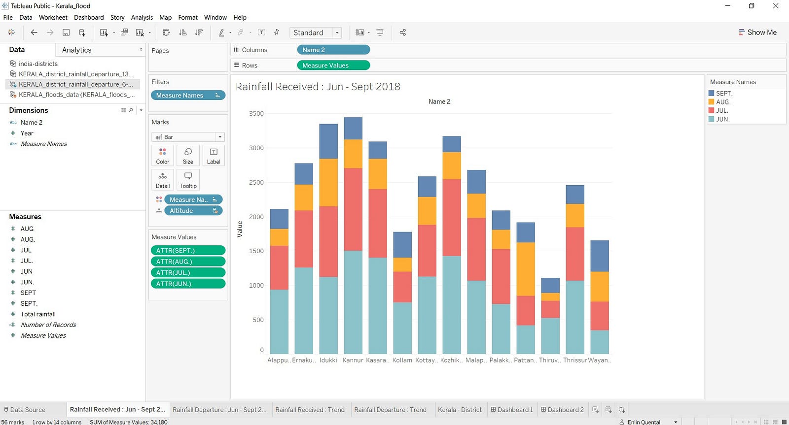
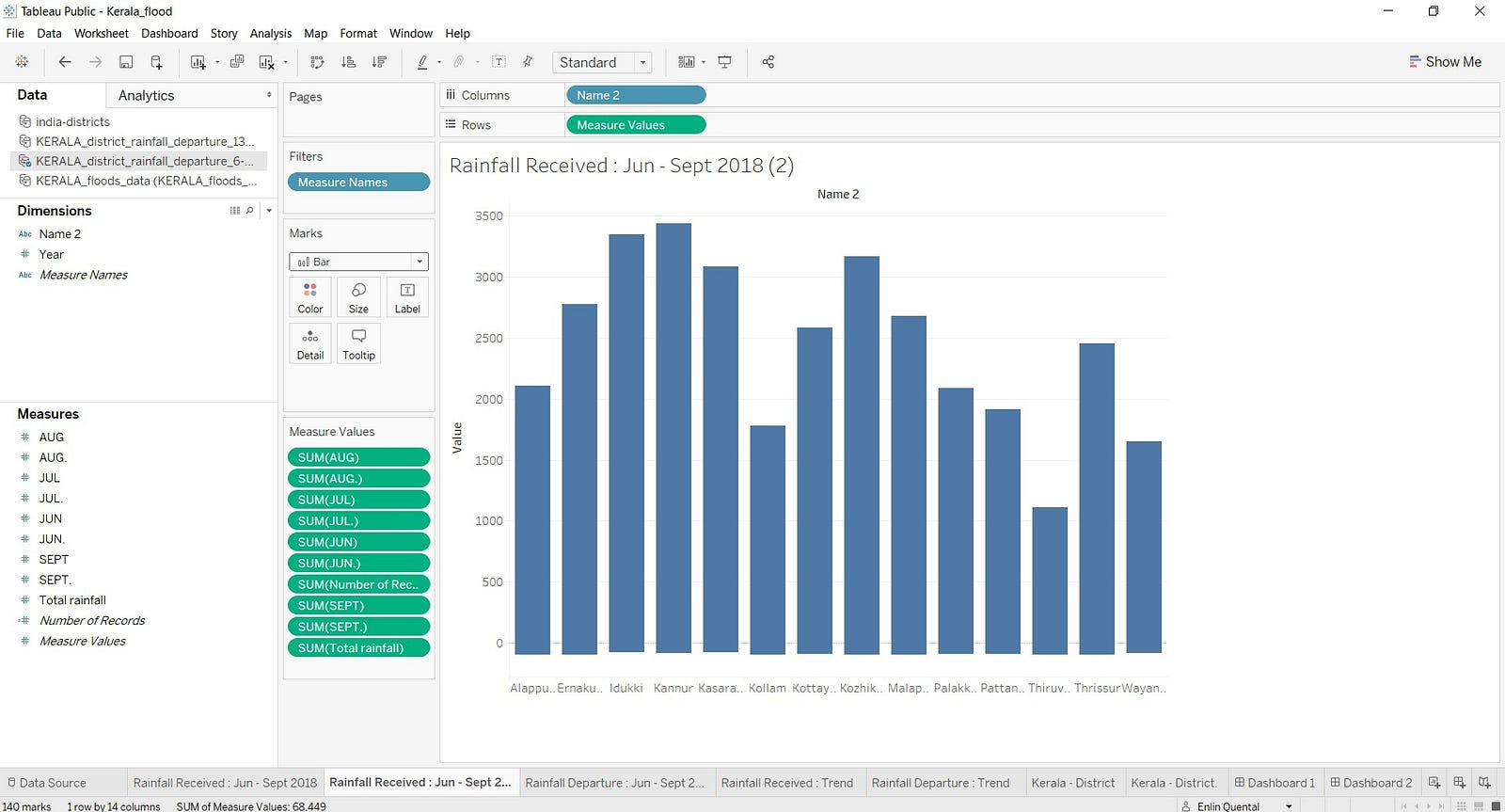
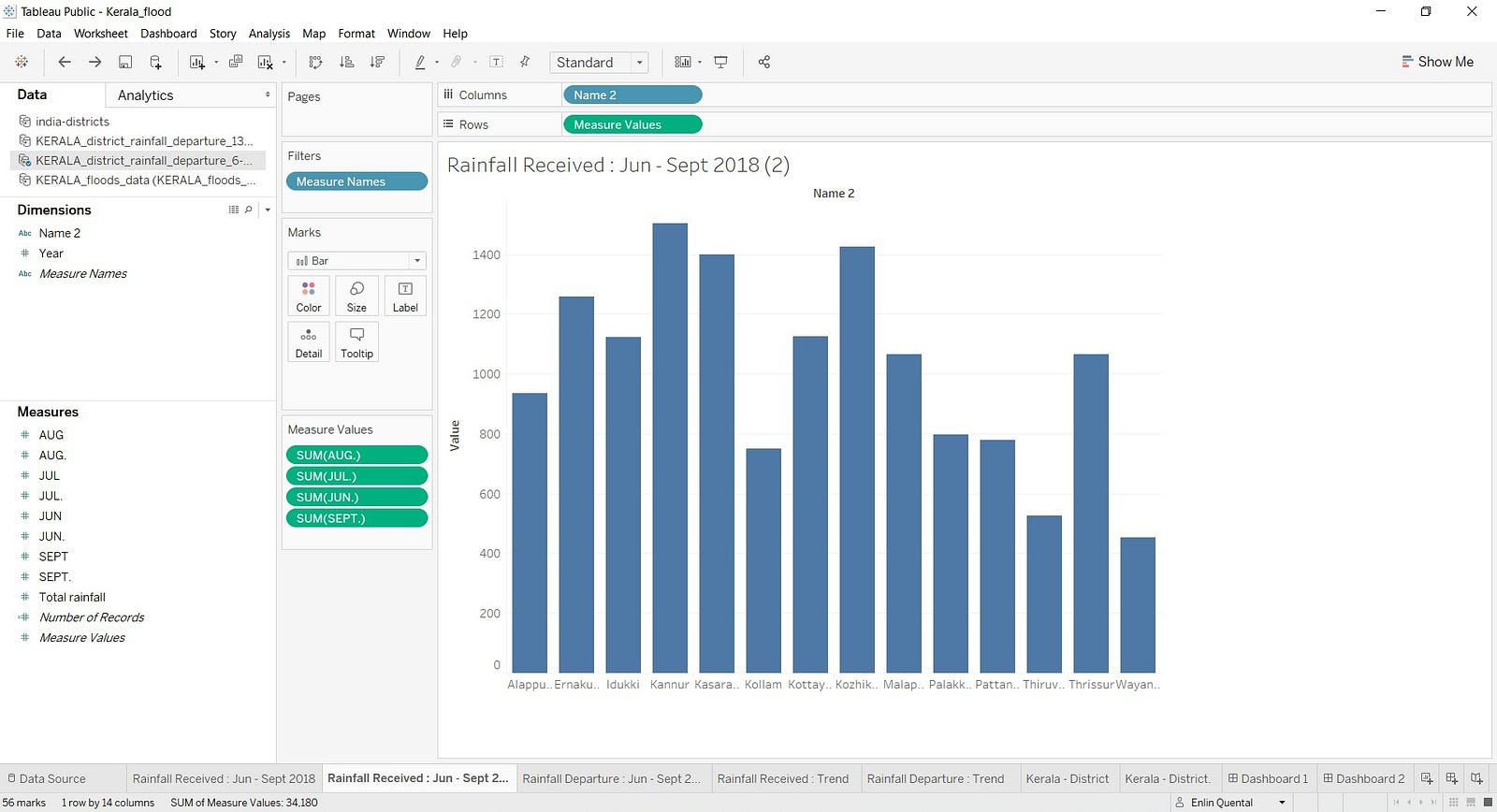
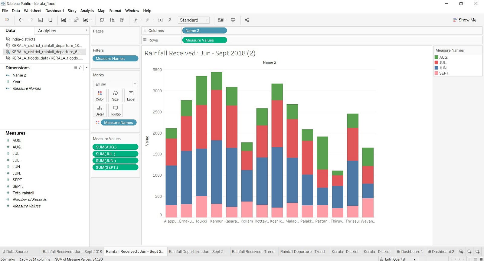
Tableau comes with features of sheets, dashboard and story. Sheets work similar to sheets in Microsoft Excel, where you create one type of data visualization, e.g: I created a sheet for rainfall received from June to September which shows a graph of the same. Now I refer the uploaded files and Tableau gives me instant values for dimensions and measures automatically. So drag and drop the specific parameter to column and rows for the chart or graph, which helps in creating it. From the example I mentioned before, I will refer the file of rainfall received and Tableau gives me dimensions : district name, year & month and measures : month, measured values & total rainfall. I dragged and dropped district name to column and measured values to rows, thus creating a bar graph.


To visualize the amount of rainfall occurred each month, I dragged and dropped measured names ( months ) to marks, thus dividing each bar by size according to amount of rainfall received by a month.


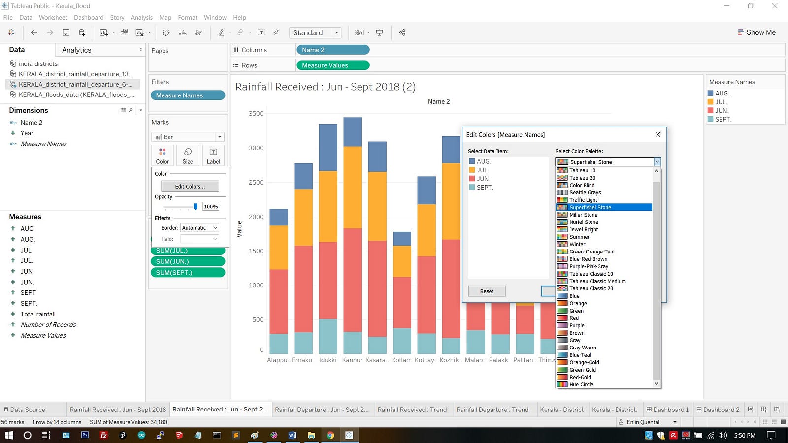
As I had 4 different files, I had to be very careful with the names of column parameter and variables, so as to link them together. I uploaded the map file and filtered it out to show Kerala districts. Now I have put the values of elevation of districts on the map. For that the names of the district and its column title has to match with names of the district and its column title of other files. If you are a beginner to Tableau and don’t want to mess up with names and creating relations, better compile all the data into one single file. This will help you create interactive dashboards easily.
Dashboard lets you add and organize your created graphs, maps & other visuals into one area. There it will add more interactivity between the visuals, e.g. clicking a district gives focused information, which affects other data — elevation, rainfall received and flood information — mapped to it to focus and give more details. Stories lets you create a story for the work you created, embed the graphs, pictures, dashboards and share it with others. For e.g. the narrative that I am sharing through this article can be done in Tableau stories.

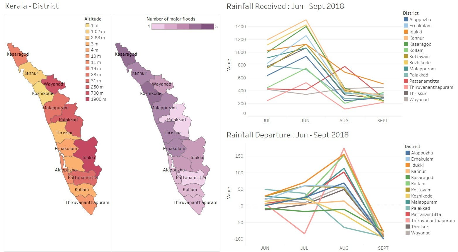

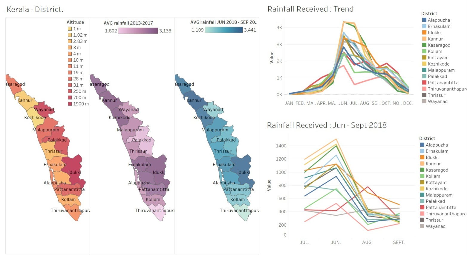
After creating the necessary graphic visuals, I found that rainfall trends are almost same for all years, difference is the amount of rainfall received each month. Even comparing trend and 2018 rainfall received are similar. If we compare average rainfall received from 2013–2017 and June –September 2018, it shows the average rainfall was showered in just 4 months. Comparing rainfall and elevation of districts are same. There are valid reports saying the dams were released when water almost reached the height and they were released suddenly. Some reports says KSEB ( Kerala State Electricity Board Limited ) was waiting for dams to be filled with water to store energy. Altogether it can be concluded that it is a man-made disaster and Madhav Gagil’s report is valid. Government has now barred the construction of buildings on area affected by landslides and with plans of reforestation and less quarrying.
Link to my tableau public dashboard on Kerala Floods :
Use legends of districts to filter out entire dashboard.