
These 6 changes doubled the revenue for a national beauty brand’s website.
These 6 changes doubled the revenue for a national beauty brand’s website.
One day I receive a phone call from Tropic Isle Living.
They‘re experiencing problems stemming from their website, which also functions as an online store. They sell their products through many channels, but their website is the face of their brand and it’s due for an overhaul. They have learned about my consulting work thanks to a recommendation from a happy client.
They fly me to their headquarters where we work together to identify 6 main problems. The issues stemming from the website impact other parts of their business, so making the website easier to manage is the primary objective. We decide on a platform migration from WooCommerce to Shopify, and a redesign. Soon after, I‘m directing their marketing, design, and tech leads as we work to complete the project. Our final implementation ends up generating twice as much monthly revenue for the website.
PULLING A 2X
So, what design decisions ultimately lead to my client getting twice as many sales on their brand website? Here are the problems that we identified, and the solutions that we ultimately implement to address them.
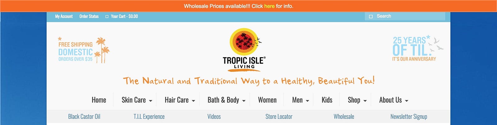
PROBLEM 1: THE SITE NAVIGATION GIVES YOU EVERYTHING ALL AT ONCE.
Symptom
There are a lot of links in the navigation area.

Why it matters
When you give people a lot of options you give them a lot of decisions to make. It adds undue cognitive load.
Prescription
Be more discerning and opinionated about the navigation. It’s fine to have a lot of options, but minimize the initial categories.
Implementation

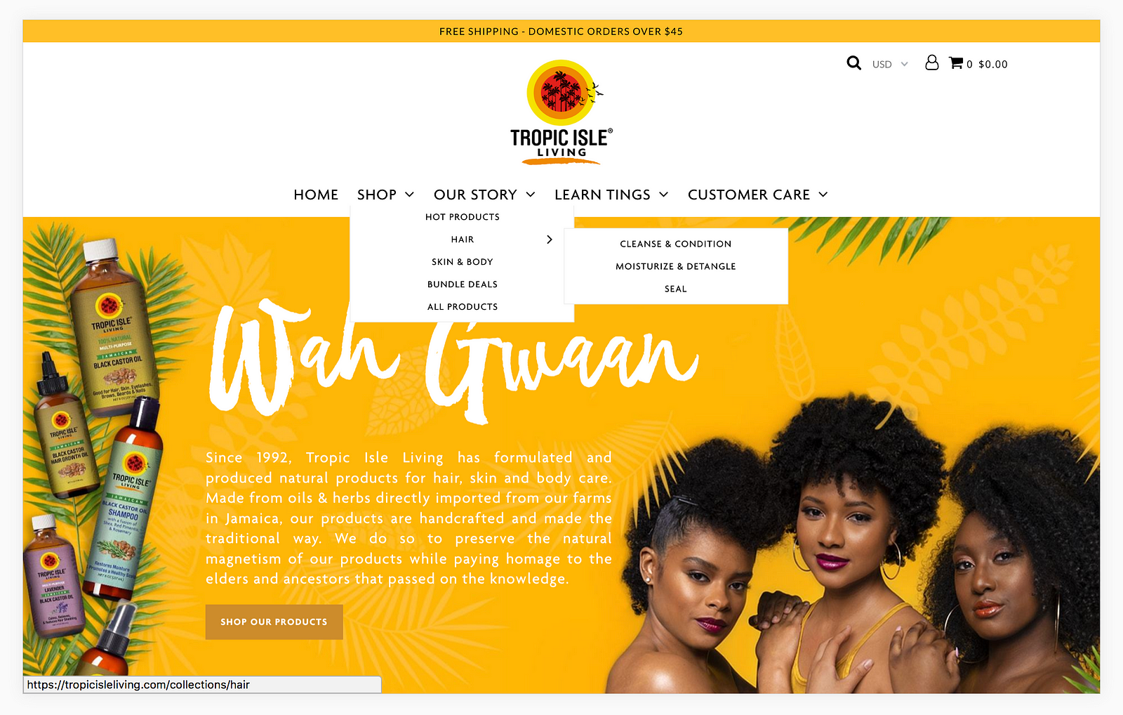
We go with a 3-level navigation. This removes some of the initial clutter, and also translates well to mobile, where there’s less real-estate to work with. We expect visitors to be here to shop, to learn about the company, or for customer support.
Hypothesis
There should be some indication that users are getting to their destination with less hopping around.
Results
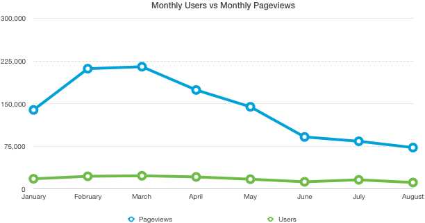
The new site receives twice as many sales with the same number of users and with less page-views. This suggests that the users are having an easier time navigating to where they want to get to. Or, they’re being nudged along better.

PROBLEM 2: THE PAGES LOAD SLOWLY
Symptom
Pages are sometimes taking longer than 10 seconds before you see something on the screen.
Why it matters
A slow page-load could be leading to unnecessary drop-offs and lost sales. The average person on the web is pretty impatient. We like instant gratification and fast web pages.
Half of the visitors on this site are first-time visitors. These visitors experience an even slower first-time visit, since none of the site’s data is in their browser’s memory cache. This site serves 200,000 pageviews per month, so even a small drop-off can be meaningful.
Prescription
The prescription is to make the pages load faster. First meaningful paint should occur asap, but take no more than 3 seconds. We need to increase server performance, compress images, double-check all the javascript libraries we’re requesting, and maybe use a CDN.
Implementation
This site is a self-hosted woocommerce site. We can increase server performance ourselves. But the CEO opts to move their site to Shopify. A platform migration is tricky, as it requires moving all the products and customers over, handling redirects, etc. But on the plus side, Shopify manages the servers so it results in less maintenance work for my client.
Webpages with excessive resources tend to be a reason for slow page loads. I work to ensure that external resources are kept lean.
We also reduce image sizes, while keeping them looking great visually.
Hypothesis
We should see a significantly faster website with these adjustments.
Results

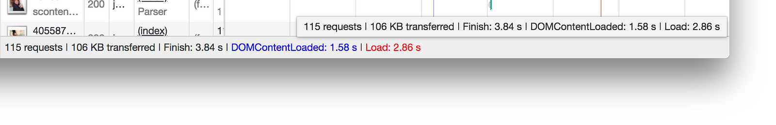
The load times are now clocking in around 2.8 seconds on a mobile LTE connection. For an image-heavy landing page with lots of products to load, that’s not bad.
Image file sizes are 80% smaller on average, while remaining visibly the same.
PROBLEM 3: THE CURRENT CHECKOUT PROCESS IS OVERWHELMING
Symptom
When you visit a product page, the product description is very long. You have to read the whole thing to find basic information you’re looking for, such as ingredients. Also, the checkout form gives the user everything to fill out at once.
Why it matters
This could be leading to dropped carts. You don’t want to add friction when a user has buyer-intent. Helping them get to the information they want can mean the difference between an item in the cart and an item skipped over. In addition, long forms are intimidating.
Prescription
We need a simple, clean, product page.
For checkout, we shouldn’t have long forms. We should use a pagination strategy, since it makes filling out the forms less overwhelming. But we have to be careful not to have too many pages, either. It’s a careful balance between page-count and form length.
Implementation
We simplified the product pages by organizing what was previously long descriptions into tabs:

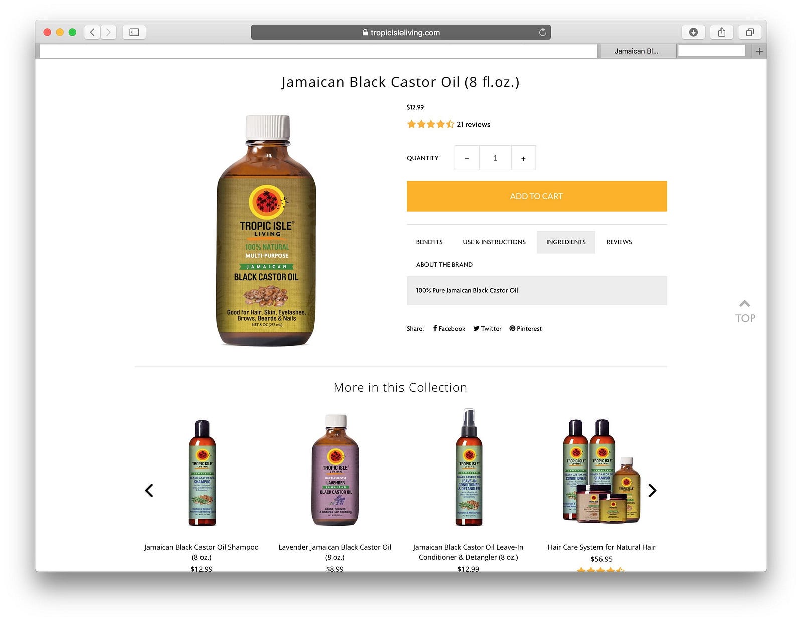
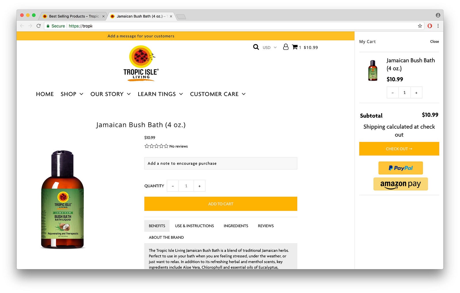
It’s easy to add items to cart and see the cart:

As for the checkout, Shopify has quite the optimized checkout flow. Their checkout flow is paginated, and it looks professional.
Hypothesis
There should be less dropped carts.
Results
It’s likely that part of the revenue increase was due to a simple & clean product page, and a less-intimidating checkout.
PROBLEM 4: STALE CONTENT
Symptom
The content from brand ambassadors is engaging. But when you return, it’s all stale, since you’ve already seen them all.

Why it matters
17–18% of visitors are returning visitors.
When a visitor looks around the site, there’s nothing they haven’t already seen before. It’s not very engaging. It wouldn’t hurt to make the site more engaging.
Prescription
Make every visit engaging by keeping content fresh.
Implementation
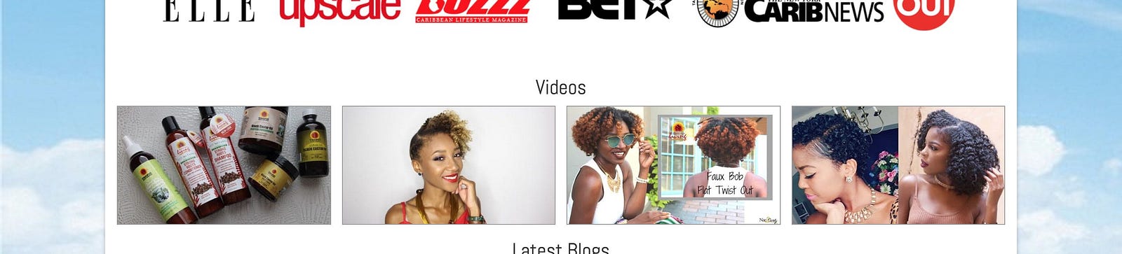
A constant stream of fresh image content via instagram.


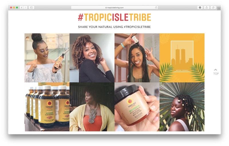
Tropic Isle Living has a very active instagram. Every image looks fantastic, and there’s always new content on there, both from the company and from happy customers. A quick way to address the stale content problem is to just feed the latest posts from the instagram feed onto the website. So we add an instagram feed on the website.

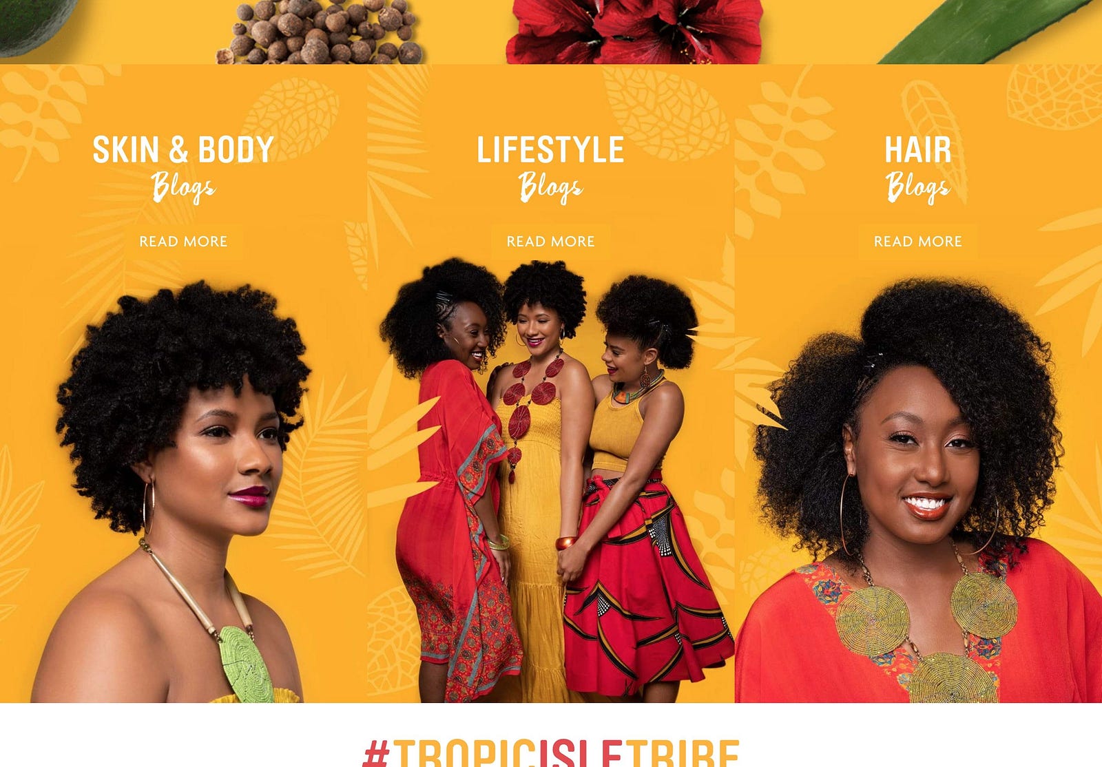
We also renew the blog and begin to implement a posting schedule. To represent the blog, we go with some on-brand cover images. There are Skin & Body blogs, lifestyle blogs, and hair blogs.
Hypothesis
There might be an increase in returning visitors.
Results
Three months in, nothing has changed about the returning visitor percentage yet. It’s still the same 17–18% as it’s always been.
However, qualitatively, the instagram feed makes it so that there are always new happy faces and interesting photos to greet a returning visitor. The webpage feels more alive. The website now better-reflects how active the brand is.
PROBLEM 5: THE BRAND STORY IS NOT READILY APPARENT
Symptom
What’s so great about Tropic Isle Living?
There’s lots of great things about TIL. They’re the ones who pioneered Jamaican black castor oil (JBCO) in the US. They have their own farms in Jamaica, and they use about 30 different natural ingredients in their products. They have a unique way they roast their castor beans, which is part of what makes their oil so highly recommended. They have a commitment to not using fillers or harmful chemicals.
However, this stuff doesn’t really come across very quickly on the website.
Why it matters
In a crowded market, you need differentiation. What makes you so special? Why should I do business with you? We’re going through a phase right now where more and more people care about the story behind the brands that they do business with.
It makes a difference in the eye of the buyer.
Prescription
If it makes you better than the rest, don’t make the visitor have to discover it. Tell it to the visitor, in bold, on the front page, like it’s today’s headline. But don’t write an essay. Put just enough on the front page for the user to decide if they want to read more.
Implementation

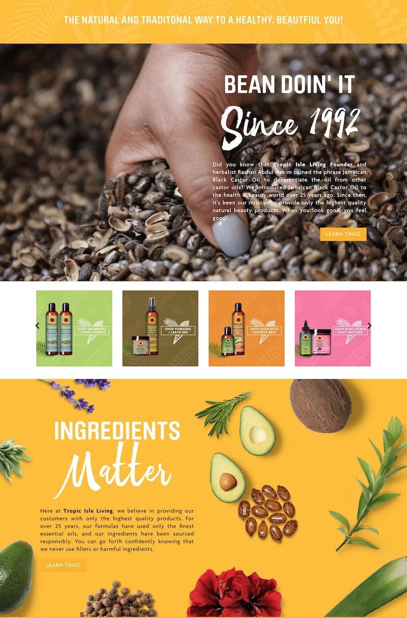
This is one of those cases where a design goal is actually to be pretty. We put what they’re about on the front page. And we spell it out, in bold. We use whitespace and imagery to drive that message through.
Hypothesis
More people will come to understand the values of Tropic Isle Living.
Results
This one is also qualitative. You don’t have to go any further than the home page to begin to see Tropic Isle Living’s story. I ran this one buy some critics and they felt that the new layout was stronger, and did more good for the brand. I’d love to hear what you think.
PROBLEM 6: MANY PRESS ARTICLES AREN’T LISTED
Symptom
The company gets good ink from big name national media such as Forbes, Black Enterprise, and Essence, and beauty industry thought-leaders. They show just a few logos on the home page, but they have a lot more features, and there’s no place on the site that highlights these features in detail.
Why it matters
Although the brand has loyal customers, every day there is someone learning about them for the first time. We live in a world where, sometimes, what others say about you can mean more than what you can say about yourself. Endorsements are a force of nature. A single endorsement can shift the outcome of an entire election. In business as in politics.
Prescription
Collect all the great press they’re getting and showcase it.
Implementation

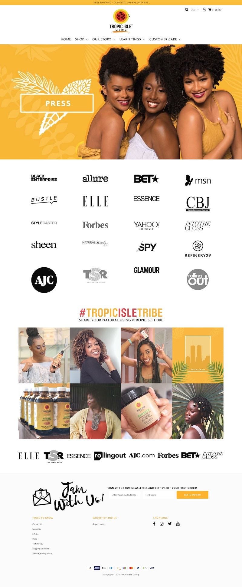
We give the site a dedicated press page. Each press feature is presented by its respective company’s logo on a grid. Clicking on the logo for any company reveals the article in a pop-up as a scroll-able image:

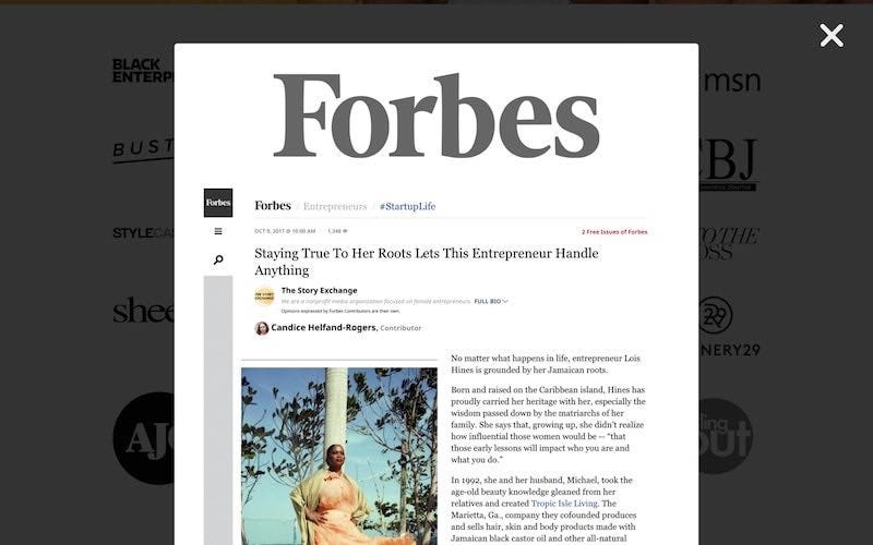
I decided it was a good idea to use full-page screenshots of the articles instead of just linking directly to them. Web pages have a habit of disappearing. With the screenshots, the articles will be on the website for as long as the website wants them to be.
Hypothesis
The website is going to catch up to where the client actually is today.
Results
You can’t really measure this one, but this feature did give me a standing ovation from the CEO.