
Learnings from a Data Science Conference, Open Data Science Europe
Learnings from a Data Science Conference, Open Data Science Europe
Last week I attended Open Data Science Europe hosted at the Novotel, London West. This is one of Europe’s largest data science conferences with a focus on open source tools, and covers a incredible breadth of topics. At the conference I attended two days of machine learning training, and a number of talks. Overall I found the conference to be a great learning experience, the training in particular was very high quality. The talks were largely theoretical so I didn’t take away anything with an immediately practical business application. How it was very useful for enriching my knowledge, and hearing about some of the cutting edge developments in the field.
In the following post I am going to give a run down of some of the highlights and key learnings from the 3 days:
Scikit Learn Training — Intro to Advanced

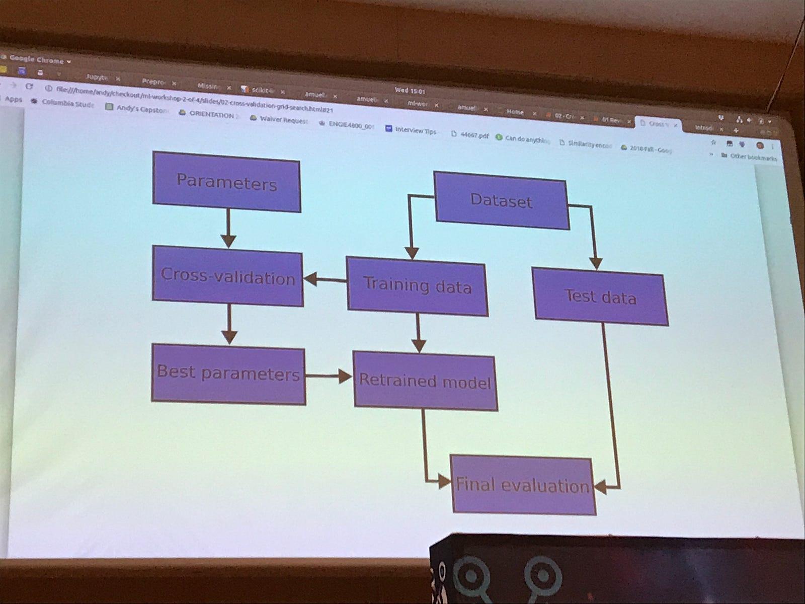
This two day course, taught by Andreas Müller — a research Scientist at Columbia University, and the author of this amazing
As he works on the scikit learn project along the way he mentioned some upcoming developments. These include the new ColumnTransformer, which allows you to carry out pre-processing steps in a pipeline (this he suggests would be released in the next week or two). A plot.tree function which should be available next year, creates the visualisation of a tree for tree based models.
Learning Functions, Understanding Gradient Descent, Back Propagation, and Vanishing Gradients

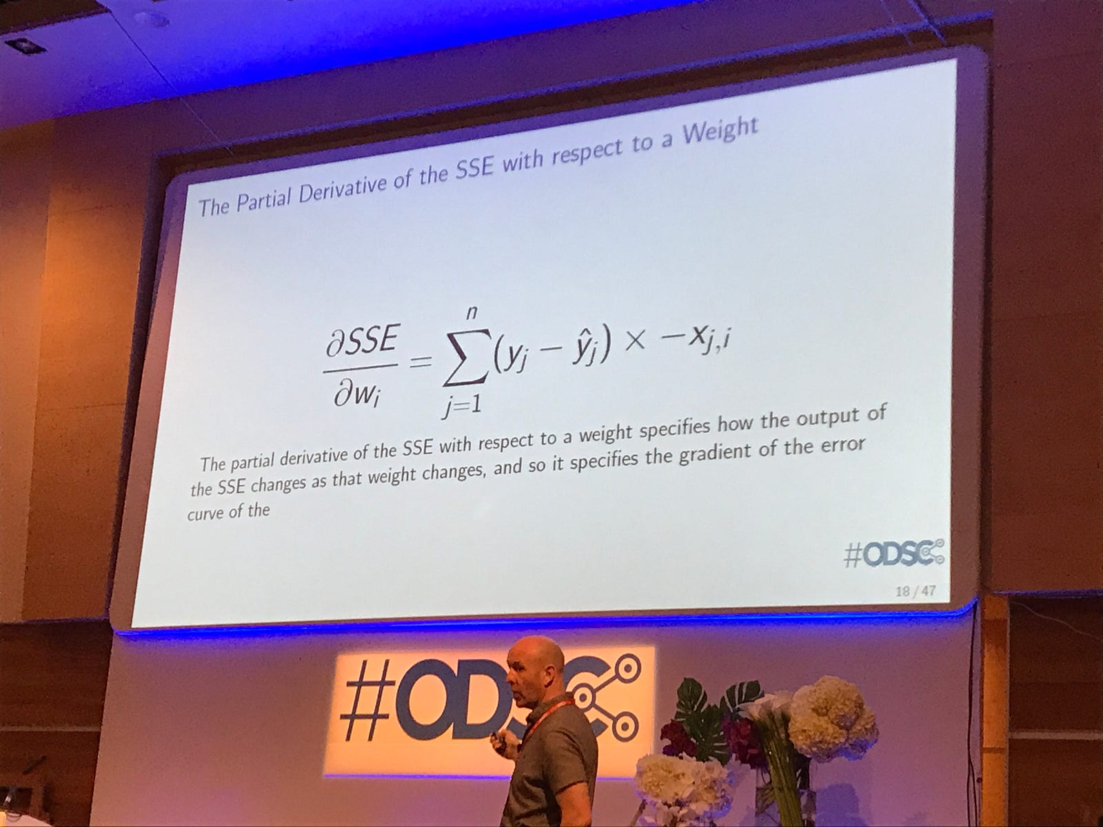
John D. Keller, gave an excellent talk on the mathematics behind deep learning. This was pitched at a really good level, as someone who does not yet understand all these concepts, I was able to follow the talk. He discussed that in training a deep neural network both gradient descent, and back propagation are used in tandem. Both concepts were explained well and included a walk through of the equations
For any dataset there is always a single best linear model
Towards Interpretable Deep Learning

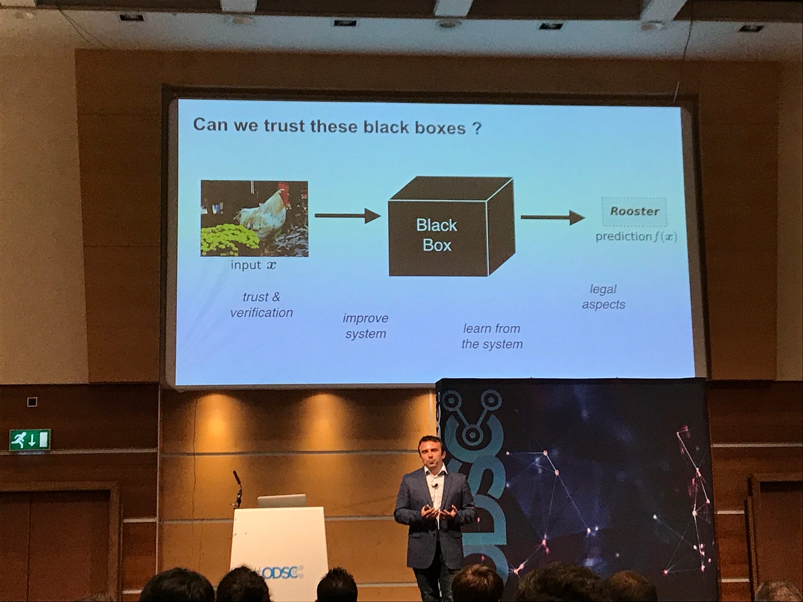
Deep learning neural networks, are highly powerful learning algorithms, but due to their high degree of complexity can be difficult to understand. For example, in the slide image of the rooster above, is the algorithm predicting based on the shape of the rooster, or is it using the area around it as a context cue? Dr Wojciech Samek introduced a new technique called layer-wise relevance propagation which is able to determine the features in a particular input vector that have contributed most strongly to the prediction.


Techniques such as these should help to develop more trust in what are currently “black box” techniques. Dr Samek gave a number of examples, including how this technique can be used to detect bias. In a project that attempted to classify images of human faces by age, he was able to determine that the algorithm had learned a bias that older people do not laugh, and was categorising the images based on wether or not the subject appeared to be laughing in the image.
From Numbers to Narrative: Data Storytelling

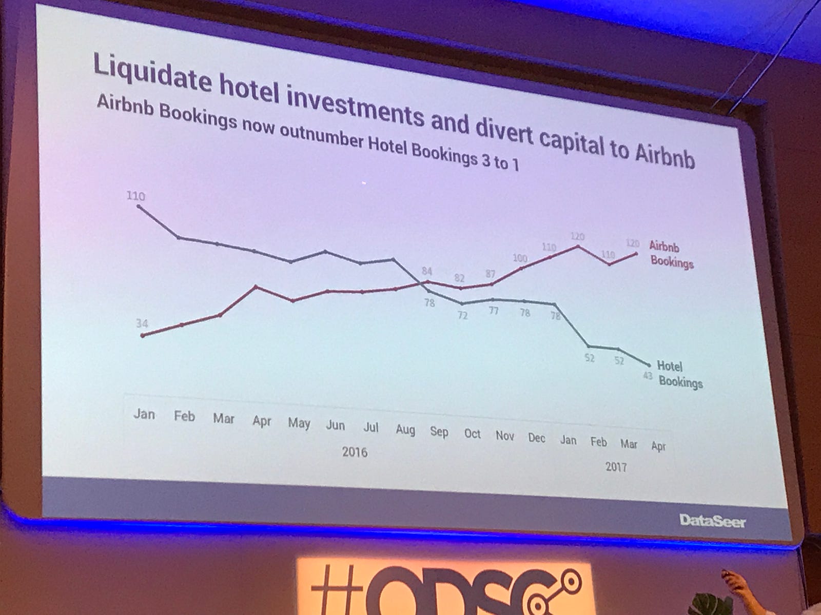
This was an excellent talk by Isaac Reyes on what makes a good and bad chart, and how to apply the Gestalt principals of visual perception to tell better data stories. Some key takeaways for me were to use the insight and/or recommended action as a chart title, a great example of this is shown in the image above. Using proximity of colour to help tell the story, so you may highlight a word in the title in the same colour as the line on the chart. Showing only the data that is absolutely relevant to the story that you are telling.
Overall this was a great learning experience, and I also got to hear about some cutting edge developments in the field. Generally the talks were pitched at a level that both newcomers and experienced members of the field would understand and find useful. Probably not something I would attend every year, due to the quantity and depth of content covered, but definitely worth attending one every couple of years or so.