用Flex實現常見的幾種佈局
阿新 • • 發佈:2018-12-29
用Flex實現常見的幾種佈局
1.水平,垂直居中。
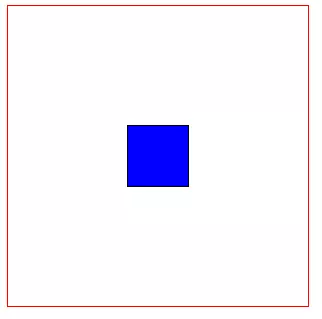
<style type="text/css"> .container{ display: flex; width: 300px; height: 300px; border: 1px solid red; align-items: center; /* 垂直居中*/ justify-content: center; /* 水平居中*/ } .item{ width: 60px; height: 60px; border: 1px solid black; text-align: center; background: blue; } </style> <div class="container"> <div class="item item1"></div> </div>
2. 左邊固定寬度,右邊佔滿寬度

<style type="text/css"> .container{ display: flex; width: 100%; height: 300px; border: 1px solid red; } .item1{ width: 100px; background: blue; } .item2{ flex:1; } </style> <div class="container"> <div class="item item1"></div> <div class="item item2"></div> </div>
3.頂部固定高度,下部佔滿剩餘高度
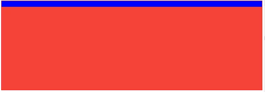
<style type="text/css"> .container{ display: flex; width: 100%; height: 300px; border: 1px solid red; flex-direction: column; } .item1{ width: 100%; height: 20px; background: blue; } .item2{ width: 100%; flex: 1; background: #F44336; } </style> <div class="container"> <div class="item item1"></div> <div class="item item2"></div> </div>
4.頂部,底部固定高度,中間佔滿剩餘高度
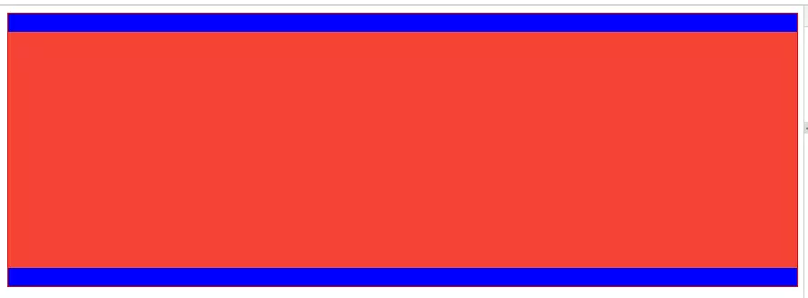
<style type="text/css">
      .container{
          display: flex;
          width: 100%;
          height: 300px;
          border: 1px solid red;
          flex-direction: column;
      }
      .item1{
          width: 100%;
          height: 20px;
          background: blue;
      }
      .item2{
          width: 100%;
          flex: 1;
          background: #F44336;
      }
      .item3{
          width: 100%;
          height: 20px;
          background: blue;
      }
</style>

<div class="container">
    <div class="item item1"></div>
    <div class="item item2"></div>
    <div class="item item3"></div>
</div>
5.中部佔滿剩餘高度,此元素內部採用"左邊固定寬度,右邊佔滿剩餘寬度"
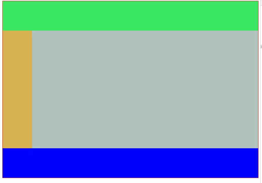
<style type="text/css">
      .container{
          display: flex;
          width: 100%;
          height: 600px;
          border: 1px solid red;
          flex-direction: column;
      }
      .header{
          height: 100px;
          width: 100%;
          background: #3be662;
      }
      .body{
          flex: 1;
          width: 100%;
          background: red;
          display: flex;
          flex-direction: row;
      }
      .footer{
          width: 100%;
          height: 100px;
          background: blue;
      }
      .left{
          width: 100px;
        background: #d7b052;
      }
      .right{
          flex: 1;
        background: #b1c2bd;
      }

</style>

<div class="container">
    <div class="header"></div>
    <div class="body">
      <div class="left"></div>
      <div class="right"></div>
    </div>
    <div class="footer"></div>
</div>
Flex相容性寫法
1.盒子的相容性寫法:
.box{
    display: -webkit-flex;  /* 新版本語法: Chrome 21+ */
    display: flex;          /* 新版本語法: Opera 12.1, Firefox 22+ */
    display: -webkit-box;   /* 老版本語法: Safari, iOS, Android browser, older WebKit browsers. */
    display: -moz-box;      /* 老版本語法: Firefox (buggy) */
    display: -ms-flexbox;   /* 混合版本語法: IE 10 */
}
2.子元素的相容性寫法:
.flex1 {
    -webkit-flex: 1;        /* Chrome */
    -ms-flex: 1             /* IE 10 */
    flex: 1;                /* Spec - Opera 12.1, Firefox 20+ */
    -webkit-box-flex: 1     /* 老版本語法 - iOS 6-, Safari 3.1-6 */
    -moz-box-flex: 1;       /* 老版本語法 - Firefox 19- */
}
最後附上各個瀏覽器對Flex的支援程度: