
Learn OpenCV之Heatmap
本文是利用熱圖(Heatmap)分析視訊序列的標定。
注意,這裡目的不是標定而是分析標定好的資料,或者也可以是檢測的結果資料
文章結構是這樣的,先詳細的解釋一下熱圖分析有什麼用,根據一些具體的應用例項給出相應的教程和Python實現程式碼。
為什麼要用熱圖對Logo檢測結果進行分析
在計算機視覺中,經常會有將視訊幀中的物體用四邊形、多邊形或者掩碼(masks)標定出來的工作。標定的工作可以是人工手動的對一些訓練資料,也可以是為了利用機器學習等方法對物體進行自動檢查和跟蹤得到的。
逐幀的分析上述得到的標定資料是不現實的,因為會有長視訊的因素,有些幾分鐘有些幾個小時,分析起來很費力。此外,雖然視訊時長較短,但是視訊個數很多,例如訓練資料集。這時候使用熱圖分析會將分析任務變得很方便直觀。
熱圖能有效的分析視訊中物體的曝光位置和曝光量。視訊幀中某些位置出現頻率高(曝光量高),那麼熱圖對應位置處是紅色的(hot),相反的,視訊幀中某些位置出現頻率低(曝光量低),那麼熱圖對應位置處是藍色的(cool)。
使用熱圖分析各種logo的曝光量
Orpix公司利用DL的方法將數字媒體中的商標、logos檢測出來,然後對贊助商進行估價,下面是該公司logo檢測的一個例圖。
贊助商會在他們贊助的活動上將他們的logo投放到數字板和衣服上。市場調查人員基於多種因素評估品牌的曝光質量,考慮的因素有如下:
- 曝光時間,在螢幕上曝光時間越長,廣告投放的就越成功
- 曝光位置,logo的曝光位置越靠近下面幾個位置上認為曝光質量越高:
a. 視訊幀的中間,因為視訊幀的中間位置更能吸引觀眾的關注
b. 著名球星的衣服上 - logo大小和清晰度,在廣告中,廣告大小對曝光質量影響很大。毫無疑問,一個廣告佔滿整個螢幕會比沒有佔滿整個螢幕的廣告更有影響力。相似的,清晰的廣告會比模糊的廣告更有影響力。
- 獨佔曝光位置,廣告商在為自己產品或者商標打廣告時不喜歡和其他的商標分享曝光時間。他們通常喜歡在獨佔一定時間內的所有廣告位置,如上圖所示。
利用熱圖分析視訊中logo的曝光情況,能提升曝光質量評價的速度。
2018世界盃決賽中的logo分析
2018世界盃是全世界上億人的狂歡時段。甚至在某些國家,世界盃期間不用上班,非常的high。
當人們聚集在電視前討論著他們喜歡的足球隊時,還有很多資料分析師正在做著資料的分析工作,目的是為了分析比賽期間所展示的贊助活動的有效性。
Orpix公司利用一些logo的檢測演算法對美國直播的視訊進行logo的檢測。世界盃決賽時長為2小時26分鐘13秒。該公司按照每秒一幀對視訊進行抽樣,總共抽取了8773幀影象。
Nike Logo檢測分析
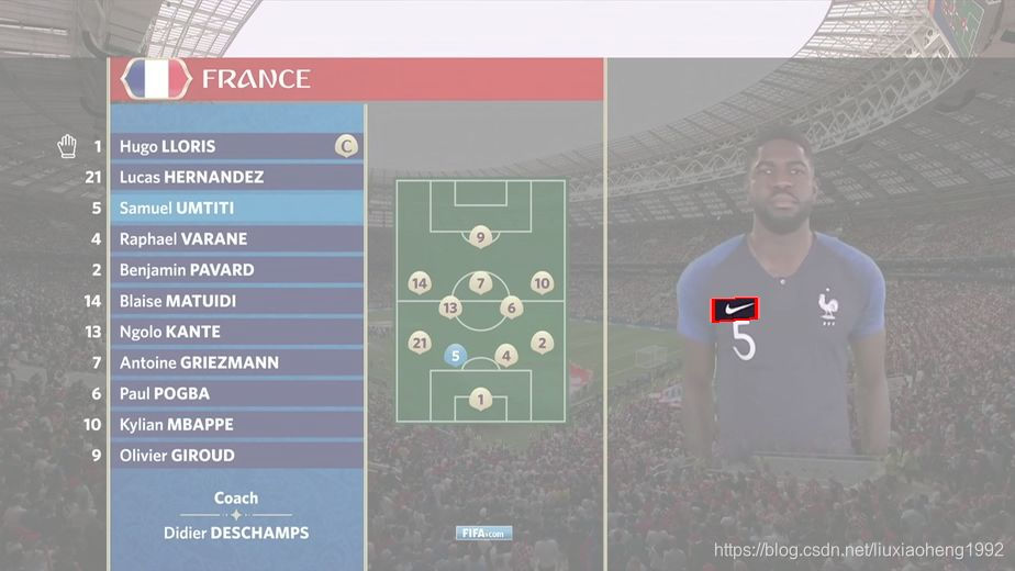
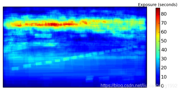
毋庸置疑,Nike(世界上最大的運動品牌公司)投放的logo,在運動員衣服上,出現了1221幀,以佔比賽14%時長的成績登頂為曝光最長的logo。下面是Nike的曝光熱圖。
雖然Nike在整場比賽中曝光時間最長,但是熱圖顯示,曝光在整個影象的分佈非常均勻。這點也很容易的從最長36s曝光時間的影象和整個1221曝光幀中看出。從熱圖上吸引人的是一小塊紅色的點是怎麼來的。通過觀察這個位置的原圖,可以知道,當介紹球員時,Nike也跟著產生曝光量,如下圖所示。
VISA Logo檢測分析
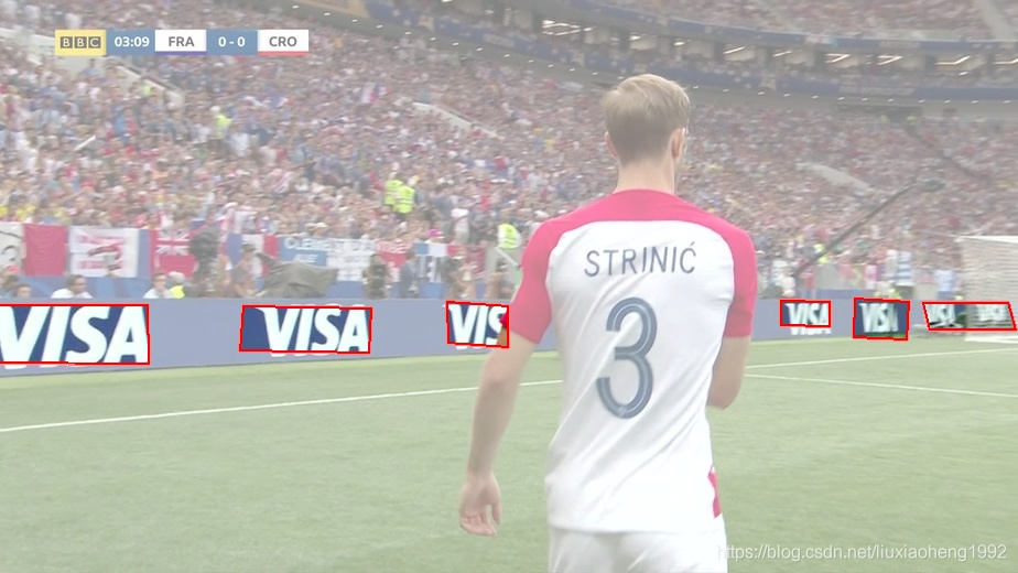
除了分析球員衣服上的logo外,還可以分析數字板上的logo。信用卡處理公司VISA在數字板上曝光時間最長(769s),運動品牌巨頭Adidas緊隨其後。
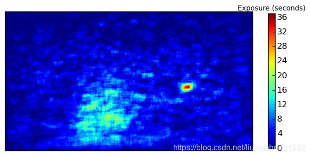
VISA logo的熱圖如下圖所示。下面紅色區域是80幀的結果,其位置分佈在圖片的左上角。不同於Nike的熱圖均勻分佈在整張圖片,它的熱圖主要集中在一個特定的區域。原因是logo是在數字板上顯示的,而不是和Nike一樣出現在不斷移動的運動員身上。
這裡,Orpix給出了世界盃決賽的所有分析樣例
Logo 熱圖生成的程式碼
下面是根據Orpix給出的VISA logo檢測資料進行分析生成熱圖的程式碼。
在學習程式碼前需要的環境是
- opencv-python
- matplotlib
- numpy
Code Overview
- generate_heatmap.py 生成熱圖程式碼檔案
- 世界盃決賽Visa標定資料
下載好上面的資料,將資料加壓後與程式碼檔案放在同一個資料夾下即可執行。
輸入
labels.txt - 裡面包含了對應圖片的VISA logo標定資訊,檔案裡每行資料如下定義:
圖片路徑 圖片中logo數量 x1 y1 x2 y2 x3 y3 x4 y4 …
注意:這裡定義的框不是矩形所以不能使用x,y,width,height表示而是採用四個點的座標表示
輸出
高亮的幀 - 輸出對應於每張輸入的logo區域高亮(其實將非logo區域加一個蒙層,為了大家容易理解,也為了方便除錯)圖片
熱圖 - 輸出一張名為"heatmap.png"的熱圖,熱圖的生成用的是matplotlib包裡的函式
程式碼細節
首先,初始化一個空的numpy array陣列,用來儲存生成heatmap的資料。
#keeps track of exposure time per pixel.  Accumulates for each image
#gets initialized when we process the first image
accumulated_exposures = None
#frames were sampled at one second per frame.  If you sampled frames from a
#video at a different rate, change this value.
#
#if you sampled frames at 10 frames per second, this value would be 0.1
#
seconds_per_frame = 1.0
然後讀取labels.txt獲取每張圖片的logo位置,為每張圖片生成一個mask,mask中logo區域值為seconds_per_frame,非logo區域值為0。最後將所有的mask相加就可以得到產生熱圖的資料了。
#parse the line using helper function
frame_path, labels = parse_line(line)

print "processing %s" % frame_path

#load the image
frame = cv2.imread(frame_path)

#this is where the highlighted images will go
if not os.path.exists('output'):
    os.mkdir('output')

#if the heatmap is None we create it with same size as frame, single channel
if type(accumulated_exposures) == type(None):
    accumulated_exposures = np.zeros((frame.shape[0], frame.shape[1]), dtype=np.float)

#we create a mask where all pixels inside each label are set to number
#of seconds per frame that the video was sampled at.
#So as we accumulate the exposure heatmap counts, each pixel contained
#inside a label contributes the seconds_per_frame to the overall
#accumulated exposure values
maskimg = np.zeros(accumulated_exposures.shape, dtype=np.float)
for label in labels:
    cv2.fillConvexPoly(maskimg, label, (seconds_per_frame))


#highlight the labels on the image and save.
#comment out the 2 lines below if you only want to compute the heatmap
highlighted_image = highlight_labels(frame, labels, maskimg)
cv2.imwrite('output/%s' % os.path.basename(frame_path), highlighted_image)

#accumulate the heatmap object exposure time
accumulated_exposures = accumulated_exposures + maskimg
最後,利用matplotlib畫出熱圖
#
#create final heatmap using matplotlib
#
data = np.array(accumulated_exposures)
#create the figure
fig, axis = plt.subplots()
#set the colormap - there are many options for colormaps - see documentation
#we will use cm.jet
hm = axis.pcolor(data, cmap=plt.cm.jet)
#set axis ranges
axis.set(xlim=[0, data.shape[1]], ylim=[0, data.shape[0]], aspect = 1)
#need to invert coordinate for images
axis.invert_yaxis()
#remove the ticks
axis.set_xticks([])
axis.set_yticks([])

#fit the colorbar to the height
shrink_scale = 1.0
aspect = data.shape[0]/float(data.shape[1])
if aspect < 1.0:
    shrink_scale = aspect
clb = plt.colorbar(hm, shrink=shrink_scale)
#set title
clb.ax.set_title('Exposure (seconds)', fontsize = 10)
#saves image to same directory that the script is located in (our working directory)
plt.savefig('heatmap.png', bbox_inches='tight')
#close objects
plt.close('all')