
CardView輕鬆實現圓角卡片效果
阿新 • • 發佈:2019-01-07

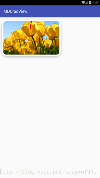
看到上面這個效果,就會想到讓美工切一張圓角圖片用imageview來實現,這也是一種實現的方式,實現起來也比較方便,且不用做什麼相容適配;其實android系統提供了CardView這個控制元件實現起來也很方便,同時還可以實現一些其他的效果。
CardView是android5.0出現的一個Material Design風格的控制元件,extends FrameLayout,可以把它當做一個佈局容器來使用;
CardView是在android.support.v7.widget,在使用的時候需要引依賴庫,
1、引依賴庫
compile 'com.android.support:cardview-v7:25.3.1' 2、佈局中直接使用
<?xml version="1.0" encoding="utf-8"?>
<RelativeLayout xmlns:android="http://schemas.android.com/apk/res/android"
xmlns:tools="http://schemas.android.com/tools"
xmlns:app="http://schemas.android.com/apk/res-auto"
android:id="@+id/activity_main"
android:layout_width="match_parent" 系統提供了不少屬性可以用來設定:
//背景
app:cardBackgroundColor
//圓角大小
app:cardCornerRadius
//z軸陰影
app:cardElevation
//z軸最大高度值
app:cardMaxElevation
//是否使用CompadPadding
app:cardUseCompatPadding
//是否使用PreventCornerOverlap
app:cardPreventCornerOverlap
//內容padding
app:contentPadding
//內容左邊padding
app:contentPaddingLeft
//內容頂部padding
app:contentPaddingTop
//內容右邊padding
app:contentPaddingRight
//內容底部padding
app:contentPaddingBottom
//最小寬度
app:android_minWidth
//最小高度
app:android_minHeight
執行效果:

設定下面兩個屬性在點選卡片的時候會有水波紋的效果,
android:foreground="?attr/selectableItemBackground"
android:clickable="true"
不過上面android6.0執行的效果,並且CardView是android5.0後才出現的,所以CardView的那些新特性在android5.0以下的手機上不會有效果,在使用CardView的時候就需要做高低版本的相容;在res目錄下根據需要新建layout檔案;
layout     --->android5.0以下佈局
layout-v21 --->android5.0+佈局
android5.0+佈局檔案:
<?xml version="1.0" encoding="utf-8"?>
<RelativeLayout xmlns:android="http://schemas.android.com/apk/res/android"
    xmlns:tools="http://schemas.android.com/tools"
    xmlns:app="http://schemas.android.com/apk/res-auto"
    android:id="@+id/activity_main"
    android:layout_width="match_parent"
    android:layout_height="match_parent"
    tools:context="com.mdcradview.MainActivity">
    <android.support.v7.widget.CardView
        android:layout_width="300dp"
        android:layout_height="200dp"
        app:cardCornerRadius="20dp"
        app:cardElevation="10dp"
        android:layout_margin="16dp"
        android:foreground="?attr/selectableItemBackground"
        android:clickable="true"
        >
        <ImageView
            android:id="@+id/iv"
            android:layout_width="match_parent"
            android:layout_height="wrap_content"
            android:scaleType="centerCrop"
            android:src="@mipmap/tulips2" />
    </android.support.v7.widget.CardView>
</RelativeLayout>
android5.0以下佈局檔案:
<?xml version="1.0" encoding="utf-8"?>
<RelativeLayout xmlns:android="http://schemas.android.com/apk/res/android"
    xmlns:tools="http://schemas.android.com/tools"
    xmlns:app="http://schemas.android.com/apk/res-auto"
    android:id="@+id/activity_main"
    android:layout_width="match_parent"
    android:layout_height="match_parent"
    tools:context="com.mdcradview.MainActivity">

    <android.support.v7.widget.CardView
        android:layout_width="300dp"
        android:layout_height="200dp"
        app:cardCornerRadius="20dp"
        app:cardElevation="10dp"
        android:layout_alignParentTop="true"
        android:layout_alignParentLeft="true"
        android:layout_alignParentStart="true">
        <com.mdcradview.RoundAngleImageView
            android:id="@+id/iv"
            android:layout_width="match_parent"
            android:layout_height="wrap_content"
            android:scaleType="centerCrop"
            android:src="@mipmap/tulips2" />
    </android.support.v7.widget.CardView>
</RelativeLayout>
android5.0+的執行效果和上面是一樣的,下面是android5.0以下的執行效果:
android5.0以下執行效果:
這個是在夜神模擬器4.4.2上面的效果,具體的可以跑到真機上面看看什麼效果。