Flutter學習:基礎元件(一)
阿新 • • 發佈:2019-01-12
1.Text
用於顯示單個樣式的文字控制元件,字串可以顯示一行或者多行,具體取決於佈局約束。
text的屬性值:
 const Text(this.data, {
    Key key,
    this.style,
    this.textAlign,
    this.textDirection,
    this.locale,
    this.softWrap,
    this.overflow,
    this.textScaleFactor,
    this.maxLines,
    this.semanticsLabel,//影象的語義描述,用於向Andoid上的TalkBack和iOS上的VoiceOver提供影象描述
  }) : assert(data != null),
       textSpan = null,
       super(key: key);
| style | 文字基本樣式設定,包括(inherit, color, fontSize, fontWeight, fontStyle, letterSpacing, wordSpacing, textBaseline, height, locale, foreground, background,) |
|---|---|
| textAlign | 文字對齊方式(如左對齊,右對齊,中心對齊等) |
| textDirection | 有兩種方式:TextDirection.rtl: 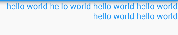 TextDirection.ltr: TextDirection.ltr: 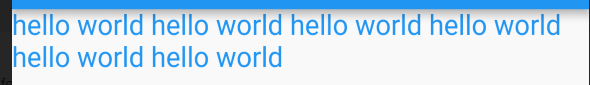 |
| locale | 分別是languageCode,scriptCode和countryCode的語言, 指令碼和 區域。 |
| softWrap | 文字是否可以換行 |
| overflow | 對文字進行處理,如果不換行結尾顯示省略,還是變模糊等有個屬性值(TextOverflow.clip,TextOverflow.ellipsis,TextOverflow.fade) |
| textScaleFactor | 文字比例縮放因子 |
| maxLines | 文字最多顯示行數 |
程式碼如下:
class TestText extends StatelessWidget {
  @override
  Widget build(BuildContext context) {
    // TODO: implement build
    return Text(
      'hello world hello world hello world hello world hello world hello world',
      textAlign: TextAlign.left,
      textDirection: TextDirection.ltr,
      locale: Locale.fromSubtags(languageCode: 'und'),
      softWrap: true,
      overflow: TextOverflow.clip,
      textScaleFactor: 1.5,
      maxLines: 2,
      semanticsLabel: ,
      style: TextStyle(
          inherit: false,
          color: Colors.blue,
          fontSize: 20,
          height: 1
      ),
    );
  }
}
對於文字樣式屬性的基本瞭解:
| 屬性 | 介紹 |
|---|---|
| inherit | 是否繼承TextSpan tree的樣式,預設為true |
| color | 字型顏色 |
| fontSize | 字型大小 |
| fontWeight | 字型的權重 通過這個fontWeight: FontWeight.w100調節字型的粗細 |
| fontStyle | 字型樣式,有斜體字,正常字型 |
| letterSpacing | 字元間距 |
| wordSpacing | 字間距,包括一個單詞與一個單詞之間的間距 |
| textBaseline | 文字基線 |
| height | 行高 |
| foreground | 文字前景繪製圖 |
| background | 文字背景繪製圖 |
| decoration | 新增上劃線,下劃線,刪除線(如TextDecoration.lineThrough) |
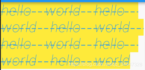
style: TextStyle(
          inherit: false,
          color: Colors.blue,
          fontSize: 20,
          fontWeight: FontWeight.w100,
          fontStyle: FontStyle.italic,
          letterSpacing: 1.0,
          wordSpacing: 20,
          textBaseline: TextBaseline.ideographic,
          height: 1,
          decoration: TextDecoration.lineThrough,
          decorationStyle: TextDecorationStyle.dashed,
          background:mPaint,
      ),
1.Text.rich
可以顯示具有不同樣式TextSpan的段落。
在他的構造器中多了TextSpan引數。
const Text.rich(this.textSpan, {
    Key key,
    this.style,
    this.textAlign,
    this.textDirection,
    this.locale,
    this.softWrap,
    this.overflow,
    this.textScaleFactor,
    this.maxLines,
    this.semanticsLabel,
  }): assert(textSpan != null),
      data = null,
      super(key: key);
TextSpan的構造器為:
const TextSpan({
    this.style,
    this.text,
    this.children,
    this.recognizer,
  });
對於這幾個引數的介紹:
| 引數名 | 描述 |
|---|---|
| style | 和Text控制元件的無差別 |
| text | 文字標籤 |
| children | 集合,新增多個textSpan |
| recognizer | 手勢識別,點選等一系列操作 |
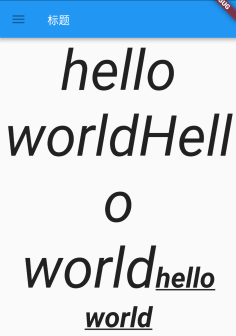
class TestTextRich extends StatelessWidget {
  @override
  Widget build(BuildContext context) {
    return Text.rich(
      TextSpan(
        text: "hello world",
        children: <TextSpan>[
          TextSpan(
              text: "Hello world",
              style: TextStyle(
                  inherit: true,
                  fontStyle: FontStyle.italic
              )
          ),
          TextSpan(
              text: "hello world",
              style: TextStyle(
                  inherit: false,
                  fontWeight: FontWeight.bold,
                  fontSize: 50,
                  decoration: TextDecoration.underline
              )
          ),
        ],
        style: TextStyle(
          inherit: false,
          fontSize: 100,
          fontStyle: FontStyle.italic,
        ),
        recognizer: new TapGestureRecognizer()
          ..onTap = () {
            print("點選了父TextSpan");
          },
      ),
      softWrap: true,
      textDirection: TextDirection.rtl,
      textAlign: TextAlign.center,
    );
  }