
打造屬於自己的進度條(筆記)
根據從前面的學習,初步學會了基本的自定義控制元件的方法,就開始學習者寫一下自定義進度條玩哇
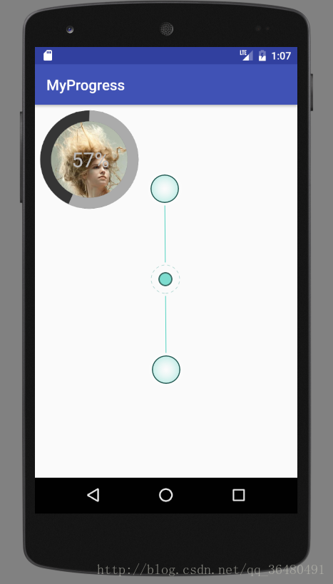
下面是效果圖
下面的是程式碼部分
首先自定義屬性
<declare-styleable name="LoadView">
<attr name="loadWidth" format="dimension">20</attr>
<attr name="loadColor" format="color">0xffababab</attr>
<attr name="loadBackgroundColor" 下面是自定義V進度條程式碼
import android.content.Context;
import android.content.res.TypedArray;
import android.graphics.Bitmap;
import android.graphics.BitmapFactory;
import android.graphics.Canvas;
import android.graphics.Paint;
import android.graphics.Rect;
import 這就是全部的了,是不是感覺很簡單
相關推薦
打造屬於自己的進度條(筆記)
根據從前面的學習,初步學會了基本的自定義控制元件的方法,就開始學習者寫一下自定義進度條玩哇 下面是效果圖 下面的是程式碼部分 首先自定義屬性 <declare-styleable name="LoadView"> &
【學習筆記】Android-打造炫酷進度條(條形)
本文是我在慕課網上學習《Android-打造炫酷進度條》整理的原始碼,和視訊中的原始碼主體一致,僅修改了部分引數。 效果圖如下所示(實際進度條是連續的)。 原始檔 attrs.xml <?xml version="1.0" encoding="utf-8"?>
使用ViewDragHelper打造屬於自己的DragLayout(抽屜開關 )
true header 限制 open() flat 重寫 support 重要 red 使用ViewDragHelper打造屬於自己的DragLayout(抽屜開關
關於進度條(ProgressBar)那些事(筆記)
ProgressBar用於介面上顯示一個進度條,表示我們的程式正在載入一些資料。(預設時是一個圓形進度條。) 控制元件的可見性 可以通過android:visibility對這個控制元件進行可見屬性的設定 >可選值有三種,visible、invisible(看不見但
js進度條(偽)
itl font style script .get black type onf clas <!DOCTYPE html> <html lang="en"> <head> <meta charset="UTF-8">
Asp.net MVC 搭建屬於自己的框架(一)
C4D pagedlist del tran 6.0 ext 才有 應該 frame 網址:https://www.cnblogs.com/sggx/p/4555255.html 為什麽要自己搭框架? 大家夥別急,讓我慢慢地告訴你!大家有沒有這種感覺,從一家跳槽到另一家
自定義帶刻度的進度條(seekbar)
效果: layout佈局,(“-”,“+”和seekbar佈局) <?xml version="1.0" encoding="utf-8"?> <LinearLayout xmlns:android="http://schemas.android.com
自定義圓形進度條(一)
由於專案需要,需要自定義一個圓形進度條,效果如下: 1 建立什麼檔案? 具體的程式碼我會放在github上,所以暫時忽略attr檔案和activity_main2檔案 2 CustomCircleProgressBar packa
圓形進度條(canvas)
效果如下圖: 程式碼如下 <canvas class="pull-right list_canvas" width="200" height="200" style="height:100px;width:100px"></canvas>
深入理解BootStrap Item14 -- 進度條(progressbar)
1、進度條 在網頁中,進度條的效果並不少見,比如一個評分系統,比如載入狀態等。就如下圖所示的一個評分系統,他就是一個簡單的進度條效果: 進度條和其他獨立元件一樣,開發者可以根據自己的需要,選擇對應的版本: ☑ LESS版本:原始碼檔案progress-
AJAX實現上傳進度條(Django)
昨天研究了一天檔案上傳進度條的實現,折騰了一天終於是完成了,期間遇到了各種BUG,讓人不禁淚落。 這裡,我們將使用最少量的AJAX來實現這個功能,沒有任何對瀏覽器支援性的檢測,這樣更容易明白。還有一點需要說明的是,後臺也是應該來摻和一腳(配合)的,當然,非常簡單,只要確認接
Android花樣loading進度條(二)-簡單環形進度條
背景 Android花樣loading進度條系列文章主要講解如何自定義所需的進度條,包括水平、圓形、環形、圓弧形、不規則形狀等。 本篇我們從圓形進度條講起,講簡單形式的環形進度條,只有進度色彩,沒有進度文字,主要是使用Canvas繪製圓和圓弧。 效果
cocos-2d-x中進度條(loadingBar)顯示資源載入
為便於看客實際操作和理解,直接上例子 #include "LoadingBar.h" #include "HelloWorldScene.h" #include "GameScene.h" static int res_count=0; // 資源集合 std::str
html js 定製進度條 (二)
版本一遺留的問題: 1 滑鼠訊息捕獲問題(圖層覆蓋),解決方法設定圖層,影象層置於底層,滑鼠訊息層置於上層且設定為透明,完美解決。 function createMouseEventDiv() { do{ var parentCanvas
egret進度條(簡單)
////////////////////////////////////////////////////////////////////////////////////// // // Copyright (c) 2014-present, Egret Technolog
自定義View實現圓形水波進度條(上)
來源:伯樂線上專欄作者 - Code4Android 連結:http://android.jobbole.com/84776/ 每次聽到某大牛談論自定義View,頓時敬佩之心,如滔滔江水連綿不絕,心想我什麼時候能有如此境界,好了,心動不如行動,於是我開始了自定義View之路,雖然過程有坎坷,但是
Unity3d中製作Loading場景進度條(轉)
背景 通常遊戲的主場景包含的資源較多,這會導致載入場景的時間較長。為了避免這個問題,可以首先載入Loading場景,然後再通過Loading場景來載入主場景。因為Loading場景包含的資源較少,所以載入速度快。在載入主場景的時候一般會在Loading
easyui 進度條(ProgressBar)
Create ProgressBar The ProgressBar component can be created from html markup or programatically. Creation from markup is even easier.
自定義View實現圓形水波進度條(下)
來源:伯樂線上專欄作者 - Code4Android 連結:http://android.jobbole.com/84776/ 接上文 通過效果圖,我們看到實現此效果就是不斷的更新進度值,然後重繪,,那麼我們只需開啟一個執行緒實現更新進度值,為了更好的控制我們再
我的Android進階之旅------>Android自定義View實現帶數字的進度條(NumberProgressBar)
今天在Github上面看到一個來自於 daimajia所寫的關於Android自定義View實現帶數字的進度條(NumberProgressBar)的精彩案例,在這裡分享給大家一起來學習學習!同時感謝daimajia的開源奉獻! 第一步、效果展