
用sklearn繪製ROC曲線
The ROC curve stands for Receiver Operating Characteristic curve, and is used to visualize the performance of a classifier. When evaluating a new model performance,accuracy can be very sensitive to unbalanced class proportions. The ROC curve is insensitive to this lack of balance in the data set.
On the other hand when using precision and recall, we are using a single discrimination threshold to compute the confusion matrix. The ROC Curve allows the modeler to look at the performance of his model across all possible thresholds. To understand the ROC curve we need to understand the x and y axes used to plot this. On the x axis we have the false positive rate, FPR or fall-out rate. On the y axis we have the true positive rate, TPR or recall.
To test out the Scikit calls that make this curve for us, we use a simple array repeated many times and a prediction array of the same size with different element. The first thing to notice for the roc curve is that we need to define the positive value of a prediction. In our case since our example is binary the class “1” will be the positive class. Second we need the prediction array to contain probability estimates of the positive class or confidence values. This very important because the roc_curve call will set repeatedly a threshold to decide in which class to place our predicted probability. Let’s see the code that does this.
1) Import needed modules
from sklearn.metrics import roc_curve, auc
import matplotlib.pyplot as plt
import random
2) Generate actual and predicted values. First let use a good prediction probabilities array:
actual = [1,1,1,0,0,0]
predictions = [0.9,0.9,0.9,0.1,0.1,0.1]
3) Then we need to calculated the fpr and tpr for all thresholds of the classification. This is where the roc_curve call comes into play. In addition we calculate the auc or area under the curve which is a single summary value in [0,1] that is easier to report and use for other purposes. You usually want to have a high auc value from your classifier.
false_positive_rate, true_positive_rate, thresholds = roc_curve(actual, predictions)
roc_auc = auc(false_positive_rate, true_positive_rate)
4) Finally we plot the fpr vs tpr as well as our auc for our very good classifier.
plt.title('Receiver Operating Characteristic')
plt.plot(false_positive_rate, true_positive_rate, 'b',
label='AUC = %0.2f'% roc_auc)
plt.legend(loc='lower right')
plt.plot([0,1],[0,1],'r--')
plt.xlim([-0.1,1.2])
plt.ylim([-0.1,1.2])
plt.ylabel('True Positive Rate')
plt.xlabel('False Positive Rate')
plt.show()
The figure show how a perfect classifier roc curve looks like:

Here the classifier did not make a single error. The AUC is maximal at 1.00. Let’s see what happens when we introduce some errors in the prediction.
actual = [1,1,1,0,0,0]
predictions = [0.9,0.9,0.1,0.1,0.1,0.1]

As we introduce more errors the AUC value goes down. There are a couple of things to remember about the roc curve:
- There is a tradeoff betwen the TPR and FPR as we move the threshold of the classifier.
- When the test is more accurate the roc curve is closer to the left top borders
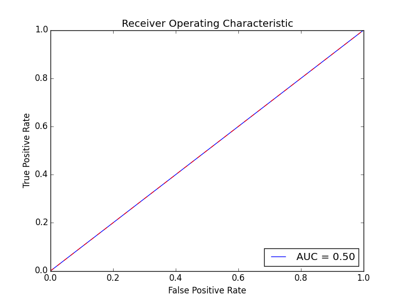
- A useless classifier is one that has its ROC curve exactly aligned with the diagonal. How does that look like? Let’s say we have a classifier that always gives 0.5 for the classification probabilities.
actual = [1,1,1,0,0,0]
predictions = [0.5,0.5,0.5,0.5,0.5,0.5]
The ROC Curve would like this:
Concerning the AUC, a simple rule of thumb to evaluate a classifier based on this summary value is the following:
- .90-1 = very good (A)
- .80-.90 = good (B)
- .70-.80 = not so good (C)
- .60-.70 = poor (D)
- .50-.60 = fail (F)
This example dealt with a two class problem (0,1). For a multi-class example checkout this scikit-learn documentation example:
This was an intro to the ideas behind the roc curve and the scikit functions that enable this.
相關推薦
用sklearn繪製ROC曲線
The ROC curve stands for Receiver Operating Characteristic curve, and is used to visualize the performance of a classifier. When evaluating a new model pe
統計分析之ROC曲線與多指標聯合分析——附SPSS繪製ROC曲線指南
在進行某診斷方法的評估是,我們常常要用到ROC曲線。這篇博文將簡要介紹ROC曲線以及用SPSS及medcal繪製ROC曲線的方法。 定義 ROC受試者工作特徵曲線 (receive
客戶貸款逾期預測[4]-記錄評分、繪製roc曲線
任務 記錄五個模型(邏輯迴歸、svm、決策樹、xgboost、lightgbm)關於precision、recall score、f1 score、roc、aoc的評分表格。 實現 # -*- coding: utf-8 -*- ""
用Python畫ROC曲線 matplotlib 顏色、標記、線條引數控制
在分類模型中,ROC曲線和AUC值經常作為衡量一個模型擬合程度的指標。最近在建模過程中需要作出模型的ROC曲線,參考了sklearn官網的教程和部落格。現在將自己的學習過程總結如下,希望對初次接觸的同學有所幫助。PS:網上的例子實在是晦澀難懂,在折騰了一下午之後
(七)sklearn繪製驗證曲線
1、繪製驗證曲線 在此圖中,隨著核心引數gamma的變化,顯示了SVM的訓練分數和驗證分數。 對於非常低的gamma值,可以看到訓練分數和驗證分數都很低。這被稱為欠配合。 gamma的中值是兩個分數的高值,即分類器表現相當好。如果gamma太高,則分類
如何繪製ROC曲線
ROC(Receiver Operating Characteristic)曲線全稱是“受試者工作特徵”,通常用來衡量一個二分類學習器的好壞。如果一個學習器的ROC曲線能將另一個學習器的ROC曲線完全包住,則說明該學習器的效能優於另一個學習器。 繪製ROC曲線
利用sklearn畫ROC曲線python程式碼個人理解
程式碼註釋 >>> import numpy as np >>> from sklearn import metrics 匯入metrics模組 >>> y = np.array([1, 1,
使用Sklearn模型做分類並繪製機器學習模型的ROC曲線
簡單的實驗,主要是使用sklearn庫中的RFR模型來進行迴歸分析並繪製相應的ROC曲線,主要是熟悉流程,下面是具體的實現: #!usr/bin/env python #encoding:utf-8 ''' __Author__:沂水寒城 功能:使用RFR模型 '
統計分析之單因素分析、多因素分析(多指標聯合分析)與ROC曲線的繪製——附SPSS操作指南
Q1.什麼是單因素分析和多因素分析? 單因素分析(monofactor analysis)是指在一個時間點上對某一變數的分析。目的在於描述事實。 多因素分析亦稱“多因素指數體系
Quartz 2d 用CGContextRef 繪製各種圖形 (文字、圓、直線、弧線、矩形、扇形、橢圓、三角形、圓角形、貝塞爾曲線、圖片)
首先了解下 CGContextRef Graphics Context是圖形上下文,可以將其理解為一塊畫布,我們可以在上面進行繪畫操作,繪製完成後,將畫布放到我們的View 中顯示即可,View看著是一個畫框。 自己學習時實現的Demo,希望對大家有幫助,具體的實現看程式碼,並有
準備工作-用python繪製金融資料曲線的進階例項
import datetime import numpy as np import matplotlib.colors as colors import matplotlib.finance as finance import matplotlib.dates as mdates import matplo
人臉認證-ROC曲線繪製計算AUC和ACC
import numpy as np import matplotlib matplotlib.use('Agg') import matplotlib.pyplot as plt from sklea
python繪製precision-recall曲線、ROC曲線
基礎知識 TP(True Positive):指正確分類的正樣本數,即預測為正樣本,實際也是正樣本。FP(False Positive):指被錯誤的標記為正樣本的負樣本數,即實際為負樣本而被預測為正樣本,所以是False。TN(True Negative):指正確分類的
py2.7 : 《機器學習實戰》 Adaboost 2.24號:ROC曲線的繪製和AUC計算函式
前言:可以將不同的分類器組合,這種組合結果被稱為整合方法 、 元演算法 使用:1.不同演算法的整合 2.同一演算法下的不同設定整合 3.不同部分分配給不同分類器的整合 演算法介紹:AdaBoost 優點:泛華錯誤率低,易編碼,可以應用在大部分的分類器上,無引數調整 缺點:
Android開發之Path的高階用法用貝塞爾曲線繪製波浪線
前言:貝塞爾曲線分為一級曲線,二級曲線,三級曲線和多級曲線,利用貝塞爾曲線可以做出很多有意思的動畫和圖形,今天我們就來實現一個比較簡單的波浪線。 -----------------分割線--------------- 初步認識貝塞爾曲線: mPath.moveTo:設定起點
用Geogebra繪製一種五角星形曲線
實際上類似的曲線可以做很多,參考Benice的部落格(或者此處上一篇部落格轉發的少量圖片),但是這個五角星形狀的曲線比較簡單。 我從來只是把網路上BBS或部落格之類的寫的東西當作一種消遣而不是研究,所以,不能指望對文字內容從語法上嚴格推敲,除非很有興趣也不太可能過問對我來
用R軟體包ROCR畫ROC曲線
ROC曲線可以簡單、直觀得觀察分析方法的臨床準確性,並可用肉眼作出判斷。ROC以真陽性率(靈敏度FPR)為縱座標,假陽性率(1-特異度TPR)為橫座標繪製的曲線,可準確反映某分析方法特異性和敏感性的關係,是試驗準確性的綜合代表。ROC曲線不固定分類界值,允許
xgene:之ROC曲線、ctDNA、small-RNA seq、甲基化seq、單細胞DNA, mRNA
會有 模板 pat 活動 fff 1.5 科學家 因子 染色 靈敏度高 == 假陰性率低,即漏檢率低,即有病人卻沒有發現出來的概率低。 用於判斷:有一部分人患有一種疾病,某種檢驗方法可以在人群中檢出多少個病人來。 特異性高 == 假陽性率低,即錯把健康判定為病人的概率低
ROC曲線
理想 pan title 收益 技術 如果 cost edi 兩個 ROC曲線指受試者工作特征曲線 / 接收器操作特性曲線(receiver operating characteristic curve), 是反映敏感性和特異性連續變量的綜合指標,是用構圖法揭示敏感性和特異
css3 cubic-bezier用賽貝爾曲線定義速度曲線
anim src near line 技術分享 需要 設置 分享 曲線 簡介 cubic-bezier 又稱三次貝塞爾,用四個點(p0,p1,p2,p3)描繪一條曲線。 p0默認為(0,0),p3默認為(1,1)。所以,我們只需關註p1,p2。