React Native 佈局
這篇部落格稍微講解下React-Native中的佈局。比較簡單。RN的而佈局是用css中的flexbox佈局,所以佈局起來與android傳統的佈局樣式有點像。接下來就結合圖片一起來看看。
常用屬性講解
RN的flexbox主要有以下幾個屬性alignItems,alignSelf,flex,flexDirection,flexWrap,justifyContent。
flexDirection
該屬性用於指定主軸的方向。即指定子view的佈局方向。它有兩個值可設定。
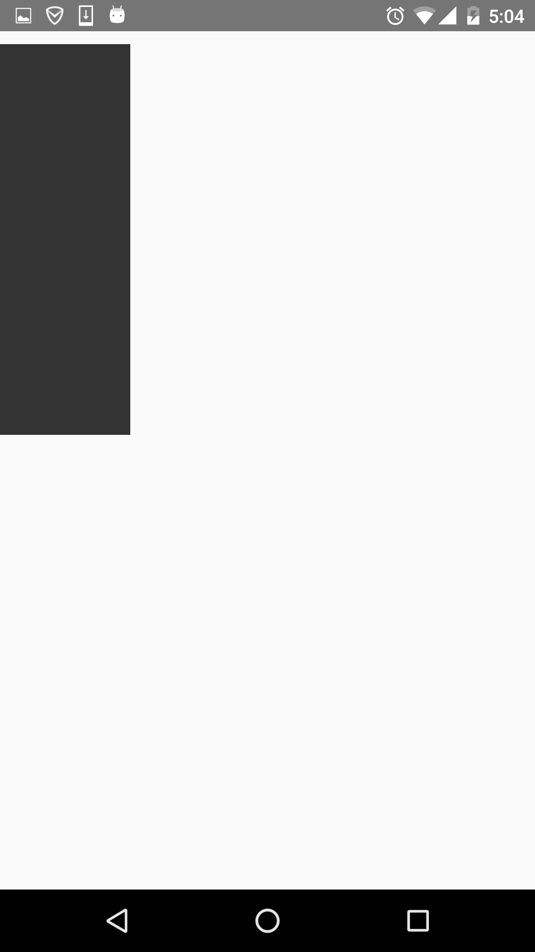
這個屬性很簡單,先看row的程式碼段:
render:function(){
return(
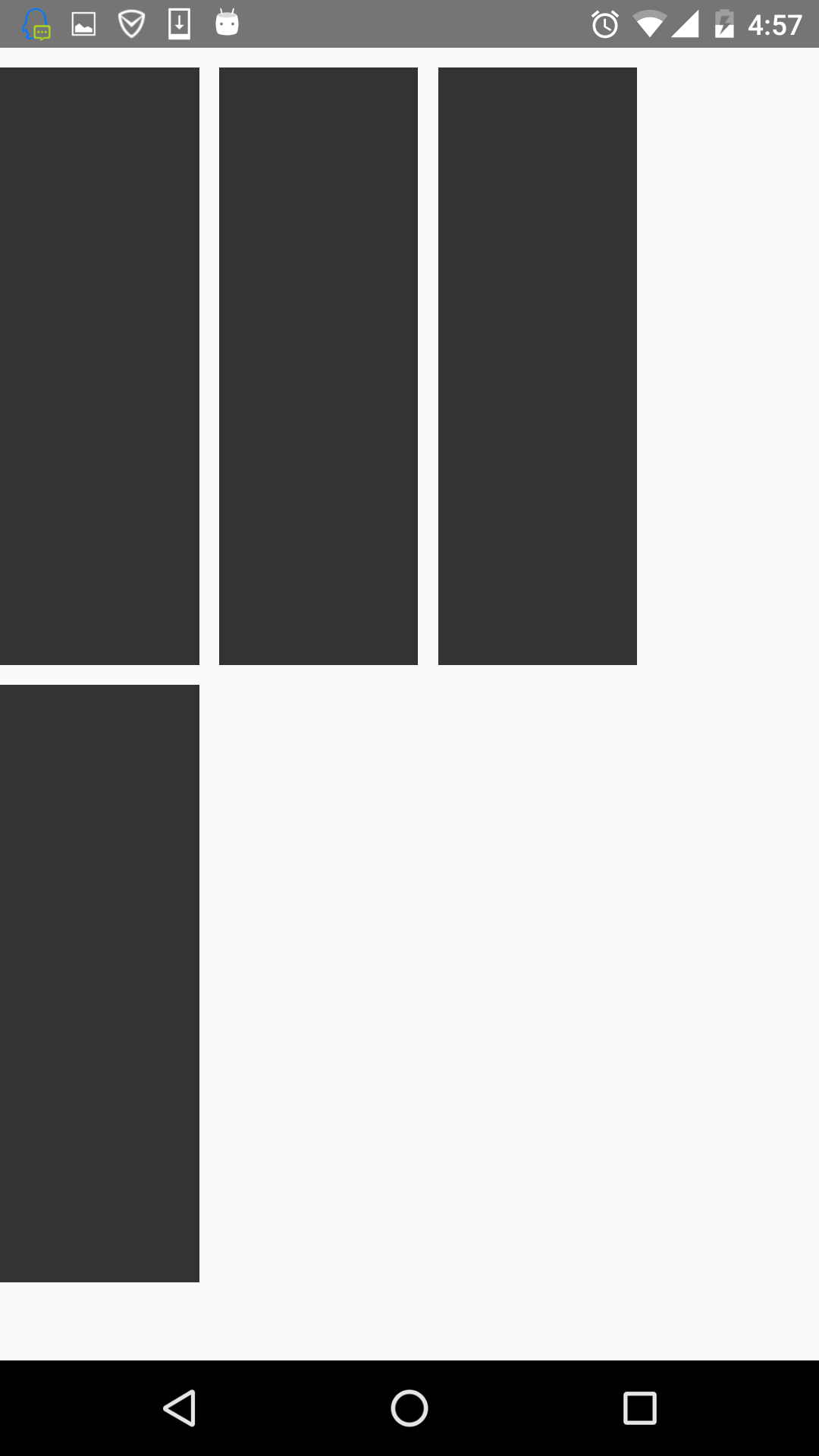
<view 一個View裡有四個小View,小View的底色是黑的,看下效果圖:
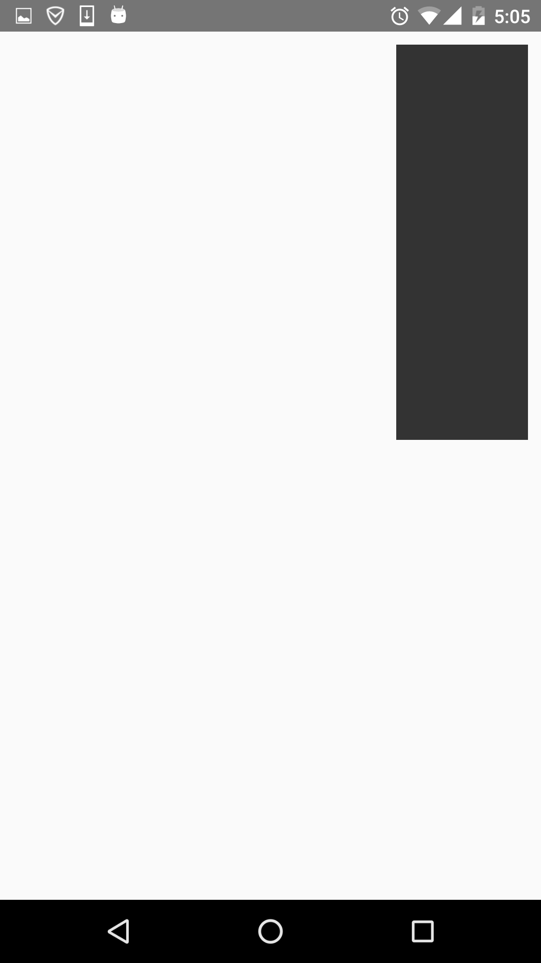
可以看到,四個view橫向的進行佈局。那改成column呢,樣式修改如下:
var styles = StyleSheet.create({
flexStyle:{
height:600,
flexDirection:'column',
},
flexSub:{
flex:1 看下效果圖:
就是縱向佈局。
alignItems
用於定義子元件在垂直方向上的對齊方式。有四個屬性可設定:flex-start,flex-end,center,stretch。
- flex-start:與父元件的頂部對齊。
- flex-end:與父元件的底部對齊。
- center:處於父容器的中間位置。
- stretch:豎直上填充整個容器。
首先來看下flex-start,順便改了下子元件的顏色,程式碼如下:
return(
    <View style={styles.flexStyle}>
    <View style= {styles.flexSelf1}/>
    <View style= {styles.flexSelf2}/>
    <View style= {styles.flexSelf3}/>
    <View style= {styles.flexSelf4}/>
    </View>
  );
  ……
var styles = StyleSheet.create({

  flexStyle:{
    height:600,
    flexDirection: 'row',
      alignItems:'flex-start',
  },
  flexSub:{
    flex:1,
    height:300,
      backgroundColor:'#333333',
      marginBottom:10,
  },
  flexSelf1:{
    flex:1,
    height:300,
      backgroundColor:'#ff0000',
      marginRight:10,
  },
  flexSelf2:{
    flex:1,
    height:300,
      backgroundColor:'#00ff00',
      marginRight:10,
  },
  flexSelf3:{
    flex:1,
      height:300,
      backgroundColor:'#0000ff',
      marginRight:10,
  },
  flexSelf4:{
    flex:1,
    height:300,
      backgroundColor:'#333333',
      marginRight:10,
  }
});
看下效果圖:
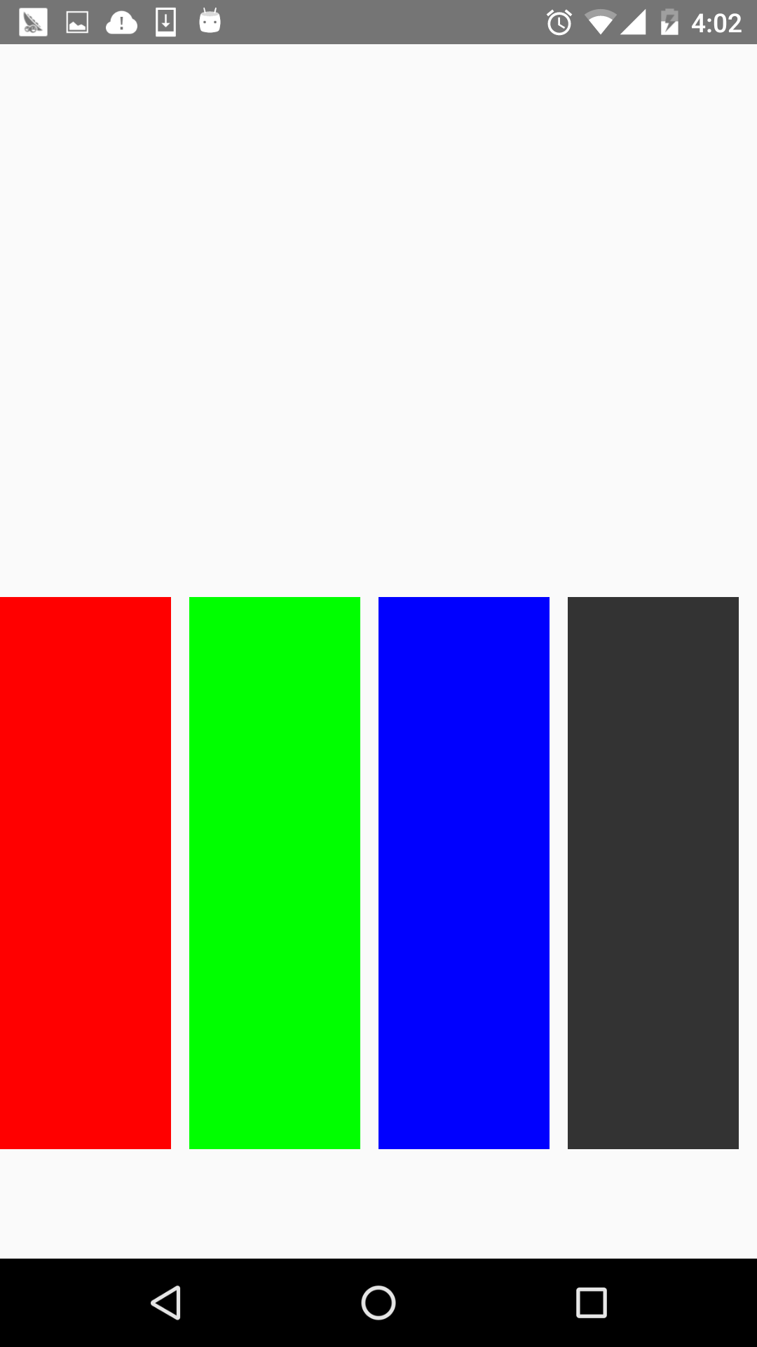
就是和父容器頂部對齊。
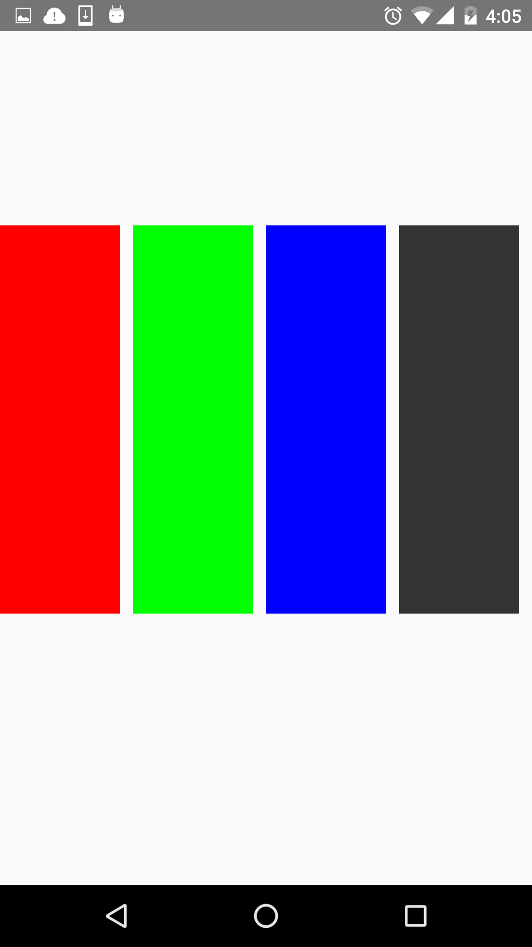
看下flex-end屬性,程式碼就不貼出來了,只要改alignItems屬性就好了。效果圖如下:
可以看到,和底部對齊了。
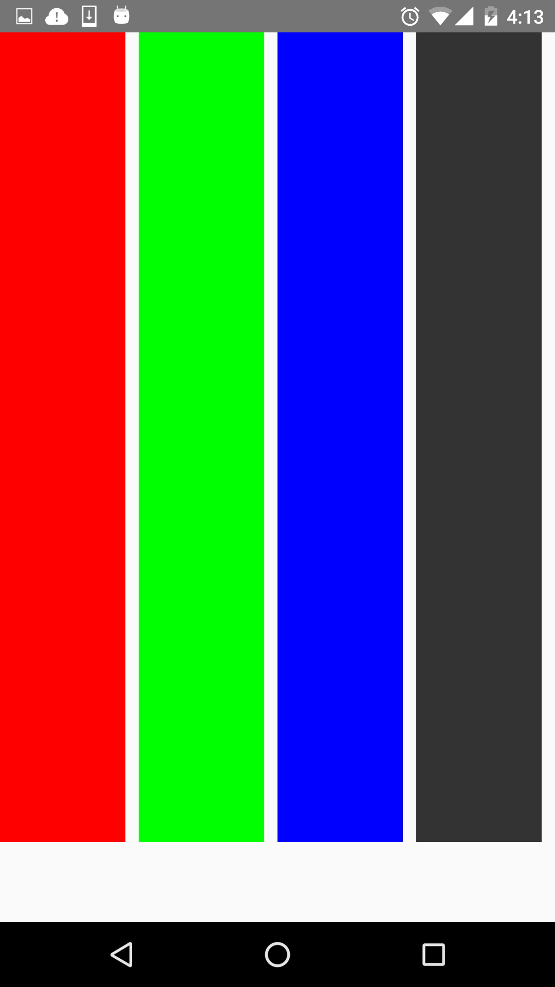
再看下center,這個可以說是用的最多的屬性,它會讓子元件位於父容器的中間位置,看下效果圖:
stretch就是豎直填充,前提是子元件沒有設定height屬性。看下效果圖:
justifyContent
有豎直就水平。justifyContent和alignItems是相對的。它有五個屬性可以設定,分別是flex-start,flex-end,center,space-between,space-around。
* flex-start:伸縮專案與父容器左端靠齊。
* flex-end:與父容器右端靠齊。
* center:水平居中。
* space-between:第一個子元件位於父容器左端,最後一個子元件位於父容器最右端。然後平均分配在父容器水平方向上。
* space-around:所有子元件平均分配在父容器的水平方向上,左右都有留空隙。
先看水平居中(center)的,先看下程式碼:
return(
<View style={styles.flexStyle}>
<View style= {styles.flexSub}/>
</View>
);
……
var styles = StyleSheet.create({
flexStyle:{
height:600,
width:400,
flexDirection: 'row',
alignItems:'center',
justifyContent:'center',
},
flexSub:{
width:100,
height:300,
backgroundColor:'#333333',
marginBottom:10,
},
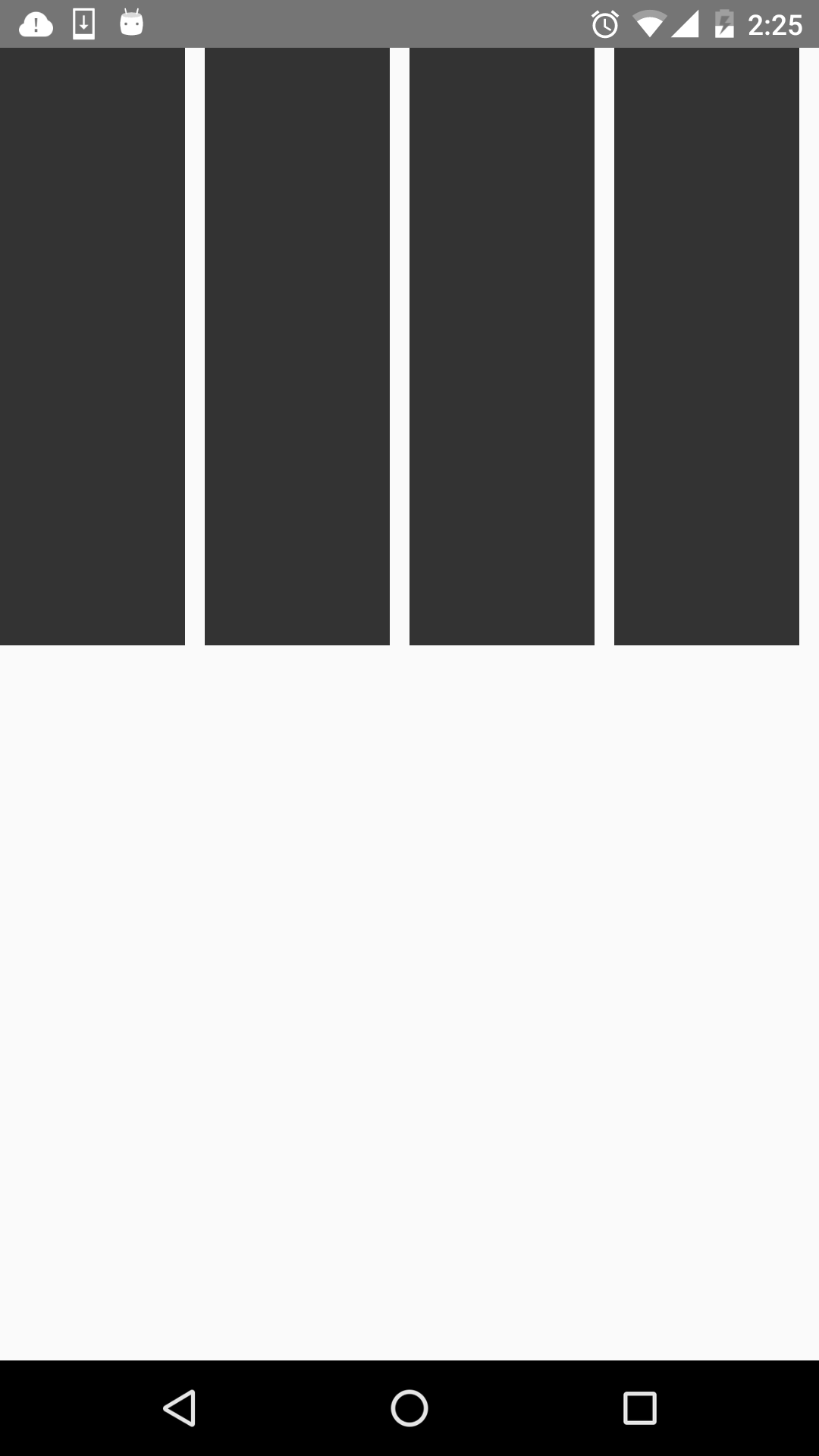
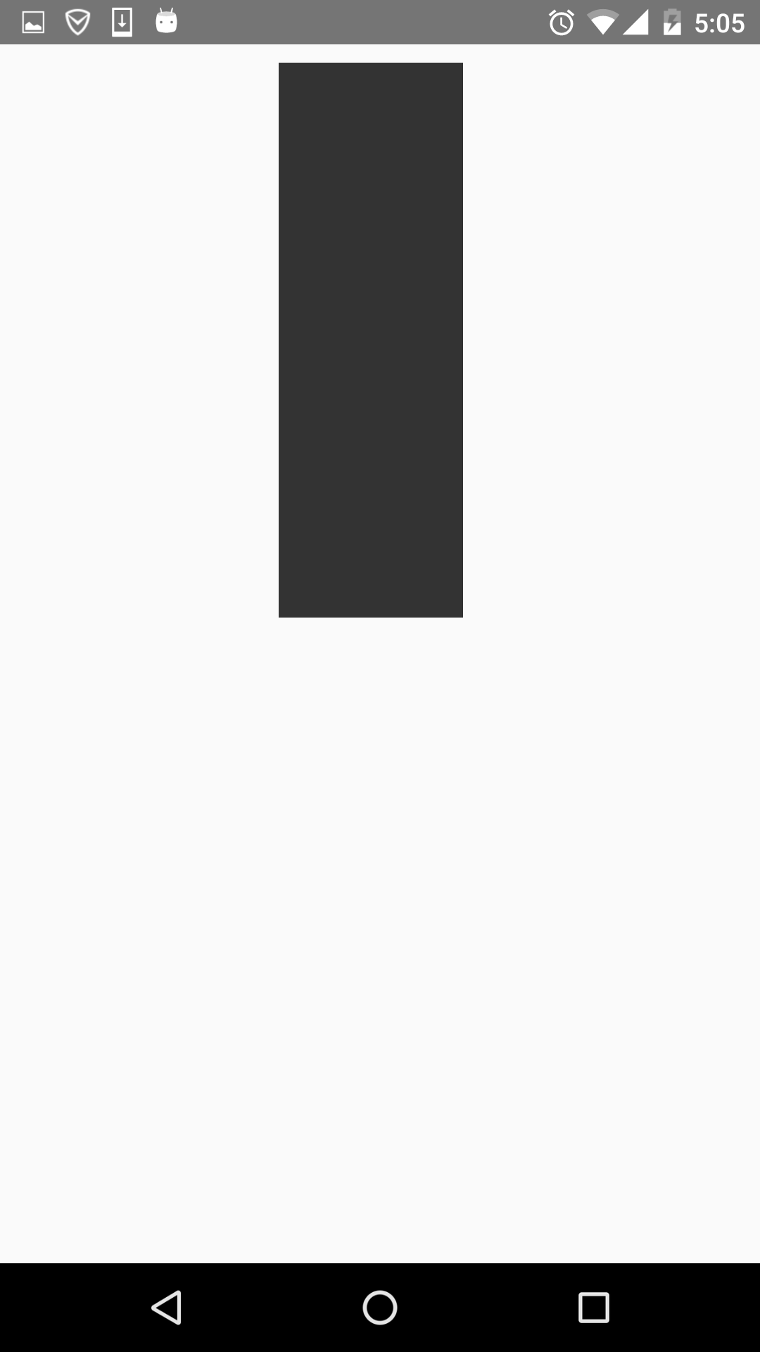
});父容器設定了justifyContent:’center’屬性,所以理論上子元件應該會水平劇中,來看下是否正確。如下:
justifyContent:’flex-start’,水平居左:
justifyContent:’flex-end’,水平居右:
這些都挺簡單的,來看下space-between和space-around的區別,先看下space-between的效果圖:
可以看到它左右都不留空隙。均勻分佈。
再看下space-around的效果圖:
它左右都留有空隙,是平均的位於整個介面的水平方向上。

alignSelf
該屬性用來設定單獨元件的豎直對齊方式,與alignItem有點像。有五個屬性可以設定,auto,flex-start,flex-end,center,streth。
* auto:按照自身設定的寬高來顯示,如果沒設定,效果跟streth一樣。
* flex-start:與父容器頂部對齊。
* flex-end:與父容器底部對齊。
* center:位於垂直位置。
* streth:垂直拉伸。
這個用法跟上面的很像,只是它用於單個元件,如本例子的子View中,看下程式碼:
return(
<View style={styles.flexStyle}>
<View style= {styles.flexSelf1}/>
<View style= {styles.flexSelf2}/>
<View style= {styles.flexSelf3}/>
<View style= {styles.flexSelf4}/>
</View>
);
……
var styles = StyleSheet.create({
flexStyle:{
height:600,
flexDirection:'row',
},
flexSelf1:{
flex:1,
alignSelf:'flex-start',
height:300,
backgroundColor:'#ff0000',
marginRight:10,
},
flexSelf2:{
flex:1,
alignSelf:'flex-end',
height:300,
backgroundColor:'#00ff00',
marginRight:10,
},
flexSelf3:{
flex:1,
alignSelf:'stretch',
backgroundColor:'#0000ff',
marginRight:10,
},
flexSelf4:{
flex:1,
alignSelf:'auto',
height:300,
backgroundColor:'#333333',
marginRight:10,
},
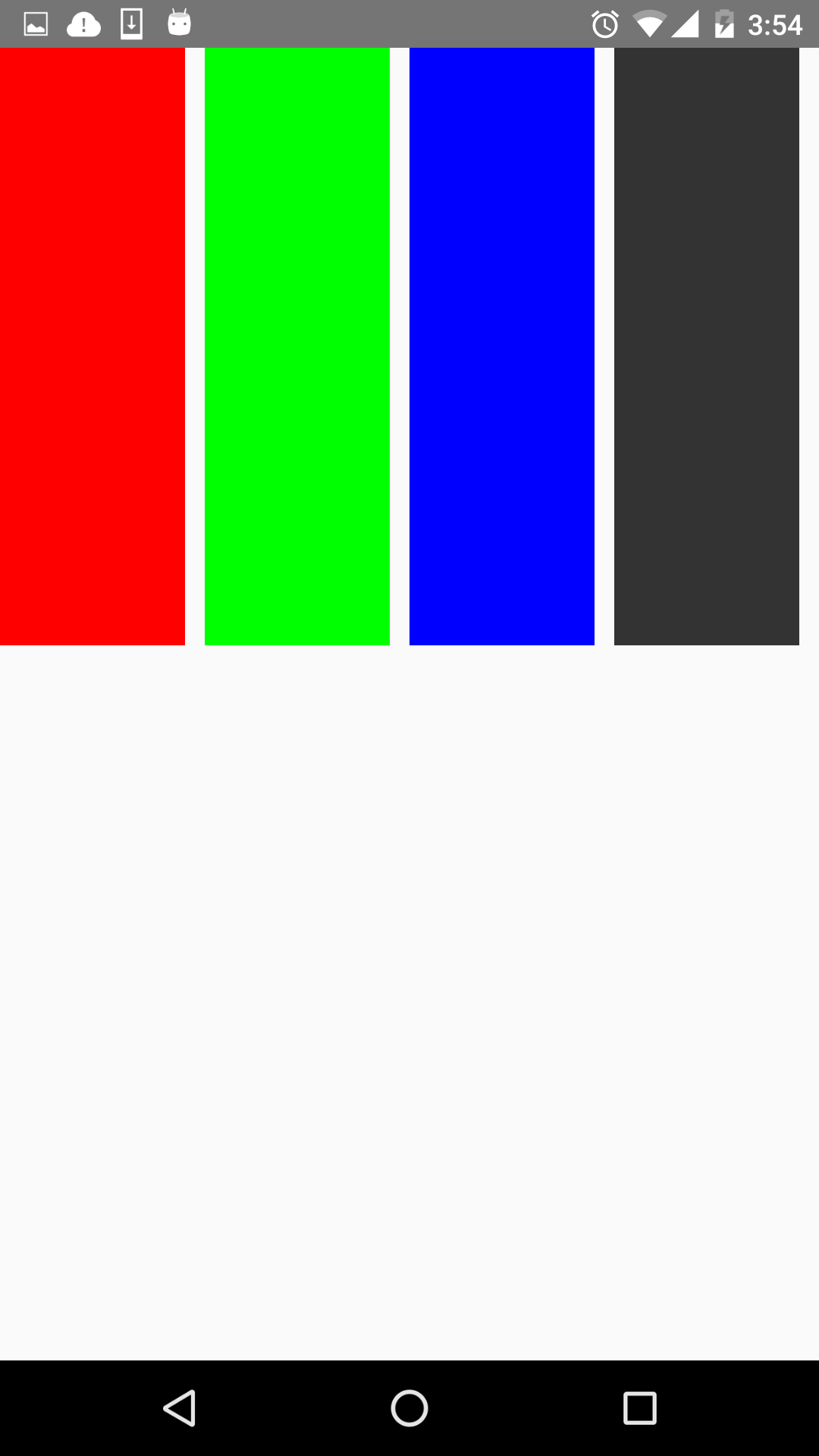
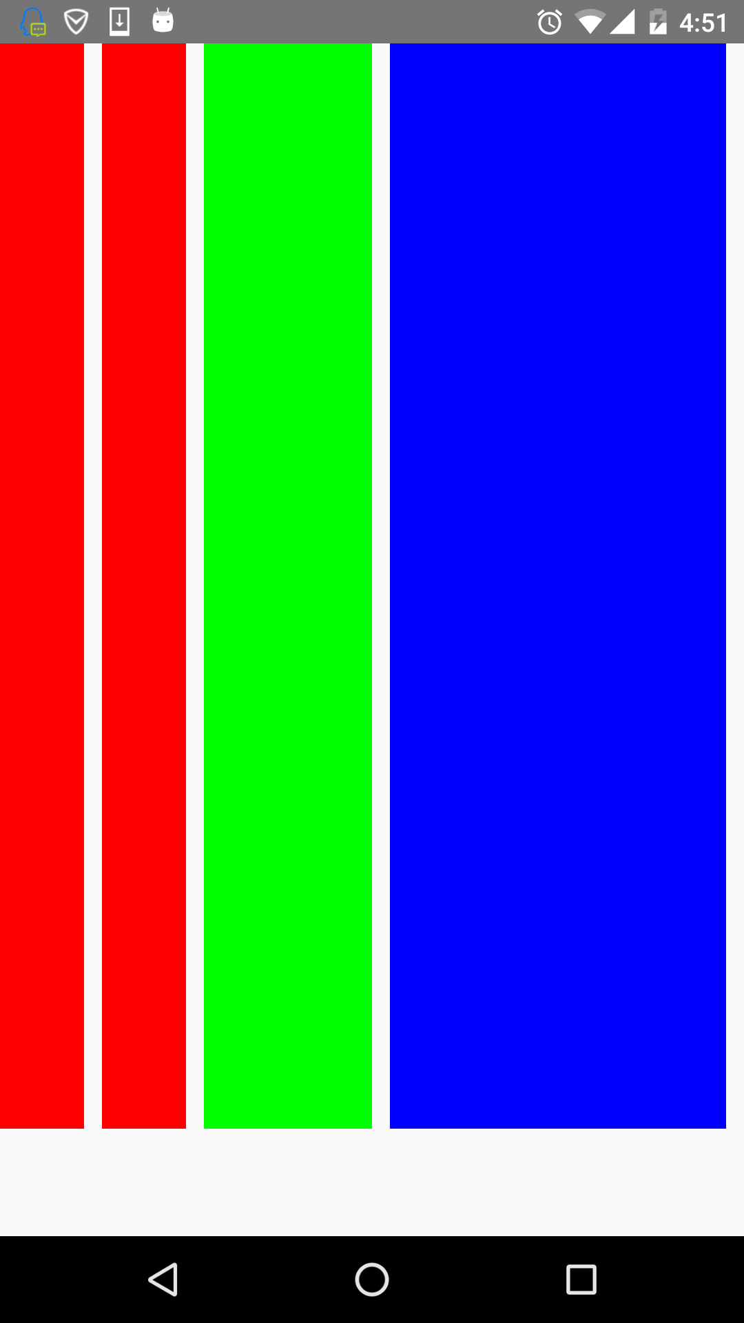
)}以上幾個子View設定了不同的樣式 ,看下效果圖:
看到了,flex-start就是頂部對齊,flex-end就是與底部對齊。第三個View是streth,垂直拉伸了。第四個View是auto,因為設定了高度,所以顯示如圖所示。沒有顯示center,但它的效果可想而知,就不再演示啦。
flex
flex指設定伸縮專案的伸縮樣式,可以把它類比成android中的weight屬性。
看一個程式碼就清楚它的用法了。
return(
<View style={styles.flexStyle}>
<View style= {styles.flexSelf1}/>
<View style= {styles.flexSelf1}/>
<View style= {styles.flexSelf2}/>
<View style= {styles.flexSelf3}/>
</View>
);
……
var styles = StyleSheet.create({
flexStyle:{
height:600,
flexDirection: 'row',
flex:1,
},
flexSub:{
height:300,
backgroundColor:'#333333',
marginBottom:10,
},
flexSelf1:{
flex:1,
backgroundColor:'#ff0000',
marginRight:10,
},
flexSelf2:{
flex:2,
backgroundColor:'#00ff00',
marginRight:10,
},
flexSelf3:{
flex:4,
backgroundColor:'#0000ff',
marginRight:10,
},
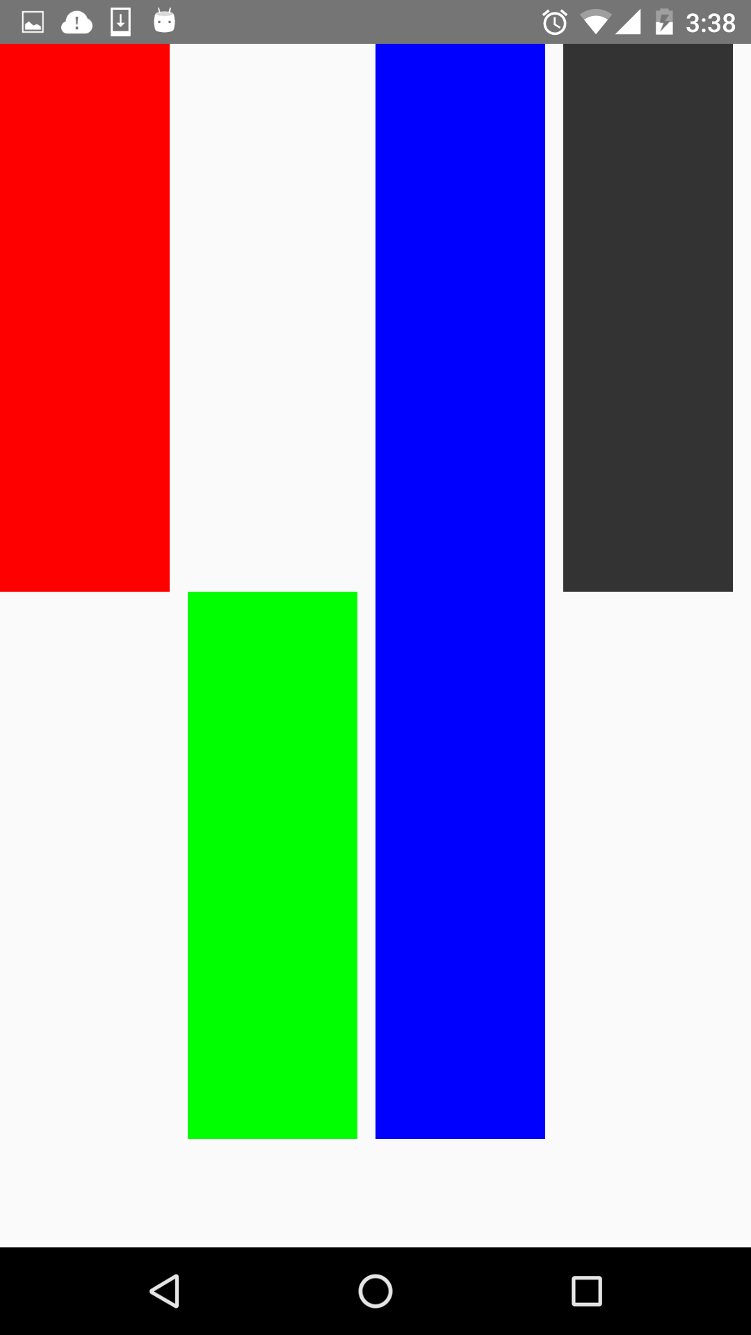
});效果圖如下:
可以看到,flex為2的元件寬度為flex為1寬度的兩倍,flex為4元件寬度則為flex為1的元件寬度的4倍。
flexWrap
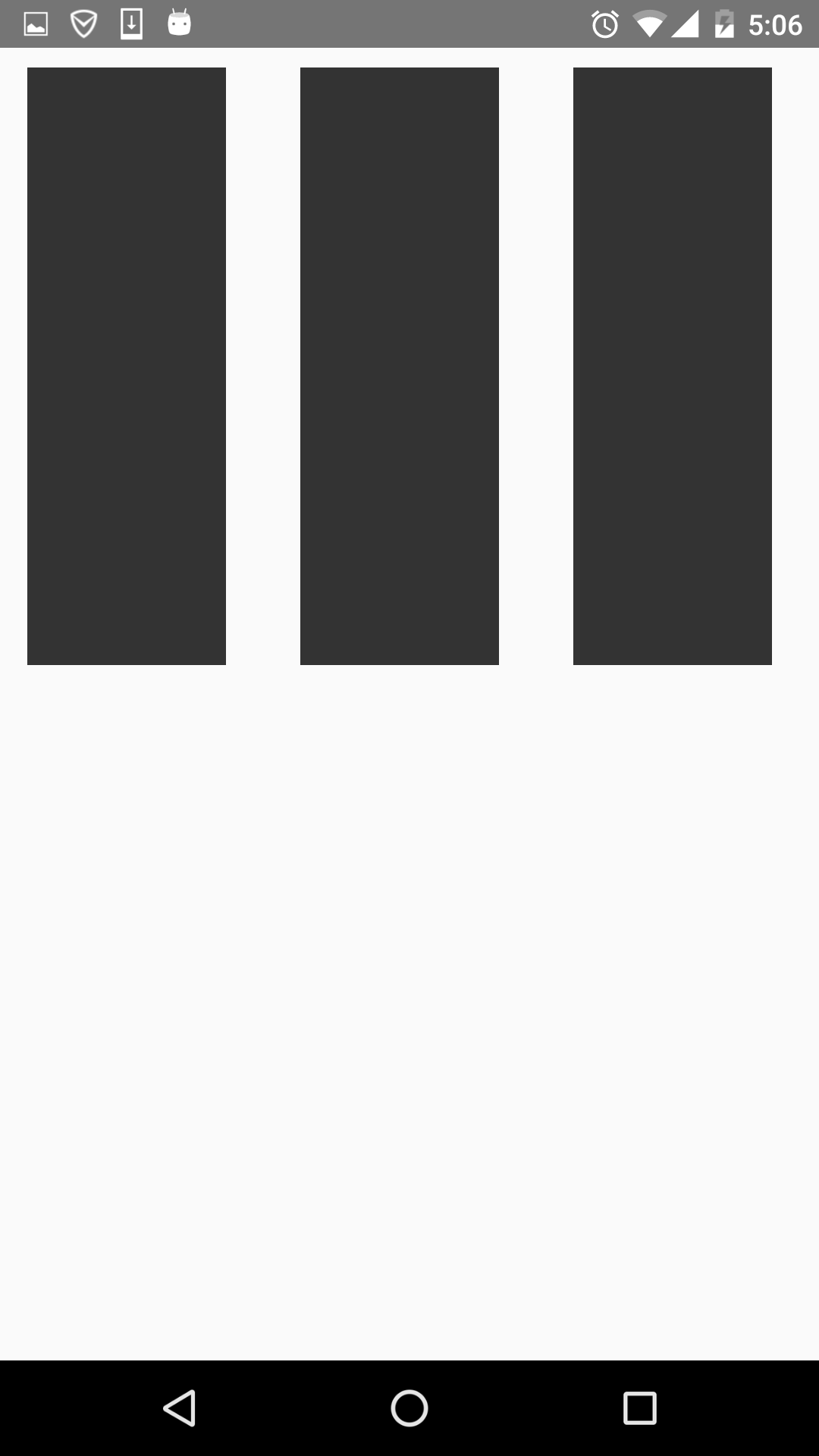
其實這些屬性都是CSS原有的屬性,只是RN只支援了部分的屬性。flexWrap用於設定是否可換行,有兩個屬性可設定nowrap和wrap。
- nowrap:即使空間不夠也不換行。
- wrap:空間不夠的話自動換行。
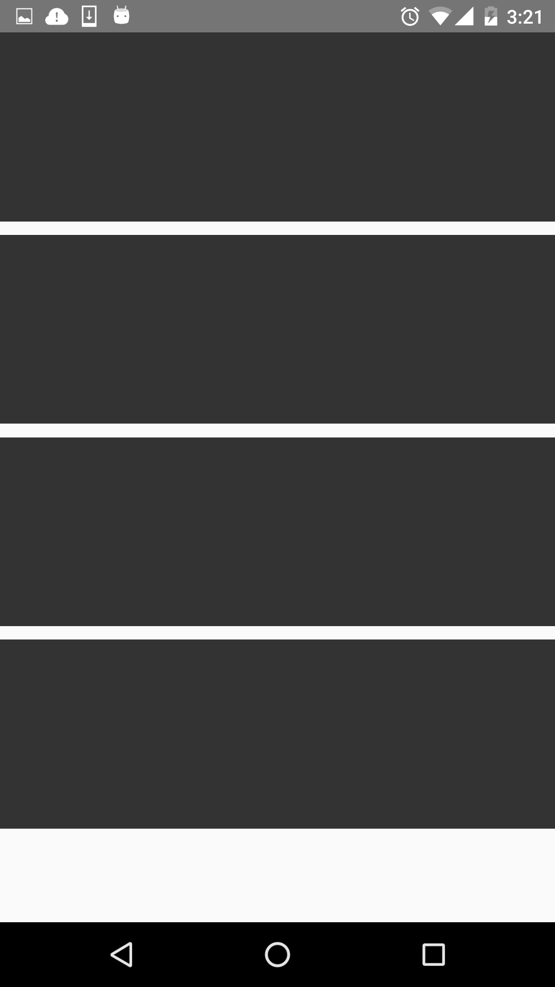
如設定成wrap時,空間不夠效果圖如下:
第四個放不下,就換行了。
這篇部落格對RN的flexbox進行一個介紹,內容很簡單,也是對自己學的東西的一個鞏固。