
使用Python估計資料概率分佈函式
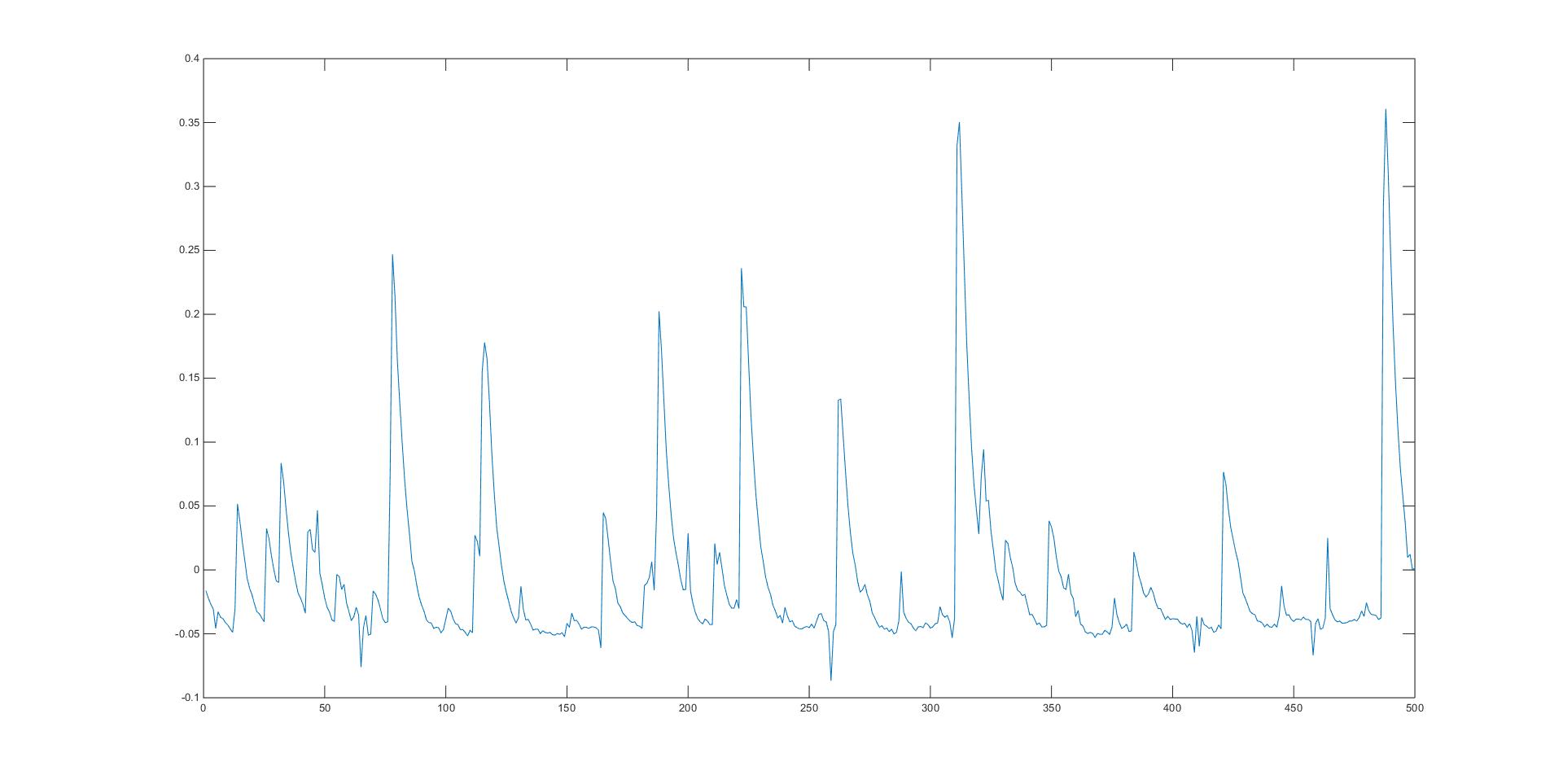
現有的資料是有探測器測得的脈衝訊號,需要對其發生時間進行一個估計。
主要思想是,通過hist方法將不同時間間隔出現的次數進行一個計數。
經過統計可以得到
[1.4000000e+013.2000000e+01,7.8000000e+01,1.1600000e+02,1.8800000e+02,2.2200000e+02,2.6300000e+02,3.1200000e+02,3.2200000e+02,4.2100000e+02,4.8800000e+02,5.0400000e+02,5.1900000e+02,5.7200000e+02,7.2600000e+02,9.4500000e+02,1.0100000e+03,1.0650000e+03,1.1900000e+03]
這些位置出現了脈衝峰,需要驗證它們之間出現的間隔分佈。
第一步,讀取脈衝位置並計算脈衝間時間間隔
def read_diff() 使用pandas的read_table方法,由於是在win平臺下,各種格式問題,導致讀入後會出現三列(應該為峰值一列,位置一列),最後一列應該為win下的’\t’,想著不礙事,就沒仔細研究。
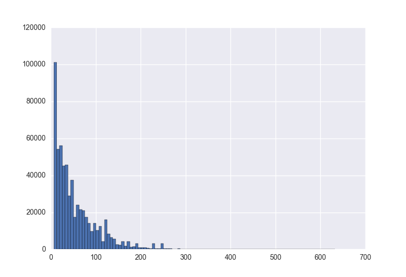
第二步,對間隔頻率進行統計
對時間間隔進行統計可以直接使用Pandas.Series的的hist方法,也可以使用pylab中的hist方法。
其實Pandas中的畫圖方法也是呼叫的matplotlib,都可以在畫出直方圖的同時進行密度估計,但是這兩個方法有一個最大的區別就是,pylab中的hist可以指定一個range引數.
```matplotlib.pyplot.hist(x, bins=10, range=None, normed=False, weights=None, cumulative=False, bottom=None, histtype='bar', align='mid 其中cnt[0]為計數值y,cnt[1]為座標x
第三步,對已得的頻率分佈做概率密度估計
Plan A
使用scipy.optimize中的最小二乘擬合
import numpy as np
from scipy.optimize import leastsq
def func_n(x, a, b, c):
    return a * np.square(x) + b * x + c

def residuals(p, x, y, reg):
    regularization = 0.1  # 正則化係數lambda
    ret = y - func_n(x, p)
    if reg == 1:
        ret = np.append(ret, np.sqrt(regularization) * p)
    return ret

def diff_time(bin=50, reg=1):
    d = pd.read_table('data/peaks.csv', names=['pks', 'locs', 'None'], delim_whitespace=True)
    time = d['locs']
    dif = []
    for i, ele in enumerate(time[1:]):
        dif.append(ele - time[i])
    plt.figure()
    cnt = plt.hist(dif, bins=bin)
    x = cnt[1]
    y = cnt[0]
    try:
        r = leastsq(residuals, [1, 1, 1], args=(x, y, reg))
    except:
        print("Error - curve_fit failed")
    y2 = [func(i, r[0]) for i in x]
    plt.plot(x, y2)
因為之前用過該方法,所以想用使用二次多項函式來擬合,結果總是丟擲異常Error - curve_fit failed。
不過也是,別人明明是一個類指數函式,你非要哪個二次多項函式來擬合=。=
Plan B
在查閱一番以後,發現,對於這類函式擬合的話,from scipy.optimize import curve_fit這個對於高斯型、指數型函式擬合效果比較好
[curve_fit]
def kde_sim(bins=150):
    dif = read_diff()
    plt.figure()
    cnt = plt.hist(dif, bins=bins)
    x = cnt[1]
    y = cnt[0]
    popt, pcov = curve_fit(func, x[1:], y)
    y2 = [func(i, popt[0], popt[1], popt[2]) for i in x]
    plt.figure()
    plt.plot(x, y2, 'r--')
    return popt
然而效果也不是很好。。。
Plan C
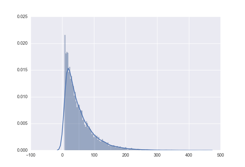
正在我躊躇之際,發現了一個新大陸,Seaborn,這模組簡直叫個好用,圖畫出來好看不說,速度還很快,還簡單,對於畫這種概率分佈的圖簡直不要太爽。displot
sns.distplot(data)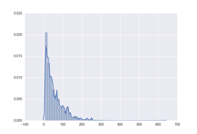
除了可以對曲線概率密度進行估計外,還可以使用指定函式進行擬合
from scipy import stats
sns.distplot(d,kde=False, fit=stats.expon)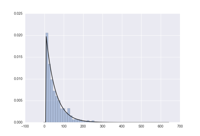
第四步 得到其概率密度函式
Plan A 使用scipy.stats模組
scipy.stats
在該模組中有兩大通用分佈類應用在連續隨機分佈變數和離散隨機分佈變數。
超過80種連續分佈和10中離散分佈。在這之外,可以由使用者自己建立新的分佈
針對連續變數的主要方法有:
Rvs:隨機變數
Pdf:概率密度函式
Cdf:累計分佈函式
Sf:殘差函式
Ppf:百分點函式,cdf/1
Isf:1/sf
不過..首先其文件對我這種六級低空飄過的人來說讀著好煩惱,所以,對其引數設定什麼的不是很理解,從而導致得到的pdf(概率密度函式)效果不是很好。
Plan B 繼續使用Seaborn模組
後來我轉念一想,seaborn返回的圖中,擬合的函式都很好的,seaborn內部肯定有估計後的函式模型,我直接加一個模型輸出不就好了,於是我就從github上把原始碼下了下來。
在displot模組中,對matplotlib做了很多的加工,在函式擬合方面使用的是
statsmodels和scipy.stats.gaussian_kde這兩個模組,優先使用的是statsmodels
distplot裡關於擬合的程式碼如下
    if fit is not None:
        fit_color = fit_kws.pop("color", "#282828")
        gridsize = fit_kws.pop("gridsize", 200)
        cut = fit_kws.pop("cut", 3)
        clip = fit_kws.pop("clip", (-np.inf, np.inf))
        bw = stats.gaussian_kde(a).scotts_factor() * a.std(ddof=1)
        x = _kde_support(a, bw, gridsize, cut, clip)
        params = fit.fit(a)  #stats中分佈具有fit方法
        pdf = lambda x: fit.pdf(x, *params)   #由引數得到概率密度函式
        y = pdf(x) #得到y向量
        if vertical:
            x, y = y, x
        ax.plot(x, y, color=fit_color, **fit_kws)
        if fit_color != "#282828":
            fit_kws["color"] = fit_color
通過該模組呼叫得到的概率密度obj有以下方法
Methods

cdf()   Returns the cumulative distribution function evaluated at the support.
cumhazard() Returns the hazard function evaluated at the support.
entropy()   Returns the differential entropy evaluated at the support
evaluate(point) Evaluate density at a single point.
fit([kernel, bw, fft, weights, gridsize, ...])  Attach the density estimate to the KDEUnivariate class.
icdf()  Inverse Cumulative Distribution (Quantile) Function
sf()    Returns the survival function evaluated at the support.
Attributes
dataset (ndarray) The dataset with which gaussian_kde was initialized.
d (int) Number of dimensions.
n (int) Number of datapoints.
factor (float) The bandwidth factor, obtained from kde.covariance_factor, with which the covariance matrix is multiplied.
covariance (ndarray) The covariance matrix of dataset, scaled by the calculated bandwidth (kde.factor).
inv_cov (ndarray) The inverse of covariance.
Methods
kde.evaluate(points) (ndarray) Evaluate the estimated pdf on a provided set of points.
kde(points) (ndarray) Same as kde.evaluate(points)
kde.integrate_gaussian(mean, cov) (float) Multiply pdf with a specified Gaussian and integrate over the whole domain.
kde.integrate_box_1d(low, high) (float) Integrate pdf (1D only) between two bounds.
kde.integrate_box(low_bounds, high_bounds) (float) Integrate pdf over a rectangular space between low_bounds and high_bounds.
kde.integrate_kde(other_kde) (float) Integrate two kernel density estimates multiplied together.
kde.resample(size=None) (ndarray) Randomly sample a dataset from the estimated pdf.
kde.set_bandwidth(bw_method=’scott’) (None) Computes the bandwidth, i.e. the coefficient that multiplies the data covariance matrix to obtain the kernel covariance matrix. .. versionadded:: 0.11.0
kde.covariance_factor (float) Computes the coefficient (kde.factor) that multiplies the data covariance matrix to obtain the kernel covariance matrix. The default is scotts_factor. A subclass can overwrite this method to provide a different method, or set it through a call to kde.set_bandwidth.所以,如果想獲取概率分佈,直接return pdf
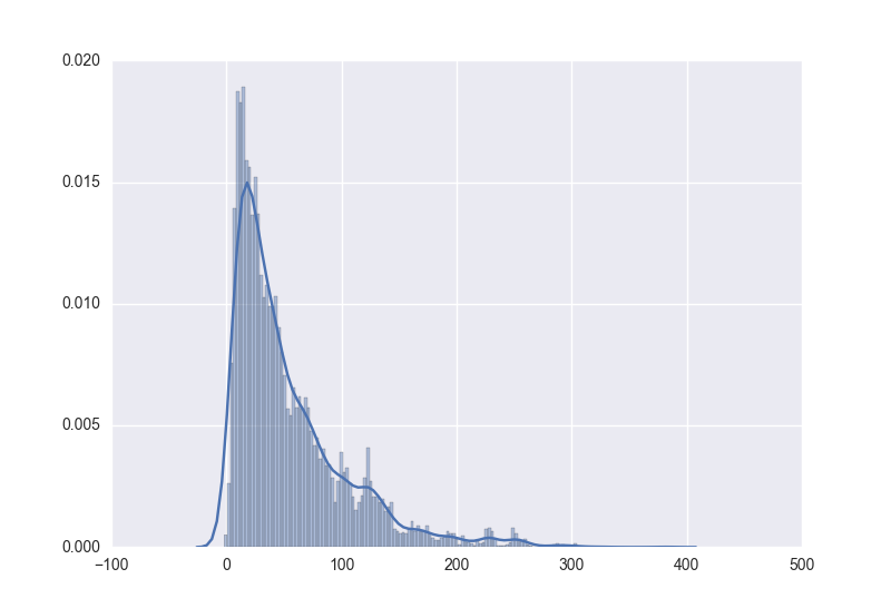
其中,使用
sns.distplot(data, bins=150, kde=True)時得到的模型進行resample同樣資料量得到的hist圖形為

當resample的數量較小時,因為噪聲的緣故反而比較接近原始分佈
而使用
from scipy import stats
sns.displot(data, bins=150, kde=False, fit=stats.expon)
時,是將資料擬合成一個指數函式,運用該模型resample同樣資料得到的資料hist圖形為
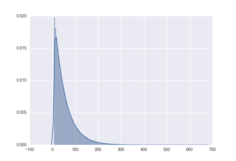
fit後使用較少數量的樣本值同樣也是
有一個問題就是,在原資料中,是從大於0的某個值開始hist的,但在resample的資料中,出現了一個較小的值甚至是負值,這個還不知道是否會給接下來的工作造成影響….先這樣吧,如果要求比較嚴的話,就只能回來再改動了。