
HTML+CSS實現動態背景登入頁面
阿新 • • 發佈:2019-02-07
實現背景圖片的動態變換
首先我們把背景圖片插入進去,在HTML頁面body板塊中,新增幾個圖片div
<body>
<div class="bgk">
<div class="bgk-image" style="background-image: url('${pageContext.request.contextPath}/img/1.jpg')"></div>
<div class="bgk-image" style="background-image: url('${pageContext.request.contextPath}/img/2.jpg')" 好了,圖片已經插入進去了,那麼現在就要對圖片修飾。為了使圖片能足夠大覆蓋頁面,則div中可以有 background-size: cover;滿足你的需求。而下面一步,則是最重要的環節–css動畫的設計(在div class=”bgk”中進行)
-webkit-animation-name: kenburns; /*-animation-name:為@keyframes 動畫規定名稱,必須與-animation-duration同時使用,否則無動畫效果*/
animation-name: kenburns;
-webkit-animation-duration: 16 動畫設計好了以後,再為每個圖片繫結子元素選擇器,有幾張變換的圖片就需要幾個選擇器:
.bgk-image:nth-child(1) {
    -webkit-animation-name: kenburns-1;       /*選擇器上的名稱*/
    animation-name: kenburns-1;
    z-index: 3;         /*動畫堆疊順序,值越大表示越先播放,離使用者越近*/
    }
.bgk-image:nth-child(2) {
    -webkit-animation-name: kenburns-2;
    animation-name: kenburns-2;
    z-index: 2;
    }
/*..........................*/建立好選擇器以後,再為每一個選擇器進行動畫設計
@-webkit-keyframes kenburns-1 {
    0% {
        opacity: 1;     /*規定不透明度*/
        -webkit-transform: scale(1.2);
        transform: scale(1.2);
    }
    27.861% {
        opacity: 0;
        -webkit-transform: scale(1);
        transform: scale(1);
    }
    80.435% {
        opacity: 0;
        -webkit-transform: scale(1.21);
        transform: scale(1.21);
    }
    100% {
        opacity: 1;
    }
}
/*................*/
最後你就可以在頁面上看到具體效果了
對登入表單的設計
前一個環節完成了背景圖片的動態變換,那麼現在我們就需要在背景圖片上實現表單的呈現,首先你得新增一個表單在頁面中
<div class="form_login_div">
<form class="form_login" action="" method="post">
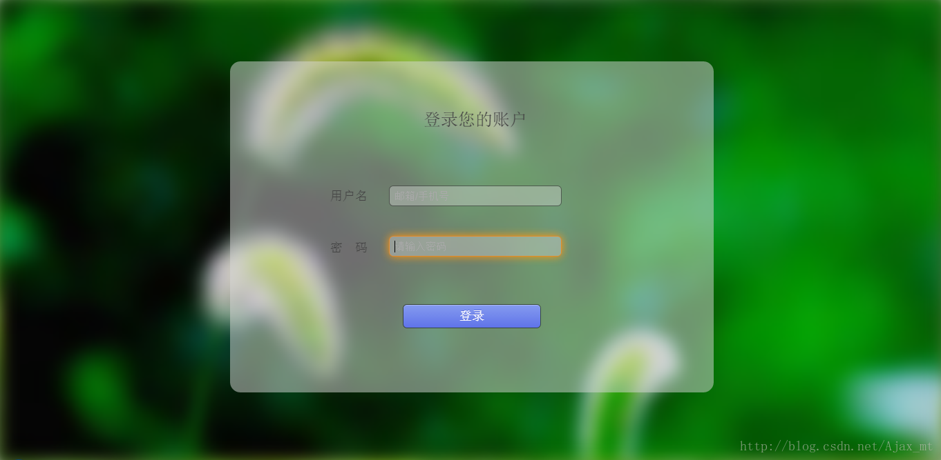
<label class="login_title">登入您的賬戶</label>
<label class="username">使用者名稱</label><input class="input_username" id="input_username" type="text" name="username" placeholder="郵箱/手機號"/>
<label class="password">密 碼</label><input class="input_password" id="input_password" type="password" name="password" placeholder="請輸入密碼"/>
<input type="submit" value="登入"/><br/>
</form>
</div>現在的表單肯定是什麼效果也沒有,只是最初始的顯示出來,那麼我們就要對錶單樣式進行修改。我要的背景效果是模糊透明,那麼background: rgba(216,216,216,0.5); 這一句就幫你實現透明的效果。為了使表單邊角看著更圓潤一些,下一句就可以進行美化:border-radius:15px;
總的來說就寫成下面這個樣子
.form_login{
    margin: auto;
    width:700px;
    height: 480px;
    top: 90px;
    left: 333px;
    position: absolute;
    border-radius: 15px;
    background: rgba(216,216,216,0.5);      /*設定form表單透明度*/
    text-align: center;
    overflow: hidden;
}骨架已經搭建好了,我們就開始對立面的各個元素進行設計。和上面方法一樣,你可以設定輸入框的透明度和圓角,這裡不再呈現。為了在輸入框聚焦的時候好看一點,我們還可以進行高亮設計
.form_login input[type="text"]:focus,input[type="password"]:focus{
    border-color:rgba(255,128,0,.75);
    -webkit-box-shadow:0 0 18px rgba(255,153,18,3);
}你還可以對輸入框中的游標初始位置改變: padding:7px;
終於要完了,最後是對提交按鈕的美化。
    margin:20px auto;
    text-shadow:0px -1px 0px #5b6ddc;       /*文字陰影設定*/
    outline:none;
    border:1px solid rgba(0,0,0,0.49);       /*按鈕邊框顏色與透明度設定*/
    -webkit-background-clip: padding-box;   /*規定內容的繪製區域,padding-box為內邊框距*/
    background-clip: padding-box;
    border-radius:6px;
    cursor:pointer;     /*游標形狀,pointer為一隻手的形狀*/
background-color:#768ee4; /*按鈕背景顏色*/為了體現滑鼠放上去有一個動態的效果呈現:margin-top:22px ;還可以進行顏色的轉變,具體如下
.form_login input[type="submit"]:hover{
        background-color:#5f73e9;
        background-image:-webkit-linear-gradient(bottom,#5f73e9 0%,#859bef 100%);
        background-image:-moz-linear-gradient(bottom,#5f73e9 0%,#859bef 100%);
        background-image:-ms-linear-gradient(bottom,#5f73e9 0%,#859bef 100%);
        background-image:-o-linear-gradient(bottom,#5f73e9 0%,#859bef 100%);
        -webkit-box-shadow: inset 0px 1px 0px #aab9f4;      /*當滑鼠放在按鈕上個時邊框的陰影*/
        box-shadow: inset 0px 1px 0px #aab9f4;
        margin-top:22px;
    }
最後整個設計完成,你可以看見你最終的成果了(這只是截圖,懶得去錄動態圖了)
注:博主是初學者,有什麼地方不對還請前輩們指出,萬分感謝!