
python plt 畫圖
阿新 • • 發佈:2018-11-14
使用csv資料檔案在百度網盤
import pandas as pd
unrate = pd.read_csv('unrate.csv')
# pd.to_datetime() 轉換成日期格式,即由 1948/1/1 轉換為 1948-01-01
unrate['DATE'] = pd.to_datetime(unrate['DATE'])
print(unrate.head(12))
DATE VALUE
0 1948-01-01 3.4
1 1948-02-01 3.8
2 1948-03-01 4.0
3 1948-04-01 3.9
4 1948 首先匯入plt庫
import matplotlib.pyplot as plt
折線圖
first_twelve = unrate[0:12]
plt.plot(first_twelve['DATE'], first_twelve['VALUE'])
plt.show()

可以看出橫座標太長,我們可以旋轉一下橫座標
plt.plot(first_twelve['DATE'], first_twelve['VALUE'])
plt.xticks(rotation=90) # 橫座標每個值旋轉90度
plt.xlabel('Month')
plt.ylabel('Unemployment Rate')
plt.title('Monthly Unemployment Trends, 1948')
plt.show()

plt可以畫多個子圖
import numpy as np
fig = plt.figure()
ax1 = fig.add_subplot(2,1,1) # 畫2行1列個圖形的第1個 
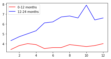
可以設定圖大小,新增圖例
unrate['MONTH'] = unrate['DATE'].dt.month
unrate['MONTH'] = unrate['DATE'].dt.month

fig = plt.figure(figsize=(6,3)) # 設定圖大小 figsize=(6,3)
plt.plot(unrate[0:12]['MONTH'], unrate[0:12]['VALUE'], c='red',label = '0-12 months')
plt.plot(unrate[12:24]['MONTH'], unrate[12:24]['VALUE'], c='blue',label = '12-24 months')
plt.legend(loc='best')

plt.show()
柱形圖
import pandas as pd
reviews = pd.read_csv('fandango_scores.csv')
cols = ['FILM', 'RT_user_norm', 'Metacritic_user_nom', 'IMDB_norm', 'Fandango_Ratingvalue', 'Fandango_Stars']
norm_reviews = reviews[cols]
print norm_reviews.shape
(146, 6)

import matplotlib.pyplot as plt
from numpy import arange
num_cols = ['RT_user_norm', 'Metacritic_user_nom', 'IMDB_norm', 'Fandango_Ratingvalue', 'Fandango_Stars']
bar_heights = norm_reviews.ix[0, num_cols].values
bar_positions = arange(5) + 0.75
tick_positions = range(1,6)

fig, ax = plt.subplots()
ax.bar(bar_positions, bar_heights, 0.5) #畫柱形圖,0.5表示柱的寬度,,ax.barh畫水平的柱形圖
ax.set_xticks(tick_positions)
ax.set_xticklabels(num_cols, rotation=45)

ax.set_xlabel('Rating Source')
ax.set_ylabel('Average Rating')
ax.set_title('Average User Rating For Avengers: Age of Ultron (2015)')
plt.show()

散點圖
fig, ax = plt.subplots()
ax.scatter(norm_reviews['Fandango_Ratingvalue'], norm_reviews['RT_user_norm']) #畫散點圖
ax.set_xlabel('Fandango')
ax.set_ylabel('Rotten Tomatoes')
plt.show()

統計bins柱形圖
import pandas as pd
import matplotlib.pyplot as plt
reviews = pd.read_csv('fandango_scores.csv')
cols = ['FILM', 'RT_user_norm', 'Metacritic_user_nom', 'IMDB_norm', 'Fandango_Ratingvalue']
norm_reviews = reviews[cols]

fandango_distribution = norm_reviews['Fandango_Ratingvalue'].value_counts()
fandango_distribution = fandango_distribution.sort_index()
print(fandango_distribution)
2.7     2
2.8     2
2.9     5
3.0     4
3.1     3
3.2     5
3.3     4
3.4     9
3.5     9
3.6     8
3.7     9
3.8     5
3.9    12
4.0     7
4.1    16
4.2    12
4.3    11
4.4     7
4.5     9
4.6     4
4.8     3
Name: Fandango_Ratingvalue, dtype: int64

fig, ax = plt.subplots()
# 分成20個bins,統計4-5的資料
ax.hist(norm_reviews['Fandango_Ratingvalue'], range=(4, 5),bins=20)
plt.show()

箱形圖
num_cols = ['RT_user_norm', 'Metacritic_user_nom', 'IMDB_norm', 'Fandango_Ratingvalue']
fig, ax = plt.subplots()
ax.boxplot(norm_reviews[num_cols].values) # boxplot 畫箱形圖 .values轉換成array形式
ax.set_xticklabels(num_cols, rotation=90)
ax.set_ylim(0,5)
plt.show()

設定邊框樣式
import pandas as pd
import matplotlib.pyplot as plt

women_degrees = pd.read_csv('percent-bachelors-degrees-women-usa.csv')
fig, ax = plt.subplots()
ax.plot(women_degrees['Year'], women_degrees['Biology'], c='blue', label='Women')
ax.plot(women_degrees['Year'], 100-women_degrees['Biology'], c='green', label='Men')
ax.tick_params(bottom="on", top="on", left="off", right="off") #將左右的小橫杆去掉

for key,spine in ax.spines.items(): #設定邊框不可見
    spine.set_visible(False)
# End solution code.
ax.legend(loc='upper right')
plt.show()

設定線顏色,粗細
import pandas as pd
import matplotlib.pyplot as plt

women_degrees = pd.read_csv('percent-bachelors-degrees-women-usa.csv')
major_cats = ['Biology', 'Computer Science', 'Engineering', 'Math and Statistics']

cb_dark_blue = (0/255, 107/255, 164/255) # 設定rgb顏色值
cb_orange = (255/255, 128/255, 14/255)

fig = plt.figure(figsize=(24, 6)) #設定圖大小,24表示寬度,6表示長度

for sp in range(0,4):
    ax = fig.add_subplot(1,4,sp+1)
    ax.plot(women_degrees['Year'], women_degrees[major_cats[sp]], c=cb_dark_blue, label='Women')
    ax.plot(women_degrees['Year'], 100-women_degrees[major_cats[sp]], c=cb_orange, label='Men',linewidth = 6)
    ax.set_xlim(1968, 2011)
    ax.set_ylim(0,100)
    ax.set_title(major_cats[sp])
    ax.tick_params(bottom="on", top="on", left="off", right="off")

plt.legend(loc='upper right')
plt.show()
