
如何用純 CSS 創作一架雙冀飛機
阿新 • • 發佈:2018-12-09
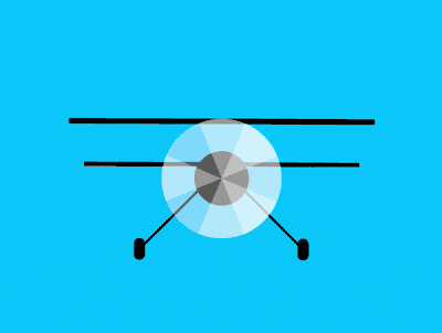
效果預覽
線上演示按下右側的“點選預覽”按鈕可以在當前頁面預覽,點選連結可以全屏預覽。
https://codepen.io/comehope/pen/yxVYRL
可互動視訊
此視訊是可以互動的,你可以隨時暫停視訊,編輯視訊中的程式碼。
請用 chrome, safari, edge 開啟觀看。
https://scrimba.com/p/pEgDAM/cmVLRc9
原始碼下載
本地下載每日前端實戰系列的全部原始碼請從 github 下載:
https://github.com/comehope/front-end-daily-challenges
程式碼解讀
定義 dom,容器中包含 3 個子元素,分別表示機冀、螺旋槳和輪子,機冀有 4 片葉片,輪子左右各一隻:
<div class="plane">
    <div class="wings"></div>
    <div class="fans">
        <span></span>
        <span></span>
        <span></span>
        <span></span>
    </div>
    <div class="wheels">
        <span class="left"></span>
        <span class="right"></span>
    </div>
</div>
定義容器尺寸:
.plane {
    width: 28em;
    height: 13em;
    font-size: 10px;
}
定義子元素整體佈局和共有屬性:
.plane {
    display: flex;
    justify-content: center;
    position: relative;
}

.plane > * {
    position: absolute;
}

.plane > *::before,
.plane > *::after {
    content: '';
    position: absolute;
}
定義基本色:
.plane {
    color: black;
}
畫出雙冀:
.wings {
    width: inherit;
    display: flex;
    justify-content: center;
}

.wings::before {
    width: inherit;
    height: 0.5em;
    background-color: currentColor;
}

.wings::after {
    top: 4em;
    width: 90%;
    height: 0.4em;
    background-color: currentColor;
}
畫出螺旋槳的中心:
.fans {
    width: 11em;
    height: 11em;
    outline: 1px dashed;
    background: radial-gradient(
        black 2.5em,
        transparent 2.5em
    );
}
定義葉片的形狀為半圓形:
.fans span {
    width: inherit;
    height: inherit;
}

.fans span::before {
    width: inherit;
    height: 50%;
    background-color: rgba(255, 255, 255, 0.4);
    border-radius: 50% 50% 0 0 / 100% 100% 0 0;
}
分別旋轉葉片的角度,使 4 個頁片均勻分佈在一個圓內:
.fans span::before {
    transform-origin: bottom;
    transform: rotate(calc((var(--n) - 1) * 90deg));
}

.fans span:nth-child(1) {
    --n: 1;
}

.fans span:nth-child(2) {
    --n: 2;
}

.fans span:nth-child(3) {
    --n: 3;
}

.fans span:nth-child(4) {
    --n: 4;
}
畫出 2 個輪子:
.wheels {
    width: 16em;
    height: 2em;
    outline: 1px dashed;
    bottom: 0;
    display: flex;
    justify-content: space-between;
}

.wheels span {
    position: static;
    width: 1em;
    height: inherit;
    background-color: currentColor;
    border-radius: 0.5em;
}
畫出輪子的 2 個支架:
.wheels span {
    display: flex;
    justify-content: center;
}

.wheels span::before {
    width: 0.2em;
    height: 8em;
    background-color: currentColor;
    transform-origin: bottom;
    bottom: 1em;
    z-index: -1;
}

.wheels .left::before {
    transform: rotate(45deg);
}

.wheels .right::before {
    transform: rotate(-45deg);
}
接下來製作動畫效果。
增加螺旋槳旋轉的動畫效果:
.fans span {
    animation: fans-rotating 0.8s linear infinite;
    animation-delay: calc(var(--n) * 0.1s);
}

@keyframes fans-rotating {
    to {
        transform: rotate(-1turn);
    }
}
增加飛機飛行的動畫效果:
.plane {
    animation: fly 5s infinite;
}

@keyframes fly {
    10%, 50%, 100% {
        top: 0;
    }

    25% {
        top: 1em;
    }

    75% {
        top: -1em;
    }
}
再增加飛機旋轉的動畫效果:
.plane {
    animation:
        plane-rotating 10s infinite,
        fly 5s infinite;
}

@keyframes plane-rotating {
    10%, 30%, 50% {
        transform: rotate(0deg);
    }

    20% {
        transform: rotate(-4deg);
    }

    80% {
        transform: rotate(8deg);
    }

    100% {
        transform: rotate(-1turn);
    }
}
大功告成!
原文地址:https://segmentfault.com/a/1190000016217774