
【eCharts】echarts餅狀圖資料重疊導致指示線及顯示文字重疊解決
阿新 • • 發佈:2018-12-18
轉載自:https://www.cnblogs.com/minjh/p/9081893.html 先看他的,再看我的,不看我的也行
1. 解決前
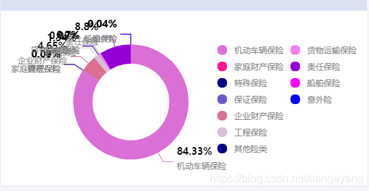
2.解決後

3.程式碼
function makePie(id, title, name, data, show) {
    if (!show) {
        show = false;
    }
    var myChart = echarts.init(document.getElementById(id));
    var option = {
        title: {
			show:false,
            text: title,
            top: 2,
            left: '20',
			textStyle: {fontSize: 14,color:'#767676',fontWeight:600,fontFamily:'Microsoft Yahei'},

        },
        tooltip: {
            trigger: 'item',
			textStyle: {fontSize: 12,fontFamily:'Microsoft Yahei'},
            formatter: function (params) {
                return params.data.name + ":<br/>" + fmoneyf(params.data.value, 0) + "(" + params.percent + "%)";
            }
        },
        legend: {
            // type: 'scroll',
			orient:'vertical',
			top:80,
			y:'middle',
			height:'60%',
            right: getValueFromJson(data, 'name').length > 6 ? 0 : 5,
		    textStyle: {fontSize: 12,color:'#848484'},
			icon:'circle',
            data: getValueFromJson(data, 'name')
        },
        series: [
            {
                name: name,
                x: 'left',
                y: 'center',
                type: 'pie',
				center:['50%', '60%'],
                //radius: getValueFromJson(data, 'name').length > 6 ?  ['40%', '84px'] :  ['46%','90px'],
				 radius: '55%',
                avoidLabelOverlap: true,
                minAngle: 5,
                label: {
                	align: 'left',
                	normal: {
                        show: show,
						lineHeight:30,
						textStyle: {fontFamily:'Microsoft Yahei'},
						formatter(v) {
                            let text = Math.round(v.percent)+'%' + '' + v.name
                            if(text.length <= 8)
                            {
                                return text;
                            }else if(text.length > 8 && text.length <= 16){
                                return text = `${text.slice(0,8)}\n${text.slice(8)}`
                            }else if(text.length > 16 && text.length <= 24){
                                return text = `${text.slice(0,8)}\n${text.slice(8,16)}\n${text.slice(16)}`
                            }else if(text.length > 24 && text.length <= 30){
                                return text = `${text.slice(0,8)}\n${text.slice(8,16)}\n${text.slice(16,24)}\n${text.slice(24)}`
                            }else if(text.length > 30){
                                return text = `${text.slice(0,8)}\n${text.slice(8,16)}\n${text.slice(16,24)}\n${text.slice(24,30)}\n${text.slice(30)}`
                            }
                        },
						rich: {
							color1: {
								color: '#000000',
								fontSize: 14,
								lineHeight:12,
								fontWeight:600
							},
							color2: {
								color: '#848484'  ,
								fontSize: 12,
							}
						},
                    }, emphasis: {
                        show: !show,
						textStyle: {fontSize: 12,color:'#000000',fontFamily:'Microsoft Yahei'},
                        formatter: function (params) {
                            return params.data.name + ": " + fmoneyf(params.data.value, 0) + "(" + params.percent + "%)";
                        }
                    }
                },

				labelLine:{
					length:10,
					length2:100,
					lineStyle:{
						color:'#848484',

					}
				},
                data: data,
                color:getValueFromJson(data, 'color'),
            }
        ]
    };
    myChart.setOption(option);
}
4.主要程式碼段:
series: [
            {
                name: name,
                x: 'left',
                y: 'center',
                type: 'pie',
				center:['50%', '60%'],
                //radius: getValueFromJson(data, 'name').length > 6 ?  ['40%', '84px'] :  ['46%','90px'],
				 radius: '55%',
                avoidLabelOverlap: true,
                minAngle: 5,
                label: {
                	align: 'left',
                	normal: {
                        show: show,
						lineHeight:30,
						textStyle: {fontFamily:'Microsoft Yahei'},
						formatter(v) {//此方法為核心程式碼,解決問題
                            let text = Math.round(v.percent)+'%' + '' + v.name
                            if(text.length <= 8)
                            {
                                return text;
                            }else if(text.length > 8 && text.length <= 16){
                                return text = `${text.slice(0,8)}\n${text.slice(8)}`
                            }else if(text.length > 16 && text.length <= 24){
                                return text = `${text.slice(0,8)}\n${text.slice(8,16)}\n${text.slice(16)}`
                            }else if(text.length > 24 && text.length <= 30){
                                return text = `${text.slice(0,8)}\n${text.slice(8,16)}\n${text.slice(16,24)}\n${text.slice(24)}`
                            }else if(text.length > 30){
                                return text = `${text.slice(0,8)}\n${text.slice(8,16)}\n${text.slice(16,24)}\n${text.slice(24,30)}\n${text.slice(30)}`
                            }
                        },
						rich: {
							color1: {
								color: '#000000',
								fontSize: 14,
								lineHeight:12,
								fontWeight:600
							},
							color2: {
								color: '#848484'  ,
								fontSize: 12,
							}
						},
                    }, emphasis: {
                        show: !show,
						textStyle: {fontSize: 12,color:'#000000',fontFamily:'Microsoft Yahei'},
                        formatter: function (params) {
                            return params.data.name + ": " + fmoneyf(params.data.value, 0) + "(" + params.percent + "%)";
                        }
                    }
                },
ps:轉載的