UX Design Immersive: Project 1 — Groupie App
UX Design Immersive: Project 1 — Groupie App
Solving for a user’s need from research to prototype to presentation in 3 days

My challenge: Create an app that will solve a need articulated by my partner Sarah
Phase 1: User Interviews

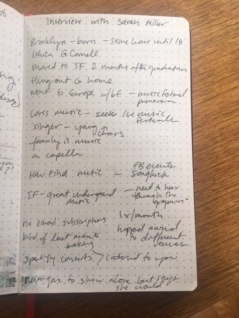
‣ I interviewed Sarah for 30 minutes
‣ I quickly found out that music is a life long passion of hers
‣ Due to limited time, I knew that even though I could ask her more questions about other parts of her life, that I had already hit on a big source of joy for her that likely would have a pain point somewhere.
‣ My critique of my interviewing approach for this first interview is that I asked ‘yes’ or ‘no’ questions that could have been more open ended.
I had some ideas immediately after the interview.
Sarah stressed that she:
‣ Hated missing getting tickets to shows because she didn’t hear about the sales in time
‣ Yet, she didn’t want to be overwhelmed by too many alerts on her phone or email newsletters
So how would she strike the balance between making sure she heard about her top shows with not being on notification overload?
I thought about my own experience (Yes, I know I’m not the user!) about how I would sometimes buy tickets ahead of knowing who would go with me. Sarah reported that she would do this too but most times was able to find someone to go with her. I took the liberty of thinking about the problem scenario of having extra tickets with no one to go with you. And thus the second part of the problem/solution statement was born:
How can Sarah have the best chance of selling the extra tickets she buys upon hearing about a ticket sale to someone that she would like to go with?
Sarah had mentioned that going to shows was a nice way to deepen friendships with existing friends or people in her network. I wondered how the app I could design for her could enable Sarah to post to a wider net of people she knew beyond her inner circle of friends.

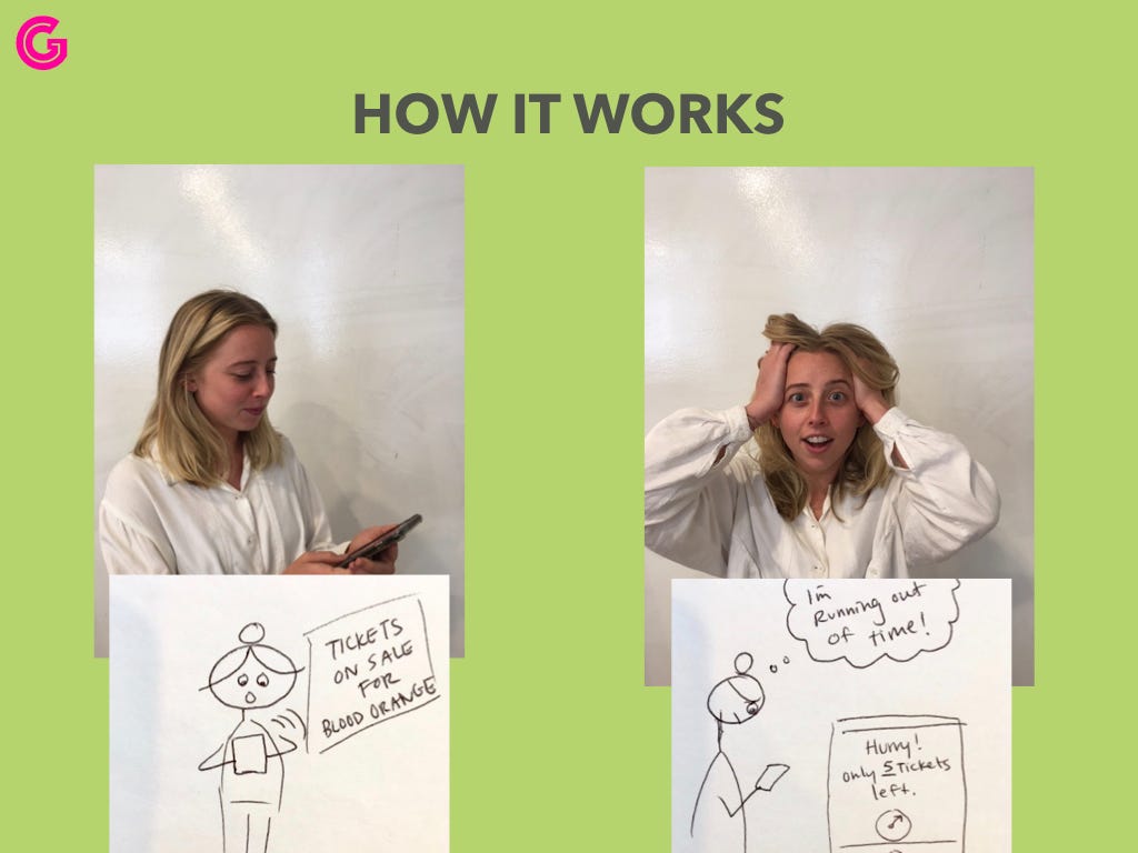
I went home and brainstormed in written form what the app would do and boiled it down to these three main functions:
‣ Help Sarah get notices about only selected top shows
‣ Help Sarah alert her inner circle of friends that she had extra tickets they could buy
‣ Help Sarah alert a wider network (her FB friends) that she had extra tickets they could buy
The seeds for Groupie were planted!
Phase 2: Competitive and Comparative Analysis
Competitive: I researched existing music platforms that I thought might have a feature to alert users about upcoming shows.




Spotify — Has a concert finding feature on their web app and app and sends occasional emails about upcoming shows but you can’t control what kinds of emails you receive and there is no ticket selling feature.
Songkick — This was the closest competitor to my Groupie app idea. Sarah said she felt overwhelmed by the thought of going through all the bands that it pre-populated for her. It also didn’t have a sell tickets feature.
Comparative: I also researched services that do similar things to the Groupie app but not in the music field.

HotelTonight — This model would help Sarah get cheap or last minute tickets. But she was more concerned about getting the tickets than she was about cost.

Classpass — This model would be great for people who go to a lot of shows and are in explore more. I realized that Sarah would want more control over which shows she sees and that the variety of a Classpass model wouldn’t be ideal for her needs.
It was nice to know that there wasn’t an existing app easily discoverable that did the same things I had dreamed up for the Groupie app. This motivated me to press on.
Phase 3: Sketching Storyboard Ideas

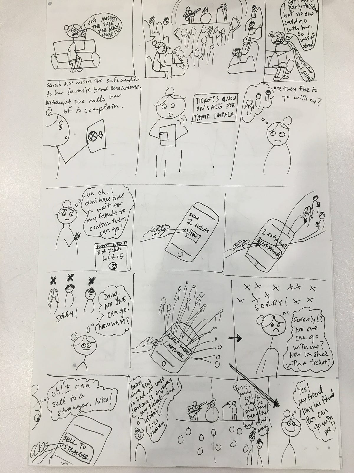
‣ I realized that I wanted to solve for a few different use case scenarios, which would make storyboarding a bit more challenging.
‣ I wasn’t too precious in terms of planning out each particular drawing in advance or even charting out the spacing in between panels. I am hoping that my tendency to dive into things without worrying too much about perfection will aid me in being able to rapidly iterate as a UX designer.
‣ Drawing was fun! And I was pleased that I wasn’t too hard on my drawings. I know that I am not a trained fine artist.
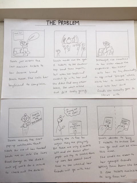
After seeing a few other storyboards that my peers had sketched, I realized that I could make my storyboard even more comprehensible if I reserved cartoon Sarah’s thought and speech bubbles just for her emotions. I could then use space below each panel to provide the context and narrative:

Phase 4: Paper Prototyping
I had already identified several different user flows within the Groupie app.
People would need to be able to sign up — which would include the integrations with Spotify, Facebook and Venmo or Paypal.
People would need to select their top bands they want to track and the friends they want to include in their inner circle of people to send first invites to.
People would need to be able to receive alerts from their friends who bough tickets and either decline or claim tickets.
Since I didn’t have time to do usability testing for all scenarios, I decided to focus on the user flow that most directly addressed Sarah’s problem: Receive alerts about tickets being newly on sale, buy them, and alert your friends.
