
Breaking the Mobile UX Design Rules
Breaking the established rules and conventions that others conform to seems to be essential to the pursuit of innovation. In any industry, it’s always the rule-breakers who disrupt and revolutionise.
Just as Napster broke the entrenched rules of the record industry, paving the way for iTunes and Spotify or Uber broke the rules of the taxi industry to bring us ride-sharing, so too have the rules of UX design evolved through the breaking of rules and conventions.
Ever since Steve Jobs looked at a PC command line and thought ‘There must be a better way to navigate this thing’, the way users interact with digital products has been changing.
In fact, it was Apple who broke one of the biggest and longest standing mobile UX rules when they introduced the touch screen, ending the reign of keypads and stylus pens.
I’m a strong advocate for the breaking of UX rules as a means of advancing our industry and improving the way people interact with hardware and software. But, all too often I see UX rules being broken not for the advancement of our art form but out of a lack of understanding.
The fact is, you can’t successfully break the established rules of UX design without first knowing what those rules are.
To me, the most obvious sign of an ametuer designer is a design that seemingly ignores established an accepted conventions, instead opting for less intuitive and less user-friendly alternatives.
A classic example is the use of web standards in a native mobile application. Think a web drop down menu used instead of a native iOS picker view or header bar navigation instead of a simple iOS tab bar.
Users have a set of basic expectations when it comes to the user experience of an app and if you aren’t going to meet those expectations you better have both a really good reason and a better alternative.
So what are the mobile app UX rules and why do we need them?
The rules, conventions and best practices of mobile UX design is a very big topic in itself and certainly not a topic I can do justice to here is this article but I will give you a few of the basics as an example.
Navigation should be consistent
Choose a method of navigation and stick to it throughout the app. Trying to mix too many different types of navigation within the one app can be clunky and confusing for the user.
Present tasks to the user in bite-sized chunks
Filling out long forms on a mobile device is a thing of the past. Research shows that users are far more likely to complete a sign-up or onboarding process if they are given single tasks, one at a time, rather than a bunch of tasks all on the same page.
Don’t assume Android conventions will work on iOS and vice versa
While the two platforms do handle some functions and interactions in similar ways, there are also some major differences. Concepts like action sheets, segmented controls or push alerts are handled in almost the exact same way by both platforms. But, rely solely on Android’s hardware back button for backwards navigation and your app simply won’t work on iPhone, which doesn’t have a hardware back button.
Keep the interface as clean and simple as possible
Less is definitely more when it comes to good mobile UX design. In the words of Antoine de Saint-Exupéry — “Perfection is achieved when there is nothing left to take away.” By taking away or hiding everything but the task at hand, you as the UX designer are guiding the user’s journey through the app. If you design it well the user’s path should be that of least resistance.
These are just a few of the many mobile UX rules developed through the collective learnings of the entire industry over many years and they are probably pretty obvious to the seasoned designer. For less experienced UXers though, It pays to get to know the rules and know them well. Like a lawyer who knows the law or a taxi driver who knows the city, knowing the rules of UX will enable you to work more efficiently and effectively.
So if these rules are so great, why would one ever need to break them? And when would it be acceptable to do so?
As I mentioned earlier, breaking the rules leads to innovation but breaking them for the sake of breaking them or because you don’t know them in the first place rarely leads to any worthy breakthroughs. The best UX innovation is born out of necessity. When the existing rules and guidelines hinder the desired outcome or your unique vision, it might be a good time to start bending them.

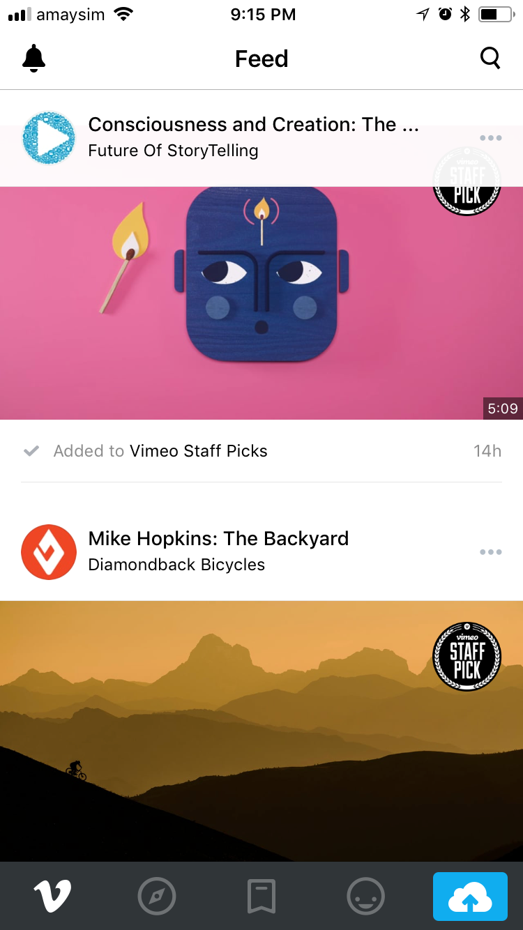
Take, for example the Vimeo app for iOS (See below). Traditionally, the tab bar is only used for top level navigation but here the designer has opted to break that rule and include a video upload button which gives the user direct access to their camera roll. This slight bending of the guidelines is becoming more and more popular with designers starting to treat the tab bar as more of a quick-access menu for the most popular features of the app, rather than purely for top level page navigation.


In the Uber Eats app for iOS (See below), the designer has included a custom floating quick-jump menu button in the bottom right corner for easy navigation around the page. While unusual, this button makes perfect sense in this unique context. The designer has avoided cluttering the more important top of the page where secondary navigation would usually happen, often with segmented controls or a boring accordion view. Instead the floating button keeps the screen clean and free flowing. Floating buttons are also becoming a popular trend as the evolution of UX continues.
So what other UX conventions and best practices are ripe for disruption? The only way to know is follow them when designing and see where they fall over. As app requirements evolve and app development innovations continue to change what is possible, UX change is inevitable.
It’s exciting to see how mobile UX designers today are shaping the UX rules of tomorrow through necessity, curiosity and experimentation. As the rules of UX continue to evolve the only constant rule is to know the rules before you decide to break them.
By Joseph Russell
Founder and Creative Director — DreamWalk