
Sprint Design Exercise: NPS for Mobile
阿新 • • 發佈:2018-12-28
Before designing the experience, I wanted to understand if there are already a set of design patterns available for a NPS form. Arguably, NPS is not new and I was sure other companies would have designed some intuitive solutions for the same already. So, I created a mood board.

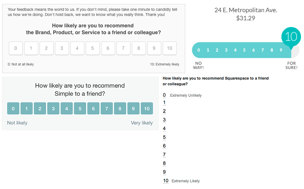
Unfortunately, most examples that I could find were very horizontally heavy. Even on mobile, the experience was not optimised for the audience, form factor and surfacing point. So, based on what I could find, I created a guideline that can help me nail down the design balancing experience as well as aesthetics (for mobile).
Problems I could find in the available solutions:
- Horizontal Layout
- Very small area for selection
- Not good to be viewed on mobile
Ground Rules for our design:
- 0 = Least Likely | 10 = Most Likely
- No Pre-selection — Don’t introduce a bias for the user
- Use slightly bigger UI elements = Leads to easy selection of score
- Should visually look good
- Make sure it looks like a rating/graded scale
- Should have a mechanism to show visual feedback based on the rating given (+ve / -ve)