分類模型效果評估
分類模型效果評估
評估標準:
- Accuracy
- Precision
- Recal
- F Score
- ROC curve
以鳶尾花資料集為例子,我們用PCA(主成分迴歸法)(重點展示效果評估這一塊,所以暫時只用這一方法選擇特徵)絳維,然後進行建模,最後對模型的效果進行評估。
import pandas as pd
import numpy as np
from sklearn.decomposition import PCA
iris = pd.read_csv(r"G:\Iris_copy.csv")
iris.sample(4)| Id | SepalLengthCm | SepalWidthCm | PetalLengthCm | PetalWidthCm | Species | |
|---|---|---|---|---|---|---|
| 89 | 90 | 5.5 | 2.5 | 4.0 | 1.3 | 1 |
| 41 | 42 | 4.5 | 2.3 | 1.3 | 0.3 | 0 |
| 73 | 74 | 6.1 | 2.8 | 4.7 | 1.2 | 1 |
| 54 | 55 | 6.5 | 2.8 | 4.6 | 1.5 | 1 |
del iris["Id"]
iris.sample(3)| SepalLengthCm | SepalWidthCm | PetalLengthCm | PetalWidthCm | Species | |
|---|---|---|---|---|---|
| 45 | 4.8 | 3.0 | 1.4 | 0.3 | 0 |
| 21 | 5.1 | 3.7 | 1.5 | 0.4 | 0 |
| 43 | 5.0 | 3.5 | 1.6 | 0.6 | 0 |
data = iris.iloc[:,:4]
data.head(3)| SepalLengthCm | SepalWidthCm | PetalLengthCm | PetalWidthCm | |
|---|---|---|---|---|
| 0 | 5.1 | 3.5 | 1.4 | 0.2 |
| 1 | 4.9 | 3.0 | 1.4 | 0.2 |
| 2 | 4.7 | 3.2 | 1.3 | 0.2 |
pca = PCA()   #先保留所有成分
pca.fit(data)
print(pca.explained_variance_)
print("各個成分的方差百分比(貢獻率):", pca.explained_variance_ratio_)
[ 4.22484077 0.24224357 0.07852391 0.02368303]
各個成分的方差百分比(貢獻率): [ 0.92461621 0.05301557 0.01718514 0.00518309]當選取前兩個主成分時,累計貢獻率已達97.76%。接下來保留兩個主成分。
pca = PCA(2)
pca.fit(data)
new_data = pca.transform(data)   #轉換原始資料
new_data = pd.DataFrame(new_data)
Species = pd.DataFrame(iris.Species)
new_iris = pd.concat([new_data, Species], axis=1)    #拼接資料
print(new_iris.head())
0 1 Species
0 -2.684207 0.326607 0
1 -2.715391 -0.169557 0
2 -2.889820 -0.137346 0
3 -2.746437 -0.311124 0
4 -2.728593 0.333925 0下面用邏輯迴歸來進行建模
from sklearn.linear_model import LogisticRegression as LR
from sklearn.model_selection import train_test_split
x = new_iris.iloc[:,:2]
y = new_iris.iloc[:,-1]
x_train, x_test, y_train, y_test = train_test_split(x,y,test_size=0.3)
lr = LR()
lr.fit(x_train,y_train)
y_pred = lr.predict(x_test)
接下來介紹幾種模型效果的評測標準

1.混淆矩陣
Actual = [1,1,0,0,1,0,0,0,1,1]
Model = [0,0,0,1,1,1,1,0,0,0]
from sklearn.metrics import confusion_matrix
a = confusion_matrix(Actual, Model)
b = pd.DataFrame(a,columns=["0","1"],index=["0","1"])
b.index.name = "實際"
b.columns.name = "模型"
b| 模型 | 0 | 1 |
|---|---|---|
| 實際 | ||
| 0 | 2 | 3 |
| 1 | 4 | 1 |
二分類中
TP,預測是正樣本實際是正樣本,預測正確
FP,預測是正樣本實際是負樣本,預測錯誤
FN,預測是負樣本實際是正樣本,預測錯誤
TN,預測是負樣本實際是負樣本,預測正確
from sklearn.metrics import confusion_matrix
confusion_matrix(y_test,y_pred)
array([[14, 0, 0],
[ 0, 9, 7],
[ 0, 0, 15]], dtype=int64)2.Accuracy (準確率)
Accuracy = (TP+TF)/(TP+FP+FN+TN)
Accuracy是對分類器整體上的正確率的評價,而Precision是分類器預測為某一個類別的正確率的評價。
Accuracy要在樣本均衡時使用才有效 ,不然再高也不能代表該模型好。
例:我買了100000個玩具,其中100個是Bubblebee,其餘的是海綿寶寶,現在我想把
Bubblebee全部放在客廳。我讓一個小朋友幫我忙,那即使他把這100000個玩具都判定為海綿寶寶,那他的判斷能力
Accuracy = (TP+TF)/(TP+FP+FN+TN)
=(0+99900)/100000
= 99.9%
這麼高的Accuracy卻依然沒有真實反映這個小朋友的判斷能力。Consequently,在實際應用中,若樣本不均衡,不能僅以Accuracy為模型的評判標準。
要加以考慮下面的評判標準。
3.Precision (精準率)
Precision = TP/(TP+FP)
在所有預測為正的樣本中,實際為正的樣本比例 (猜對率)
4.Recall (召回率)
Recall = TP/(TP+FN)
在所有實際為正的樣本中,預測為正的比例 (猜全率)
5.F1-score
精確率和召回率是相互制約的,一般精確率低的召回率高,精確率搞得召回率低。所以出現了f1 score,它是 Precision 和 Recall 的調和平均數。
F1-score = 2 / [(1 / precision) + (1 / recall)]
Fscore裡的一個檢驗值
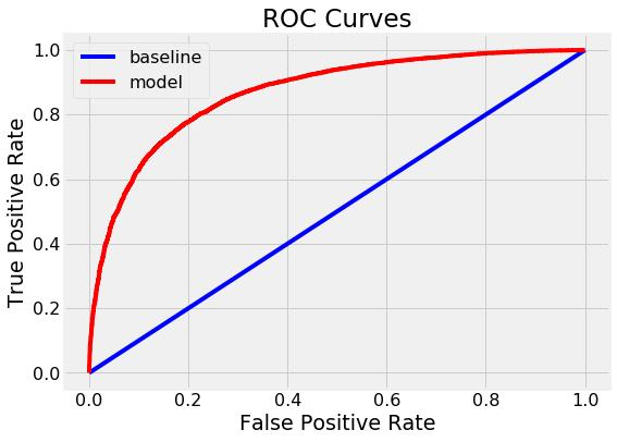
6.Roc/Auc (僅針對二分類變數)
ROC 是針對不同閾值,根據對應的fpr、tpr生成ROC圖,曲線下方的面積就是AUC(類似散點圖跟相關係數的關係,一者以圖的形式給你直觀感受,一者以精確的尺度衡量大小)
橫座標fpr (tpr是模型在正樣本上的預測準確率)
縱座標tpr(fpr是模型在負樣本上的預測準確率)
fpr, tpr, thresholds = metrics.roc_curve(y_test,y_pred)
import matplotlib.pyplot as plt
plt.plot(fpr, tpr)
auc_value = auc(fpr,tpr) #計算auc值
官網參考:https://scikit-learn.org/stable/modules/generated/sklearn.metrics.roc_curve.html
sklearn.metrics.roc_curve(y_true, y_score, pos_label=None, sample_weight=None, drop_intermediate=True)[source]
僅針對二分類變數
""""""
Parameters:
y_true : array, shape = [n_samples]
實際的二分類標籤. 如果標籤不是 {-1, 1} 或者 {0, 1}, 那麼pos_label應該被指定,表示哪個是正標籤,剩下的那個就是負標籤。
y_score : array, shape = [n_samples]
Target scores, 也可以是正類標籤的估計概率, confidence values, or non-thresholded measure of decisions (as returned by “decision_function” on some classifiers).
pos_label : int or str, default=None
Label considered as positive and others are considered negative.
sample_weight : array-like of shape = [n_samples], optional
Sample weights.
drop_intermediate : boolean, optional (default=True)
Whether to drop some suboptimal thresholds which would not appear on a plotted ROC curve. This is useful in order to create lighter ROC curves.
New in version 0.17: parameter drop_intermediate.
Returns:
fpr : array, shape = [>2]
Increasing false positive rates such that element i is the false positive rate of predictions with score >= thresholds[i].
tpr : array, shape = [>2]
Increasing true positive rates such that element i is the true positive rate of predictions with score >= thresholds[i].
thresholds : array, shape = [n_thresholds]
Decreasing thresholds on the decision function used to compute fpr and tpr. thresholds[0] represents no instances being predicted and is arbitrarily set to max(y_score) + 1.
""""""
#後面再翻譯
And then,實踐:
from sklearn import metrics
print("Accuracy:",metrics.accuracy_score(y_test, y_pred))
print("Precision:",metrics.precision_score(y_test, y_pred, average='micro'))
print("Recall:",metrics.recall_score(y_test, y_pred, average='micro'))
print("f1-score:",metrics.f1_score(y_test, y_pred, average='micro'))
Accuracy: 0.844444444444
Precision: 0.844444444444
Recall: 0.844444444444
f1-score: 0.844444444444classification_report直接把上面的指標綜合成一份報告輸出:
from sklearn.metrics import classification_report
print(classification_report(y_test,y_pred))
precision recall f1-score support
0 1.00 1.00 1.00 14
1 1.00 0.56 0.72 16
2 0.68 1.00 0.81 15
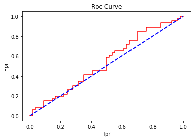
avg / total 0.89 0.84 0.84 45roc、AUC例子:(用random生成隨機數,所以效果較差)
import numpy as np
import random
from sklearn import metrics
import matplotlib.pyplot as plt
%matplotlib inline
y_true = np.random.randint(1,3,size=100)
y_score = [np.random.random() for i in range(100)]
fpr, tpr, thresholds = metrics.roc_curve(y_true, y_score, pos_label=2)
plt.plot(fpr, tpr, color="red", label="Roc Curve(area = %0.2f)" % auc_value)
auc_value = metrics.auc(fpr,tpr)
print("Auc:",auc_value)   #計算auc
plt.plot((0,1),(0,1), color="blue", linewidth=2, linestyle='--')
plt.title("Roc Curve")
plt.xlabel("Tpr")
plt.ylabel("Fpr")
Auc: 0.540660225443
<matplotlib.text.Text at 0xf0843147f0>
一般而言,Auc值處於0.5-1之間,曲線越靠近左上角越好,那麼面積將越接近於1,效果越好。下圖展現較好效果: