
基於BootStrap 4.x 中的Flex 實現各種佈局
各種佈局,總有一款適合你
基於bootstrap 4.x 中的flex 佈局
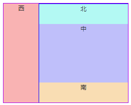
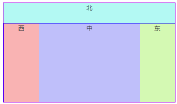
1、左右結構(左窄右寬)
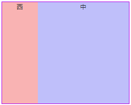
<div class="d-flex flex-row" style="width: 500px; height: 400px;border:2px solid #ae00e6">
    <div region="west" class="west" style="width: 140px;">
        西
    </div>
    <div region="center" class="center flex-fill">
        中
    </div>
</div>
2、左右結構(左寬右窄)
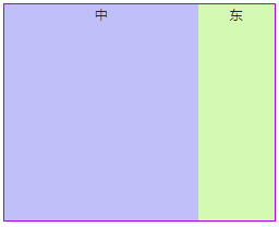
<div class="d-flex flex-row" style="width: 500px; height: 400px;border:2px solid #ae00e6">
<div region="center" class="center flex-fill">
中
</div>
<div region="east" class="east" style="width: 140px;">
東
</div>
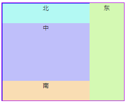
</div>3、上下結構(1)
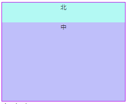
<div class="d-flex flex-column" style="width: 500px; height: 400px;border:2px solid #ae00e6">
    <div region="north" class="north" style="height: 80px;">
        北
    </div>
    <div region="center" class="center flex-fill">
        中
    </div>
</div>
4、上下結構(2)
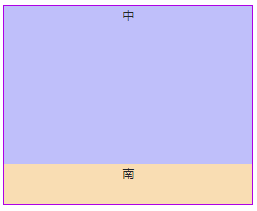
<div class="d-flex flex-column" style="width: 500px; height: 400px;border:2px solid #ae00e6">
    <div region="center" class="center flex-fill">
        中
    </div>
    <div region="south" class="south" style="height: 80px;">
        南
    </div>
</div>
5、上中下
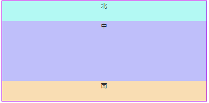
<div class="d-flex flex-column" style=" height: 400px;border:2px solid #ae00e6">
<div region="north" class="north" style="height: 80px;">
北
</div>
<div region="center" class="center flex-fill">
中
</div>
<div region="south" class="south" style="height: 80px;">
南
</div>
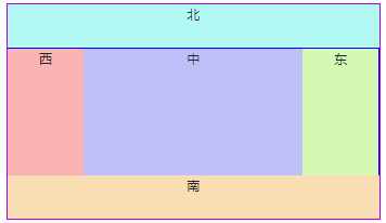
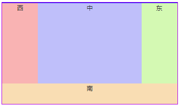
</div>6、左中右
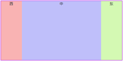
<div class="d-flex flex-row" style=" height: 400px;border:2px solid #ae00e6">
    <div region="west" class="west" style="width: 140px;">
        西
    </div>
    <div region="center" class="center flex-fill">
        中
    </div>
    <div region="east" class="east" style="width: 140px;">
        東
    </div>
</div>
7、組合巢狀(1)
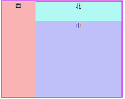
<div class="d-flex flex-row" style="width: 500px; height: 400px;border:2px solid #ae00e6">
    <div region="west" class="west" style="width: 140px;">
        西
    </div>
    <div region="center" class="center flex-fill">
        <div class="d-flex flex-column flex-fill" style="border:1px solid blue;height: 100%;">
            <div region="north" class="north" style="height: 80px;">
                北
            </div>
            <div region="center" class="center flex-fill">
                中
            </div>
        </div>
    </div>
</div>
8、組合巢狀(2)
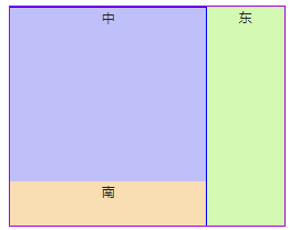
<div class="d-flex flex-row" style="width: 500px; height: 400px;border:2px solid #ae00e6">
    <div region="center" class="center flex-fill">
        <div class="d-flex flex-column flex-fill" style="border:1px solid blue;height: 100%;">
            <div region="center" class="center flex-fill">
                中
            </div>
            <div region="south" class="south" style="height: 80px;">
                南
            </div>
        </div>
    </div>
    <div region="east" class="east" style="width: 140px;">
        東
    </div>
</div>
9、組合巢狀(3)
<div class="d-flex flex-row" style="width: 500px; height: 400px;border:2px solid #ae00e6">
    <div region="center" class="center flex-fill">
        <div class="d-flex flex-column flex-fill" style="border:1px solid blue;height: 100%;">
            <div region="north" class="north" style="height: 80px;">
                北
            </div>
            <div region="center" class="center flex-fill">
                中
            </div>
            <div region="south" class="south" style="height: 80px;">
                南
            </div>
        </div>
    </div>
    <div region="east" class="east" style="width: 140px;">
        東
    </div>
</div>
10、組合巢狀(4)
<div class="d-flex flex-row" style="width: 500px; height: 400px;border:2px solid #ae00e6">
    <div region="west" class="west" style="width: 140px;">
        西
    </div>
    <div region="center" class="center flex-fill">
        <div class="d-flex flex-column flex-fill" style="border:1px solid blue;height: 100%;">
            <div region="north" class="north" style="height: 80px;">
                北
            </div>
            <div region="center" class="center flex-fill">
                中
            </div>
            <div region="south" class="south" style="height: 80px;">
                南
            </div>
        </div>
    </div>
</div>
11、組合巢狀(5)
<div class="d-flex flex-column" style=" height: 400px;border:2px solid #ae00e6">
    <div region="north" class="north" style="height: 80px;">
        北
    </div>
    <div region="center" class="center flex-fill d-flex flex-column">
        <div class="d-flex flex-row flex-fill" style=" height: 100%;border:1px solid blue">
            <div region="west" class="west" style="width: 140px;">
                西
            </div>
            <div region="center" class="center flex-fill">
                中
            </div>
            <div region="east" class="east" style="width: 140px;">
                東
            </div>
        </div>
    </div>
    <div region="south" class="south" style="height: 80px;">
        南
    </div>
</div>
12、組合巢狀(6)
<div class="d-flex flex-column" style=" height: 400px;border:2px solid #ae00e6">
<div region="center" class="center flex-fill d-flex flex-column">
<div class="d-flex flex-row flex-fill" style=" height: 100%;border:1px solid blue">
<div region="west" class="west" style="width: 140px;">
西
</div>
<div region="center" class="center flex-fill">
中
</div>
<div region="east" class="east" style="width: 140px;">
東
</div>
</div>
</div>
<div region="south" class="south" style="height: 80px;">
南
</div>
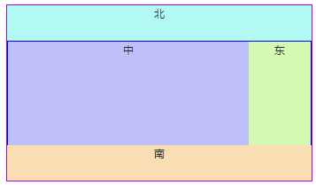
</div>13、組合巢狀(7)
<div class="d-flex flex-column" style=" height: 400px;border:2px solid #ae00e6">
    <div region="north" class="north" style="height: 80px;">
        北
    </div>
    <div region="center" class="center flex-fill d-flex flex-column">
        <div class="d-flex flex-row flex-fill" style=" height: 100%;border:1px solid blue">
            <div region="west" class="west" style="width: 140px;">
                西
            </div>
            <div region="center" class="center flex-fill">
                中
            </div>
            <div region="east" class="east" style="width: 140px;">
                東
            </div>
        </div>
    </div>
</div>
14、組合巢狀(8)
<div class="d-flex flex-column" style=" height: 400px;border:2px solid #ae00e6">
    <div region="north" class="north" style="height: 80px;">
        北
    </div>
    <div region="center" class="center flex-fill d-flex flex-column">
        <div class="d-flex flex-row flex-fill" style=" height: 100%;border:1px solid blue">
            <div region="center" class="center flex-fill">
                中
            </div>
            <div region="east" class="east" style="width: 140px;">
                東
            </div>
        </div>
    </div>
    <div region="south" class="south" style="height: 80px;">
        南
    </div>
</div>
相關推薦
基於BootStrap 4.x 中的Flex 實現各種佈局
各種佈局,總有一款適合你 基於bootstrap 4.x 中的flex 佈局 1、左右結構(左窄右寬) <div class="d-flex flex-row" style="width: 500px; height: 400px;border:2px solid #ae00e6">
OpenCV3.4.X中Nonfree模組的使用-SURF為例
作者使用OpenCV3.4.3+VS2015+CMake3.8.2編譯了包含opencv3.4.3以及opencv_contrib的完整的OpenCV庫,因而能夠使用tracking、saliency等非穩定模組。 在後續工作中又需要利用SURF進行實驗,程式碼如下: P
卡通渲染Cocos2d-x中的實現(描邊與對物體表面顏色的色階化)
卡通渲染Cocos2d-x中的實現 在一些型別的遊戲中,使用卡通渲染能夠將原有模型的一些細節剝離,使原本比較寫實的模型變得卡通化。在這裡,我向大家介紹簡單介紹一下如何在Cocos2d-x中實現卡通渲染。 事實上,卡通渲染具體來說,可以分為兩個部分:描邊與對物體表面顏色的
基於bootstrap的JQuery中所有checkBox預設選中
js部分 //當頁面載入成功之後,所有checkbox都預設選中 $("#definedColumns input[type='checkbox']").prop("checked",true)
Eclipse 4.x中Command是如何對映到Handler的
1. Eclipse中的Command模式,使得具體的實現和Command定義分離,便於維護。 但是在Debug的時候,或者沒有souce code的時候,我們想知道每一個commandId對應的Handler是什麼,怎麼辦? 2. 在Eclipse 4.x中,其實當Ecl
Linux kernel 4.x中的min和max巨集
min和max是兩個很常用的操作,一般都是用巨集實現的,不過想要寫出一個很完善的巨集定義還是要考慮很多問題的,本文就來分析下Linux Kernel中的實現方法。文中僅考慮min,max的結構與其完全相同,只要修改下大於小於號即可。 巨集定義中要將整體和變數都
ArcGIS API for JavaScript 4.x中的3D部分(3)
(3)基於cityengine建模,ArcGIS Portal釋出Web服務 本篇文章主要針對自行生產、釋出、使用3D圖形服務資料。若沒有這類特別需求,可直接使用esri官網API中提供 的服務,簡單
[Unity]關於Unity5.5以及5.4.x中的UGUI在安卓中出現Image不顯示的BUG的解決辦法
使用Instantiate建立UGUI的元件,就有可能會出現看不到的情況,這種看不到不只是看不到,連事件本身也是無法接收,如果除錯會發現物體是在場景中存在的。 如果Canvas設定成overlay就不會有這個問題,但是這個不是解決辦法,因為總有需要設定攝像機的時候。 其
Arcgis api 4.x整合 Echarts實現二三維點狀圖和遷徙圖
由於Arcgis api 4.x版本與3.x版本相比改動較大,重要的是增加了越來越火的三維效果,因此本文用Arcgis api最新版本4.8集成了echarts最新版本4.x,這裡暫時主要實現了點狀圖和二三維遷徙圖的效果,下面對其進行概括介紹。 在arcgis
報表中如何實現不規則佈局
報表,我們習慣於認為主要用來呈現資料彙總、排序、分組對比的效果,一般都是“橫平豎直”的效果,也就是我們常說的二維表格,最多也就是通過一些斜線、合併表示一些特殊的資料關係。事實上,報表還可以通過實行各種不規則的佈局,來發揮更大的作用。 首先,我們就拿我們每個人幾乎都遇到過的大
css中flex:1彈性佈局例子
<!DOCTYPE html> <html> <head> <meta charset="utf-8"> <style> #main { width: 220px; height: 300px;
RecyclerView的簡單使用(一)———— 實現各種佈局效果
文章內容 本文簡單介紹了RecyclerView的基本使用方式,引入了控制RecyclerView佈局的LayoutManager類, 並且實現了RecyclerView的各種佈局效果。 預覽效果圖 準備工作
基於BootStrap的initupload()實現Excel上傳和獲取excel中的數據
增強for循環 function tail throws tab https pow preview layer 簡單說明:後邊要做exl解析(還沒做呢),所以先有一個excel的的上傳以及獲取excel中的數據,展示出來。 代碼: //html代碼 <div c
Appium+Robotframework實現iOS應用的自動化測試-4:OS X中安裝和啟動RIDE
有兩種方式進行Appium測試: 1. 遠端方式進行Appium測試:在Windows系統中啟動RIDE並執行測試,這種方式的好處是方便,簡單,但在一開始可能因為配置的問題測試跑不起來; 2.本地方式
OpenLDAP學習筆記(基於OpenLDAP-2.4.x)
ldap slapd 同步 1.1、什麽是目錄服務(Directory Services)? 目錄是一個特殊的數據庫,專門用於搜索和瀏覽,另外也支持基本的查詢和更新功能。 目錄是一個為查詢、瀏覽和搜索而優化的專業分布式數據庫,它呈樹狀結構組織數據,就好象Linux/Unix系統中的文件
基於CentOS 7.x上部署Zabbix 3.4
zabbix 3.4 監控 linux 服務器 1、安裝zabbix最新版epel源:rpm -ivh http://repo.zabbix.com/zabbix/3.4/rhel/7/x86_64/zabbix-release-3.4-1.el7.centos.noarch.rpm2、安
基於bootstrap的上傳插件fileinput實現ajax異步上傳功能(支持多文件上傳預覽拖拽)
允許 jquery pac locale 錯誤信息 部分 src alt date 首先需要導入一些js和css文件 ? 1 2 3 4 5 6 <link href="__PUBLIC__/CSS/bootstrap.css" rel="exte
基於arcpy實現工作中需要實現功能的經驗和代碼總結:
命名 parameter gem 叠代器 aps .... pri 工具箱 文件夾 不知道從哪兒總結起,就按時間順序整理吧。 關鍵詞:arcgis,python,批量,字段,地圖發布 1.給不同的要素添加不同的批量字段(例如:給“閥門”要素添加“本點號”、“點類型”、“狀
虛幻4 在Material中如何實現 車子壓倒草的功能
比較 shader cnblogs 浮點 性能 nan 向量 eve 要求 上次發了篇介紹車子壓倒草的博文 http://www.cnblogs.com/JinT-Hwang/p/8169146.html 中的2.部分。 不過存在一個問題,就是如果草很多,會有很多個碰撞
基於bootstrap selectpicker ,實現select下拉框模糊查詢功能
sele TP 選擇器 art 基於 i++ 同時 html .html 1、html代碼塊 需要引入bootstrap的css js jquery bootstrap.css bootstrap-select.min.css jquery-