
Android圖層妙用之layer-list的基本使用介紹
1. layer-list 是啥?有啥作用?
1.1 layer-list 是什麼?
簡單理解,layer 是層,list 是列表,那麼 layer-list 就是層列表的意思。但是,是什麼層列表呢?? 其實 layer-list 是用來建立 LayerDrawable 的,LayerDrawable 是 DrawableResource 的一種, 所以,layer-list 創建出來的是 圖層列表,也就是一個drawable 圖形。
1.2 layer-list 用途
上面已經說過,layer-list 是用來建立 圖層列表的,通過它能創建出一些特殊的 drawable, 比如:
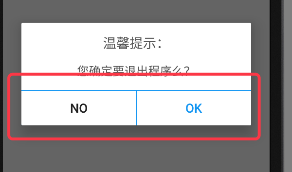
下圖 AlertDialog 中,我們只需要設定 button 的 頂部邊線,以及 左側button的右邊線(或者右側button的左邊線),這種時候我們就無法直接使用 shape 了,因為直接使用 shape 繪製出來的是四個邊框; 如果讓美工切圖也可以,但那樣的話靈活度就差了很多,而且會增加app的體積;這種情況下,使用 layer-list 就是最佳選擇。當然,layer-list 的用途還有很多,這裡只是舉一個例子,具體的使用請繼續往下看。
2. layer-list 的大致原理
layer-list 的大致原理類似 RelativeLayout(或者FrameLayout) ,也是一層層的疊加 ,後新增的會覆蓋先新增的。在 layer-list 中可以通過 控制後新增圖層距離最底部圖層的 左上右下的四個邊距等屬性,得到不同的顯示效果。
上面示例圖中,AlertDialog 底部的 ok按鈕 的背景就是用layer-list實現的。該layer-list 中,底層使用一個填充色為藍色 的shape,上層使用一個填充色為白色的shape ,然後控制上層距離最底層的頂部邊距為1dp , 這樣在視覺上就形成了一個 具有藍色頂部邊線的白色背景。具體程式碼繼續往下看。
3. layer-list 基本使用示例:
因 layer-list 創建出來的也是 drawable 資源,所以,同 shape selector 一樣,都是定義在 res 中的 drawable 資料夾中,也是一個 xml 檔案。使用的時候,同shape selector , 佈局檔案中使用 @drawable/ xxx 引用, 程式碼中使用 R.drawable.xxx 引用。
layer-list 中不同的圖層使用 item 節點來定義。
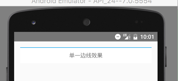
3.1 效果1 :單一邊線
效果圖:
圖中,TextView 只有一個頂部邊線
具體程式碼:
- 建立帶有藍色頂部邊線的 layer-list 圖
在 res 目錄中的 drawable 目錄下,建立名稱為 singleline.xml 的xml 檔案,然後編輯 layer-list 的詳細程式碼,如下:
<?xml version="1.0" encoding="utf-8"?>
<layer-list xmlns:android="http://schemas.android.com/apk/res/android">

    <!--底層使用藍色填充色-->
    <item>
        <shape>
            <solid android:color="#02a0ef"/>
        </shape>
    </item>

    <!--上面一層距離底層的頂部1dp,類似marginTop,填充色為白色,這樣就形成了一個帶有藍色頂部邊線的白色背景的圖-->
    <item android:top="1dp">
        <shape>
            <solid android:color="#fff"/>
        </shape>
    </item>
</layer-list>- 使用 layer-list 圖,設定為textView的背景
<TextView
android:layout_width="match_parent"
android:layout_height="40dp"
android:background="@drawable/singleline"
android:gravity="center"
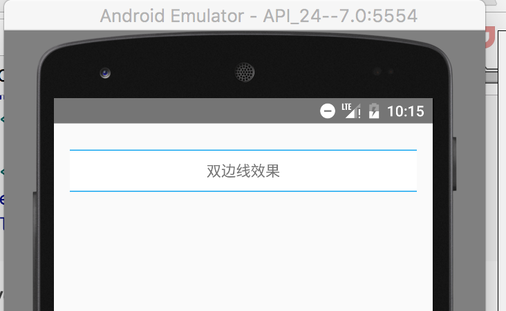
android:text="單一邊線效果"/>3.2 效果2 :雙邊線
效果圖:
圖中,TextView 具有上下邊線
具體程式碼:
- 建立帶有藍色頂部和底部邊線的 layer-list 圖
<?xml version="1.0" encoding="utf-8"?>
<layer-list xmlns:android="http://schemas.android.com/apk/res/android">

    <!--底層使用藍色填充色-->
    <item>
        <shape>
            <solid android:color="#02a0ef"/>
        </shape>
    </item>

    <!--上面一層距離底層的頂部1dp,距離底部1dp,類似marginTop,填充色為白色,這樣就形成了一個帶有藍色頂部邊線和底部邊線的白色背景的圖-->
    <item android:bottom="1dp"
          android:top="1dp">
        <shape>
            <solid android:color="#fff"/>
        </shape>
    </item>
</layer-list>- 使用 layer-list 圖,設定為textView的背景
<TextView
android:layout_width="match_parent"
android:layout_height="40dp"
android:layout_marginTop="10dp"
android:background="@drawable/doubleline"
android:gravity="center"
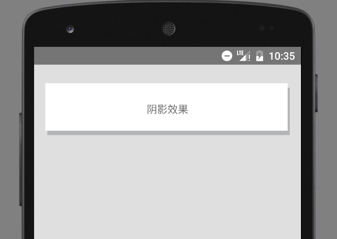
android:text="雙邊線效果"/>3.3 效果3:陰影
效果圖:
具體程式碼:
- 建立 layer-list
<?xml version="1.0" encoding="utf-8"?>
<layer-list xmlns:android="http://schemas.android.com/apk/res/android">

    <!--底層的左邊距離上層左邊3dp, 底層的頂部,距離上層的頂部6dp,如果不做這個控制,底層和上層的左側和上側會重合在一起-->
    <item android:left="3dp"
          android:top="6dp">
        <shape>
            <solid android:color="#b4b5b6"/>
        </shape>
    </item>

    <!--上層的右邊距離底層的右邊3dp, 上層的底部距離底層的底部6dp-->
    <item android:bottom="6dp"
          android:right="3dp">
        <shape>
            <solid android:color="#fff"/>
        </shape>
    </item>
</layer-list>- 使用 layer-list 圖
 <TextView
        android:layout_width="match_parent"
        android:layout_height="70dp"
        android:layout_marginTop="10dp"
        android:background="@drawable/shadow"
        android:gravity="center"
        android:text="陰影效果"/>
3.4 效果4 : 圖片層疊
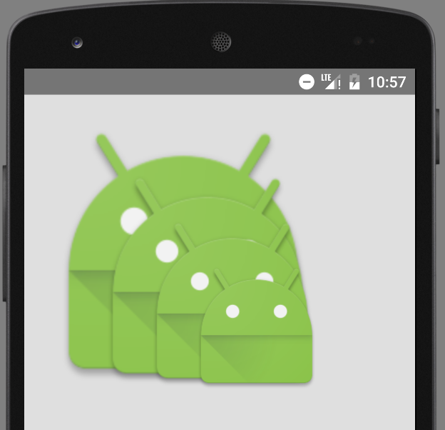
圖片層疊的時候,有兩種效果,一種是縮放後層疊,一種是不縮放的層疊。預設是縮放效果。具體效果以及實現程式碼如下:
效果圖 1) : 帶有縮放效果的
具體程式碼 1):
- 建立 layer-list
<?xml version="1.0" encoding="utf-8"?>
<layer-list xmlns:android="http://schemas.android.com/apk/res/android">
    <!--預設縮放-->
    <item>
        <bitmap
            android:src="@drawable/ic_launcher"/>
    </item>

    <item android:left="35dp"
          android:top="35dp">
        <bitmap
            android:src="@drawable/ic_launcher"/>
    </item>

    <item android:left="70dp"
          android:top="70dp">
        <bitmap
            android:src="@drawable/ic_launcher"/>
    </item>
</layer-list>
或者也可以使用如下程式碼,實現縮放的疊加圖:
<?xml version="1.0" encoding="utf-8"?>
<layer-list xmlns:android="http://schemas.android.com/apk/res/android">
    <!--這種方式拿到的是帶有縮放的效果,即便給item 設定了gravity 並且從模擬器上看到的效果是不縮放的,但是真機上依舊是縮放的效果-->
    <item android:drawable="@drawable/ic_launcher">
    </item>
    <item android:drawable="@drawable/ic_launcher"
          android:left="45dp"
          android:top="45dp">
    </item>
    <item android:drawable="@drawable/ic_launcher"
          android:left="90dp"
          android:top="90dp">
    </item>
</layer-list>- 使用 layer-list 圖
  <ImageView
        android:layout_width="wrap_content"
        android:layout_height="wrap_content"
        android:background="@drawable/overlay"
    />
效果圖 2):不帶縮放效果的
注意:
A. 不縮放的時候,必須在 item 節點中使用 bitmap 節點,並給 bitmap 設定 gravity=center ;
B. 雖然在實現縮放效果的時候,可以直接使用 item 中的 drawable屬性,但實現不縮放的效果時,如果還用drawable 屬性,即便給item 設定了gravity =center ,在真機上的效果依舊是縮放的。(但模擬器是不縮放的)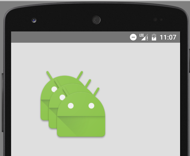
具體程式碼 2):
- 建立 layer-list
<?xml version="1.0" encoding="utf-8"?>
<layer-list xmlns:android="http://schemas.android.com/apk/res/android">
    <!--不縮放-->
    <item>
        <bitmap
            android:gravity="center"
            android:src="@drawable/ic_launcher"/>
    </item>

    <item android:left="35dp"
          android:top="35dp">
        <bitmap android:gravity="center"
                android:src="@drawable/ic_launcher"/>
    </item>

    <item android:left="70dp"
          android:top="70dp">
        <bitmap android:gravity="center"
                android:src="@drawable/ic_launcher"/>
    </item>

</layer-list>- 使用 layer-list 圖
 <ImageView
        android:layout_width="wrap_content"
        android:layout_height="wrap_content"
        android:background="@drawable/overlay"
    />
3.5 效果5 :疊加旋轉
效果圖:
具體程式碼:
- 建立 layer-list
<?xml version="1.0" encoding="utf-8"?>
<layer-list xmlns:android="http://schemas.android.com/apk/res/android">

    <item>
        <rotate android:fromDegrees="-10" android:pivotX="0"
                android:pivotY="0">
            <bitmap android:src="@drawable/decibel_blue_background"/>
        </rotate>
    </item>
    <item>
        <rotate android:fromDegrees="10" android:pivotX="0"
                android:pivotY="0">
            <bitmap android:src="@drawable/decibel_orange_background"/>
        </rotate>
    </item>
    <item>
        <rotate android:fromDegrees="30" android:pivotX="0"
                android:pivotY="0">
            <bitmap android:src="@drawable/decibel_red_background"/>
        </rotate>
    </item>


</layer-list>
旋轉的時候,只需要給出 起始的角度( fromdegress )即可。
- 使用 layer-list 圖
    <!--圖片疊加並帶旋轉效果-->
    <ImageView
        android:layout_width="wrap_content"
        android:layout_height="wrap_content"
        android:background="@drawable/rotate"/>
4. layer-list 的擴充套件使用
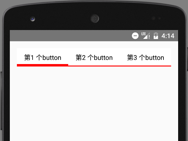
4.1.實現選擇器的效果
主要使用元件:RadioGroup Selector layer-list
1). 效果圖:
2). 具體程式碼
定義 selector 選擇器
selector 的 item 節點中,直接巢狀 layer-list
當然也可以先寫好layer-list ,然後再去引用
<?xml version="1.0" encoding="utf-8"?>
<selector xmlns:android="http://schemas.android.com/apk/res/android">
    <!--被選中時是4dp的底部邊線-->
    <item android:state_checked="true">
        <layer-list>
            <item>
                <shape>
                    <solid android:color="#f00"/>
                </shape>
            </item>
            <item android:bottom="4dp">
                <shape>
                    <solid android:color="#fff"/>
                </shape>
            </item>
        </layer-list>
    </item>

    <!--未被選中的是2dp的底部邊線-->
    <item>
        <layer-list>
            <item>
                <shape>
                    <solid android:color="#f00"/>
                </shape>
            </item>
            <item android:bottom="2dp">
                <shape>
                    <solid android:color="#fff"/>
                </shape>
            </item>
        </layer-list>
    </item>
</selector>
注意:
在上面的程式碼中,由於並沒有具體的shape ,所以可以省略shape , 直接用 color , 簡化後的程式碼如下:
<?xml version="1.0" encoding="utf-8"?>
<selector xmlns:android="http://schemas.android.com/apk/res/android">

    <!--被選中時是4dp的底部邊線-->
    <item android:state_checked="true">
        <layer-list>
            <item>
                <color android:color="#f00"/>
            </item>
            <item android:bottom="5dp">
                <color android:color="#fff"/>
            </item>
        </layer-list>
    </item>

    <!--未被選中的是2dp的底部邊線-->
    <item>
        <layer-list>
            <item>
                <color android:color="#f00"/>
            </item>
            <item android:bottom="2dp">
                <color android:color="#fff"/>
            </item>
        </layer-list>
    </item>
</selector>- 使用selector
<LinearLayout xmlns:android="http://schemas.android.com/apk/res/android"
              android:layout_width="match_parent"
              android:layout_height="match_parent"
              android:orientation="vertical"
              android:padding="15dp">
    <RadioGroup
        android:id="@+id/rg"
        android:layout_width="match_parent"
        android:layout_height="wrap_content"
        android:orientation="horizontal">
        <RadioButton
            android:id="@+id/rb1"
            android:layout_width="0dp"
            android:layout_height="wrap_content"
            android:layout_weight="1"
            android:background="@drawable/selector_bk_rb"
            android:button="@null"
            android:checked="true"
            android:gravity="center"
            android:padding="10dp"
            android:text="第1 個button"/>
        <RadioButton
            android:layout_width="0dp"
            android:layout_height="wrap_content"
            android:layout_weight="1"
            android:background="@drawable/selector_bk_rb"
            android:button="@null"
            android:gravity="center"
            android:padding="10dp"
            android:text="第2 個button"/>
        <RadioButton
            android:layout_width="0dp"
            android:layout_height="wrap_content"
            android:layout_weight="1"
            android:background="@drawable/selector_bk_rb"
            android:button="@null"
            android:gravity="center"
            android:padding="10dp"
            android:text="第3 個button"/>

    </RadioGroup>
</LinearLayout>
注意:
在 RadioGroup 中,是通過 RadioButton 的 id 來控制是否選中。
所以,如果需要設定某一個 RadioButton 為預設選中,就必須給該 RadioButton 設定 id ;
如果不設定 id ,導致的結果就是該 RadioButton 會一直處於選中狀態!!!