Graphic Design For Screen Based Communication
Usability of Web Design
First of all, let’s talk about what usability is in terms of web design. Web usability is the ease of use of a website. In order to achieve good usability, you must consider the presentation of information and the placement of important content in appropriate areas. This involves features such as navigation bars, menus, hyperlinks etc that users will experience when they visit your page. Another vital element of usability is ensuring that the content works on various devices and browsers.
The three main terms that should be remembered when considering usability are effective, efficient and satisfactory. When a user opens an effective site, their expectations are exceeded, and they are able to use the site to complete their intended goals. An efficient website is on a slightly higher level for expectations in that it enables its guests to find the information they need as quickly and economically as possible, with no wasted time. That then leaves satisfaction. This is when a user searches and discovers a site that fulfils their requirements. If you combine these three together you will have great usability of your website.
Usability is so important as it will help to meet your customer’s expectations and thus help your business to thrive and receive more visitors. Therefore, maintenance of usability of your website is extremely important. Below are the five main things you should constantly monitor in order to main the usability of your site.
Clarity — Communication is one of the most important factors that can either make or break your website. Communication is essential for a positive user experience and for a successful website that truly benefits its owners. If you distract or confuse your visitors, they will require more time to find what they were initially looking for or forget about it altogether. Therefore, you must make sure that your website is clearly communicating the features and content it contains. A great way to do this is to focus on simplicity and to not overwhelm the user. This can be achieved by creating a simple layout and having a small amount of text explaining the content rather than large chunks of text all over the page. You must also make sure the content is relevant and appropriate. Whilst doing this, you should always remember to guide your users through your page with the use of headings and subheadings, allowing the user to gain the information they need without exploring the whole site.


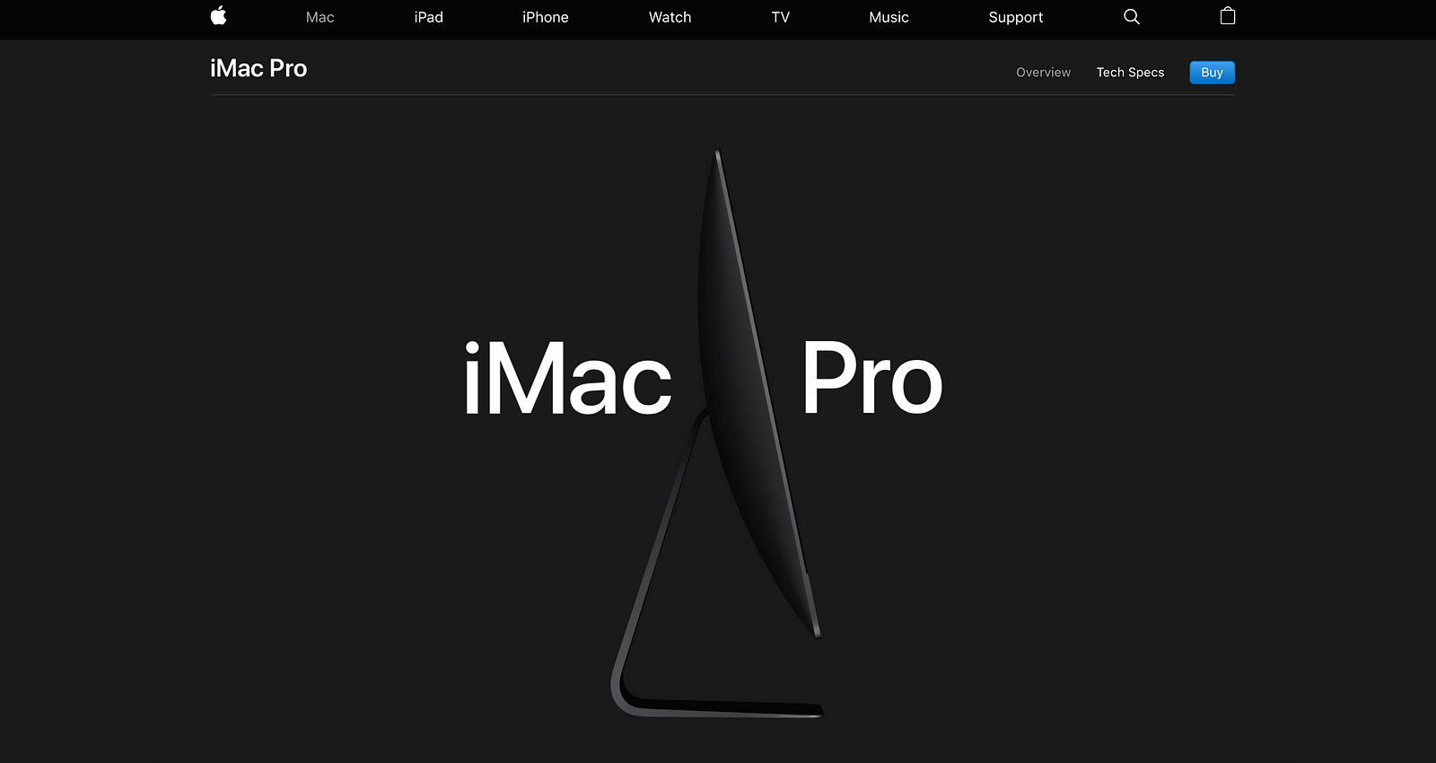
An example of a website that has great clarity is the Apple site. As you can see, the layout is very basic but visually appealing to the eye. It appears very elegant and minimalist. There is a lot of space and only relevant content is presented in a clean and straightforward way. The classical top navigation menu holds the logo and home button, the store, different product categories, a link to the support page, and a search function. This is the essentials and makes a great user experience as everything is easily found on the website.
Availability and Accessibility — This is a basic aspect to your website, in that you must always make sure your website is in working order. If a user tries to access your website and it doesn’t work, it will become useless to the user resulting in them leaving the page. In order to ensure this doesn’t happen, you must monitor your server uptime. This is vital so users will not receive errors when trying to load your site. Always double check that your links are not broken. You will not receive visitors if the links on your website don’t work. Finally, consider screen sizes and slow connections for mobile responsiveness. You want your website to be available on different devices rather than just laptops and computers.
Netflix is a good example for usability as the site is optimized for both tablets and desktop screens. For mobile, there is an explicit version of the site with a clean interface, less clutter, and a clear hierarchy of the content.
Learnability — This is another essential aspect of usability. Learnability is defined as the capability of a product to enable the user to learn how to use it. The way to achieve learnability for your site is to make it familiar. By now, people are familiar with a lot of design concepts used on the web. By using these concepts consistently, you meet the user’s expectations. This also saves the user a lot of time and prevents them from getting bored of trying to find the information they need, thus creating a good user experience. For example, you can offer additional information, or instructions the first time they use your site or product. Keep this easy and visual to help people remember these concepts. Take a look at the website below.


When you open this editing website, a box will pop up explaining how to get started with editing. As you can see its simple, easy on the eye and doesn’t overwhelm the user with a lot of text. This is a great way to introduce users to new features or rules on your page.
Relevance — This is extremely important when creating a site. It won’t matter if you have a good layout and a working site unless the content you are providing is relevant. You must start by deciding who your target audience is and what their goals might be when they visit your site. That way you can create content that is appropriate and informing for the user, resulting in a more user-friendly website.


A valubale example of a website that provides relevant content is Nike. As you can see, there is very clear headings dividing the whole store into six categories ( men, women, boys, etc). Once you choose one of these categories, you will be brought to a page offering the different sections you can explore. It appears extremely simple and with the use of white space it does not appear overwhelming to the user. All of the content is relevant, allowing users to navigate quickly through the site to achieve their goals.
Credibility — This is a crucial aspect of any site. You must make a website that users can trust, otherwise your content is worthless. The quality of your site is what will determine this factor. It is important to have an ‘About Us’ section, allowing users to read more about your company and what you really do. As well as that, you must create a fully functioning website that appears professional. Avoid incorrect grammar and cluttered spaces. If you have social media accounts it is always ideal to have those linked to your website, so users can explore and view the interaction you have with other users or customers. This in a way acts as a review of your site.


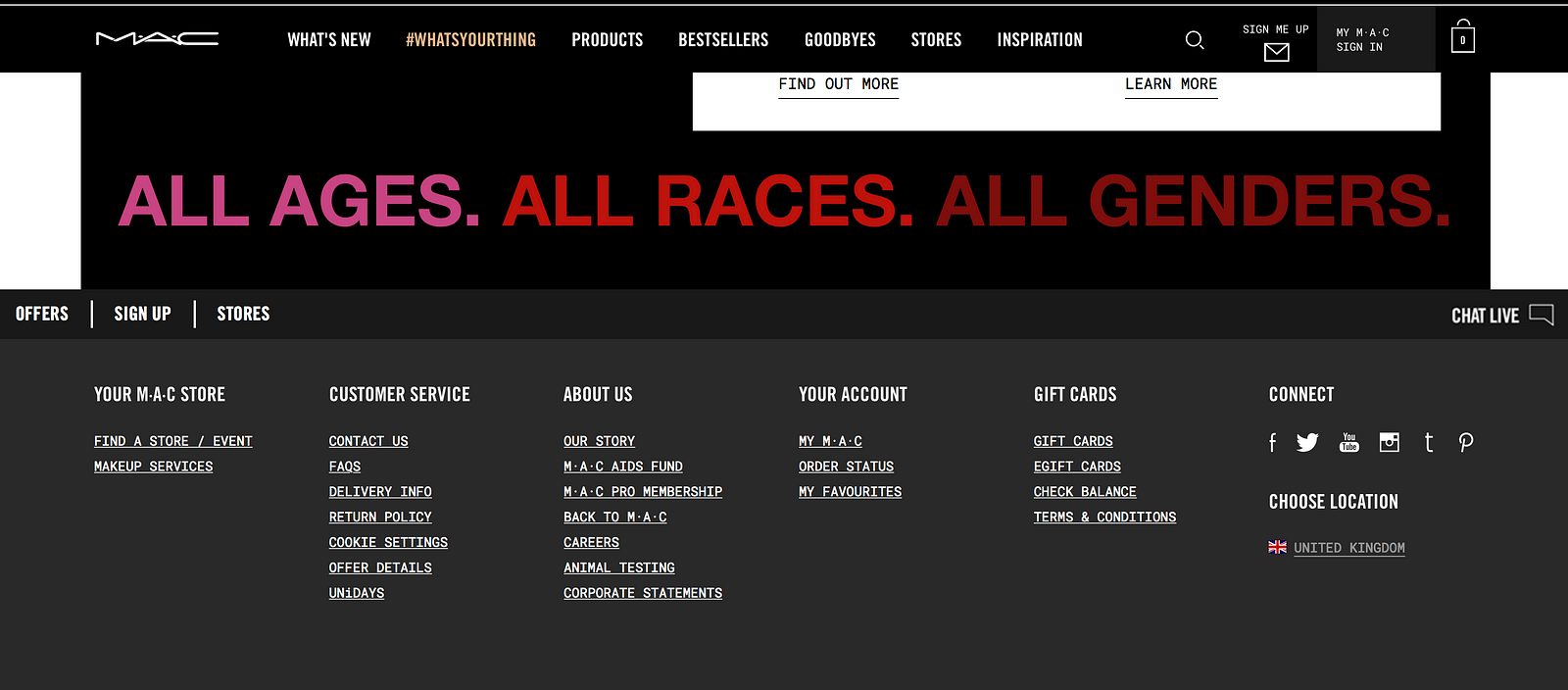
As you can see at the bottom of the Mac Makeup website, there is a whole section dedicated to ‘About Us’ in the footer. Options include animal testing, the history of the brand, careers and corporate statements. This is an excellent way to increase the credibility of your site and informing your users of everything they need to know.
