
Discovering Data Science: A Chronicle
EXPLORATORY DATA ANALYSIS
Like any set of metrics, pitcher value metrics based on a small number of observations can drastically impact their accuracy. As a check on the pitchers included in my dataset, I decided to check the minimum value for innings pitched and plot annual salary against the number of innings pitched.
df.IP.min()
Output: .10000000

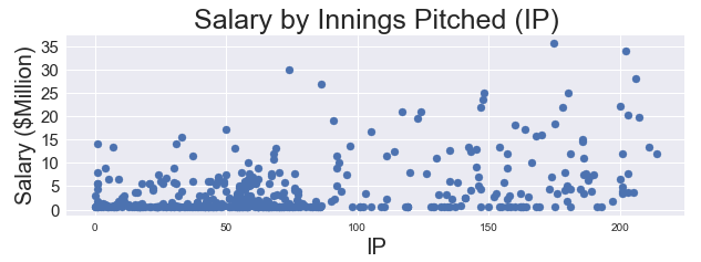
Hmmm, it looks like we have some players that did not even pitch a full inning, as well as a high concentration of pitchers with fewer than 100 innings pitched. The small number of innings pitched by certain players could mean that pitchers were injured, underutilized, OR that position players (non-pitchers) are occasionally pitching in games and might skew the data. Remember the data table snapshot from Baseball-Reference earlier in the post? It demonstrates the problem of having highly paid position players who pitched for one inning during the year!


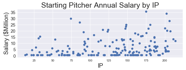
The high concentration likely results from all of the aforementioned issues as well as the inclusion of relief pitchers in the data, which is beyond the scope of this project. Instead of including all pitchers, I chose to examine those that started five or more games. Eliminating those observations that do not truly belong in our target population yields the following, much friendlier scatter plot:

At this point, I need to explore the various features included in my dataset and determine which ones are the best candidates for performing a linear regression.
WARNING: Bare in mind that I want to practice linear regression techniques, regardless of whether or not the features and target exhibit a linear relationship. Performing a linear regression assumes that a linear relationship exists among the data, so I do not advocate violating said assumption when performing actual work.
In order to gain insight into which features are more correlated with a starting pitcher’s salary, I create a correlation matrix in pandas and a pair plot in Seaborn. Due to the size of the correlation matrix and unrefined pair plot, I will only display the output for the plot with five features.
df.corr()sns.pairplot(df[['Age', 'IP', 'GS', 'RA9', 'WAR', 'Salary']]);


Although I plotted five features, some of them demonstrate collinearity with one another. For this reason, I choose to eliminate two of the collinear measures and concentrate on three independent features with the highest correlations: Age, IP, and WAR. Age is just the age of the player taken at a predetermined point in the season. IP is the number of innings pitched by the player over the course of 2017. Finally, WAR is an acronym for ‘Wins Above Replacement,’ which is an important sabermetric statistic designed to represent the number of wins a particular player contributed to his team above what a replacement level player might produce (WAR = 0). The highest correlation for the three features is .559, which is not fantastic. At this point, I would already consider using a different model if it were an actual deliverable.