
在Python中進行基於穩健馬氏距離的異常檢驗
阿新 • • 發佈:2019-01-04
原文地址:https://my.oschina.net/dfsj66011/blog/793392
例如,假設你有一個關於身高和體重的資料框資料:
# -*- coding: utf-8 -*-
import pandas as pd
import numpy as np
from numpy import float64
#身高資料
Height_cm = np.array([164, 167, 168, 169, 169, 170, 170, 170, 171, 172, 172, 173, 173, 175, 176, 178], dtype=float64)
#體重資料
Weight_kg = np.array([54,  57,  58,  60,  61,  60,  61,  62,  62,  64,  62,  62,  64,  56,  66,  70], dtype=float64)
hw = {'Height_cm': Height_cm, 'Weight_kg': Weight_kg}
hw = pd.DataFrame(hw)#hw為矩陣 兩列兩個變數(身高和體重) 行為變數序號
print hw
將這些點畫成散點圖,你就可以直觀的看到異常點,例如,我們假設與資料中心偏離大於2的即為異常值,則:Height_cm Weight_kg 0 164.0 54.0 1 167.0 57.0 2 168.0 58.0 3 169.0 60.0 4 169.0 61.0 5 170.0 60.0 6 170.0 61.0 7 170.0 62.0 8 171.0 62.0 9 172.0 64.0 10 172.0 62.0 11 173.0 62.0 12 173.0 64.0 13 175.0 56.0 14 176.0 66.0 15 178.0 70.0
import pandas as pd
from sklearn import preprocessing
import numpy as np
from numpy import float64
from matplotlib import pyplot as plt


#scale 資料進行標準化    公式為:(X-mean)/std  將資料按按列減去其均值,並處以其方差   結果是所有資料都聚集在0附近,方差為1。
is_height_outlier = abs(preprocessing.scale(hw['Height_cm'])) > 2 #線性歸一化    資料中心的標準偏差與2比較
is_weight_outlier = abs(preprocessing.scale(hw['Weight_kg'])) > 2
is_outlier = is_height_outlier | is_weight_outlier#按位或 表示兩個變數中有一位是異常的 本組資料(體重,身高)異常    is_outlier是陣列,值為True或False
color = ['g', 'r']
pch = [1 if is_outlier[i] == True else 0 for i in range(len(is_outlier))]#pch是陣列,值為1或0,1表示異常點
cValue = [color[is_outlier[i]] for i in range(len(is_outlier))]#顏色陣列
# print is_height_outlier
# print cValue
fig = plt.figure()
plt.title('Scatter Plot')
plt.xlabel('Height_cm')
plt.ylabel('Weight_kg')
plt.scatter(hw['Height_cm'], hw['Weight_kg'], s=40, c=cValue)#散點圖 s代表圖上點大小
plt.show()
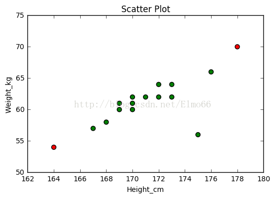
注意,身高為175cm的這個資料點(圖中右下角)並沒有被標記為異常點,它與資料中心的標準偏差低於2,但是從圖中直觀的發現的它偏離身高、體重的線性關係,可以說它才是真正的離群點。
順便說一下,上圖中尺度的選擇可能會有些誤導,實際上,身高對體重的影響關係應該讓Y軸從0開始,但是我僅僅是想通過這些資料說明異常值的檢測,希望你能忽略這個不好的習慣。
下面我們使用馬氏距離求解:
#馬氏距離檢查異常值
# -*- coding: utf-8 -*-
#馬氏距離檢查異常值,值越大,該點為異常點可能性越大
import pandas as pd
import numpy as np
from numpy import float64
from matplotlib import pyplot as plt
from scipy.spatial import distance
from pandas import Series
from mpl_toolkits.mplot3d import Axes3D
#身高資料
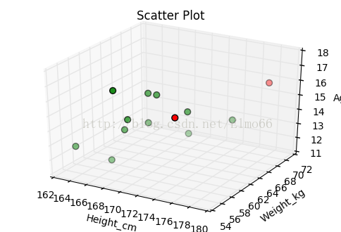
Height_cm = np.array([164, 167, 168, 168, 169, 169, 169, 170, 172, 173, 175, 176, 178], dtype=float64)
#體重資料
Weight_kg = np.array([55, 57, 58, 56, 57, 61, 61, 61, 64, 62, 56, 66, 70], dtype=float64)
#年齡資料
Age = np.array([13, 12, 14, 17, 15, 14, 16, 16, 13, 15, 16, 14, 16], dtype=float64)
hw = {'Height_cm': Height_cm, 'Weight_kg': Weight_kg, 'Age': Age}#hw為矩陣 三列三個變數(身高、體重、年齡) 行為變數序號
hw = pd.DataFrame(hw)
print len(hw)#13
n_outliers = 2#選2個作為異常點
#iloc[]取出3列,一行 hw.mean()此處為3個變數的陣列 np.mat(hw.cov().as_matrix()).I為協方差的逆矩陣 **為乘方
#Series的表現形式為:索引在左邊,值在右邊
#m_dist_order為一維陣列 儲存Series中值降序排列的索引
m_dist_order = Series([float(distance.mahalanobis(hw.iloc[i], hw.mean(), np.mat(hw.cov().as_matrix()).I) ** 2)
for i in range(len(hw))]).sort_values(ascending=False).index.tolist()
is_outlier = [False, ] * 13
for i in range(n_outliers):#馬氏距離值大的標為True
is_outlier[m_dist_order[i]] = True
# print is_outlier
color = ['g', 'r']
pch = [1 if is_outlier[i] == True else 0 for i in range(len(is_outlier))]
cValue = [color[is_outlier[i]] for i in range(len(is_outlier))]
# print cValue
fig = plt.figure()
#ax1 = fig.add_subplot(111, projection='3d')
ax1 = fig.gca(projection='3d')
ax1.set_title('Scatter Plot')
ax1.set_xlabel('Height_cm')
ax1.set_ylabel('Weight_kg')
ax1.set_zlabel('Age')
ax1.scatter(hw['Height_cm'], hw['Weight_kg'], hw['Age'], s=40, c=cValue)
plt.show()上面的程式碼根據馬氏距離(也稱廣義平方距離)檢測離群值得兩個極端點。馬氏距離可以解決n維空間資料,關於馬氏距離的計算公式可參考其他資料,R和Python關於馬氏距離求解的包在引數上以及計算結果的含義上略有不同(R計算結果是距離的平方,協方差矩陣預設可自動求逆,而Python計算結果預設就是馬氏距離,但是引數中的協方差需自己求逆),這次右下角的點被捕捉到。
你可以通過這種方式移除掉5%的最有可能是異常點的資料
percentage_to_remove = 20    # Remove 20% of points
number_to_remove = round(len(hw) * percentage_to_remove / 100)   # 四捨五入取整
m_dist_order =  Series([float(distance.mahalanobis(hw.iloc[i], hw.mean(), np.mat(hw.cov().as_matrix()).I) ** 2)
       for i in range(len(hw))]).sort_values(ascending=False).index.tolist()

rows_to_keep_index = m_dist_order[int(number_to_remove): ]
my_dataframe = hw.loc[rows_to_keep_index]
print my_dataframe
Age Height_cm Weight_kg
3 17.0 168.0 56.0
1 12.0 167.0 57.0
0 13.0 164.0 55.0
11 14.0 176.0 66.0
6 16.0 169.0 61.0
8 13.0 172.0 64.0
7 16.0 170.0 61.0
5 14.0 169.0 61.0
4 15.0 169.0 57.0
2 14.0 168.0 58.0
9 15.0 173.0 62.0警告
當你的資料表現出非線性關係關係時,你可要謹慎使用該方法了,馬氏距離僅僅把他們作為線性關係處理。,例如下面的例子。
import pandas as pd
from sklearn import preprocessing
import numpy as np
from numpy import float64
from matplotlib import pyplot as plt
from scipy.spatial import distance
from pandas import Series

x = np.array([4,  8, 10, 16, 17, 22, 27, 33, 38, 40, 47, 48, 53, 55, 63, 71, 76, 85, 85, 92, 96], dtype=float64)
y = np.array([6, 22, 32, 34, 42, 51, 59, 63, 64, 69, 70, 20, 70, 63, 63, 55, 46, 41, 33, 19,  6], dtype=float64)
hw = {'x': x, 'y': y}
hw = pd.DataFrame(hw)

percentage_of_outliers = 10    # Mark 10% of points as outliers
number_of_outliers = round(len(hw) * percentage_of_outliers / 100)   # 四捨五入取整
m_dist_order =  Series([float(distance.mahalanobis(hw.iloc[i], hw.mean(), np.mat(hw.cov().as_matrix()).I) ** 2)
       for i in range(len(hw))]).sort_values(ascending=False).index.tolist()

rows_not_outliers = m_dist_order[int(number_of_outliers): ]
my_dataframe = hw.loc[rows_not_outliers]

is_outlier = [True, ] * 21
for i in rows_not_outliers:
    is_outlier[i] = False
color = ['g', 'r']
pch = [1 if is_outlier[i] == True else 0 for i in range(len(is_outlier))]
cValue = [color[is_outlier[i]] for i in range(len(is_outlier))]
fig = plt.figure()
plt.title('Scatter Plot')
plt.xlabel('x')
plt.ylabel('y')
plt.scatter(hw['x'], hw['y'], s=40, c=cValue)
plt.show()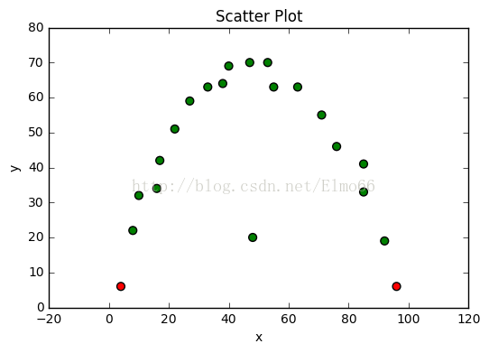
請注意,最明顯的離群值沒有被檢測到,因為要考慮的資料集的變數之間的關係是非線性的。
注意,在多維資料中使用馬氏距離發現異常值可能會出現與在一維資料中使用t-統計量類似的問題。在一維的情況下,異常值能很大程度上影響資料的平均數和標準差,t統計量不再提供合理的距離中心度量值。(這就是為什麼使用中心和距離的測量總能表現的更好,如中位數和中位數的絕對差,對異常值檢測更健壯。可以參考利用絕對中位差發現異常值。)作為馬氏距離,類似t統計量,在高維空間中也需要計算標準差和平均距離。