
翻翻git之---偏向iOS風格的Switch ToggleSwitch
阿新 • • 發佈:2018-12-23
這一篇上一個自定義控制元件ToggleSwitch
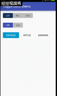
效果圖:

第一眼看上去感覺就像舊版的iOS風格的Switch。
How to use?
Grade:
dependencies {
    compile 'us.belka:androidtoggleswitch:1.1.1'
}
Maven:
<dependency>
<groupId>us.belka</groupId>
<artifactId>androidtoggleswitch</artifactId>
<version>1.0</version Eclipse:
Copy下圖圈出來的部分就好了
如何設定?(這邊拿Eclipse Copy完為例)
<sample.wjj.toggle_switchdemo.ToggleSwitch
android:id="@+id/aTo"
android:layout_width="wrap_content"
android:layout_height="wrap_content"
custom:textToggleLeft="開啟" 那如果你又許多個?不止三個?
那就在業務的Activity中獲取控制元件物件,再傳入一個 ArrayList就行了
像這樣
ToggleSwitch toggleSwitch = (ToggleSwitch) findViewById(R.id.multiple_switches);
ArrayList<String> labels = new ArrayList<>(); 效果如下:

因為他不是繼承於Switch所以,也就沒有所謂的true false2個返回值的概念,全部都由 position返回,也就是從最左邊->最右邊,從0開始遞增就是所被點選的那個position
那麼如何獲取position呢?
  aTo = (ToggleSwitch) findViewById(R.id.aTo);
 aTo.setOnToggleSwitchChangeListener(new ToggleSwitch.OnToggleSwitchChangeListener() {
            @Override
            public void onToggleSwitchChangeListener(int position) {
                Toast.makeText(MainActivity.this,position+"被點選",Toast.LENGTH_SHORT).show();
            }
        });
例子中的土司也就是這麼實現的。
那如果你要初始化設定某個為預設項,就設定下position 像這樣
toggleSwitch.setCheckedTogglePosition(position);
要獲取就這樣
int position = toggleSwitch.getCheckedTogglePosition();還有些設定內容下面也羅列一下,主要是字型大小啊,顏色啊,間距什麼的
| Option Name | Format | Description |
|---|---|---|
| android:textSize | dimension |
Text size of each button |
| custom:activeBgColor | color |
Background color of the checked button |
| custom:activeTextColor | color |
Text color of the checked button |
| custom:inactiveBgColor | color |
Background color of the inactive buttons |
| custom:inactiveTextColor | color |
Text color of the inactive buttons |
| custom:separatorColor | color |
Color of the vertical separator between inactive buttons |
| custom:toggleWidth | dimension |
Width of each button |
總體使用起來和源生控制元件一樣,沒什麼區別,實現難度也不高,大家可以適當的學習下,自己頁寫寫 會有長進。